Honor 6X and EMUI 5.0: Everything you need to know
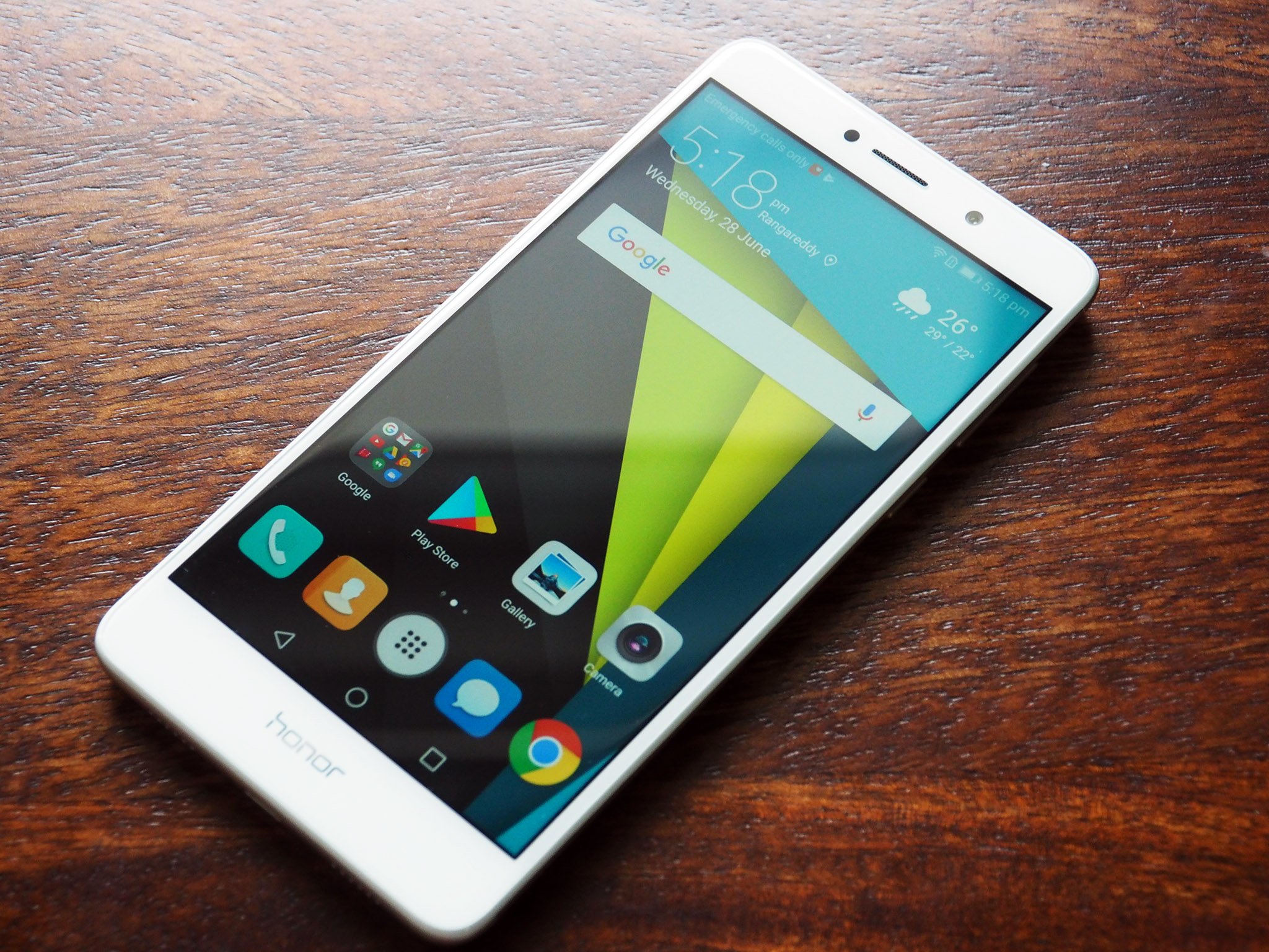
Huawei has been making great hardware for several years now, but the software was always the main drawback. Earlier versions of EMUI were primarily designed for Chinese users, and as such they didn't translate well in Western markets. In particular, the lack of an app drawer was a major feature omission as Huawei looked set to expand its global ambitions. That changed at the end of last year with the introduction of EMUI 5.0.
Along with a visual overhaul, the latest iteration of EMUI brings much-needed features aimed at customers in Western markets, key among which is the introduction of the app drawer. You're still looking at a heavily-skinned version of Android, only this time around it actually feels like Huawei put in some effort toward creating a cohesive design aesthetic.
The EMUI 5.0 update rolled out to the Honor 6X earlier this year, bringing the new additions to Huawei's budget offering. Let's get started with some of the key feature additions.
There's finally an app drawer
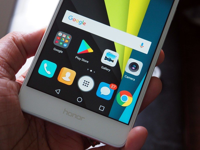
With EMUI 5.0, Huawei finally added a traditional app drawer. Chinese vendors are notorious for not including an app drawer, instead following the iOS convention of listing out all the installed apps on the home screen. Another common feature that is "inspired" by iOS is unread notification badges, which is still present in EMUI 5.0.
The app drawer isn't enabled by default, but you can easily turn it on from the settings. Just head to Settings -> Home screen style -> Drawer to switch to enable the traditional app drawer. The drawer sorts your installed apps in a vertically scrolling list, and there's a suggestions pane at the top that shows you your frequently used apps along with a search bar.
The notification pane has quick toggles
Be an expert in 5 minutes
Get the latest news from Android Central, your trusted companion in the world of Android
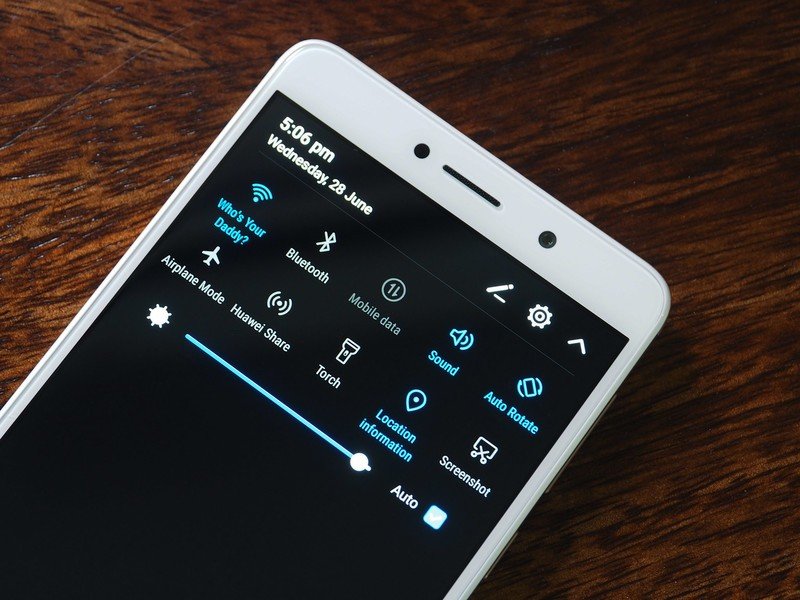
The notification shade in EMUI 4.1 was woefully inadequate — it was split into two panes, with the first pane serving up notifications and the second reserved for toggles. In EMUI 5.0, Huawei finally went with a more traditional two-stage notification window that includes quick toggles at the top of the pane. The quick toggles are customizable, and there's also a brightness slider that lets you easily adjust the display's brightness.
Notifications work the way they're supposed to on Nougat — you can easily expand and swipe away alerts, and use in-line replies to compose a quick reply without having to go into the app.
UI gets a much-needed overhaul
EMUI 5.0 brings the biggest visual refresh to the skin in recent years. Huawei's stock apps now feature predominantly white visual elements with blue accents "inspired by the Aegean Sea," and the UI as a whole feels significantly less cluttered. The settings have also been simplified, giving you easy access to core functions without having to go several levels into a sub-category.
Like previous versions of EMUI, there's a lot of stuff to explore, so if you're interested in tweaking the phone to suit your particular tastes, you'll like all the options on offer. For instance, you can use display scaling options to adjust the size of the interface elements, and enable a blue light filter to reduce eye strain at night. There's also the ability to tweak the color temperature of the display, alter the configuration of the on-screen nav keys, change the look of the UI with themes, and much more.
New battery saving features
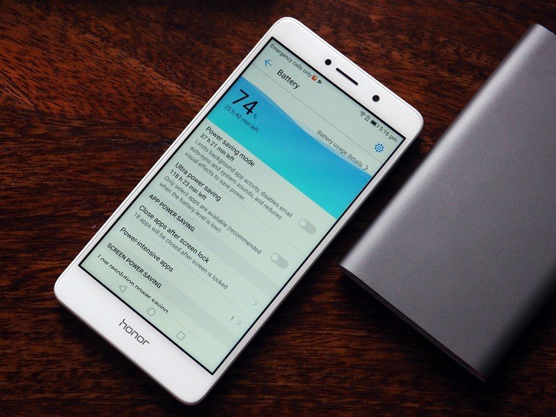
EMUI 4.1 wasn't great at presenting battery usage statistics, but Huawei has overhauled the feature in EMUI 5.0. Battery is now a top-level category in the settings, and the manufacturer has added new power-saving features that allow you to eke out the most from the 3340mAh battery.
The standard power saving mode kills background apps, turns off auto sync and animations to maximize battery life. The "Ultra" mode switches everything off, only giving you access to six apps of your choice. Dialer, Messaging, Contacts, and SOS are set as default, but you can remove them and add your own apps. The mode is designed to extend battery life when the battery level is low, and it certainly manages to do that.
EMUI also has an optimization feature that lets you identify apps that are consuming too much battery in the background, and you also have the option of lowering the screen resolution to increase battery life.
Run two WhatsApp accounts with App twin
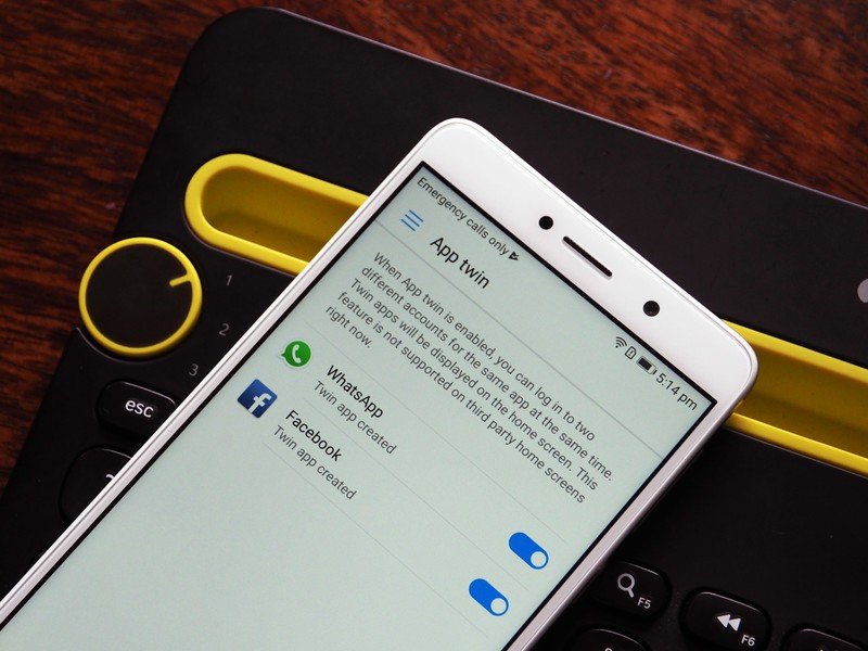
This is a feature that will see more usage in Asian markets, but it's still a nifty one to have if you have two accounts on the same social media platform. App twin essentially allows you to run two instances of an app simultaneously, allowing you to use two WhatsApp or Facebook accounts from the same device.
The data is sandboxed, meaning there's no chance of information crossing over from one instance of an app to another. An indent with a numeral "2" at the bottom right corner of the app icon lets you know that the particular version is a secondary instance of the app. Huawei isn't the first manufacturer to offer this feature — Xiaomi and Lenovo have been offering the same for some time now — but it's a valuable addition nevertheless.
Your turn
What are your thoughts on the direction Huawei is taking with EMUI 5.0? Share your thoughts in the comments below.

Harish Jonnalagadda is Android Central's Senior Editor overseeing mobile coverage. In his current role, he leads the site's coverage of Chinese phone brands, networking products, and AV gear. He has been testing phones for over a decade, and has extensive experience in mobile hardware and the global semiconductor industry. Contact him on Twitter at @chunkynerd.
