Home screen layouts and how to theme them
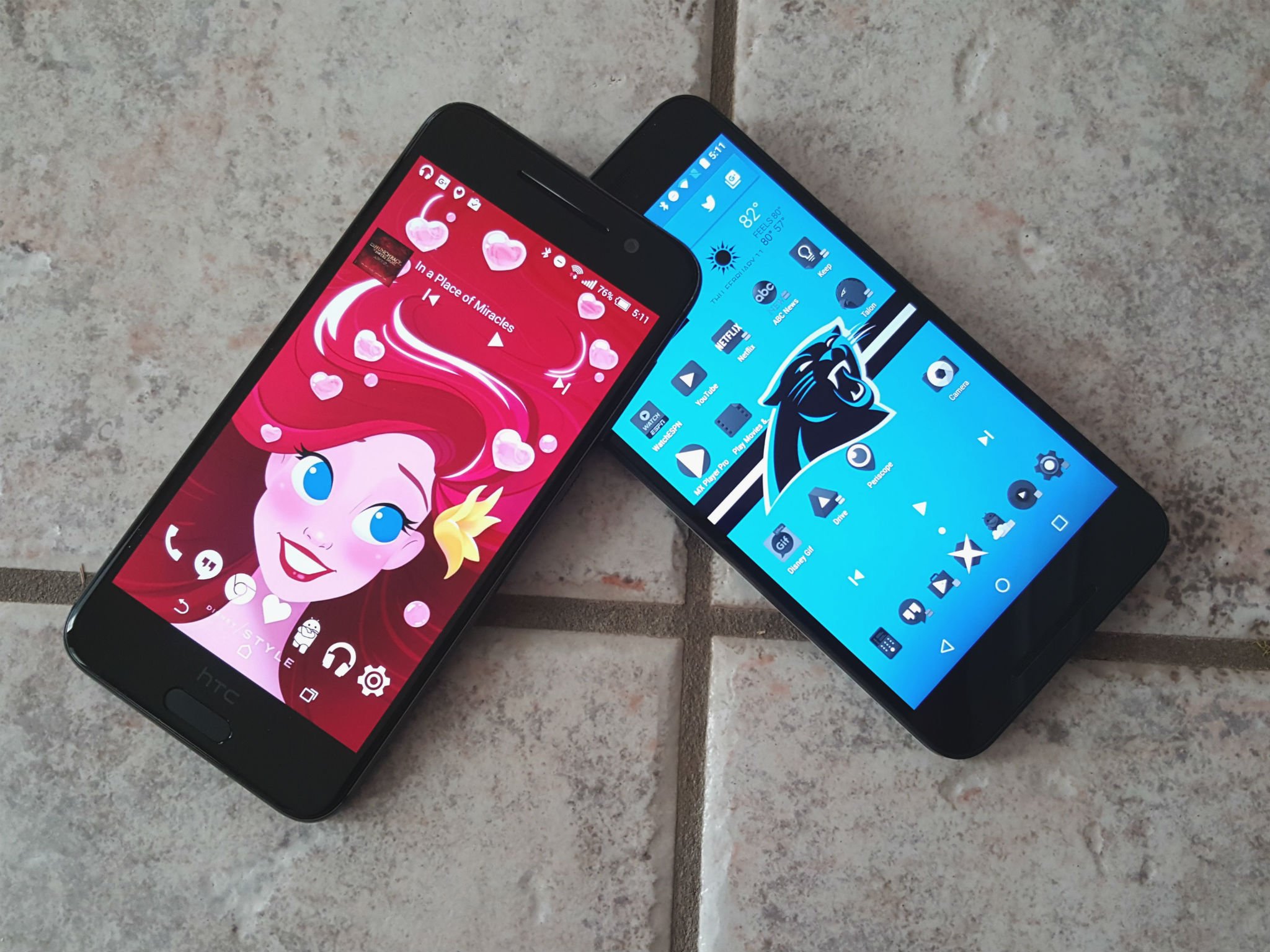
Even if you don't actively theme your phone, you do actively lay out your home screen. Layouts are the way you arrange the apps and widgets on your home screen. We don't talk about them nearly as much when theming as we should. In fact, I try to avoid specific layouts in my themes so they are more accessible to users of varying tastes. But layouts are important, whether you intend to theme your phone or not.
Some people like their home screen to have as little on it as possible. Some people want everything on the home screen they possibly can squeeze in there. Some people are a little of column A and a little of column B, because we believe that the space on our home screen is meant to be used, but we don't need/want to cover up every inch of it. No matter which camp you fall in, all of us can benefit from seeing the differences and the benefits of each approach.
Heavy home screens
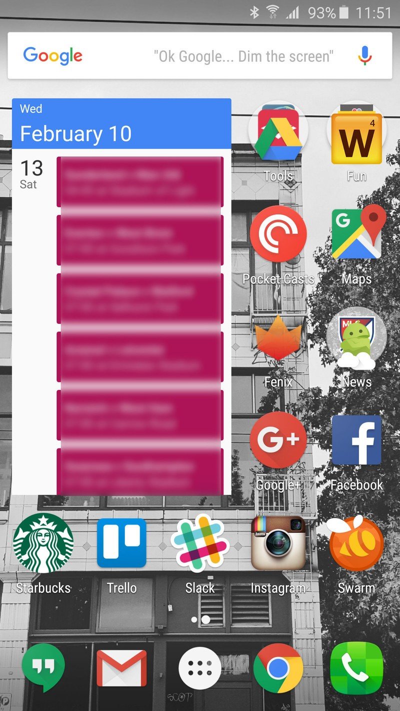
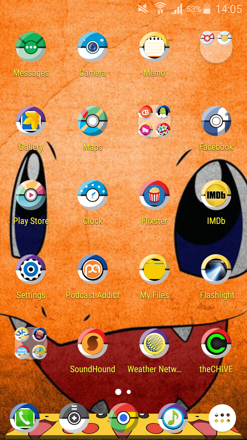
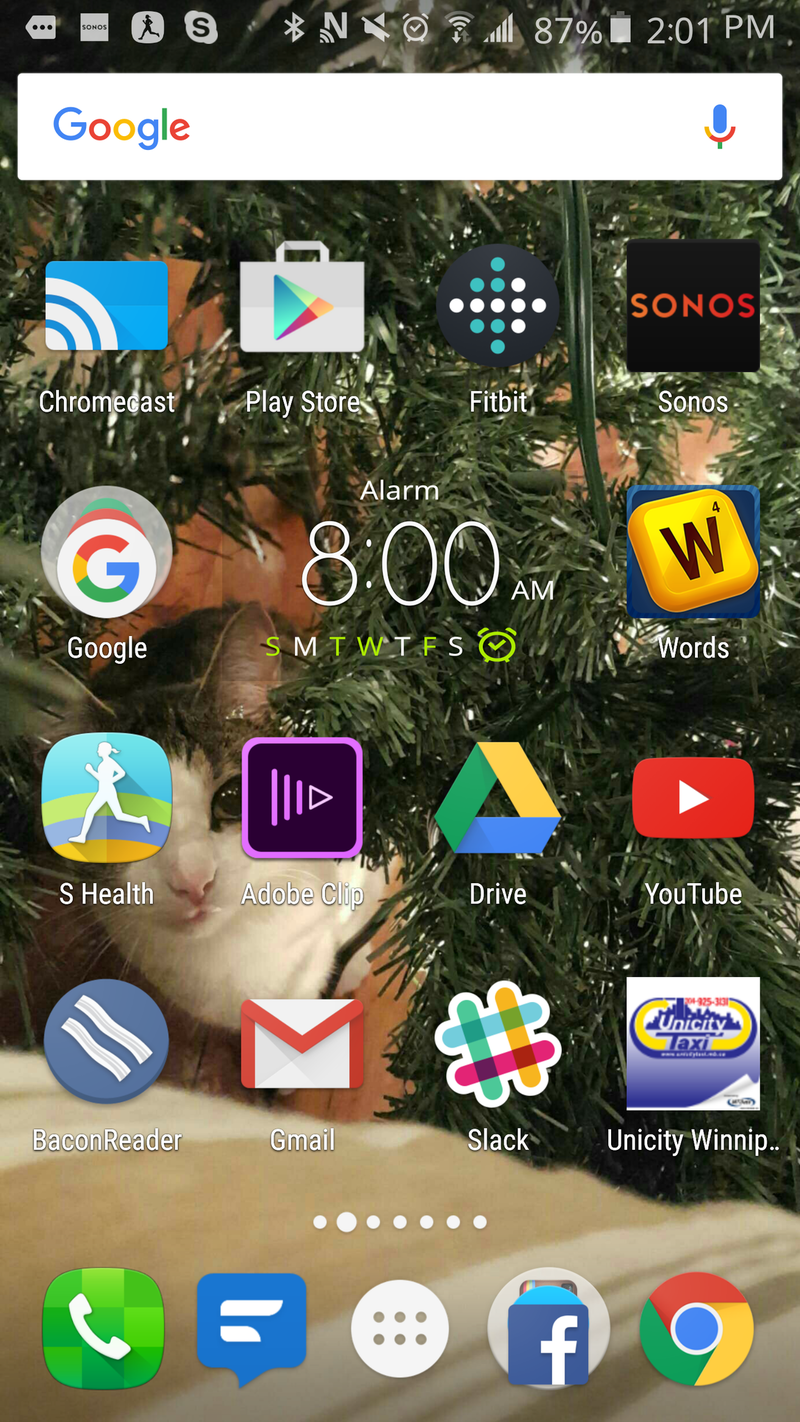
These are without a doubt the most prevalent layouts in the mobile space, in part because these layouts look a lot like how Windows Phone and iOS home screens look: a vast sea of app icons and (maybe) widgets. For users who have recently migrated from one of these platforms, or users on their first smartphone, this busy layout is a taste of the familiar, like the desktop they save everything to at home.
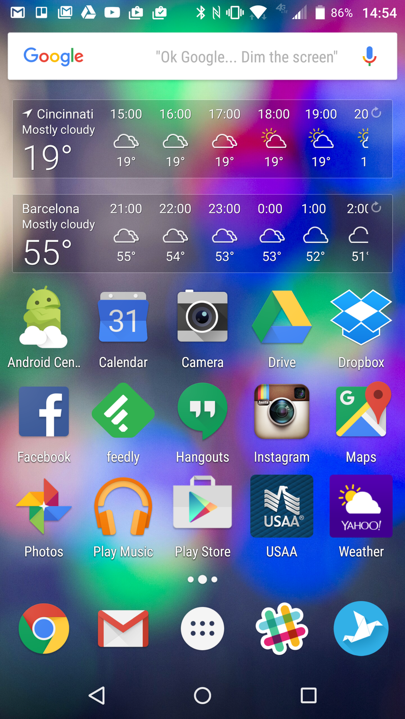
Because everything important is in one place, these users spend little time digging through apps they don't frequently use in their app drawer. It keeps some users focused on the apps they need to use, rather than getting sucked in by an app that catches their eye in the drawer. If there are widgets here, they're usually a clock, some settings toggles, and maybe a weather widget.
Despite the time-consuming look of these home screens, these layouts are usually the quickest to come together: drag everything you need to the home screen and maybe sort them. However, busy home screens also don't leave much space open for gestures beyond a double-tap.
These layouts may look chaotic to the untrained eye, but to the user who set them, everything has a place and they know where that place is. When theming a heavy home screen like these, stick to simple wallpapers without a single area of focus. Icon packs are especially important here as the screen is covered in apps. If you use a lot of obscure apps that are unlikely to be themed in icon packs, alternative icons and filters for unthemed icons matter.
Minimalist home screens
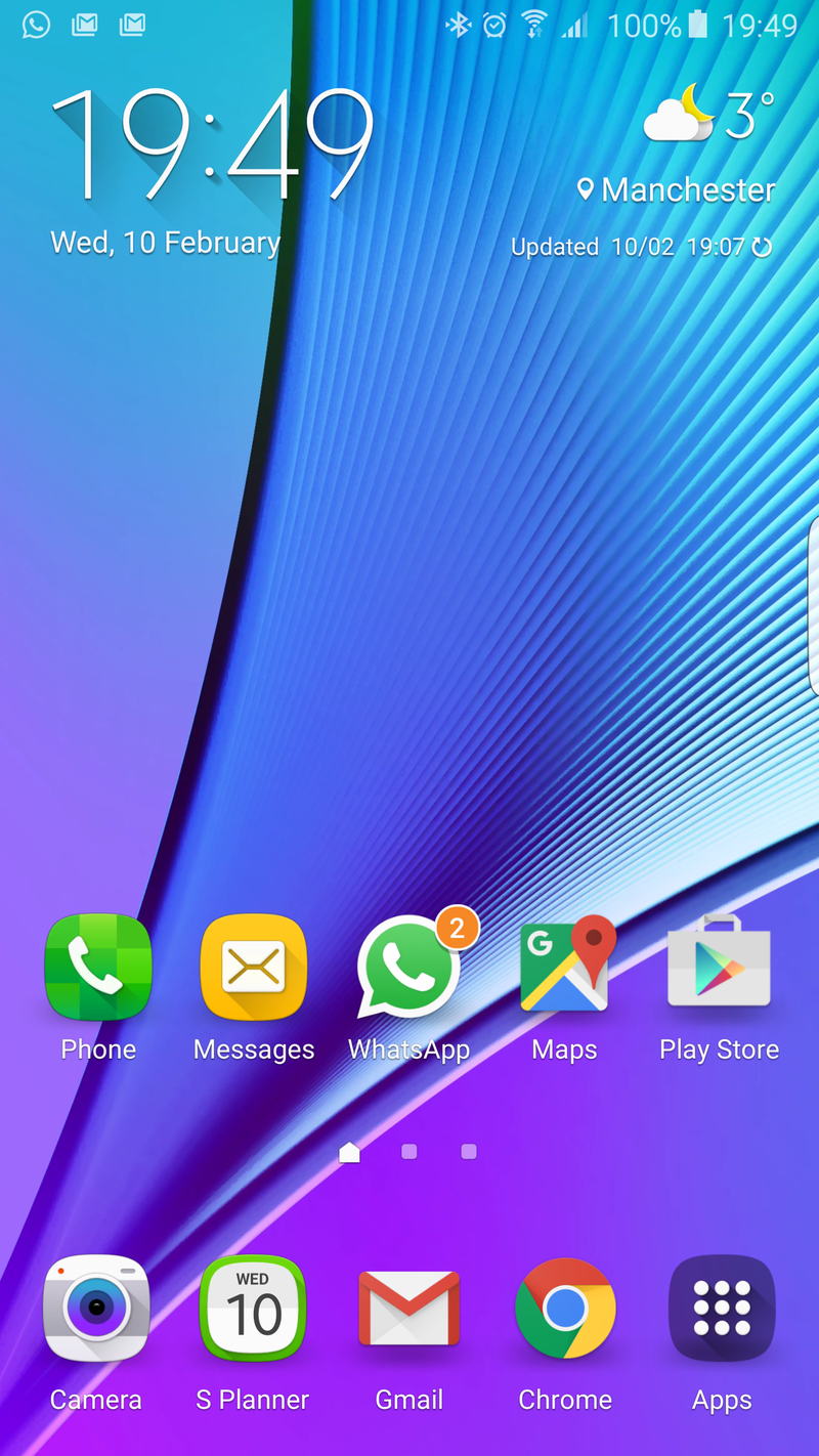
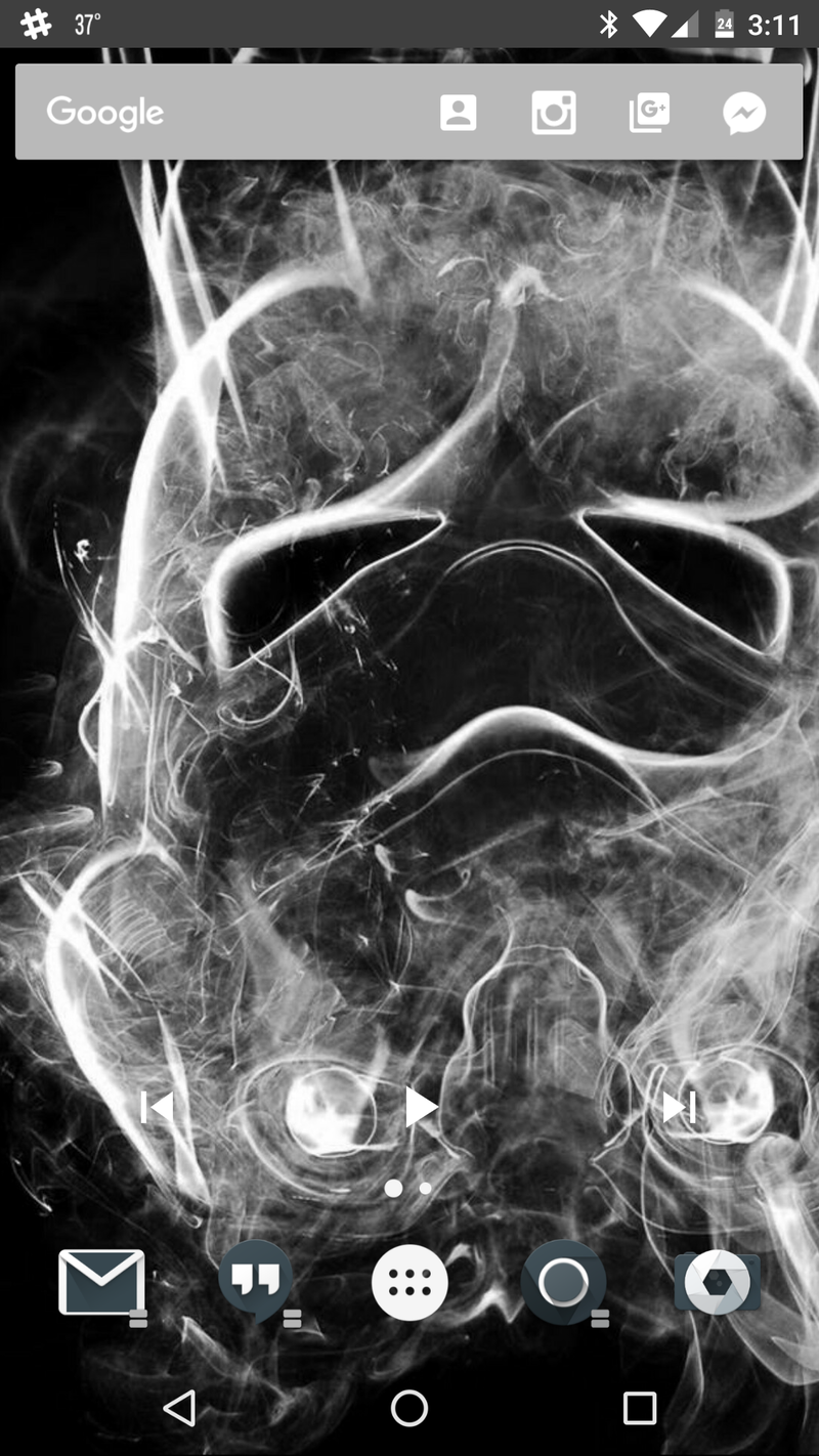
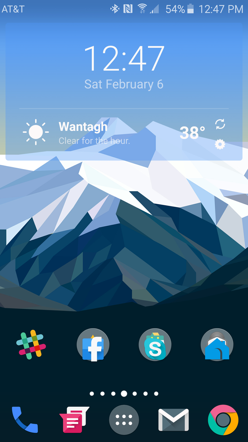
At the other end of the home screen spectrum lie screens with as little on them as possible. Minimalist home screens are tidy, they are simple, they are here to stay out of the way and let you get what you need to do done. The default layout on most third-party launchers, and even some manufacturer launchers like Google Now Launcher, lean towards the minimalist side so as to not overwhelm new users.
Be an expert in 5 minutes
Get the latest news from Android Central, your trusted companion in the world of Android
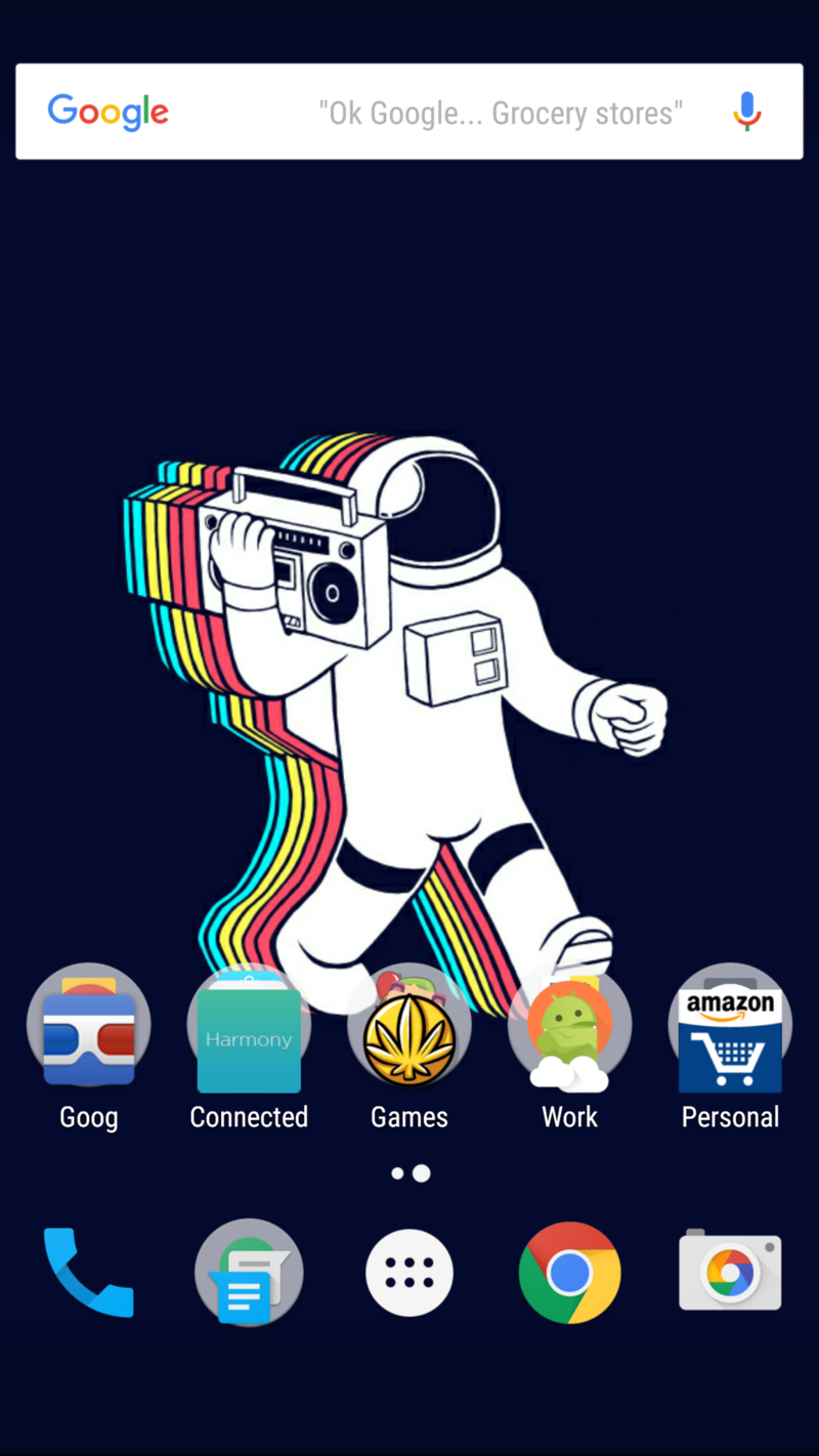
Sometimes, their home screen will be completely clear, just a small array of apps in the dock and a wallpaper that's easy on the eyes. Maybe there's a single widget at the top with the time and weather, or maybe another row of apps above the dock, but that's it. While this makes it easier to find the few apps that are there, this does mean that you'll dip into your app drawer more often, so app drawer organization becomes much more important.
Folders allow many of us to cheat, giving us a clean look on the home screen while still offering more apps outside the app drawer. When theming a lean home screen, you have much more freedom with your wallpaper, as that will be the most prominent element on your screen.
The need for your icon pack to compliment the wallpaper is higher with these layouts because the few apps that are there stand out more. Widgets with clear backgrounds play especially well with minimalist layouts, but a bright, custom widget can also serve as a bit of a statement.
Mixed home screens
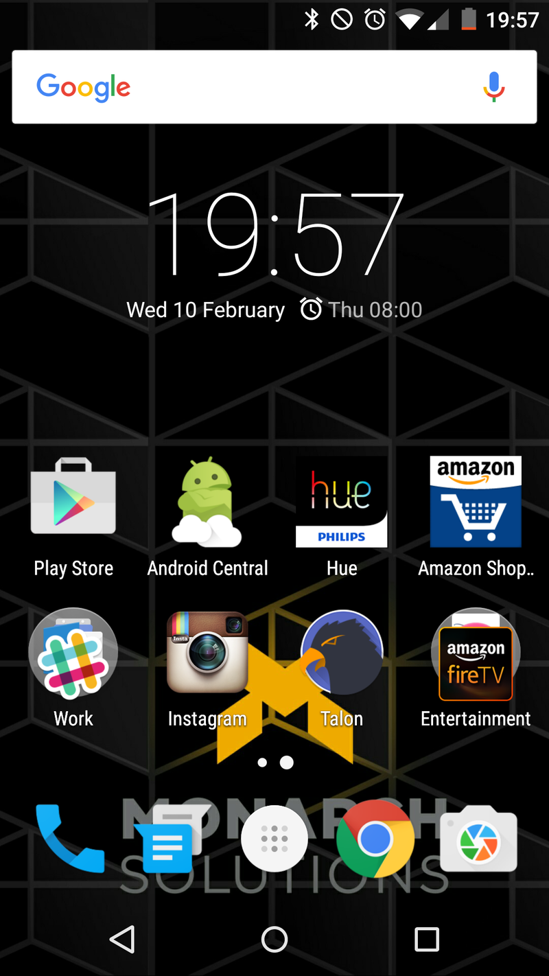
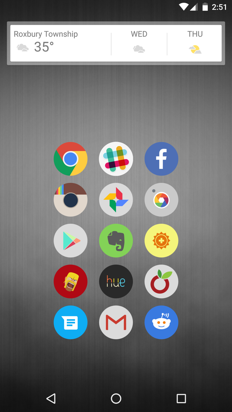
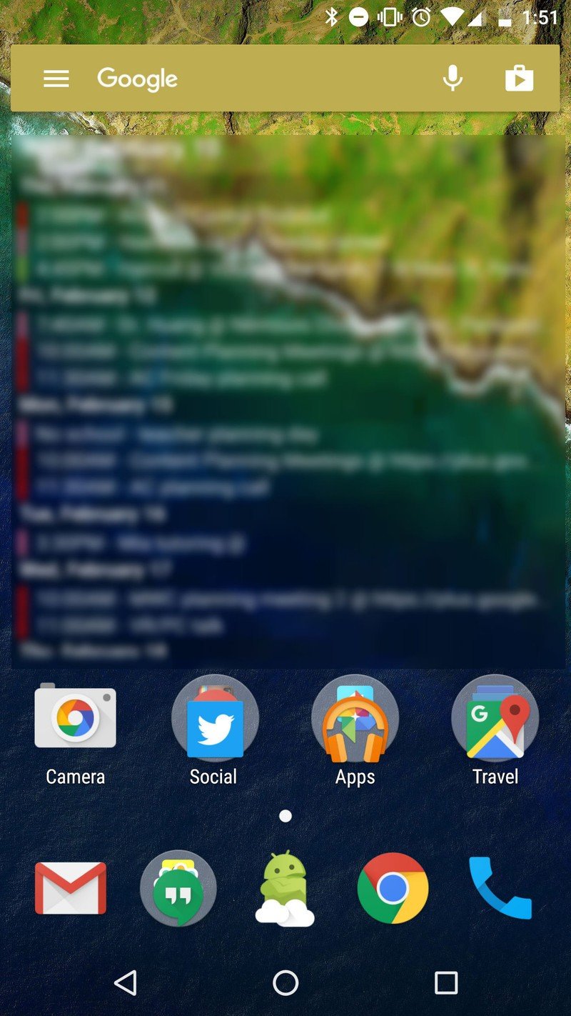
Mixed home screens try to strike a balance between the shelves of shortcuts and the emptiness of a minimal layout. These layouts can skew busy or simple, trying to make the most of the space given to them without overcrowding things. When building themes for myself or the site, this is the layout category I strive for.
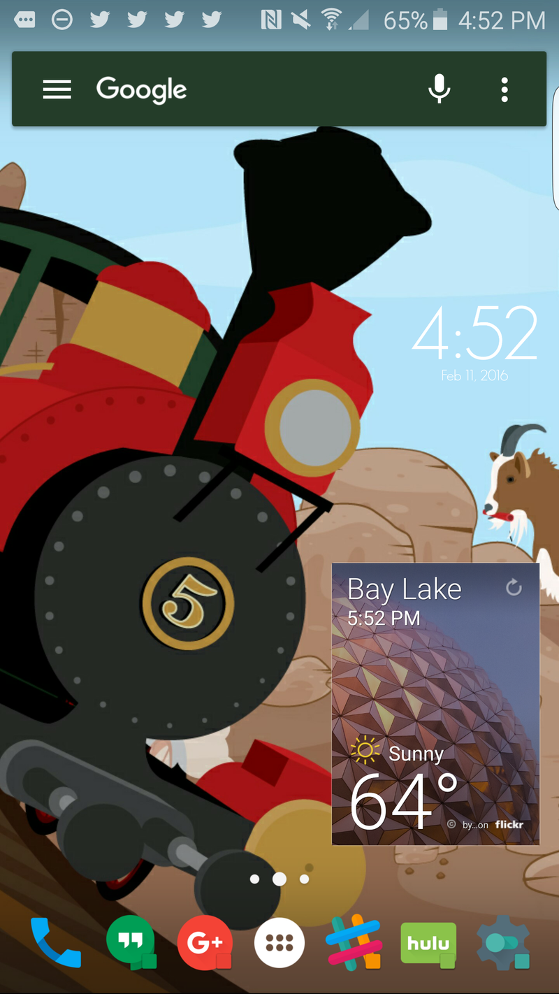
The key to a well-balanced layout is defining the space you do and do not want to use. If you've got a phablet and don't want to strain yout thumbs reaching for that top row, keep your folders and icons down low while leaving the top for glanceable widgets, or leaving it open to show off your wallpaper. I usually keep the middle open on my themes, both to let my wallpaper shine through and to have an open space for gestures.
Because mixed layouts are somewhat built around their device or wallpaper, they'll adapt to most themes you throw at them. If your wallpaper is busy in the middle of your screen, lay out your elements on the top and bottom of the screen. If your wallpaper features a character's profile on the left side, keep your apps and widgets to the right.
The key here is being flexible with your element placement and playing around with your layout until you find what works for you.
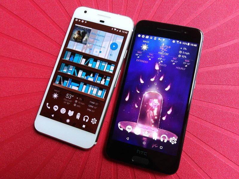
Beyond these three broad categories for home screen layouts, there are many more precise flavors and variants to try, and there's a method to the madness for each and every one. My dock consists of six folders and a phone. A friend of mine hides almost every app and just uses search to pull them up.
How do you make order out of the chaos on your home screen? We're always looking for ideas. Share your layout with us in the comments below, and stay tuned for more theming tips and tricks here on Android Central.
Ara Wagoner was a staff writer at Android Central. She themes phones and pokes YouTube Music with a stick. When she's not writing about cases, Chromebooks, or customization, she's wandering around Walt Disney World. If you see her without headphones, RUN. You can follow her on Twitter at @arawagco.
