Stop freaking out over hole punch displays, they're actually good

I have a lot of love for Russell. He's a great guy, has a wonderful sense of humor, and is someone I have a tremendous amount of respect for. I do, however, disagree with his recent Hole punch displays are worse than notch displays editorial.
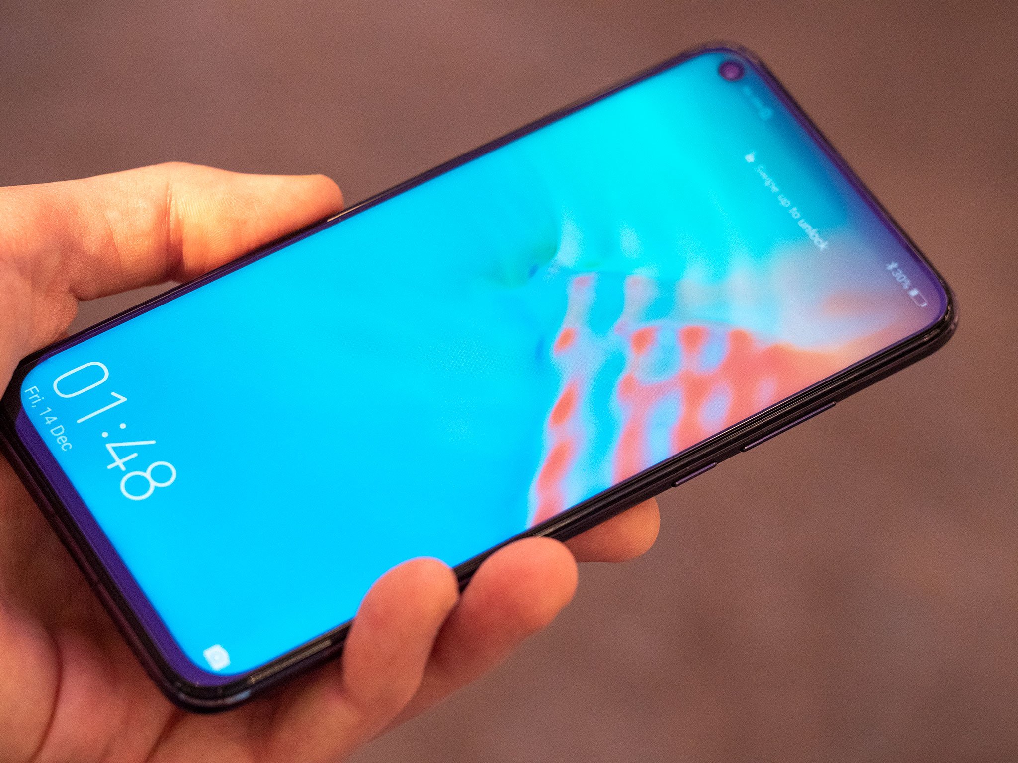
Hole punches are the latest trend when it comes to smartphone displays in our never-ending quest to eliminate bezels, but no, I do not think they're a worse solution than the notch. They're not 100% better, but they do come with a benefit that notches don't.
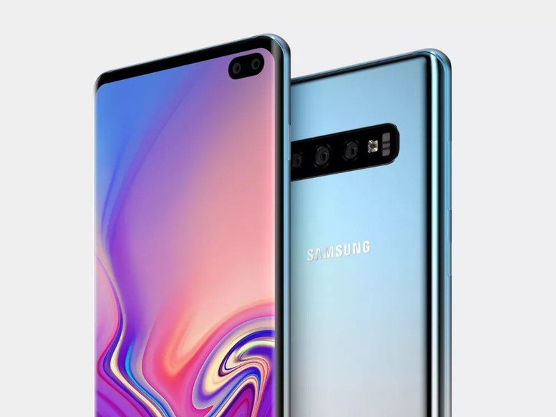
We've seen a lot of different solutions for cutting back on bezels, ranging from traditional notches, waterdrop notches, hole punches, and even sliding mechanisms that introduce moving parts to hide certain components behind a phone's display. All of these serve the same main goal, and hole punches seem like the obvious step forward from notches.
Apple popularized notches with the iPhone X, and since then Android OEMs have been in a race to add notches to their own phones and make them as small as can be. The first wave of phones had notches that looked identical to Apple's, then we got ones using the waterdrop style, and now we have hole punches — a small, circular cutout in a screen to accommodate the front-facing camera.

Looking at the current implementation of hole punches, they differ from notches in a couple different ways:
- They're positioned in the left or right corner of the display rather than the middle.
- They aren't connected to the top bezel and sort of float freely on the screen.
It's a pretty different look compared to what we've grown used to with notches, and that's created for a lot of excitement/anguish over them. I get that the left or right positioning has a greater impact on the status bar and that the implementations we've seen so far aren't perfectly symmetrical with the rest of the phone's design, but hole punches have a pretty big positive to them, too — media consumption.
I've become quite accustomed to the notch over the last few months, but whether it be on my OnePlus 6 or iPhone XS, the time the notch bothers me the most is when I'm watching a fullscreen video. Having that large black bar in the middle cover the content I'm watching is always a pain, but with the hole punch notch, you see a lot more of what's playing. Instead of a huge unibrow staring back at you, there's now this small circle in the bottom corner. It's less invasive, leaves more of the screen free for you to watch your shows, and in this sense, does a better job at getting us to the bezel-less future we're trying to get to.
Be an expert in 5 minutes
Get the latest news from Android Central, your trusted companion in the world of Android
Hole punches mean more screen real estate, and that's something I can get behind.
This may be an unpopular opinion, but I'm all for having more screen real-estate at the expense of having one or two fewer icons show up in my status bar. I really don't rely on them anyways with our current notch setups, but again, I could be in the minority there.
Going throughout 2019, it'll be interesting to see if OEMs keep with this current hole punch fad, continue to evolve the notch, or come up with yet another solution we haven't even seen yet.
All of these things are just transitional pains we have to put up with until the day we have a phone that really is all display and nothing else, and if you ask me, the hole punch is one of the better ones we've had yet. It leaves more space for movies/games, doesn't compromise a phone's structural integrity, and is a pretty impressive engineering feat compared to where we were at just a year ago.
We got used to notches pretty quickly, and we'll get used to hole punches, too.
Slider phones are an important step in eliminating bezels, but nobody should buy one
Joe Maring was a Senior Editor for Android Central between 2017 and 2021. You can reach him on Twitter at @JoeMaring1.

