Hole punch displays are worse than notch displays

I have no love for the notch. I don't understand the techy Stockholm Syndrome I see when pundits and commenters say they "get used to it" after a few days of use. The notch is a miserable compromise to give us something we don't actually need to compromise for.
But there's a darker evil on the horizon, friends. The gadget nerd in me had hoped the mechanical slider would have caught on while the industry figured out how to functionally hide everything under the display, but instead another solution has emerged. A solution in name only, a pretender prancing around as our savior, and after spending some time with a couple of upcoming phones with this new design I found myself actually wishing I could use a phone with a notch instead of this abomination.
Hole punch displays suck. They're worse than notch displays, and they don't actually fix the thing they claim to fix.
More screen, only not really
Even with the less terrible teardrop notches, where the display cut out is just about as small as it could possibly be, there's still this weird black shape in the middle of the display when you're trying to do something. Notches take up space where information could be displayed, no matter what you do. Even with Google making UI guidelines for notch-friendly interfaces, it's clear this cut out gets in the way sometimes and makes the interface less functional. At the end of the day, there's no screen there. It's always going to cause at least a little bit of a problem.
On some phones you actually lose more of the notification tray space to the hole punch camera than you do a teardrop notch.
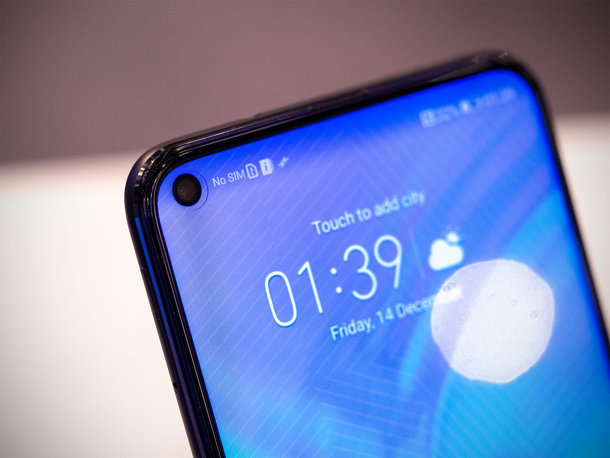
Holepunch displays remove the black material connecting the camera to the bezel and replaces it with pixels. It makes the camera less noticeable when the display is off or showing something dark, and admittedly looks much nicer. But that's it, the only real benefit is the look. There's never going to be anything useful displayed in the 12 pixels between the top of the camera cut out and the bottom of the bezel. The camera is in the notification tray still so, you're still losing space for notifications and actually useful information to make room for the camera.
In fact, on some phones you actually lose more of the notification tray space to the hole punch camera than you do a teardrop notch. The Honor View 20 puts the camera to the far left of the display, making the entire top left of the display worthless. Nothing useful is ever displayed to the left of the camera, so that whole area just does nothing while the rest of the notification tray shifts to the right by a quarter inch. And worse, you only get the camera. No infrared dot-projection sensor for better facial recognition or eye tracking, just the camera.
How is this better?
Be an expert in 5 minutes
Get the latest news from Android Central, your trusted companion in the world of Android
Asymmetry is gross, stop it

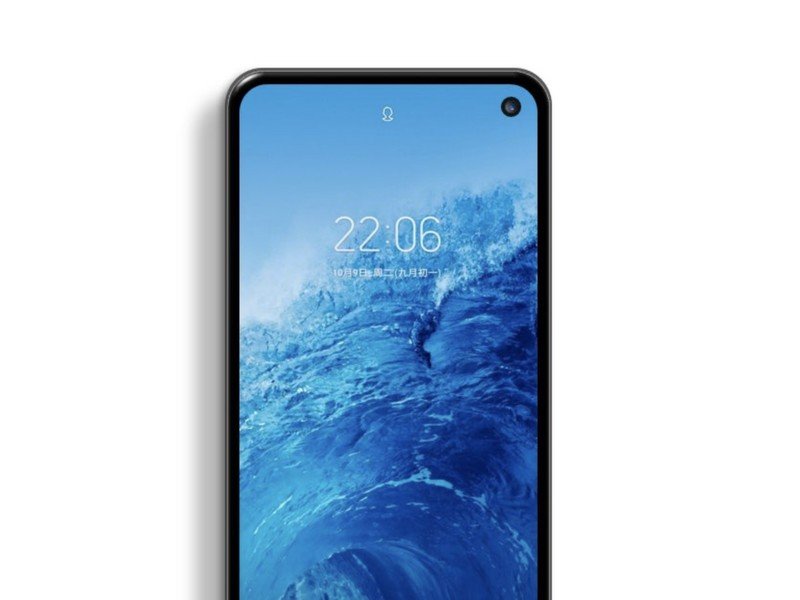
My biggest issue with these hole punch displays is the awful asymmetry that inevitably comes with this idea. We can't put the camera in the middle of the top of the display like we do with notch displays, that's crazy talk. Instead, let's put the camera over in one of the corners! That way, when someone is watching a video the hole in the display is down in one of the corners and less noticeable. Weirdly, when Samsung had a 5G prototype with a notch on the far right of the display there was no shortage of people with Very Strong Opinions, but the hole punch doesn't elicit the same response for some reason.
The display is wrong in two ways, and the longer I stare at it the louder the buzzing sound just under my scalp gets.
I get that many people spend lots of time gaming and watching movies on their phones, but that designing for those experiences instead of the day to day browsing and notification checking that happens all day every day is so weird to me. There's a hole in the corner of your phone that you can never unsee, and you're going to notice it 100 times every day when you casually unlock your phone to check for messages or respond to a comment. Like the notch, that hole never really goes away. And even if it disappears for you some of the time, it's never going to be totally gone.
Worst of all, the radius for corner of the display and the camera circle don't match even though they are side by side. So the display is wrong in two ways, and the longer I stare at it the louder the buzzing sound just under my scalp gets. Sure, I could see a therapist for this, but these companies could also just not make a display with a big awkward hole in it.
We're going to suffer through this together

Unfortunately, none of my complaining is going to do much. Huawei, Honor, and several other companies have already demonstrated the hole punch is the way forward. And now, if the leaks are to be believed, Samsung is at least partially adopting the hole punch in an attempt to keep pace and make it seem like Galaxy phones are setting the trend instead of following it.
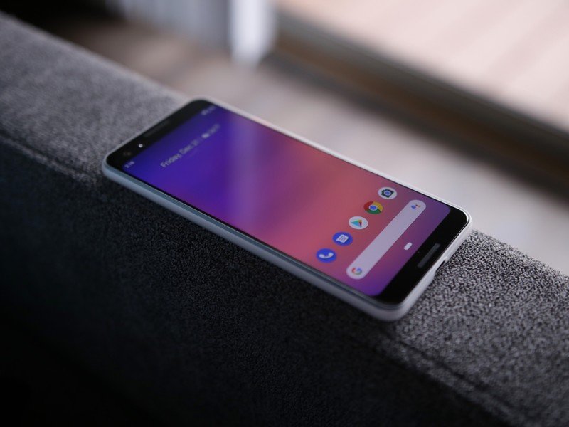
By the end of 2019, most new phones will probably be hole punch displays. And I'm going to hate most of them. I hope Google keeps close the smaller Pixel 3 design with its next phone so I can be saved from this fate, but it seems like this is the direction most phones will be going for the forseeable future.

