Flow Home Launcher aims for the social media crowd
Everyone approaches their home screen differently. Some like to set it and forget it, sometime not even deviating from the default layout that their phone came with. Some are constantly redoing their entire layout, belonging to theming communities where custom skins and elements are shared frequently and freely. Others have a basic layout that they'll tweak occasionally with new widgets and new themes. I am one such user.
And I am not quite who Flow Home was designed for — yet — but maybe you are.
Flow Home is very much a beta and is still evolving.
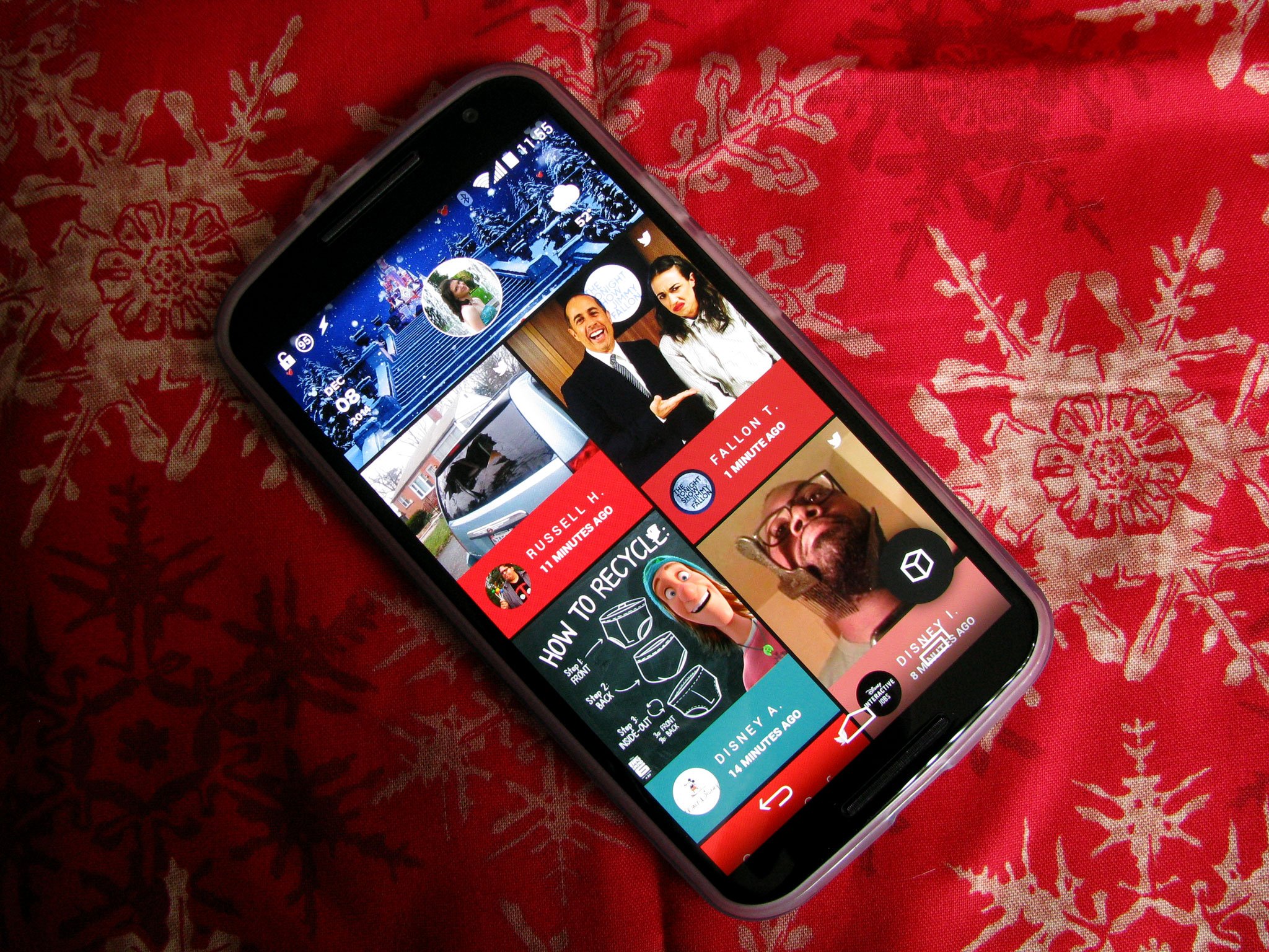
Flow Home is trying to break away from traditional launchers, but it's not after the same goals as home screen replacements like Aviate, which seek to rearrange your whole phone according to what's timely. No, Flow Home is selling itself as a home screen with one unchanging feed that draws the info out of your apps to display in it.
At this point in its beta, however, Flow Home really only pulls out information from five apps: Twitter, Facebook, Instagram, Tumblr, and Feedly. Reddit is on its way, but for those of us who aren't active in these services, Flow Home is just kinda lifeless. Those of you who know me, know I'm very active in social media, but mostly on Google+. And the most integration for that you'll find here is in the notification card that'll pop up with new replies or mentions. It's not Flow's fault that Google+ doesn't have a simple method for integrating it, but it's still a shame.
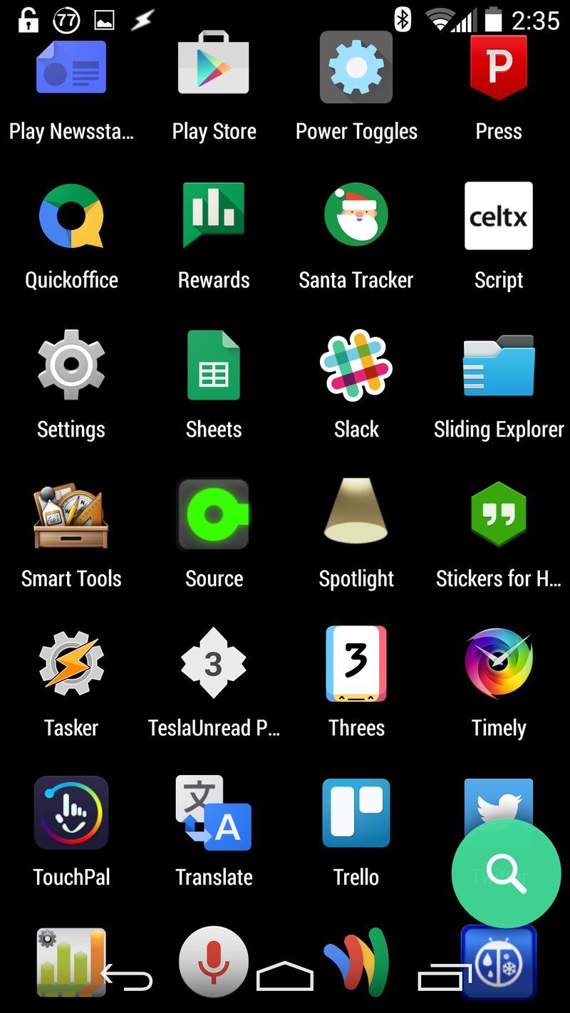
That said, there are a few things that Flow Home does really well. It's a very material launcher in terms of feel and design, and it feels right at home with Lollipop, even on devices that don't have that yet. It's a phenomenally smooth launcher, especially in the app drawer, which is one of the smoothest app drawers I've ever seen. That said, it can't do much right now.
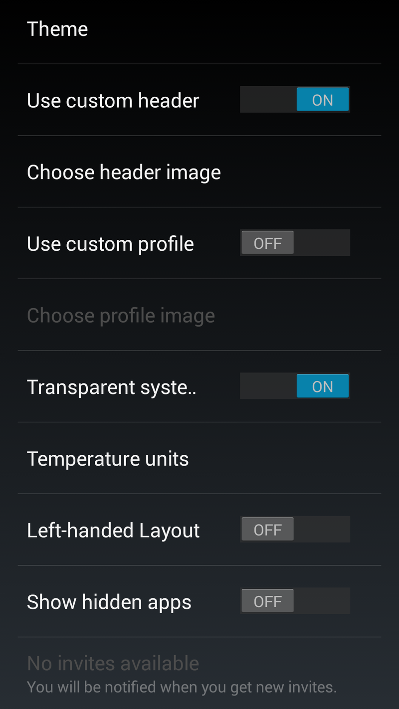
This is the entirety of Flow Home's settings: pick one of six themes, pick a custom header or profile image, left-handed layout, hidden apps, Wifi-only updating for those without unlimited data, and managing your feeds. The only other ways this launcher can be customized is by selecting which app the weather and date atop your header open, by adding apps to the shortcut on your homescreen, and by adding widgets.
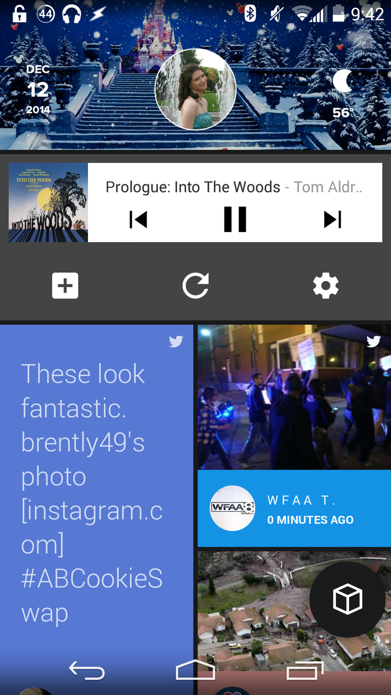
Widgets was just added yesterday, and while it is still very rough, it is a welcome addition in our eyes. For that one widget you just have to have — a music widget, or local radar — you can put it at the top of your feed. The bar under the widgets feels like a duplication, but you get another settings shortcut, a dedicated refresh button and a button to add more widgets. Currently, widgets cannot be re-sized or reordered, so be prepared to delete and re-add widgets in order to get them just right.
Be an expert in 5 minutes
Get the latest news from Android Central, your trusted companion in the world of Android
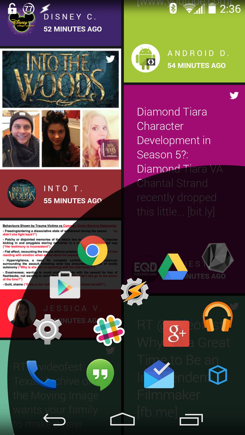
This is the only folder you get, and if you use a lot of apps — even then this is still exceedingly limited for me, but I just didn't want to go nuts here — you're going to quickly lose the romance with that super-smooth app drawer while you're scrolling like a madman up and down looking for your maps or your tunes.
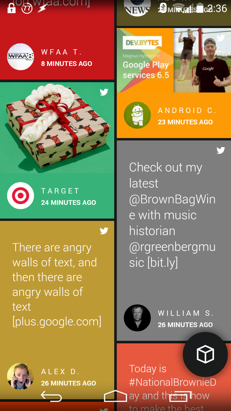
I've used Flow Home for two and a half days as my one and only launcher, and I will say the longer you use Flow, the more comfortable you become with it. However, the only benefit of Flow Home right now for me is that it forces me to keep up with Twitter and some — and only some — of my notifications when they pop up in my home screen feed. But as a heavy app user, I need folders. As a heavy Tasker user, I need shortcuts and gestures.
If you're someone who has given yourself over to tumblr — I'll never give in, I'd never get back out alive — or Instagram, then Flow Home is the launcher you've been waiting for: you'll never miss a Supernatural gif again. And if Google+ should ever grace them with a way to integrate our feed into Flow Home, I'll give it serious consideration.
Flow Home is still very much a beta app right now, and a somewhat closed one at that. If you would like to be part of making it better, invite codes are only given out on their Twitter feed and in their private Google+ beta testing community.
Ara Wagoner was a staff writer at Android Central. She themes phones and pokes YouTube Music with a stick. When she's not writing about cases, Chromebooks, or customization, she's wandering around Walt Disney World. If you see her without headphones, RUN. You can follow her on Twitter at @arawagco.
