Hands on with Chameleon Launcher for phones
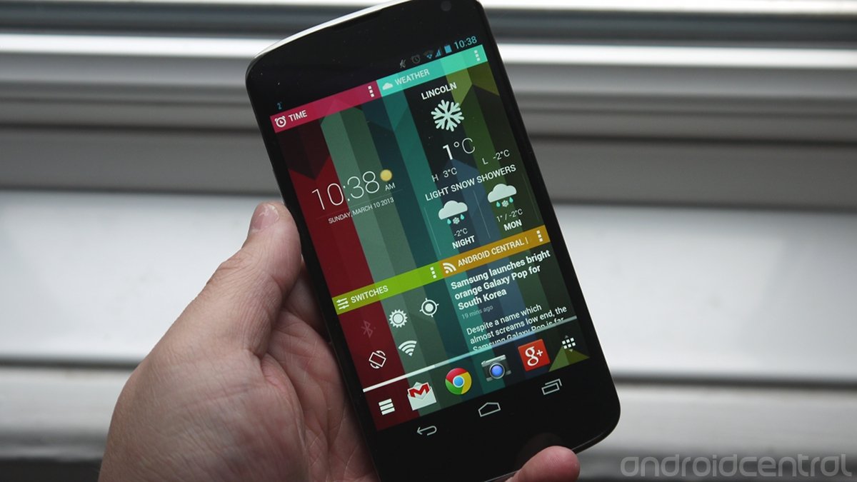
Whatever your own personal opinions on the birth of the Chameleon Launcher project, one thing remains the same. People are talking about it. As people talk, interest grows, and Chameleon certainly brought a whole new take to the custom launcher scene. Very much a widget-orientated UI, there's no denying that it could completely change the look and feel of your Android tablet.
And that's the other thing of course. Initially Chameleon launched exclusively for Android tablets. Then, not all that long ago, we got a first glimpse at a phone version in early testing. Things have progressed well since then, and the finished product is here. Sort of. At the moment, Kickstarter backers and pre-order customers can snag a copy of the phone version of Chameleon, ahead of it going on general release soon. So, how well does it transition to the smaller screen? Let's find out.
Chameleon Launcher for Phones video walkthrough
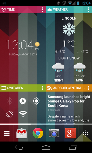
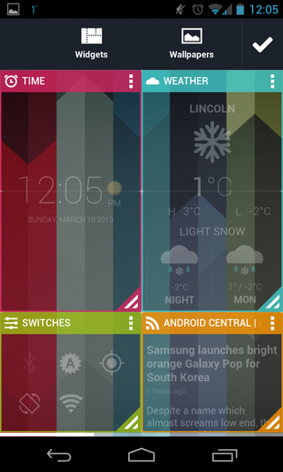
I don't like widgets, I'll say that right now. For me, they've just never felt that well done, and a screen full of widgets -- especially on a smartphone -- to me at least, looks messy. I also can't stand empty space on the screen, it feels wasted. So, on the face of it, Chameleon could well be the launcher I've been looking for. OK, so the UI is heavily widget-focused, but because the Chameleon widgets have been designed as part of the launcher everything fits. They look like they belong there.
What's more, there's actually quite a lot going on in Chameleon for phones. Considering it's still a beta product, it's very polished, and has made the transition to the smaller screen very well. But, it's by no means perfect, and there are some things that aren't so great, and a few bugs.
The good
- Gorgeous UI - Chameleon really maximizes the usefulness of your screen real estate with some really well designed widgets
- Speaking of widgets, the weather widget is sublime and when tapped enters into whichever weather app you happen to be running
- Smooth scrolling and transition effects
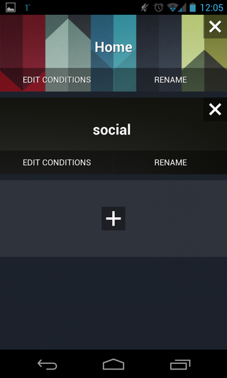
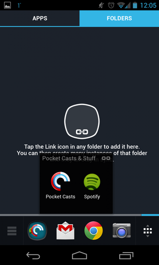
- Folders are now included, and the linked folders functionality to share between different dashboards is a nice touch
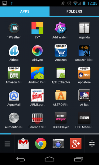
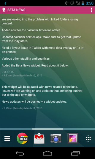
- Scrolling dock is nice, as is the fact it doesn't disappear when you open the app drawer. For most commonly used stuff it's pretty useful having it there all the time.
- There's now a 'Beta News' widget, keeping beta users up to date with all the latest goings on right on their home screen if they so wish.
The not-so-good
Be an expert in 5 minutes
Get the latest news from Android Central, your trusted companion in the world of Android
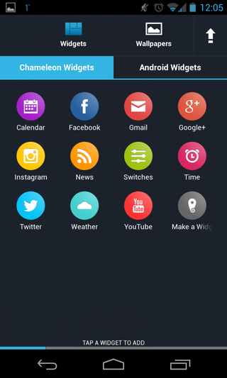
- Some of the widgets are a little wooly, Google+ and YouTube for example seem to have a habit of signing you out and Gmail seems to be somewhat hit and miss on when it updates.
- Restarting the phone seems to auto add Chrome to the dock. Chrome Beta was always removed in its place.
- Would be nice for the Twitter widget to open up a Twitter client the same way the weather widget opens up a weather app.
- Linked folders currently have a habit of losing content, although the developers are looking into this.
- Still a limited selection of Chameleon widgets.
Bugs are to be expected though, as are features we'd like to see. All in all Chameleon for phones is an impressive launcher that offers an interesting experience. For someone like me who enjoys a content-heavy home screen approach, Chameleon is well worth a look. Best of all, the transition to the smaller screen has gone really well.
Kickstarter backers and pre-order customers can grab a copy at the Play Store link above, but bear in mind you'll need to download a new version of the calendar plugin. For everyone else, it should be available soon, but we've got a good selection of screenshots for you down below.
