Hands-on and first impressions with the Oppo R7
Get the latest news from Android Central, your trusted companion in the world of Android
You are now subscribed
Your newsletter sign-up was successful
The R7 is one of its latest, and while it's not targeting the absolute highest of the high end, it's wrapped up in a very premium looking — and feeling — package.
Here are our first impressions.
First, a quick look at the main specs that make up this phone.
Article continues below| Category | Specification |
|---|---|
| Operating System | Android 4.4.4 KitKat with Color OS |
| CPU | Snapdragon 615 |
| RAM | 3GB |
| Internal storage | 16GB |
| Display | 5-inch, 1920x1080 resolution |
| Battery | 2320 mAh |
| Rear camera | 13MP |
| Front camera | 8MP |
| Size | 143 x 71 x 6.3 mm |
| Weight | 147g |
| Network | GSM 850/900/1800/1900MHz, WCDMA 850/900/1900/2100MHz |
While we rarely go for unboxings in these parts, it is important to note what Oppo includes in its retail packaging for the R7. A lot. You get the usual bundle of paperwork that no-one will read, but the rest is more interesting.
You get a set of earbuds, for one. Not groundbreaking, but also something increasingly left out of the box these days. You also get a clear TPU case, a few screen protectors, the usual microUSB cable and a whopping 4A charger.
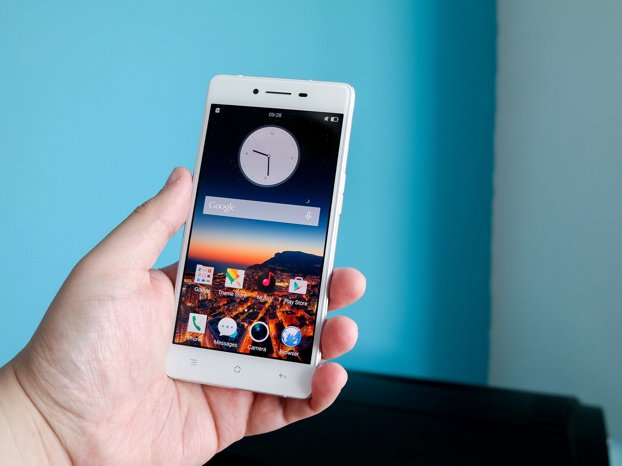
An interesting look and feel on the back, but the front is a standard white rectangle.
The inclusion of a case in particular is welcome. Sure, not all of us will want to use it, but for anyone not in a country where Oppo has retail presence, getting a case would require going online and an amount of pot luck.
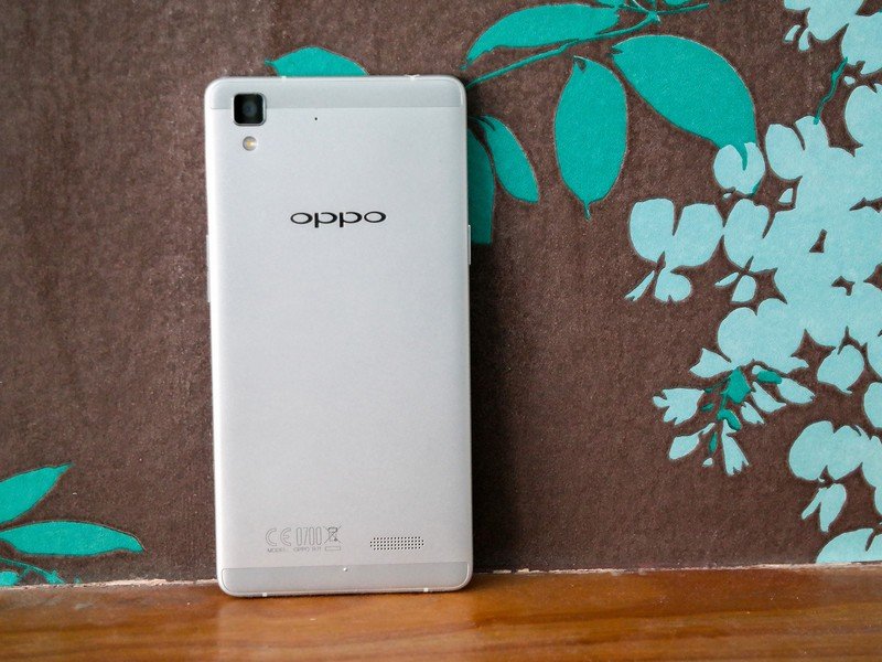
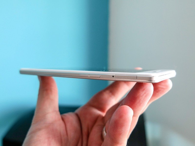
But why might you want to wrap the R7 in a case? Round the back and sides we're treated to aluminium with the usual plastic inserts and markings on the frame for the antennae. The frame also protrudes beyond the confines of the front of the phone creating a distinct lip that provides a little extra grip.
Get the latest news from Android Central, your trusted companion in the world of Android
While the back and sides leave a great taste, around the front things are a little more ordinary. You're looking at the usual white rectangle, with capacitive keys sitting beneath the 5-inch, 1080p display. Capacitive keys aren't the worst thing in the world, but Oppo has made the same choice the likes of Xiaomi and Samsung have with their phones. It's swapped the location of the task switcher and the back button.
If you've ever used a phone with the on-screen, regular layout of Android buttons, you'll end up hitting the wrong one more than a few times. Muscle memory alone keeps us hitting the wrong one.
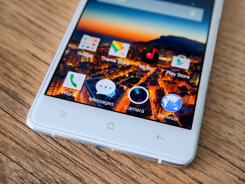
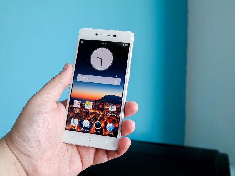
On the software side of things is where opinions will certainly divide. Oppo's Color OS is based on Android 4.4.4 KitKat and aside from the presence of the Google apps, there's nothing visually that indicates you're holding an Android phone. As with Huawei and Xiaomi, Oppo has completely re-worked every aspect of the OS.
There's nothing inherently bad about Color OS, but KitKat in July 2015 is a letdown.
That's not necessarily bad just because they did it at all, and we'll reserve final judgment until we've spent more time with it. Custom software doesn't have to suck, with Xiaomi's MIUI a shining example of how to do it properly (hint: It performs like a champ). It comes pre-loaded with a bunch of Oppo's own apps, but nothing much else in the way of "bloatware."
Camera wise there's a 13MP shooter around the back and an 8MP round the front. We've not really put either to work yet, but on paper at least, they sound decent. The camera app is extremely close to that of the iPhone in the main UI but beyond this there's a lot of exciting stuff. The Camera Shop has a bunch of add-ons like an expert mode, RAW shooting, Ultra HD video capture and more to take your mobile photography up a notch.
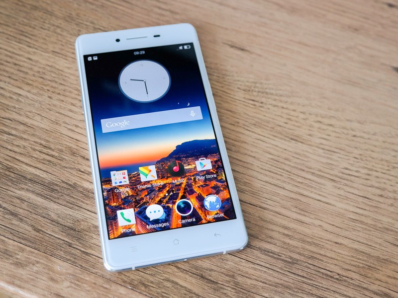
First impressions then are good. The hardware is excellent and while we'll hold off full judgment on software, the presence of KitKat on any phone in July 2015 is disappointing. Sure, you don't see the Google flavored OS beneath the customizations, but you also don't get access to any of the stuff under the hood that Lollipop brings to the table.
We'll have a full review soon, so stay tuned to Android Central for the full treatment.

