Google's updated calendar app is a gorgeous addition to Android 5.0 Lollipop
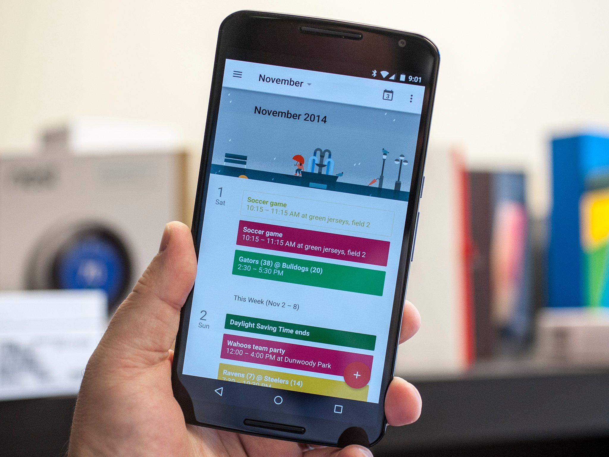
It's functional, it looks good, and you're definitely going to want to use this one
There's so much to love in Android 5.0 Lollipop at a system level. And at the same time, we've been downright smitten by the updates Google's individual apps are receiving. It's not just about MaterialYOLO, but rather how everything is finally coming together under a single design language. (That's not to say we don't still have a few issues, but that's another post for another time.)
Today Google is unwrapping the new Calendar app for Android 5.0 Lollipop. And if you're a fan of calendar apps — and who isn't, really? — you're going to want to check this out.
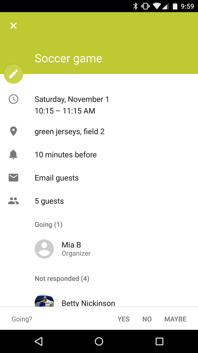
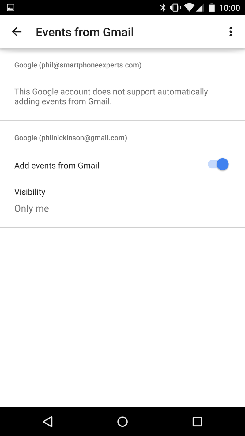
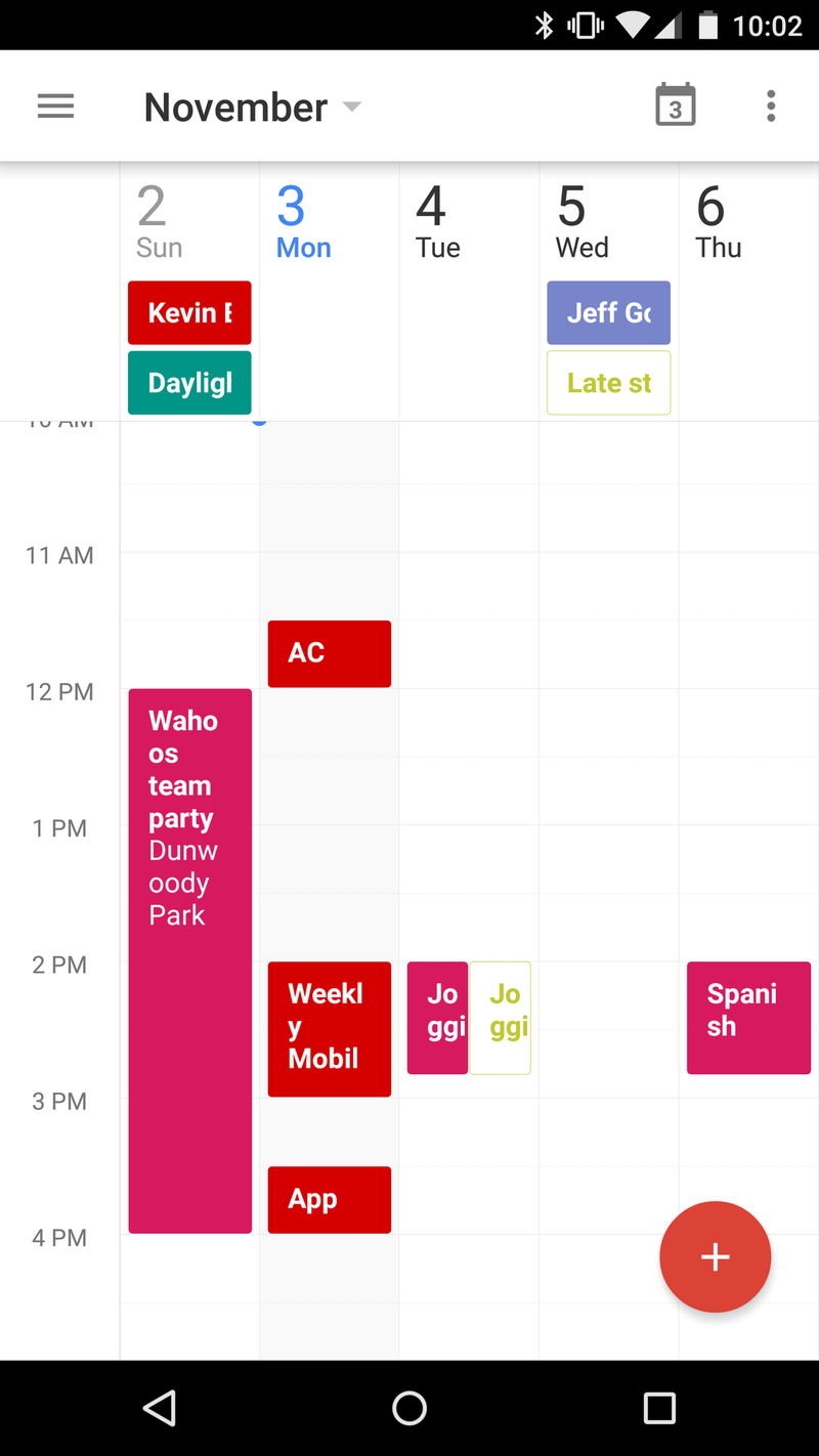
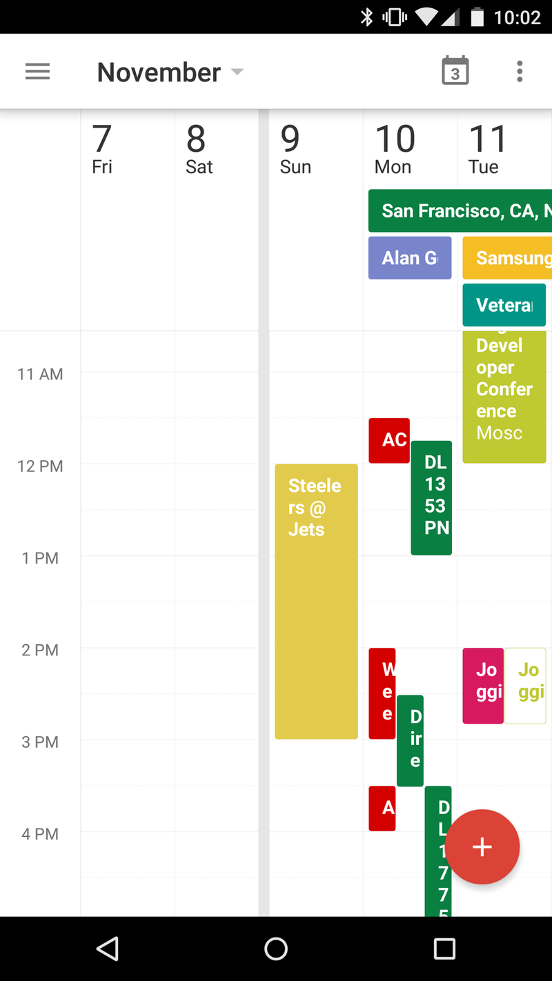
Here's how I'm looking at the new Google Calendar app. Take all the functionality you've come to know and love, and toss in a bit of the design that Google's brought with its new Inbox initiative, and some of the functionality of Google Now, and that's what you've got. Your mileage may vary a little bit depending on your accounts and what you choose for the Calendar apps to see and use. But for our bloated schedules, it's looking great.
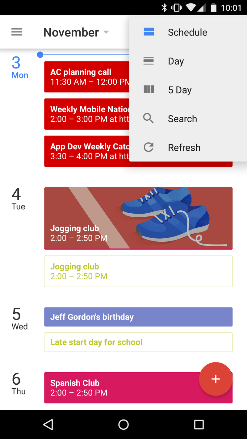
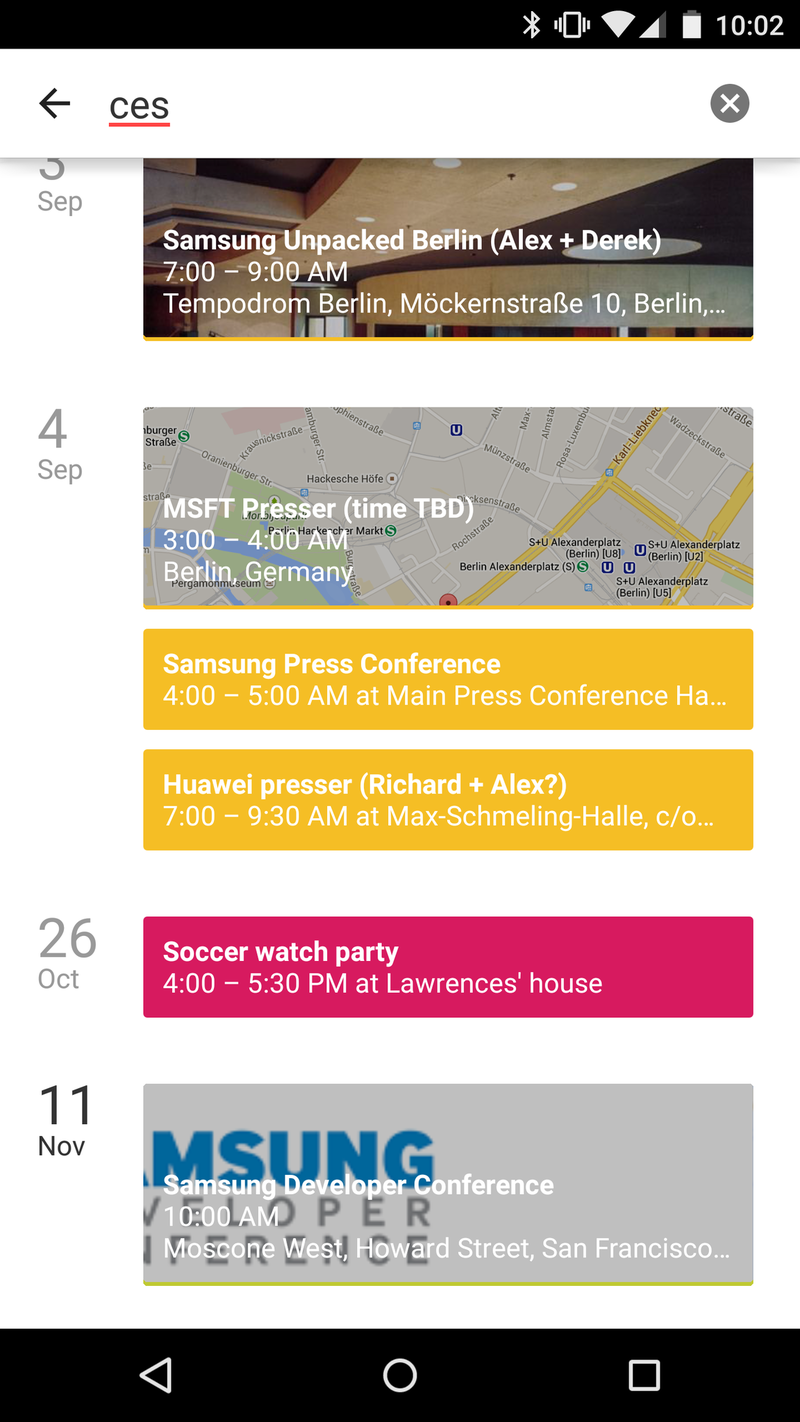
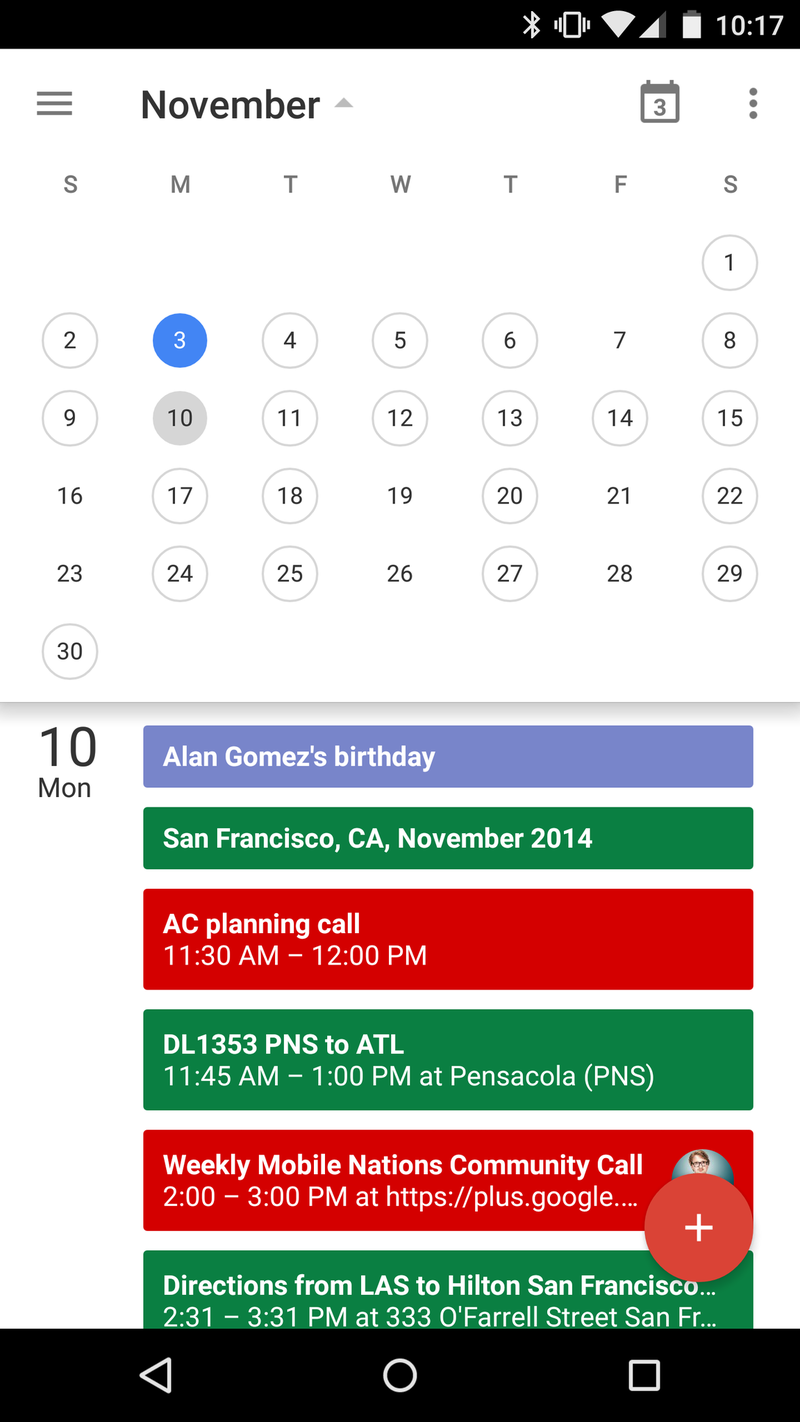
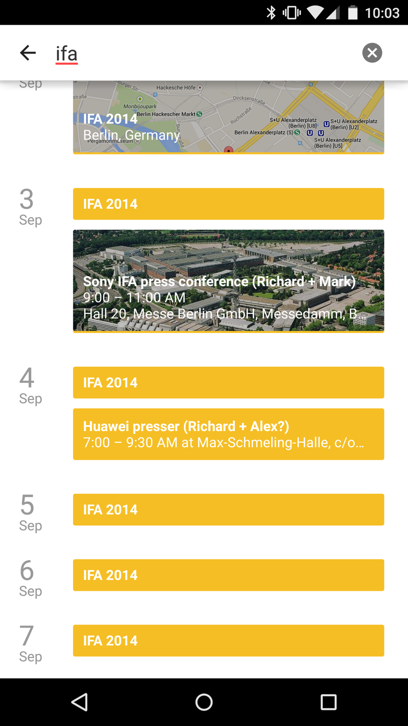
The Schedule view is what you'll see first. It's a pretty simple agenda view, done in Material Design colors, of course. But a really nice touch is where it shows images. You'll see event creators at times. Or images that were associated with an event. Or, in the case of my third-grader's weekly jogging club event, the Calendar app tossed in a graphic of some running shoes. That's a really nice touch.
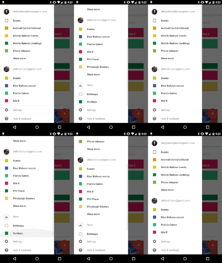
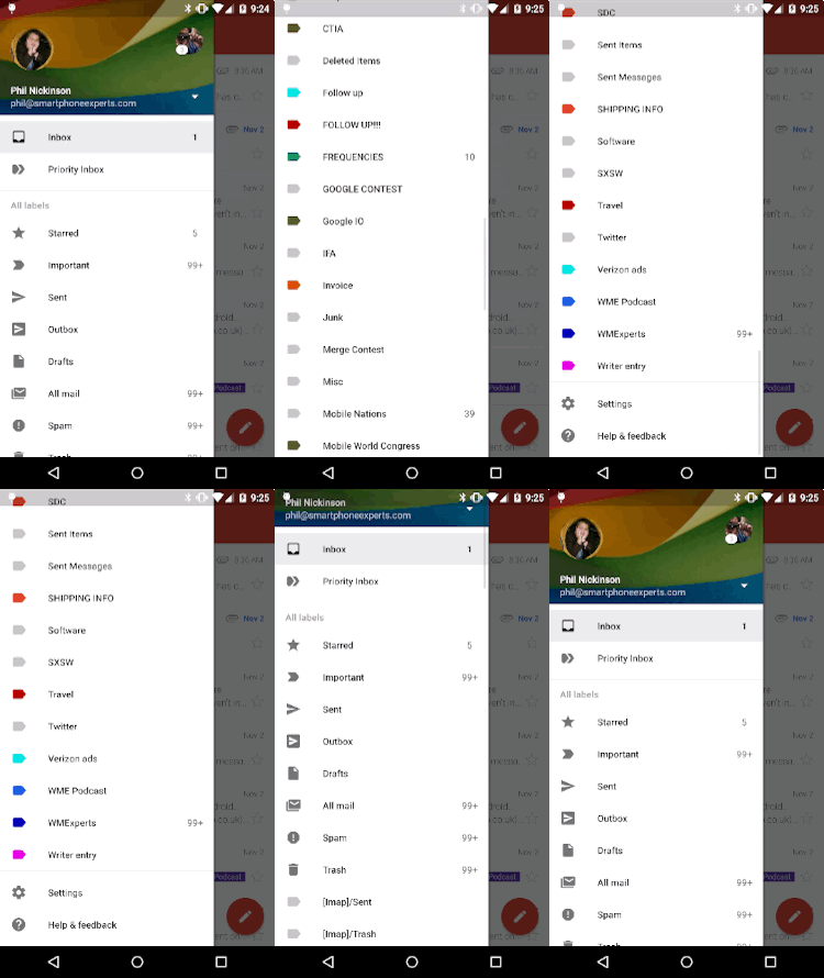
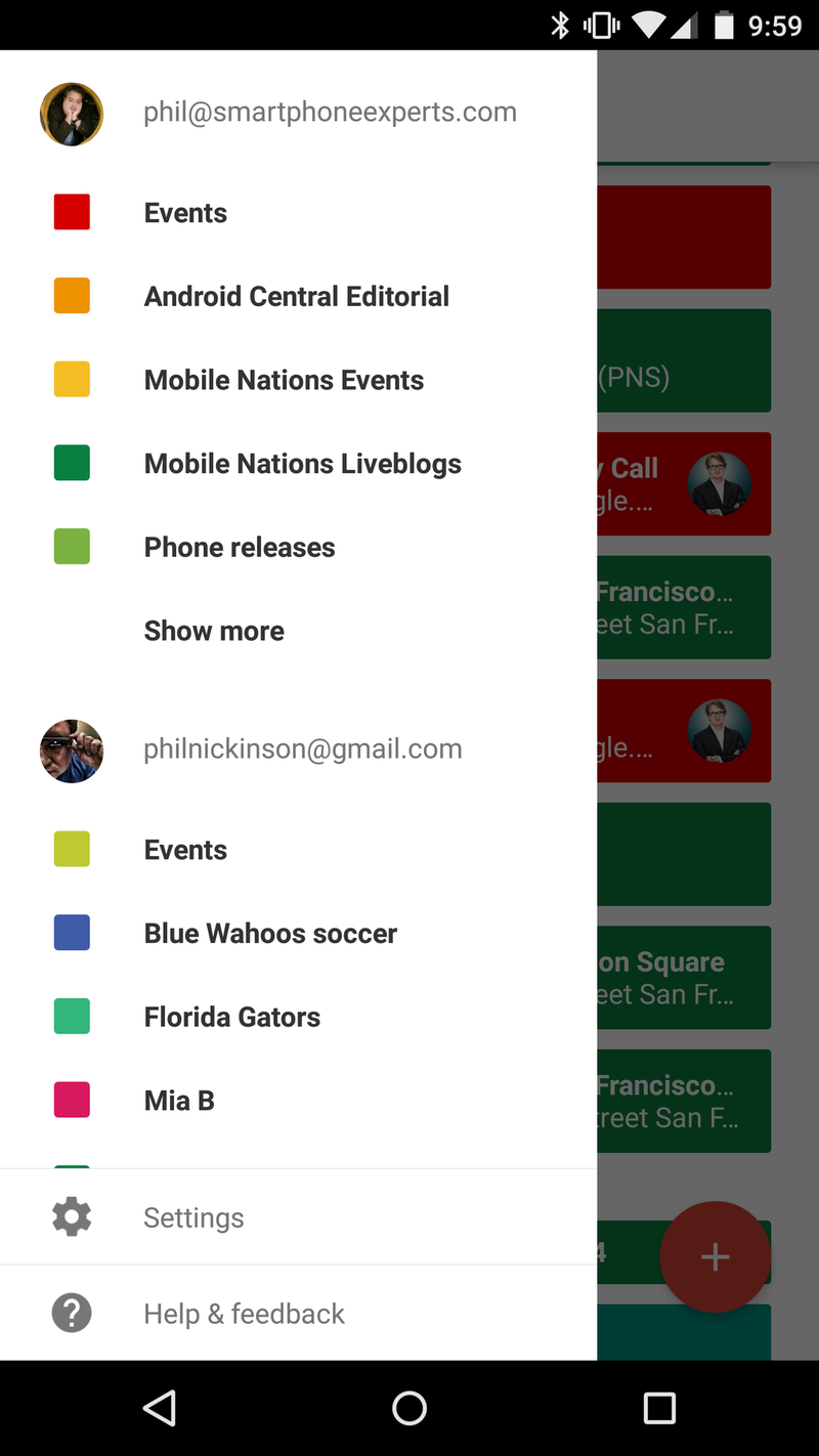
The new Calendar drawer, and the new Gmail drawer.
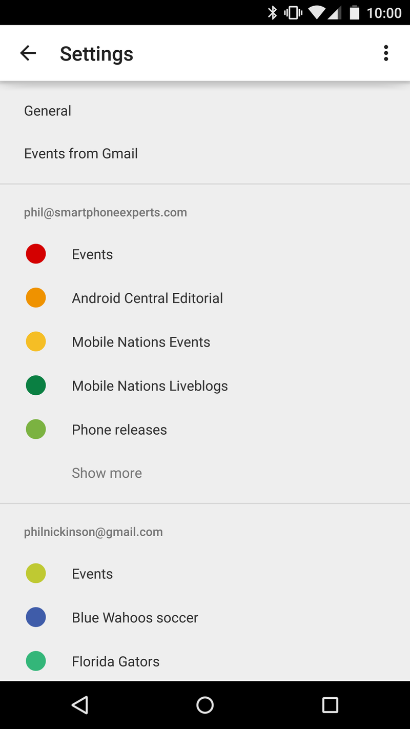
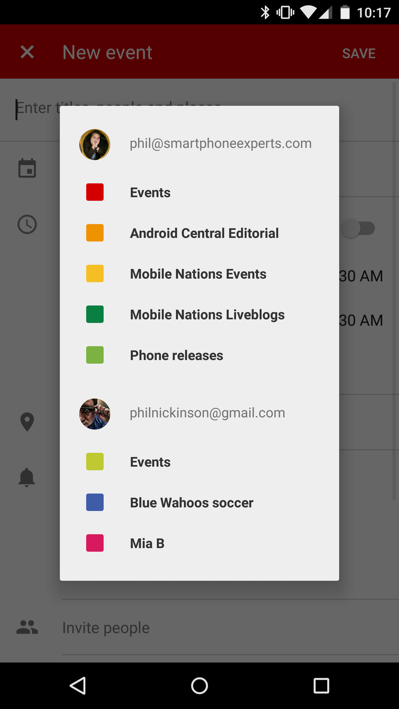
Picking and choosing which calendar subscriptions you want to see has never been easier, too. Just slide out the drawer from the left, then tap to select or deselect. Interesting here is that Google's changed up how the drawer works in comparison to other apps. The settings and Help & Feedback as pinned to the bottom, so they're always visible, even in long lists of calendars. (In contrast, the Gmail drawer just keeps going and going until you get to the bottom, and then you'll find the settings button.) This new Calendar app does that right.

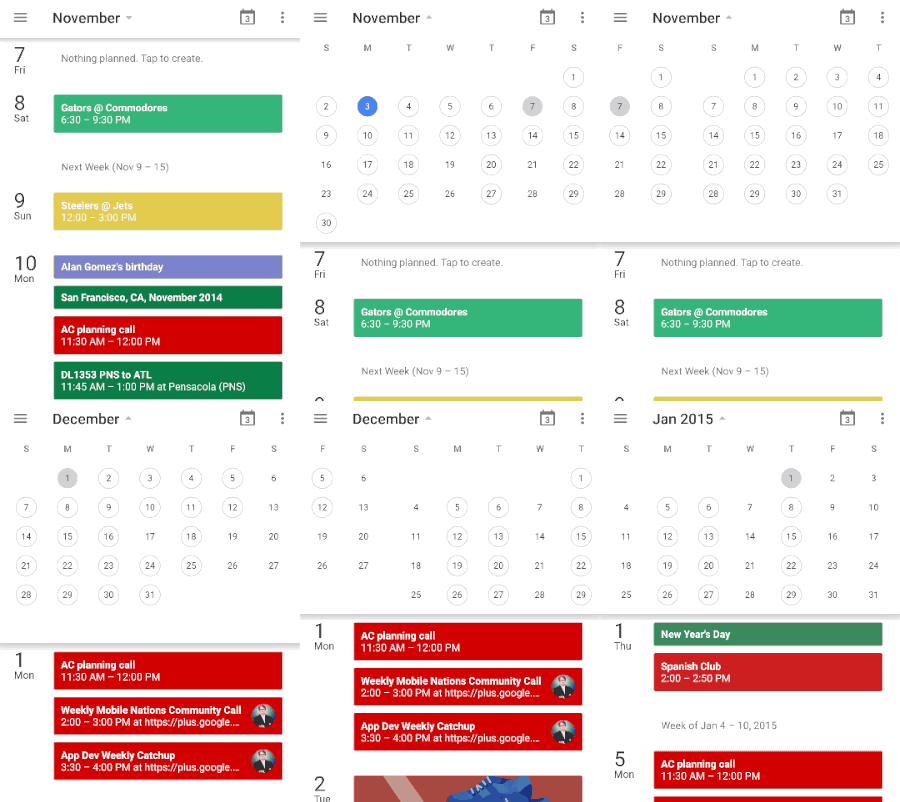
Tap the current month and you'll get a nicely animated drop-down from which you can pick whatever day you want. Scroll left or right to change which month you're in. And slide it back up to get rid of it and get back to whatever view you were in.
Be an expert in 5 minutes
Get the latest news from Android Central, your trusted companion in the world of Android
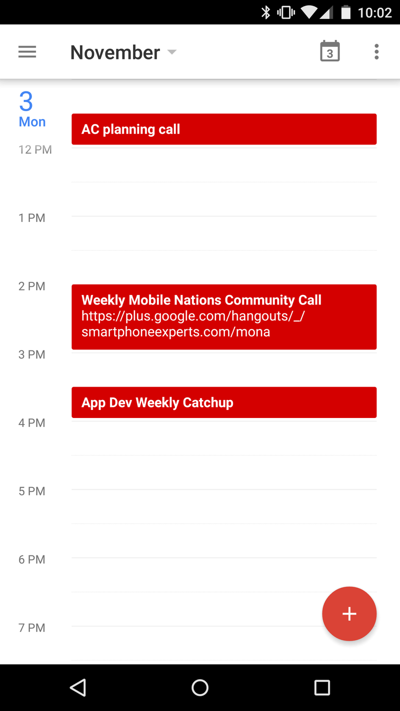
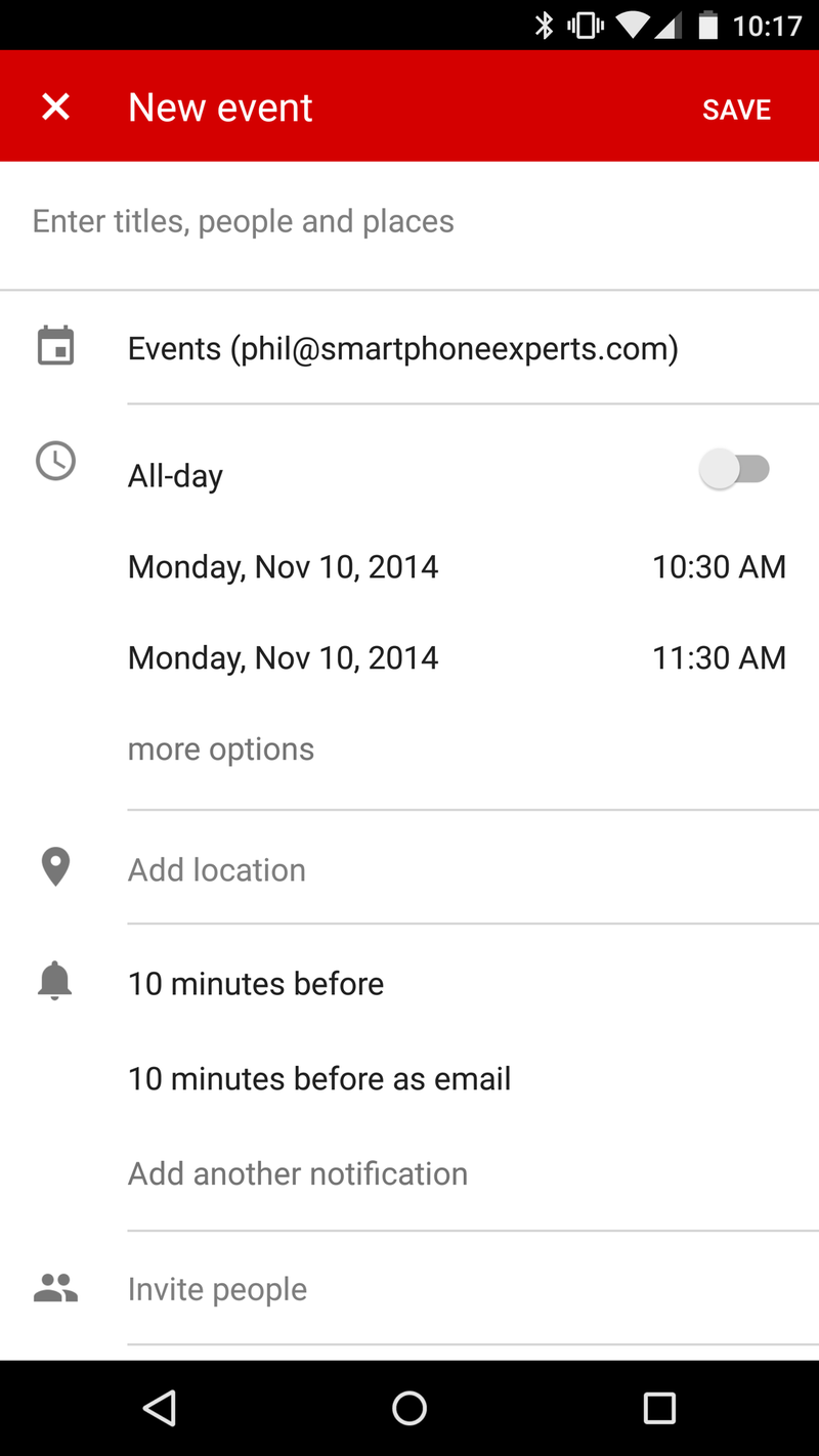
Creating new events is pretty self-explanatory. Just hit the floating action button (that's that floating read button with the + symbol on it, and you get all the usual event options.
All in all, a very nicely designed, functional calendar, and a great addition to the Android 5.0 Lollipop stable. If you're running an Android 4.1 device (or higher), you'll get to play, too. The update will hit Google Play in the usual trollout fashion.
