Google's ads now look more like search results than ever before

What you need to know
- Google changed the design of its desktop search page in January 2020 to include favicons next to search results.
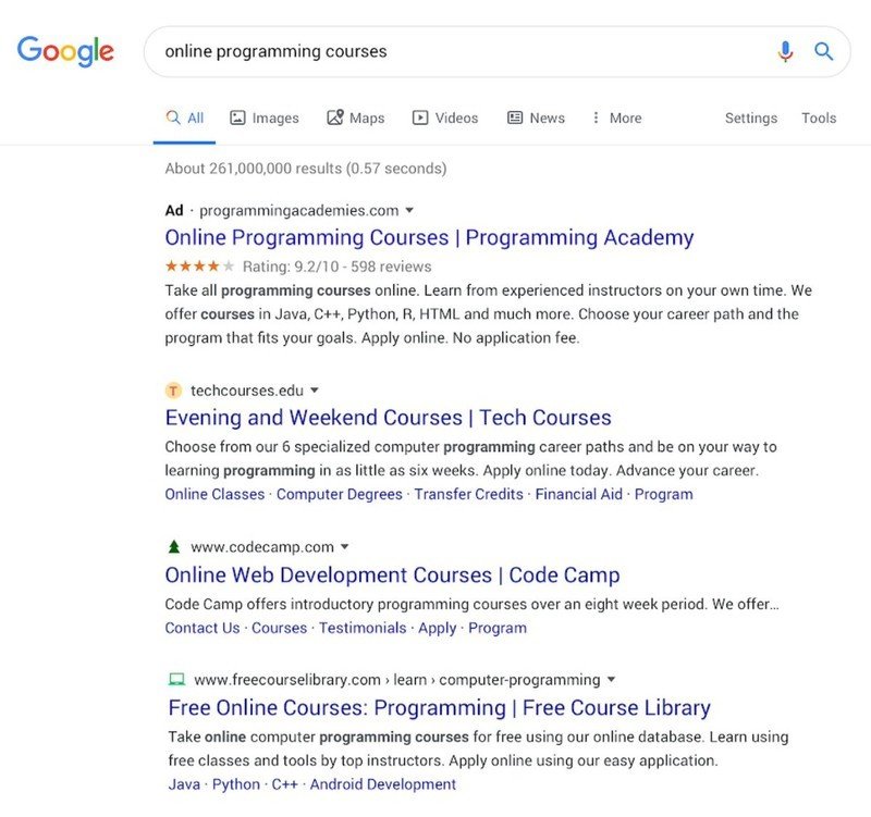
- Organic search results and ads now both feature a similar layout with advertisements using an "Ad" favicon that could lead to more users mistakenly clicking on ads.
- Early analysis reveals a slight uptick in ad clicks from some sources which could be a result of the new redesign.
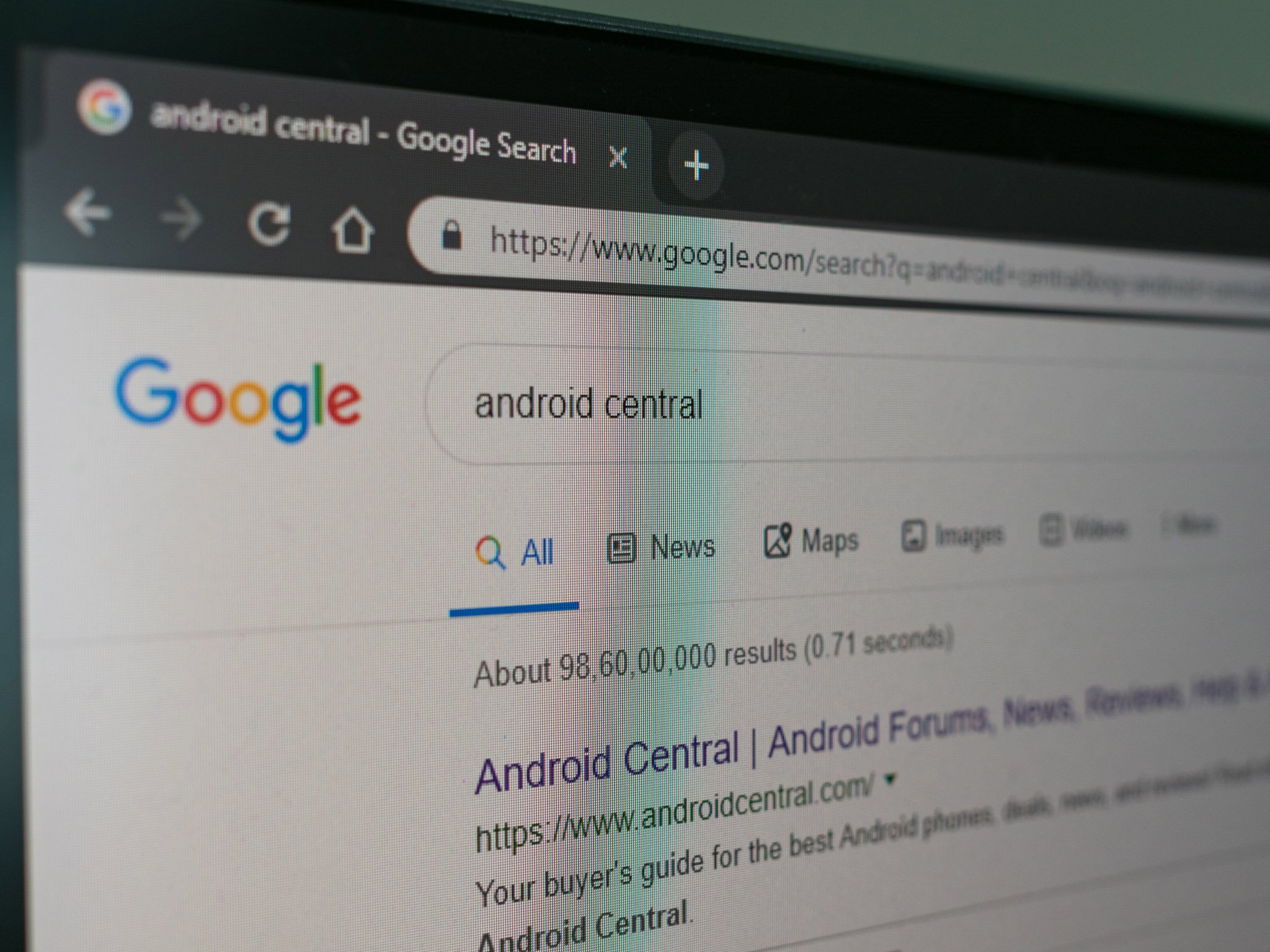
On January 13, Google rolled out a new design for search results on the desktop. Of course, this design isn't exactly new, it has been around on mobile since last year.
One of the most significant changes to come from the desktop redesign is the new favicons that appear next to URLs. This was in an effort to help sites with branding and made it possible to see if the results are coming from one of your favorite or most trusted sites with a quick look instead of having to read the URL.
However, this redesign also blurred the lines between organic search results and ads by placing an "Ad" icon next to advertisements in the results. While the ads are still clearly labeled, the streamlined design now makes it easier for some users to mistake ads for actual search results.

Taking a look at the new search results page, it's easy to see how someone could misinterpret the "Ad" label as just another favicon at a glance and quickly click on one of those results. The new design is a massive difference from how Google used to present its ads in the past. Back in 2013, the Google search results page looked a lot different, going as far as using a different color background to separate ads from organic search results.
Google's Director of Product Management for Search Ads, Sundeep Jain, once spoke about the removal of colors from the search page, saying it was about "harmony" by reducing the number of patterns and colors on the page. While it may be more harmonious, it's no secret that Google is an advertising company at its core. In the third quarter of 2019, Google's parent company Alphabet made $40 billion, with $34 billion of that being from Google advertising.
With money like that on the line, it gives Google an incentive to find ways to increase the click-through rates on ads. According to a report from Digiday, there has been some evidence to suggest the new design has increased CTR for some clients already. It's entirely possible that users are already becoming "banner blind" to the favicons and beginning to click on results without realizing it is an ad, and that's something Google can certainly get on board with.
How Google's backup encryption works: the good, the bad, and the ugly
Be an expert in 5 minutes
Get the latest news from Android Central, your trusted companion in the world of Android

