Google+ (on the web) rolls out huge cover pics, new local reviews tab
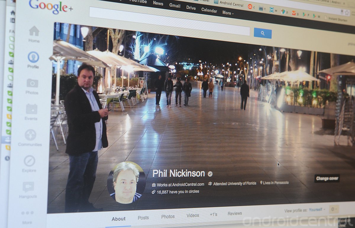
Google+ today rolled out some interesting improvements to its web version. The biggest, obviously, is the gianormous new cover photos. What was once long and skinny is now long and not-so-skinny. (We know how it feels.) When fully expanded, the new cover photos have a 16x9 aspect ration and can be as large as 2,120px by 1,192px. That's big. So make sure your image doesn't suck.
Next is a new tab for your local reviews. If you've reviewed something in your hamlet, it'll show up here. You can use it to showcase specific reviews, or you can hide it altogether. Your call.
Editing your info also is easier now, with better separation of content in the About tab, with cards acting as category separators.
Source: +SaraMcKinley
Be an expert in 5 minutes
Get the latest news from Android Central, your trusted companion in the world of Android

