Google tests a Windows 10-like Chromebook launcher

What you need to know
- A new Chrome OS test showcases a smaller app launcher.
- If adopted, it'll replace the current full-screen launcher with one more akin to Window 10.
- However, Google is only testing this behind a flag in Canary builds of the operating system at the moment.
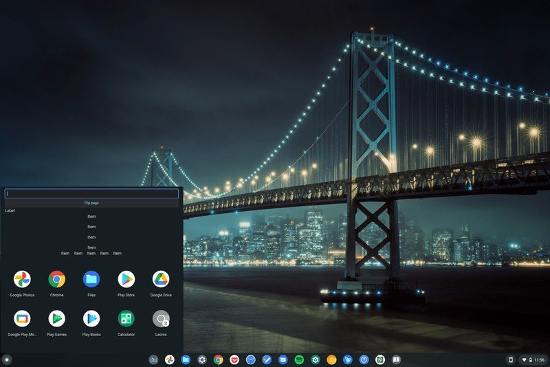
Google is testing a new Chrome OS launcher that resembles some of the earlier Chrome OS launchers in a bid to see whether it boosts productivity. The test was discovered by the folks over at ChromeStory when poking around in Canary builds of the operating system.
The experimental flag and its description read:
Productivity experiment: App Launcher: To evaluate an enhanced Launcher experience that aims to improve app workflows by optimizing access to apps, app content, and app actions.

As you can see from the screenshot, it isn't very usable at the moment. While it works for launching and organizing your apps, parts of it remain broken and full of placeholder text. It's to be expected of something in Canary, though.
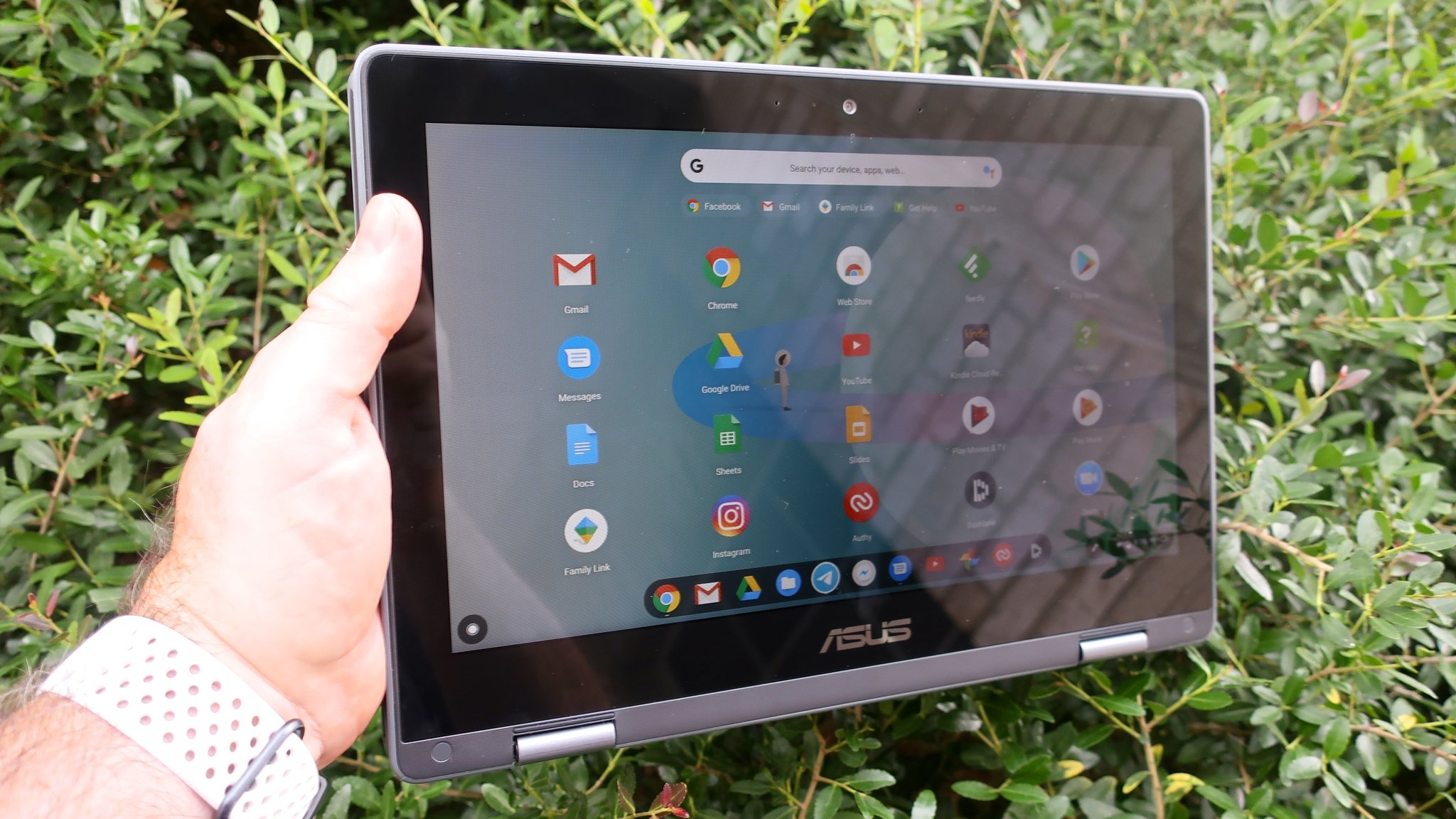
Google's current launcher, or the Peeking Launcher, as it is technically known, came around as part of Google's push into touch devices. It works well on the laptops and convertibles that make up some of the best Chromebooks, and Google has built upon it to push a more optimized design for tablets as well.
It's a lot like the Windows 8 Start Menu but without the live tiles. Much like Microsoft did, perhaps Google is coming around to the idea that a smaller launcher may make more sense on some devices — particularly Chromeboxes and larger laptops as the Acer 317.
That being said, it's an early test of an experimental feature in an experimental build of Chrome OS, it's the opposite of a sure thing. Google could well decide to scrap it today, but it remains an interesting idea regardless.
Be an expert in 5 minutes
Get the latest news from Android Central, your trusted companion in the world of Android

