Google is testing a small YouTube Music redesign for Android
What you need to know
- Google is testing an update to YouTube Music's Now Playing UI.
- This new update surfaces key parts of the interface like shuffle and repeat. It also adds a tabbed bottom bar with highlighted lyrics support.
- It's server-side triggered, so users have to wait till Google rolls it out to them.
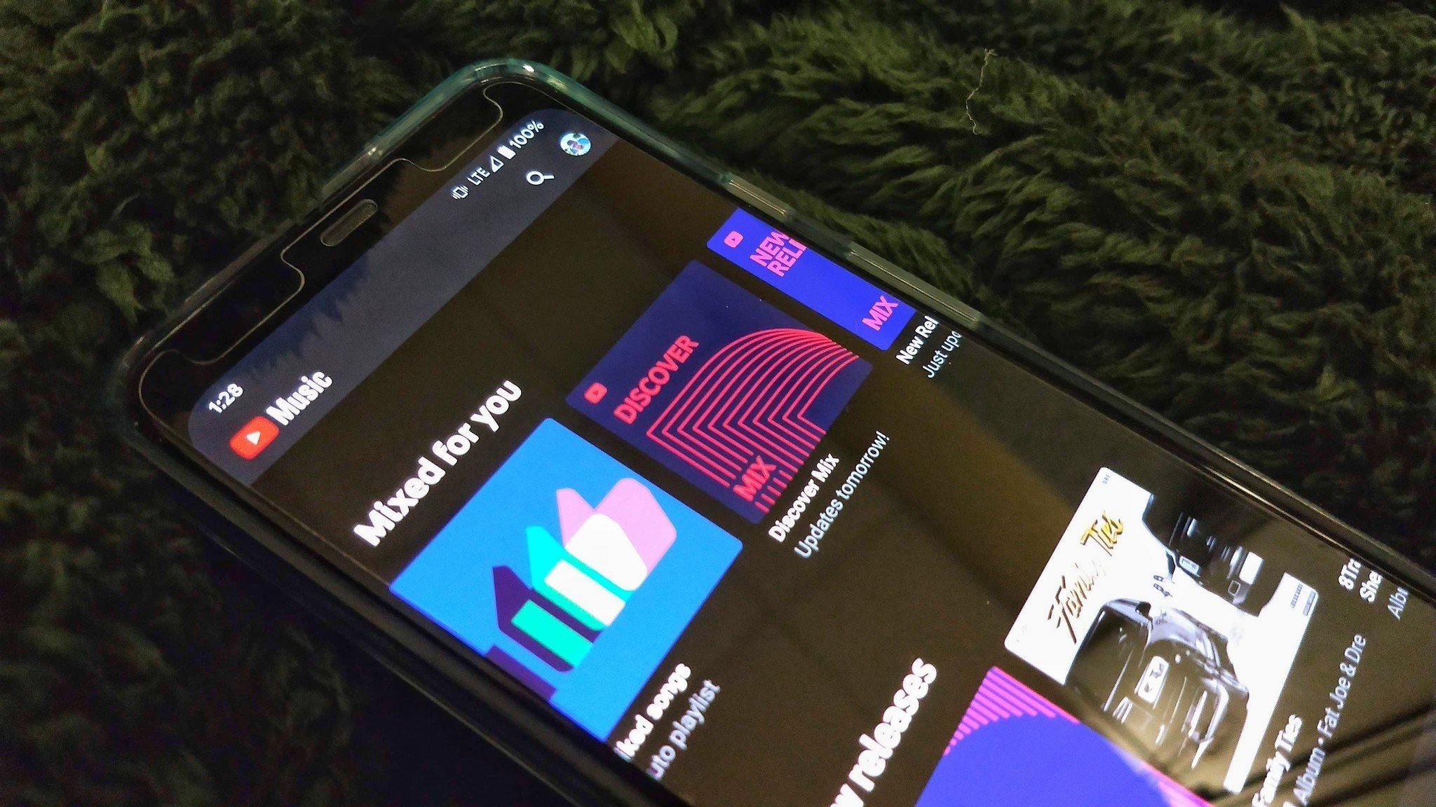
Google is testing a small YouTube Music redesign, playing with elements on the Now Playing page to improve clarity.
Spotted by Android Police, this change lightens up the default dark mode in YouTube Music's Now Playing screen to a more pleasant light grey. It also adds a tabbed interface where users can tap between the Up Next list and a new lyrics tab so the can sing along to their favorite tunes.
The changes are mostly for the better. Shuffle and Repeat were hidden by default for some reason, despite being oft used buttons. YouTube's Music lyric feature was also all but hidden, and this change makes it visible to everyone not named Sherlock Holmes.
Here's the new UI in screenshots:
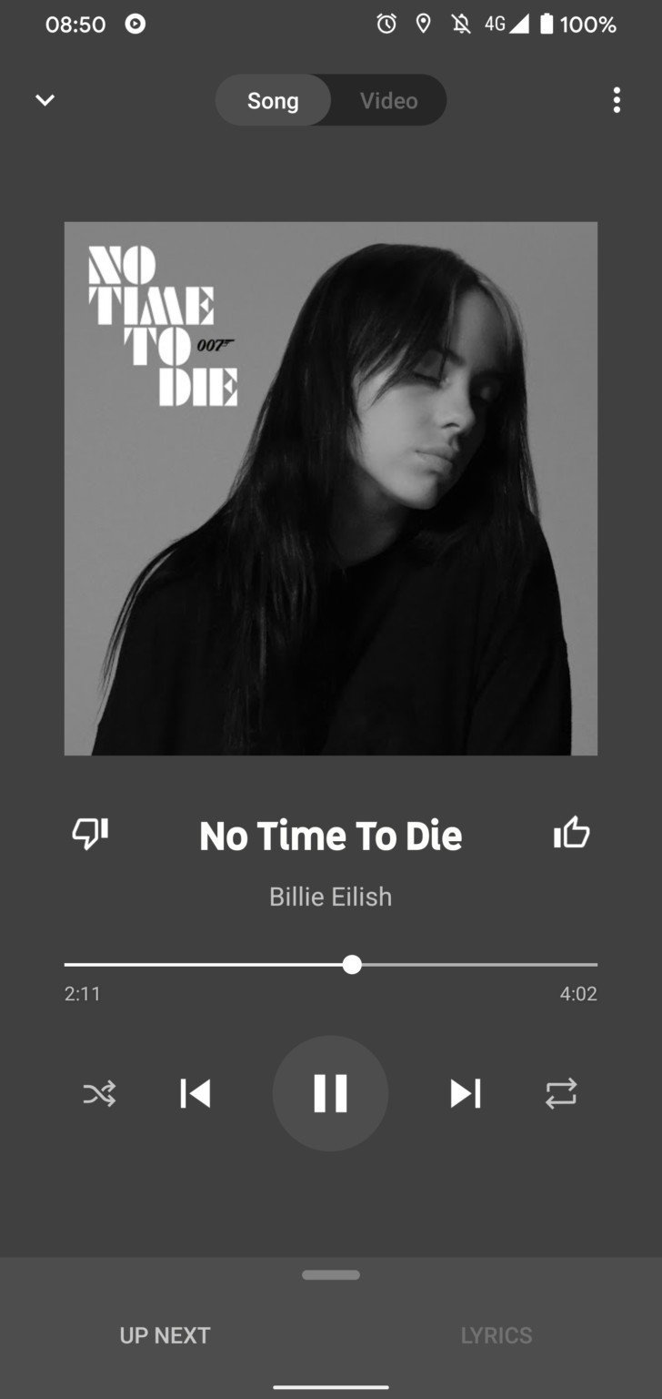
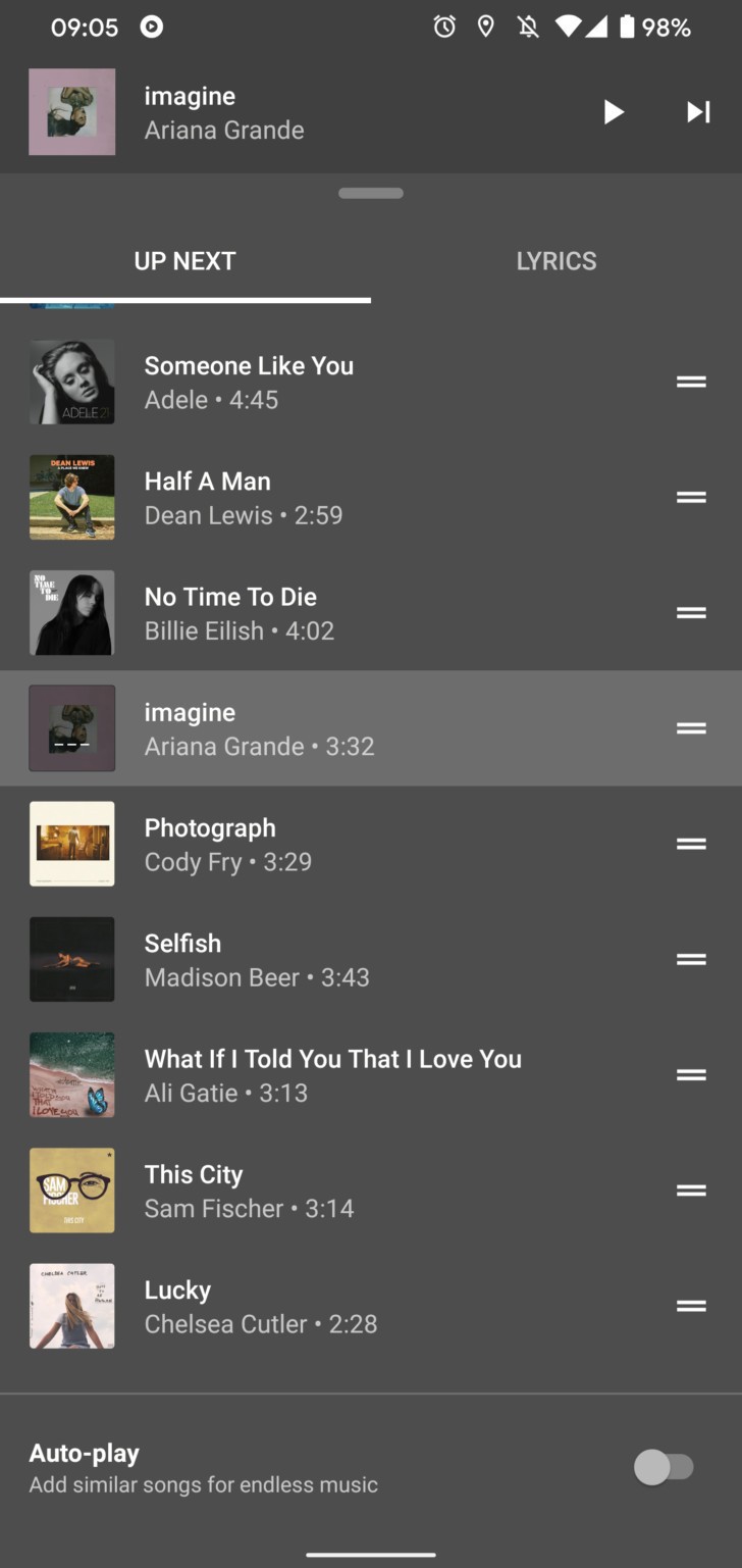
The updated interface seems to be a server-side activated one. Neither we nor Android Police have been able to replicate it as of yet. Nevertheless, as with Google's rollouts, all should receive it within a couple of weeks.
That isn't the only change Google implemented in YouTube Music recently. The firm also finally added the ability to upload your own music, with a 100, 000 song limit. This change is currently rolling out now.
YouTube Music: Everything you need to know
Be an expert in 5 minutes
Get the latest news from Android Central, your trusted companion in the world of Android
