Google is testing search results with lots of pictures and almost no words

What you need to know
- Google appears to be testing a radically different search results page with lots of visual imagery.
- These search results are only appearing on Google searches performed on a desktop browser, not mobile devices.
- While it's light on text, the visual distinction between search results and ads is incredibly stark.
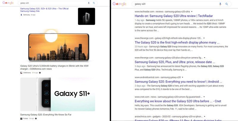
Google is testing a new page design for desktop search results, and it's a rather jarring way of viewing information. When performing a Google search from a desktop computer, some users are being given the mobile AMP search results, but with even fewer words than you'll find on a mobile device. The result is a string of search results littered with pretty pictures and little more than a headline to identify the search result in question.
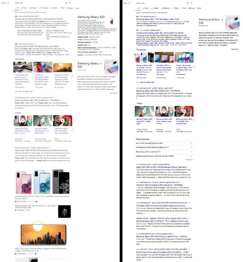
When pasting the new results next to the page design that most people will experience today, the difference is substantial, to say the least. While the new design is a way to highlight some gorgeous imagery, it takes away a significant amount of information that would help users identify exactly what they're looking for before they click a link. On the positive side, this new results page provides stark visual differences between websites, while the existing results page has no real visual identifiers between results. In the images below, the new visual design on the left, while the current design on the right.


Google loves testing new designs and concepts and regularly undergoes what's called "A/B testing", where a set of users will receive one test design, while another group of users receives a different design. So far we've only seen one new results page among those that work at Android Central, but it's very likely there's at least one other test going on right now.
Google recently rolled back a minor search page redesign after stark criticism due to the fact that the use of "favicons" made regular search results look too visually similar to ads. If there's any single thing we can highlight as a positive of this new design undergoing testing, it's that regular search results look absolutely nothing like ads, as evidenced in the full-page view comparisons above.
Be an expert in 5 minutes
Get the latest news from Android Central, your trusted companion in the world of Android

