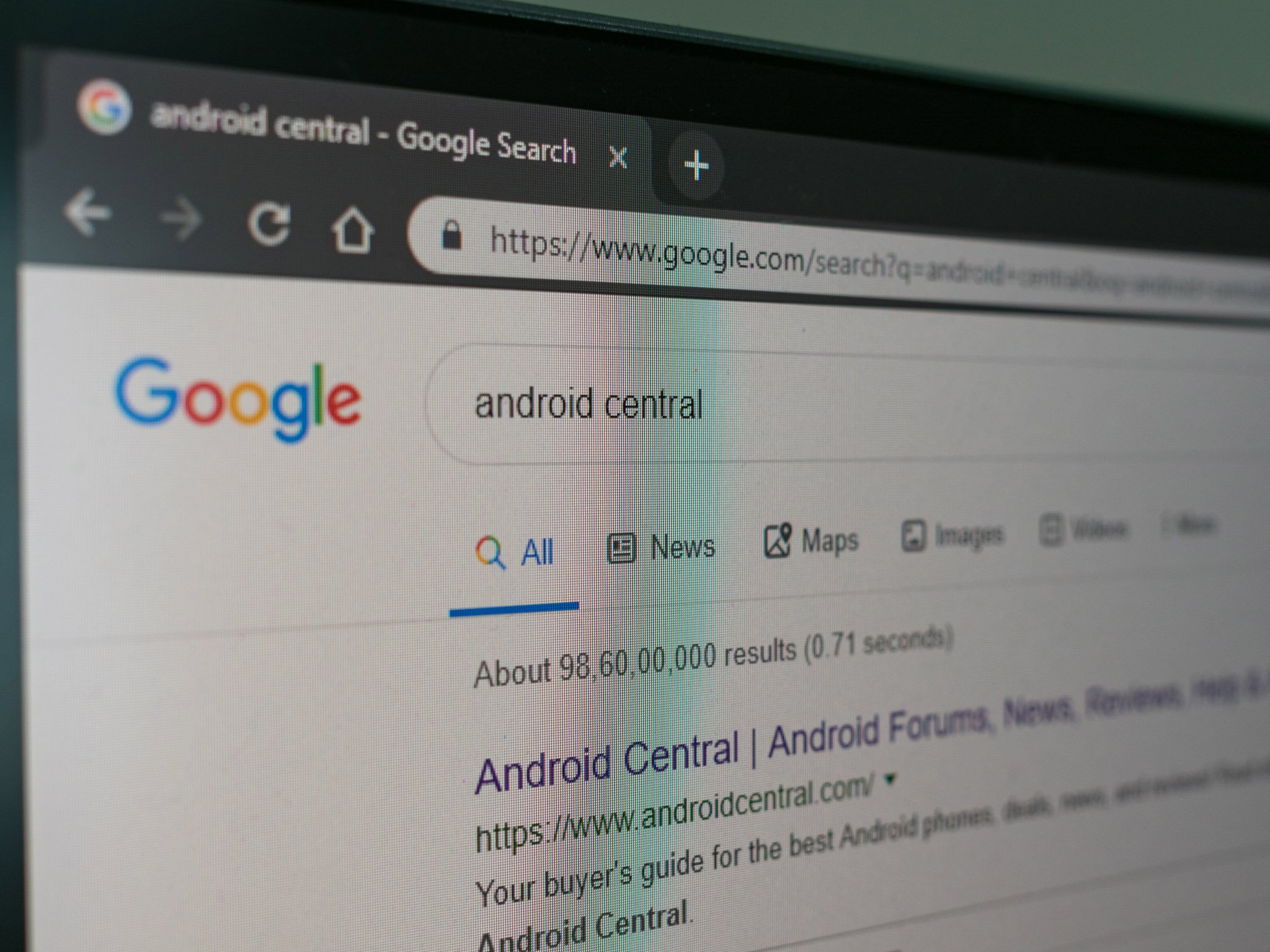
Google's colorful Search redesign for the desktop highlights ads, site favicons

What you need to know
- Google has rolled out its Search redesign to desktop users.
- The new UI prioritizes transparency, highlighting brand iconography, and bolder ad labeling.
- The company brought the same redesign to iOS and Android last year.
Last year, Google redesigned Search for Android and iOS to more clearly label content on the search results page. Ads would get a bolder ad label, while sites would now have colorful favicons so users could see — at a glance — what sites they were clicking into.
The same redesign has now hit desktop users, as per an announcement by Google. Here's how the new Google Search should look on your computer from today.

Google's Jamie Leach Senior Interaction Designer, Search, explained the move last year:
As we continue to make new content formats and useful actions available—from buying movie tickets to playing podcasts—this new design allows us to add more action buttons and helpful previews to search results cards, all while giving you a better sense of the web page's content with clear attribution back to the source
The new UI certainly is busier, but it also makes it easier to distinguish what sites you're navigating to by highlighting distinctive brand elements like the favicon. This arguably tackles the scourge of some sites which package themselves as other well-known brands in order to capitalize on consumer confusion.
It's not universally acclaimed, some social media critics have argued that the overabundance of colorful elements on the screen actually draws away from the "ad" labeling by sheer contrast and eye-catching nature. While that may be true, it's worth noting that Google's sole desire was not to focus on ads but to more push for overall transparency in the search results page.
Google hit with $1.7 billion EU antitrust fine for blocking ad rivals
Be an expert in 5 minutes
Get the latest news from Android Central, your trusted companion in the world of Android

