Google is rolling out a simplified Google Pay app for Android
What you need to know
- Google today rolled out a new update to the Google Pay app.
- This new update simplifies the interface and puts a fresh focus on the hamburger menu.
- It's triggered server-side, so it should be enabled automatically.
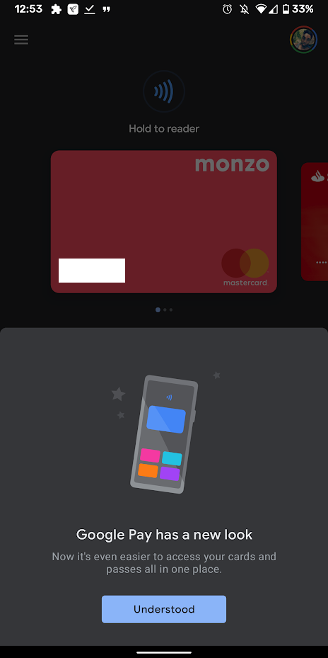
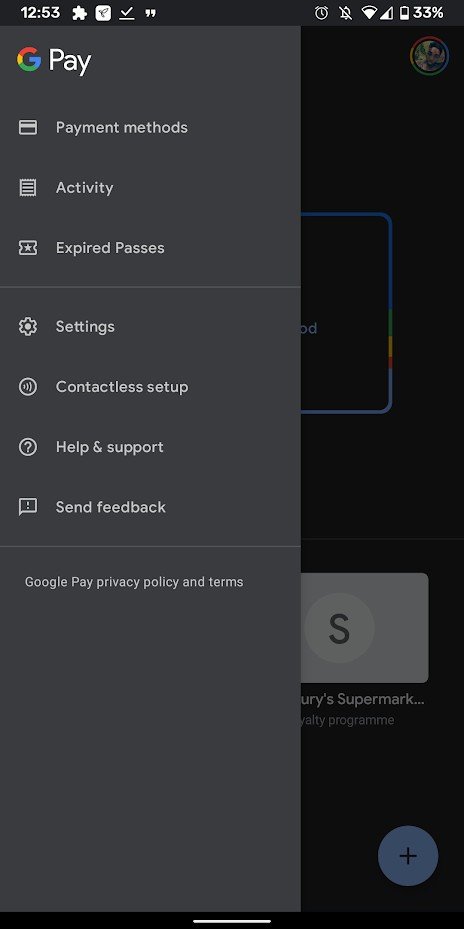
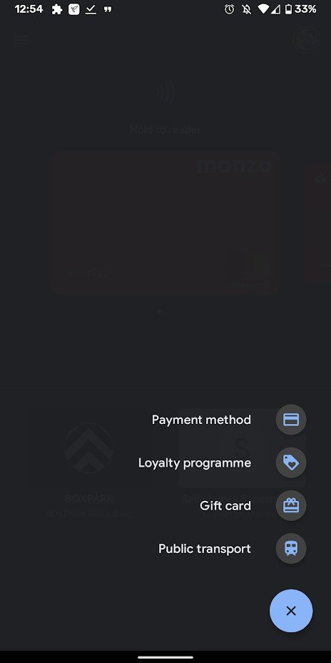
Google is rolling out a new update to the Google Pay app on Android that redesigns the mobile payments app. The new design strips the app of its lower bottom tab menu and moves all options to the hamburger menu (yes, Google's shifting a focus on that after shifting away from hamburgers for the past few years.)
Source: Android Central
A prompt in the app notes that this design will make it easier to access all your saved cards and passes, and it does fulfil that promise. You can now see all your cards and loyalty passes in one main screen, rather than having cards front and center and everything else tucked away. Google has also added a new floating action button (FAB), letting you add new cards and passes to the new Google Pay app. Overall, Google Pay isn't one of those apps you spend a lot of time in, so the faster it is to set and forget, the better it the experience is for users.
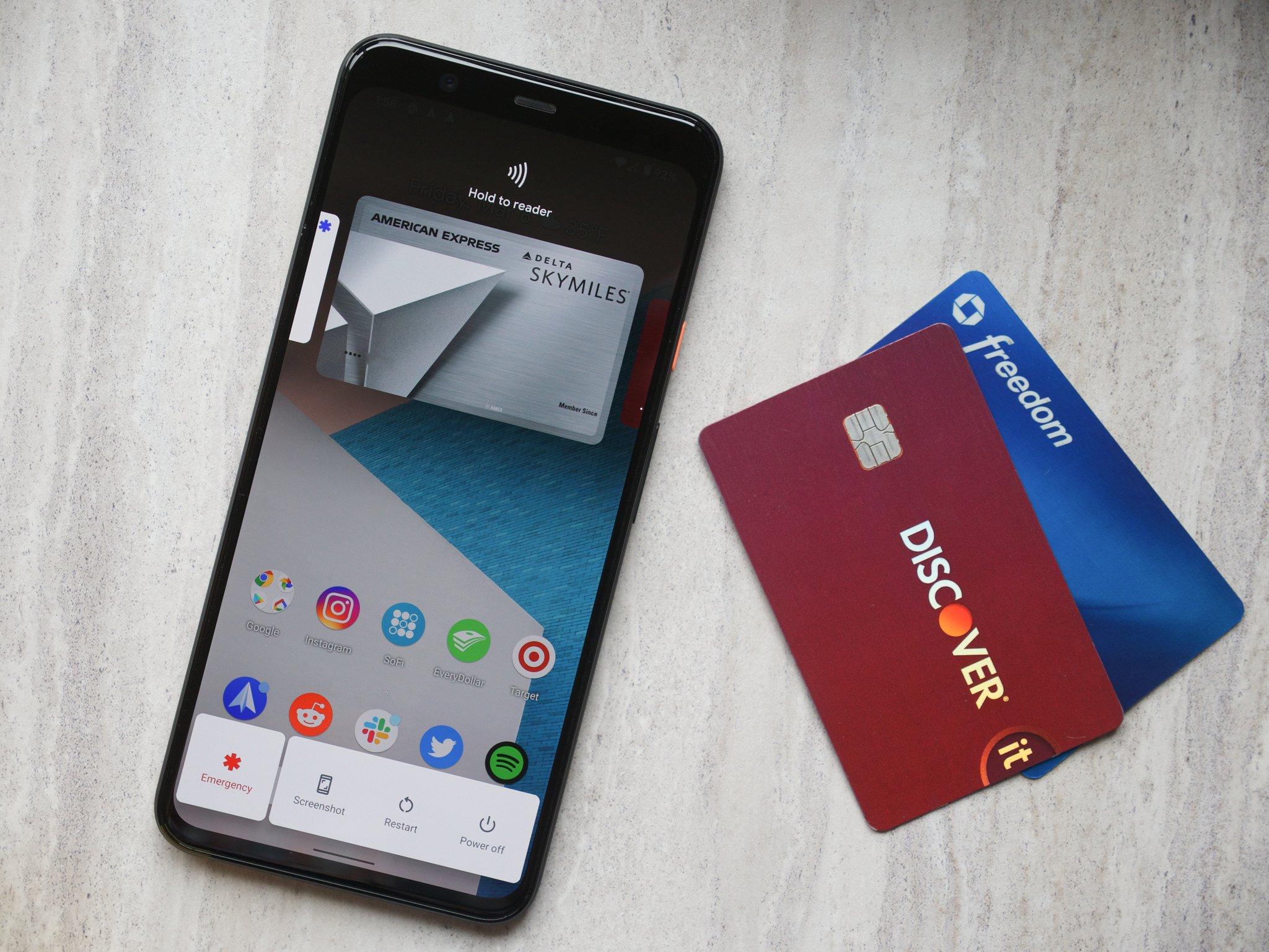
Google has recently made Google Pay easier to access on Pixels and other Android 11 phones. A new power button prompt means that your payment cards are only ever a button tap away, and choosing which card to pay with becomes more convenient. This new interface was actually always available with Android 11's power button shortcut, but now Google is making it the main way to use Pay and unifying the two disparate interfaces.
The new update is rolling out server-side, but most people should have access to it now.
Google Pay finally feels like a core Android feature, and that's exciting
Be an expert in 5 minutes
Get the latest news from Android Central, your trusted companion in the world of Android

