Google finally gives the Play Store website some love with a new look

Get the latest news from Android Central, your trusted companion in the world of Android
You are now subscribed
Your newsletter sign-up was successful
What you need to know
- Google appears to be testing a redesign for the Play Store website.
- The new design features a new layout with rounded corners that uses more screen real-estate.
- The revamp appears to be live in Korea and Taiwan so far, although it seems not every section has been updated.
The Play Store is finally getting a new look, but this time Google is focusing its attention on the website version of the Play Store.
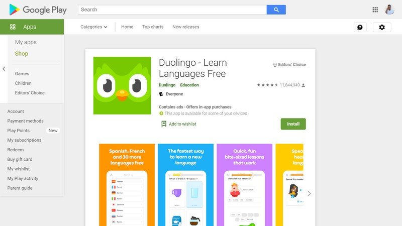
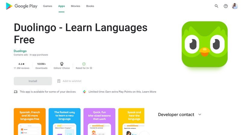
Android Police spotted the new design, which drastically changes up the look from the previous site design. Instead of the cluttered, boxy look of yore, the new website appears to take some Material design cues with rounded corners while also borrowing from the more recent Play Store app design by ridding of the side navigation bar.
Settings, app management, and the like are now found when clicking the user thumbnail, just like on the mobile version.
Article continues belowNear the top is a selection of chips to filter apps by device type, which should make it easier to find exactly what you need for your various devices, particularly while in the middle of a search. This coincides with the new Play Store experience that Google has teased for some time.
Additionally, app pages take up much more of the display with a fullscreen experience. Overall, the experience looks much cleaner. You can view the differences between app pages below:
Source: Android Central
Some apps even get a fullscreen video preview when you open their page, like Minecraft:
Get the latest news from Android Central, your trusted companion in the world of Android
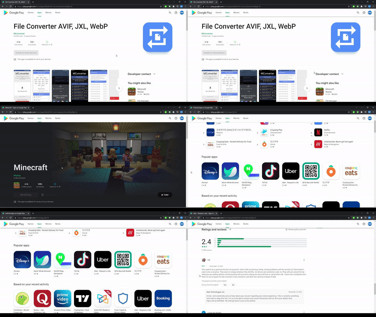
The change doesn't appear to be live yet on the U.S. version of the website, but Android Police notes that it is already live in Korea and Taiwan. That said, it appears that the new design hasn't reached certain parts of the site, such as the app library.
Still, after the Play Store has seen quite a few design changes over the years on the best Android phones, it's nice to see Google finally giving its outdated website a modern overhaul. Hopefully, the new experience will roll out for more users sooner rather than later.

Derrek is the managing editor of Android Central, helping to guide the site's editorial content and direction to reach and resonate with readers, old and new, who are just as passionate about tech as we are. He's been obsessed with mobile technology since he was 12, when he discovered the Nokia N90, and his love of flip phones and new form factors continues to this day. As a fitness enthusiast, he has always been curious about the intersection of tech and fitness. When he's not working, he's probably working out.
