Google Play Music's latest update is two steps forward, one step back
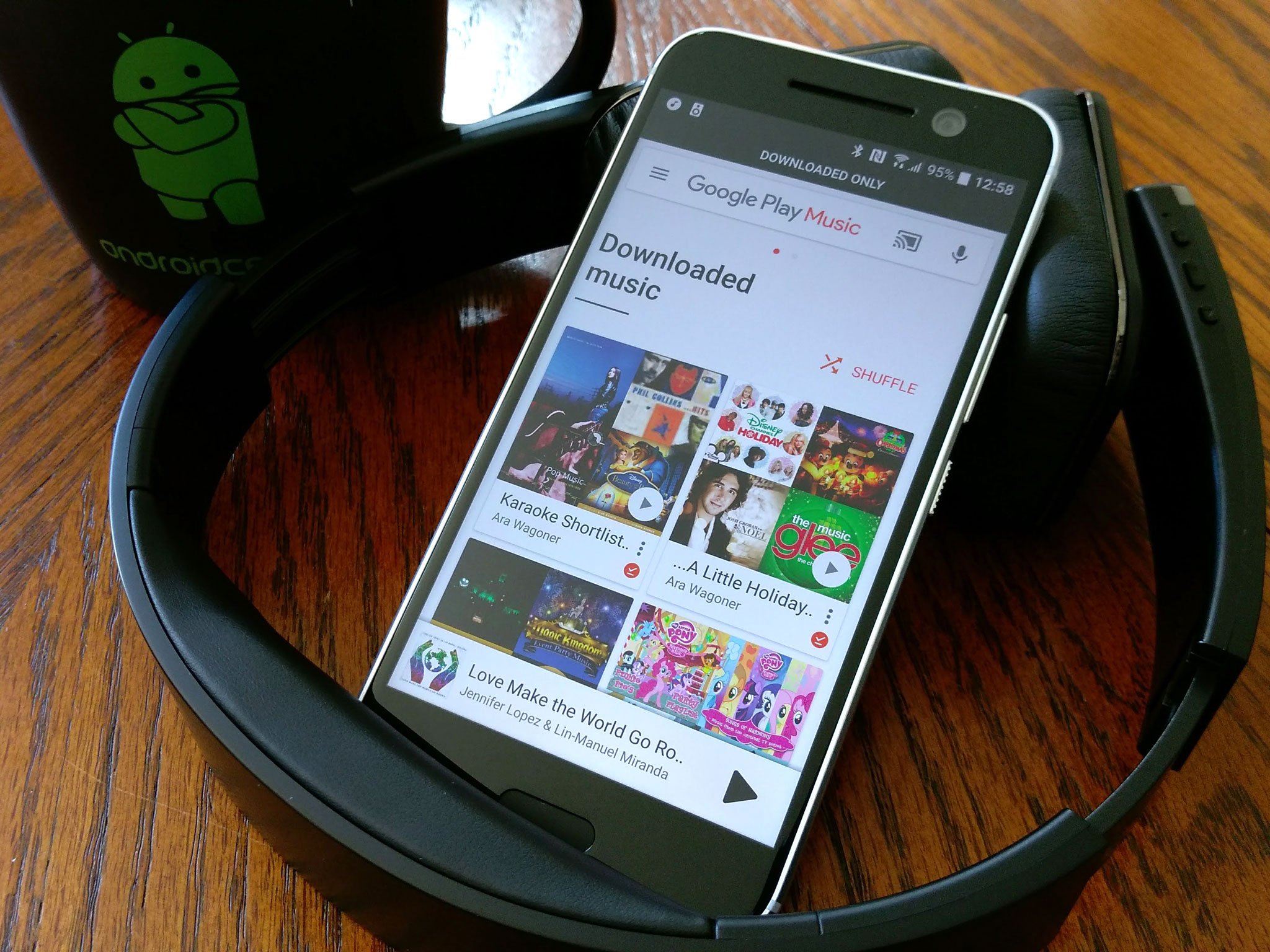
The recent Google Play Music update changes only one element of the UI: the home page. Before the update, it was a mix of Recents and Recommendations. Now, Listen Now is entirely recommendations, with only a Recents button in the top right corner to remind you that Play Music is anything but AI-made radio stations… until you switch to Downloaded. Then, Home changes into something far more useful.
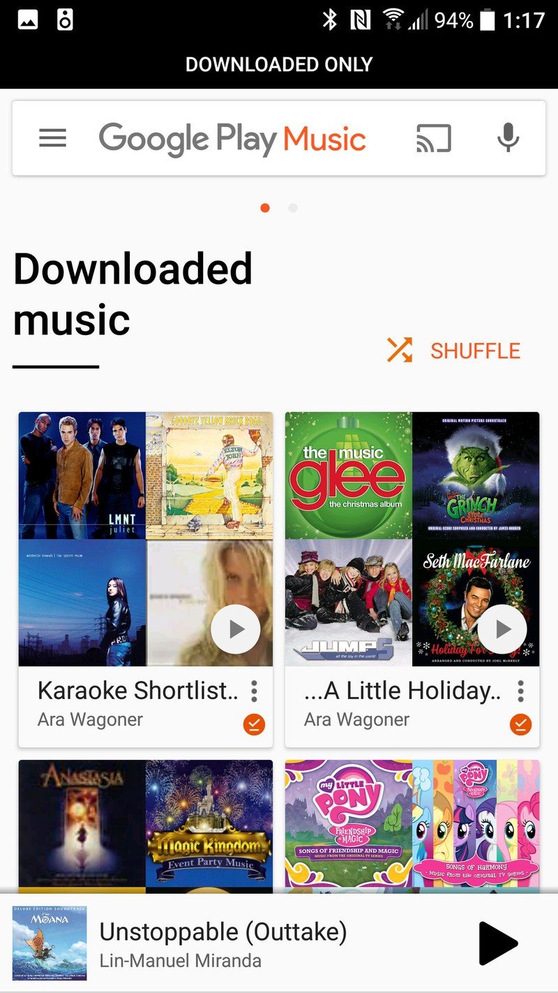
In Downloaded Only mode, the home page changes to Downloaded music, showcasing the playlists that you have stored locally, starting with the most recently-used four playlists. There's also a Shuffle button that pops up right above your playlists, allowing you to quickly shuffle all your offline tunes, but the real gem is hiding at the bottom of the page: Cached music.
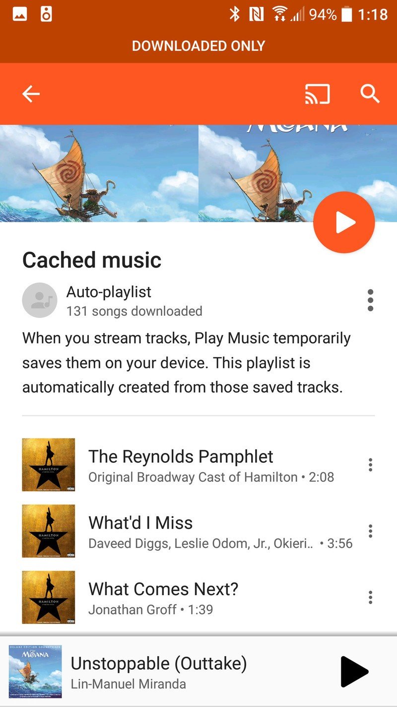
Cached music is made up of songs that you listened to once or twice and Play Music downloaded them in case you want to hear them again. Previously, it was impossible to tell what was Cached music as opposed to downloaded as a part of a playlist/album. Listing it is a great first step, but I'm eagerly awaiting the ability to tap a song in here and tap Remove from cached music to clear out songs I don't want wasting space without emptying the whole cache.
There are honestly some great features in here, but they're only accessible on Downloaded, which many users never turn on.
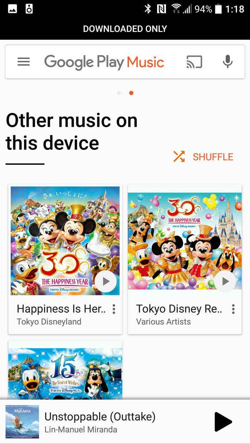
You may also notice there is a page indicator just above Downloaded music; if you swipe right, you'll be treated to another menu we haven't seen on Play Music before: Other music on this device. Before now, if you had music downloaded on your phone, Google Play Music would show it and play it as if it was part of your cloud library, but you couldn't tell what was local-only. This menu will be useful, especially when you're about to migrate to a new device and need to know what needs syncing off the old phone.
There are honestly some great features in here, but they're only accessible on Downloaded, which many users never turn on, and the regular menus they replace are far less useful (at least to my Station-avoiding tastes). At least these menus encourage me to stay offline and save my data, but should the main page of an app change so completely based on your data status? Is there a happy balance to be re-struck between our personal libraries and cloud recommendations? I think so, but for now, here's what we've got.
We can only hope as more changes come, they're more consistently useful than Home.
Get the latest news from Android Central, your trusted companion in the world of Android
Ara Wagoner was a staff writer at Android Central. She themes phones and pokes YouTube Music with a stick. When she's not writing about cases, Chromebooks, or customization, she's wandering around Walt Disney World. If you see her without headphones, RUN. You can follow her on Twitter at @arawagco.
