Google Play Music update adds machine learning and a fresh new look

Get the latest news from Android Central, your trusted companion in the world of Android
You are now subscribed
Your newsletter sign-up was successful
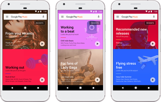
Google has just announced the biggest overhaul of its Play Music streaming service in years. On the face of it, Play Music has moved beyond the card-centric design of old, and now shows an interface built around album art, bright colors and vector graphics. Instead of shaded squares, graphics now expand to fill the entire window. (And there's a lot less orange going on, too.)
But aside from these superficial changes, the way Google recommends music for you is about to get a whole lot smarter, thanks to AI.
Google Play Music uses machine learning to figure out what music you like and then mixes in signals like location, activity, and the weather along with hand-picked playlists to personalize music for wherever you are and whenever you want tunes. Starting this week on Android, iOS and the web, the new experience will roll out globally (62 countries, to be precise).When you opt in, we'll deliver personalized music based on where you are and why you are listening — relaxing at home, powering through at work, commuting, flying, exploring new cities, heading out on the town, and everything in between. Your workout music is front and center as you walk into the gym, a sunset soundtrack appears just as the sky goes pink, and tunes for focusing turn up at the library.
Google says a new home screen will act as a "personal DJ" — one that's sensitive not only to days of the week and time of day, but also where you are and what you're doing. (Based on data from the sensors in your phone.) Ideally, Google will learn now only what kind of music you like in general, but what you prefer to listen to in specific places, at specific times, and while doing specific activities (for example, working out.)
Article continues belowAnd to make sure you're never without music when you're offline, the new version of the streaming app will maintain an offline playlist of stuff you've recently listened to at all times. It's unclear exactly how this works, but we're guessing it's just Google being smarter about presenting music it's already cached in the background.
We're not yet seeing the Android update on any of our devices, however Google Play Music on the web already has the new look, if you want an early peek.
Get the latest news from Android Central, your trusted companion in the world of Android

Alex was with Android Central for over a decade, producing written and video content for the site, and served as global Executive Editor from 2016 to 2022.
