Google Pixel: Welcome to your new, very circular home screen

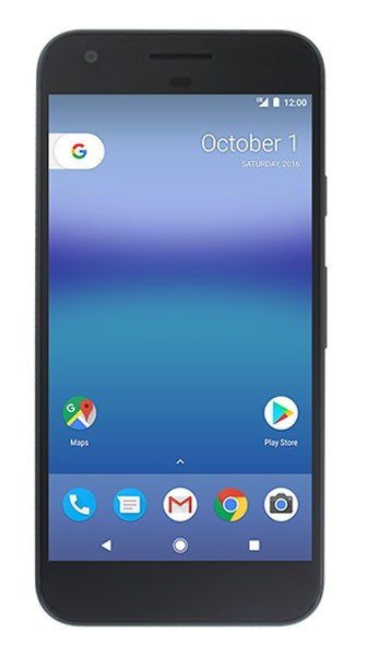
The first leaked Google Pixel phone render doesn't show us a whole lot. It's a rounded rectangle with a screen on the front, an earpiece, cameras, sensors and buttons. By far the most interesting thing about the leaked image is what's on that screen.

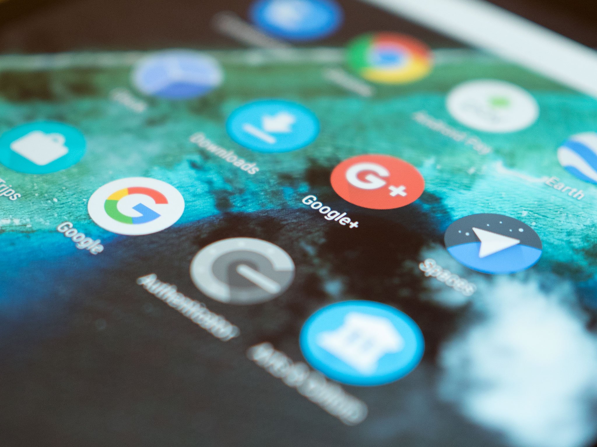
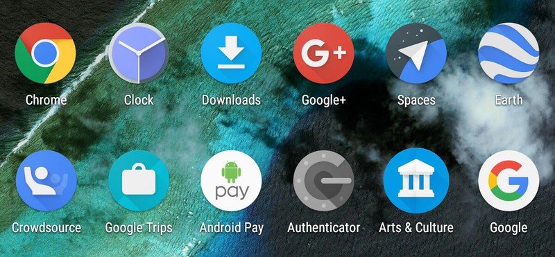
Every icon is a circle. Even apps like the phone dialer, Messenger and Gmail have been put in a bubble. Depending on your perspective, it's either a refreshing change, or a weird, confusing corruption of Material Design.
The immediate comparison to draw is with iOS. Since the first iPhone, Apple has used a rounded rectangular cookie cutter around all app icons, both first- and third-party. Then there are the likes of Huawei and Samsung, who've emulated that approach. (Though mercifully, it's an option on Samsung phones, and only applies to certain skins in Huawei's EMUI.)
All of which raises the question: Will Google do the same thing to all your apps on the Pixel? David Ruddock of Android Police raised the possibility a couple of weeks back, and we have to wonder how well this would work out in practice. In the early days at least, there'd be a whole lot of apps that just looked bad on your home screen.
The apparent move to a new "Google UI" on top of Nougat also complicates matters. Would the new Google design guidelines for icons apply to the whole of the Android ecosystem, or just Pixel phones? With Google's hardware division apparently taking the lead here, it's unclear who's in the driving seat for design in the rest of the Android world. Today's leaked render serves to highlight the possible confusion ahead when it comes to Nexus Android, Pixel Android and the nebulous mass that is the rest of the ecosystem.
In either case, Google has certainly been moving many of its apps over to circular (or in the case of Hangouts, almost circular) frames in recent weeks. Chances are that's no accident.

Apps are a central part of any platform, as is how they're presented to the user. If Google does go full-circle (see what we did there??), it's probably because it wants to recreate the sense of cohesion that iPhone's home screen has had from day one. (Perhaps that's a good thing, once app developers are onboard with it.) By the same token, maybe it's a product-level decision (i.e. Pixel) and not a platform-level one (i.e. Android).
Be an expert in 5 minutes
Get the latest news from Android Central, your trusted companion in the world of Android
In either case it's an interesting design decision, and one that hints at just how wide-ranging the announcements at Google's October 4 event could be.

Alex was with Android Central for over a decade, producing written and video content for the site, and served as global Executive Editor from 2016 to 2022.
