It's been a fun few days, what with unboxing the Pixel and trying to get to know it as quickly as possible.
And in that time, I've realized a few important things about the device, from its feel in the hand (great!) to the Assistant (WIP!) and everything in between. Andrew and Alex have each put their thoughts down on paper already, but since I'm the only one of the three to spend any length of the time with the smaller Pixel so far, it's a good opportunity to give my less formal take on this new phone.
More: Google Pixel specs

Hold me
This is the right size for me
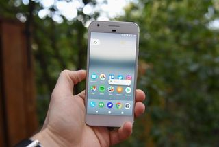
The Pixel is not a big phone. Seriously, get over those chins, because in person — at least on the smaller version — they just aren't distracting. In fact, the bezel below the screen is perfectly sized for holding the phone in landscape and manipulating the screen — especially the camera— with your thumb.
Using the Pixel is like taking a masterclass in regression: trying to use a 5-inch phone after spending years manipulating ones up to 20% larger forces you to relearn the basics in some ways. With the Pixel, I end up using it in one hand for almost everything except typing, and effortlessly reaching up to the notification shade with my thumb is a pleasure.
Seriously, get over those chins, because in person they just aren't distracting.
To be fair, this isn't the first "small" phone I've used in 2016: I've spent plenty of time with the Honor 8 (5.2 inches, but almost the same physical footprint), the Sony Xperia X Performance (5 inches, slightly smaller footprint), and even the iPhone 7 (4.7 inches, notably smaller footprint). But it's the one that, in its smaller size, convinced me almost immediately that there are no real compromises with the product.
I'll talk about it in the next section, but it's more important that a phone feels right than looks good, and the Pixel was designed to be held. Its rounded bevel meets the contour of your hand perfectly, and the smaller Pixel's narrowness means it's easy to grip comfortable and securely.

Don't stare
If looks could kill
An inordinate number of people find themselves comparing the Pixel to the iPhone — mainly the 6s, but also the 7 — of which the phone looks nothing alike. Sure, there are generalities some could point to — exposed antenna lines, aluminum chassis, chamfers — but the two phones are in a world where devices need to look a certain way to perform their function.
Anyone calling the iPhone 7 ugly and boring hasn't used an iPhone 7. Anyone who says the same of the Pixel hasn't used a Pixel.
People accusing the Pixel of looking like the iPhone 7 are, in the next breath, defending the iPhone 7's familiar design against calls for drastic change for change sake. When my colleague Rene Ritchie talks about grading the Pixel on a curve, he means that people are willing to look past the phone's purported similarities to the iPhone — or its inherent ugliness, which is it? — because Google is finally, finally making its own phones. He writes:
I even get the reception we're seeing. After years in the Google desert, we're finally being thrown a cracker, and so we're so hungry for it, we're telling ourselves it tastes like a Ritz. Meanwhile, we're taking Apple's year-over-year crackers for granted, and looking at them like they're just regular old saltines. The human brain is a real jerk that way. It only takes perspective when you force it to.
The problem with that argument, in my mind, is that you're inserting Apple into the wrong end of the argument: Anyone calling the iPhone 7 ugly and boring hasn't used an iPhone 7. Anyone who says the same of the Pixel hasn't used a Pixel.
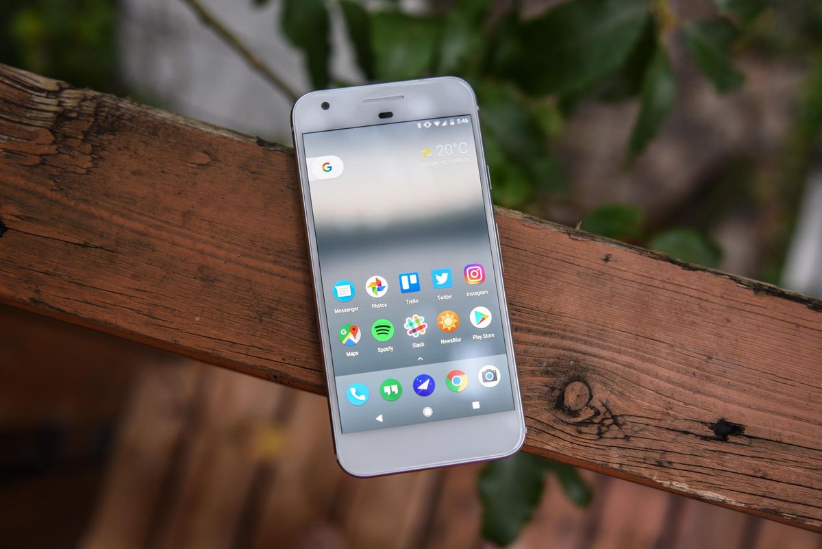
The Pixel isn't beautiful; it's modern and utilitarian, as if it were designed to get stuff done. Which is exactly what I want.
But the Pixel isn't beautiful; it doesn't have the sleek curves of the Note 7 or the flashiness reflectiveness of the Honor 8. My "Very Silver" Pixel is modern and utilitarian, as if it were designed to get stuff done. That suits me, because as much as I enjoy affectionately staring and purring at my devices, I prefer to actually, you know, use them. And for that purpose, the Pixel performs its job admirably. While I'm not a huge fan of the distracting white front of the Very Silver model — I wish there was an option for a black front with the same white-on-silver rear, but that will never happen — I like the dual-toned nature of the phone's back, and think it plays well into Google's design ethic.

Speed demon
The Pixel is the fastest phone I've ever used
The iPhone is fast. The Galaxy S7 is fast. But the Pixel is uproariously quick. Using off the shelf components, with few, if any, customizations, Google has pulled off the greatest platform coup yet: making Android instant. The progress started way back when Android 4.1 was released, with Project Butter, and has progressed rapidly since then, but the Pixel is the something else.
In an interview with Bloomberg, Android head Hiroshi Lockheimer said that the Google hardware team behind the Pixel gets access to the same underlying Android code as Samsung or LG, and is free to "build on top of it" like those OEMs. The difference, though, is that despite the firewall within Google, there is a clear parallel intention: to simplify and optimize Android as much as possible. Like Motorola, the progenitor of the company's current hardware strategy when it was inside Google (run by the same guy, Rick Osterloh), Big G has no reason to undermine its approach to software development.

Though the Pixel's version of Android 7.1 may have a few visual and function tweaks, Google's approach to building software for it has not fundamentally changed from its years of building Nexus. The main difference is that the hardware team, in choosing the right camera sensor or GPS chip, could walk over to the people optimizing Android's software and tell them explicitly to focus on making this happen, or that work better. It's a strategy that Apple has been improving for years, and Google's next step — if it wants to take the Pixel seriously — will be to customize its hardware components to a fine tip.
Samsung is already most of the way there, building its own screens, processors, RAM, and many other parts of the animal, but its fundamental inability to control Android is what keeps its software mired in occasional slowdown. Admittedly, Samsung has improved dramatically in this regard in 2016, but it's not all the way there yet. Google, with the Pixel, not only got there, but lapped Samsung — twice — and isn't even out of breath.

Top-up
Battery life is a concern
I'm a week or so into this phone, so I don't want to get too ahead of myself, but the 2,770mAh battery in the smaller Pixel is definitely a concern for all-day usage.
I get the impression that the combination of Android 7.1 and very efficient Snapdragon 821 chip does perform some measure of magic.
I've managed to eke a full day several times — 7 a.m. off the charger to midnight — but more than once I felt the need to top up for half an hour during lunch, or risk seeing the scary red exclamation around dinner. That's par for the course on any phone of this size these days, but I was kind of hoping for Google to, with its aforementioned control of the hardware and software, pull a magical battery rabbit from its hat and optimize the hell out of this thing.
I do get the impression that the combination of Android 7.1 and a very efficient Snapdragon 821 chip does perform some measure of magic, and that with the same software running on, say, a Snapdragon 810 and Android 6.0.1 Marshmallow the phone would shave a couple of hours off its uptime, but that's conjecture. What I do know is that in switching to a 5-inch phone with a comparatively small battery, I'm opening myself up to the kind of charging anxiety I used to feel on a regular basis, and haven't since moving to a combination of Galaxy S7 edge, OnePlus 3, or iPhone 7 Plus. (I felt a very different type of battery anxiety with the Note 7, but I digress.)

Sweet as Nougat
The software improvements are substantial
Even without the Google Assistant, the assiduously considered software improvements on the Pixel make it, in my opinion, the most mature and interesting implementation of Android yet. From the Pixel Launcher, which right now looks like it will stay a Google hardware exclusive indefinitely, to the resurgent Live Wallpapers that take advantage of the Pixel's ample graphical abilities, everyone can find something to like here.
I am less critical of the Pixel's rounded icons, and the inconsistency derived from the early state of Google's admittedly haphazard promulgation of that strategy — a round icon API is only available on the Android 7.1 Developer Preview right now — than my peers. Some icons do look better than others, but that's been true of Google's own apps, rounded or not, for years. The company can't seem to settle on an aesthetic for its many brands, and though I am no fan of indecision, I find them neither distracting, nor the heavy criticism against them justified.

I can find more things to criticize about Google Assistant, which is definitely disappointing in its current state, not because it is "dumb," as some others have said, but because it overemphasizes voice interaction when it should operate, like it does in Allo, as a bot. Even the flawed Now on Tap, which Google deprecated on the Pixel in favor of Assistant, offered a search bar if the contextual offerings weren't sufficient. By forcing users to head to the Feed (nee Google Now) for a search bar, Google is adding an unnecessary step to the proceedings.
Most of the frustration with Assistant comes from the fact that we know where it is going, and we don't want to wait the two or so years until it gets there.
Assistant as a product is fine right now. I've yet to be wowed, and I've yet to yell out in frustration. As Alex said in his review, it's a 1.0 product that fakes its way to a 1.5 every once in a while. Most of the frustration comes from the fact that we know where it is going, and we don't want to wait the two or so years until it gets there.
Let's also talk about notifications. I know there's nothing especially new about them on the Pixel, but this is my first time spending a large chunk of time with a phone running Nougat, and I have to commend Google for improving and standardizing a system that was already way beyond iOS and Windows 10 Mobile. Kudos.
Imperfect formula
There are still problems

The Pixel isn't perfect. I am that guy who leaves his phone on the table at lunch, or next to him while working. I want to be able to quickly check it and get back to what I was doing. (Don't tell me that's what a smartwatch is for :P)
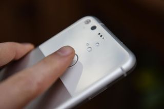
Having the fingerprint sensor on the back of the phone, combined with an ambient mode that isn't nearly as useful as Motorola's Moto Display, makes it hard to quickly check my notifications and get back to it. You also can't double-tap to turn on the screen, which I feel is a wasted opportunity to alleviate the awkward motion of picking up the phone and holding one of your index fingers to the sensor just to turn it on.
A lack of waterproofing is a regression after spending most of my year with a Galaxy S7 edge.
There are a couple other nits to pick, too: A lack of waterproofing is a regression after spending most of my year with a Galaxy S7 edge, though I'm still aware that neither LG's nor Motorola's flagships are IP67-certified, either. The speaker, while loud, lacks HTC's manufacturing legacy high-quality stereo components, and the AMOLED screen, while vivid and sharp, doesn't get nearly as bright as the Galaxy S7 or iPhone 7.
None of these issues nags at me, but they're present, and will continue to be justifications for people to rail against the Pixel's high asking price in relation to its forebears, the Nexus line.
Better than you hoped for
This camera...

I don't know what else to say besides, Holy Shit. This camera is amazing. I'm not saying it's the best camera out there, because I haven't tested it enough against our current champ, the Galaxy S7, to make a determination.
And yes, the Pixel sometimes screws up white balance and makes everything — especially indoor scenes — far too yellow. But that doesn't happen often enough, or severely enough, to distract from the incredible photos, in almost any condition, this phone takes.

But the Pixel, even without OIS, manages to frame the beauty of a world that's not always easy to capture.
Here's my typical test for a phone camera: my friends sitting around a dinner table, doing their thing, a candid moment with a bit of movement and little preparation. If the shot comes out usable, without too much grain, properly exposed and in focus, the camera has my utmost trust for almost every other scene. And the Pixel not only passed the test, but it generated shots that I'd actually want to share with said friends.
Every phone takes great photos of the Statue of Liberty or Chicago's Bean. Every camera focuses quickly on someone's steady hand holding up a beautiful craft hamburger on a sunny patio. But the Pixel, even without OIS, manages to frame the beauty of a world that's not always easy to capture.

Buy it
...Is worth the price
The question posed to me most often about the Pixel, and the criticism I see most often levelled against it, is its cost. How dare Google price this ugly, boring phone at the same level as the Galaxy S7 and iPhone 7?
But if you were following along with the themes I presented above, I feel I more than adequately explained the reasons for the Pixel's $649 starting price. This is a well-made phone that performs its function as a mobile computer better than any Android phone currently available, and potentially better than any phone, period. Some of that is thanks to its portability, which despite the slight battery shortcomings is, to me, a huge boost to one-hand friendliness and therefore productivity, but much of it is due to a no-BS design that just makes it easier to use the phone.
Daniel Bader was a former Android Central Editor-in-Chief and Executive Editor for iMore and Windows Central.

