The Google Pixel C was the best Android tablet ever made

Android tablets, no matter what company makes them, have continuously struggled to be relevant alongside the iPad's dominance. And Google's history with tablets, Android and Chrome OS alike, is even rougher — it's often argued that everything went downhill after the second Nexus 7. But I'll forever remember a different tablet, the Google Pixel C, as the best Android tablet ever made.
But the funniest thing about the Pixel C is that I only have these positive feelings about it when it's paired with its metal keyboard accessory — which, at the time, ran you $150 on top of the $500 tablet. Without it, the Pixel C is rather forgettable and even boring. That's because the keyboard — and that's only the metal keyboard — is an exceptional piece of hardware design, and the way it all came together was pure perfection. And it deserves more praise.
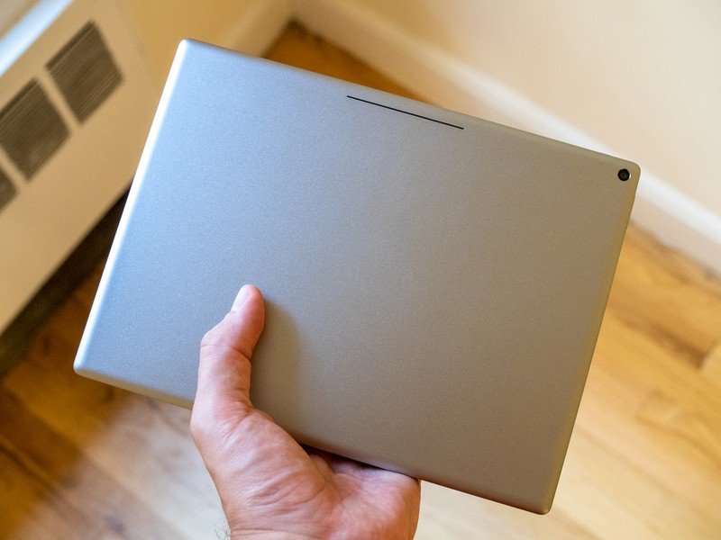
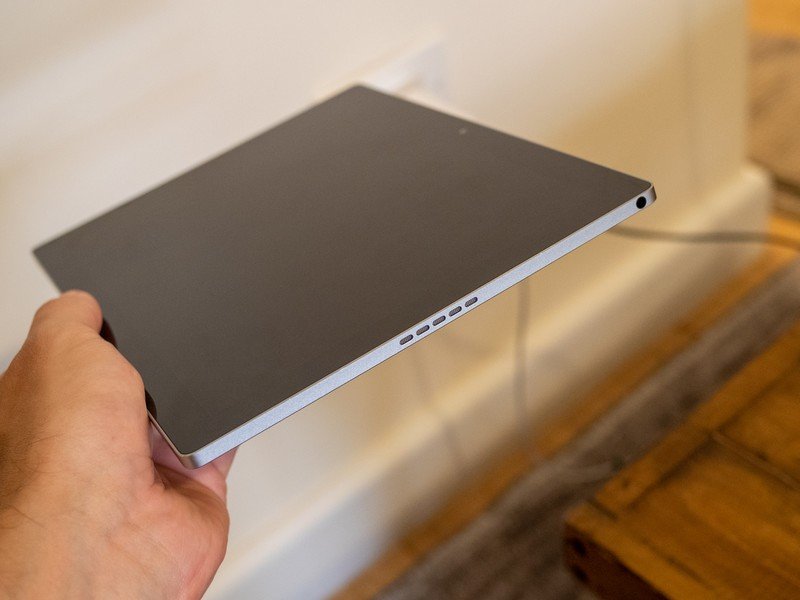
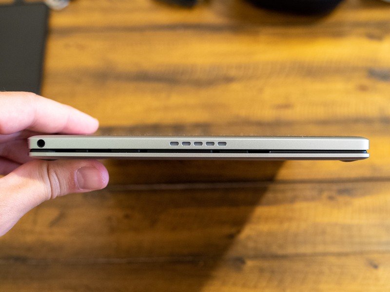
The stark "slab of metal" isn't particularly unique, but was a huge upgrade from the Nexus 9 and other Android tablets of the time, and perhaps unsurprisingly makes this design continue to feel modern in 2020. The flat edges, smooth back, perfectly-drilled stereo speaker slots and simple buttons are still great. And the multi-color LED light bar on the back is just a fantastic touch. And it gives you one of the best features ever put in a tablet: double-tap the back while it's sleeping, and the light bar shows you the battery level. It's the little things.
The tablet's design still feels modern, and even some of the specs hold up today.
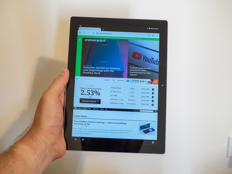
That design was filled with solid specs and features, too. Sure the Tegra X1 processor is old, and 3GB of RAM isn't enough nowadays. But the 34.2 Wh (about 9200 mAh) battery with 15W USB-C charging is still good, there's a headphone jack and stereo speakers, and a usable pair of cameras. The screen bezels are hilariously large by today's standards, but the 10.2-inch 2560x1800 panel actually looks great (though it's a bit dim) and was early in the game of moving to a very "tall" landscape aspect ratio instead of the old-school 16:10 look.
But using the Pixel C as a tablet didn't live up to the potential of all that hardware. Even the exquisite hardware design can't remove you from the fact that you're trying to use a 10-inch tablet running Android, and that means huge issues with app compatibility and an interface that just doesn't feel like it utilizes the screen size. Yes things have improved a bit in the latter category with tablets running Android 10, but the former is still a problem today — Android apps are mostly still bad on large tablets.
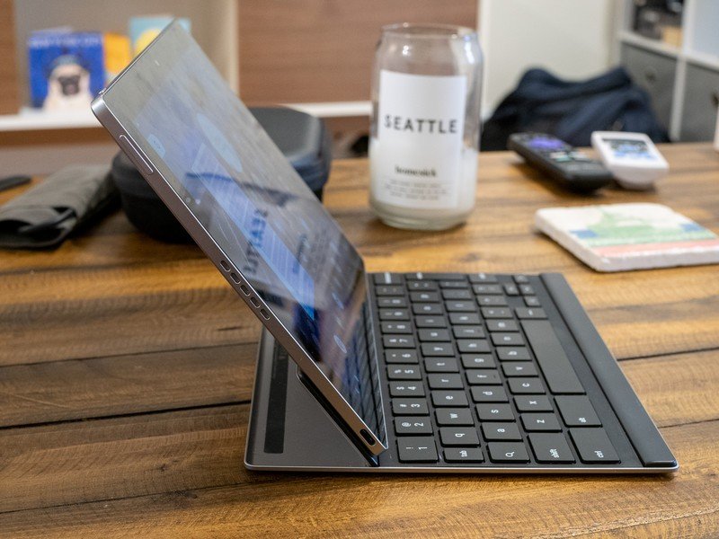
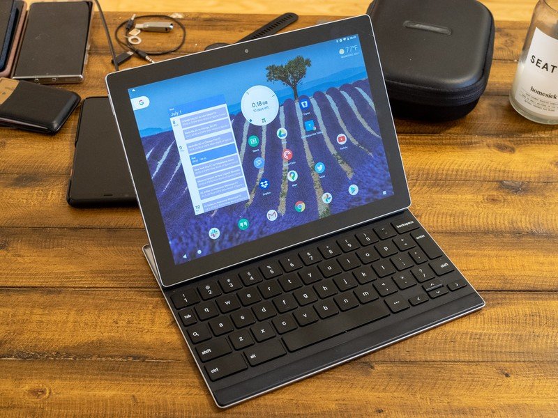
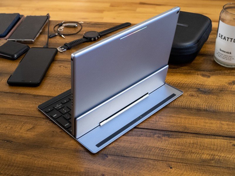
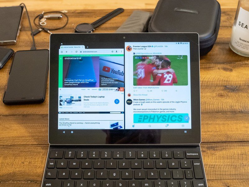
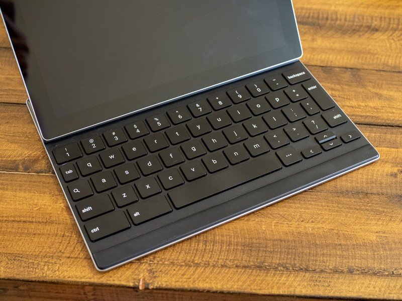
But that's what made the keyboard accessory so amazing. It took a so-so Android tablet and made it an incredible little Android laptop. The keyboard, made in the same great minimalist metal aesthetic, attaches to the tablet with incredibly strong magnets that immediately suck it into place with what feels like three times the force necessary. The hinge mechanism for adjusting the angle of the screen is contained in the keyboard, not the tablet, and is tight and infinitely adjustable. This design only works because the keyboard is Bluetooth, not using a pogo pin connector, and immediately pairs and connects every time you click the magnets together.
The metal keyboard accessory turned a so-so tablet into an amazing mini-laptop with tons of capability.
That large screen with big bezels and a tall aspect ratio ended up having a knock-on benefit of making the keyboard accessory much larger. So even with the complicated hinge and magnet area, there's still plenty of room to have full-sized keys with good spacing, as well as a nearly complete set of keys. There's enough weight in the keyboard base that the tablet doesn't feel top-heavy, even when typing in your lap. And there's even a little pad at the bottom for the screen to rest on that doubles as a pseudo palm rest.
Be an expert in 5 minutes
Get the latest news from Android Central, your trusted companion in the world of Android
In typical reviewer trope fashion, I wrote a majority of this piece on the Pixel C. And damnit, it still feels great today. It's a little mushy and arguably could have even less key travel and still be usable, but that's coming from someone who types on a MacBook Pro every day. Other than missing dedicated keys for brackets, I don't have a single issue typing thousands of words on this keyboard case — and I have written countless AC articles on this thing while traveling over the years. Very few tablet keyboards offer that level of comfort and usability.
This tablet and keyboard are so amazingly over-designed, I wish Google would re-release it.
And when you're done working on the Pixel C, the keyboard immediately becomes a protective cover, again utilizing very strong magnets to suck the screen face-down onto the keyboard. No need to have a portion of the keyboard that wraps around the tablet, or attaches in any other way — just plop it down, and it's fully contained just like a laptop. The tablet even wirelessly charges the keyboard while it's closed, so you'll never think about power — it just works. And when you're ready to use it again, the Google-sanctioned method of removing the face-down tablet with a twist of the top is ever-so-clever, if a bit unnerving at first.
A lot of these great design elements and features would later be replicated in plenty of other tablets, and you can of course find a much better overall experience today in the Galaxy Tab S6 and iPad Pro. But there's something about the look and feel of the Pixel C that still seems more desirable than those. And there are certainly still some aspects of the way the keyboard and tablet interact that haven't been replicated since — I'm dying to use it again today if only some of the Pixel C's specs were modernized.

It's so incredible that even now, nearly five years after it was released, I still want to pick up and use the Pixel C. The keyboard is still just as great to type on, the software is surprisingly quick, and though Android 8.1 feels old at this point, there are still plenty of things I love doing on it. It's a great little "weekend computer" for browsing, checking social networks, triaging a pile of email and doing the occasional bit of typing.
Sadly, the Pixel C's life came to an end rather fast for a device that was so beloved by those who had one. After receiving two major software updates, the Pixel C was outright discontinued just two years after it was released. And now, nearly five years after it launched, nothing better summarizes the Pixel C than what our own Phil Nickinson wrote in our original review of it back in 2015:
It's easy when reviewing a device to get distracted by what the product could have been, or what it maybe was supposed to have been, rather than what it actually is. And that distraction is even more apparent when it comes to the Google Pixel C, a beautiful but heavy 10-inch Android tablet that almost certainly isn't yet living up to its full potential.
The Pixel C's design was just overflowing with potential. Yet, it was never realized — not in the two years it was available, or in the years since. And like so many Google hardware products, few people ever had an opportunity to use a Pixel C. It never received a model refresh, and its spiritual successor, the Pixel Slate, was a total disaster. I felt at the time, as I still do today, that the Pixel C deserved a simple update with new components to give this hardware design more time to shine.
I would absolutely re-buy this exact tablet if it was only updated in a few small areas, with zero design changes. It'd easily live on if it simply had a 2020 spec sheet, and obviously would benefit from a touch of modernizing with a brighter display, fingerprint sensor and maybe some chassis lightening. But I wouldn't be picky — the Pixel C wasn't perfect before, and yet it was still my favorite tablet. And it'd be my favorite tablet all over again if it were re-released today.
Andrew was an Executive Editor, U.S. at Android Central between 2012 and 2020.


