Google Pixel 2 has a dark theme when using certain wallpapers
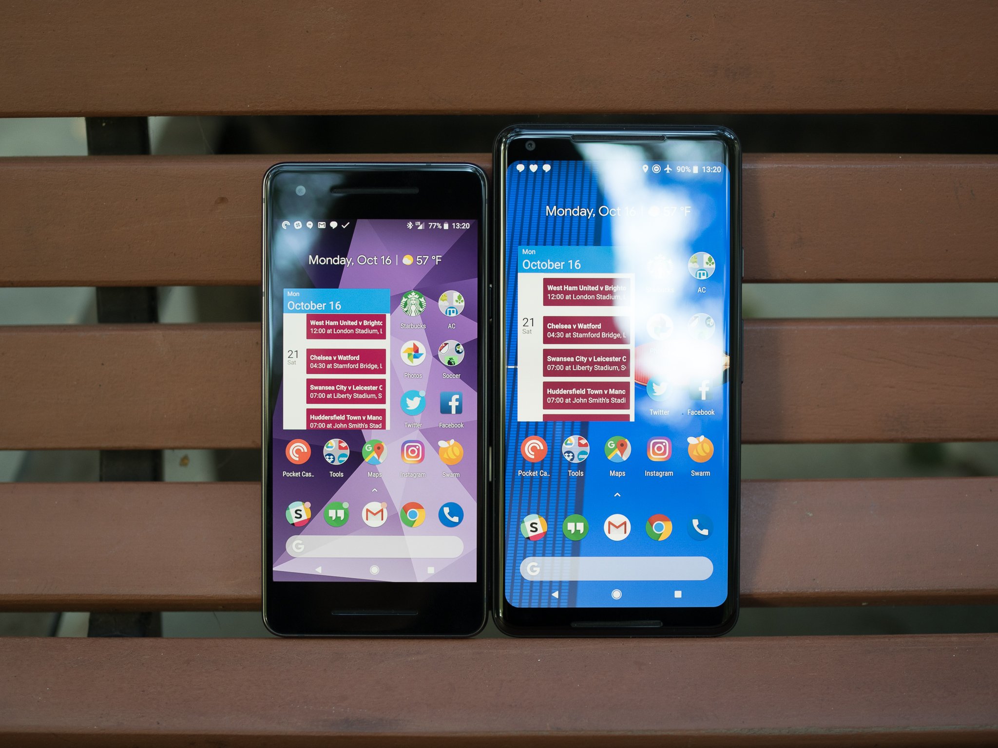
With Pixel 2 reviews now out and devices finally shipping to those with early preorders, we now have the chance to really get to know Google's latest and greatest. We covered quite of ground in our full review of the Pixel 2, but even so, there are still some subtleties that we either didn't have time to mention or haven't stumbled across yet.
One such feature is that of a somewhat hidden dark mode.
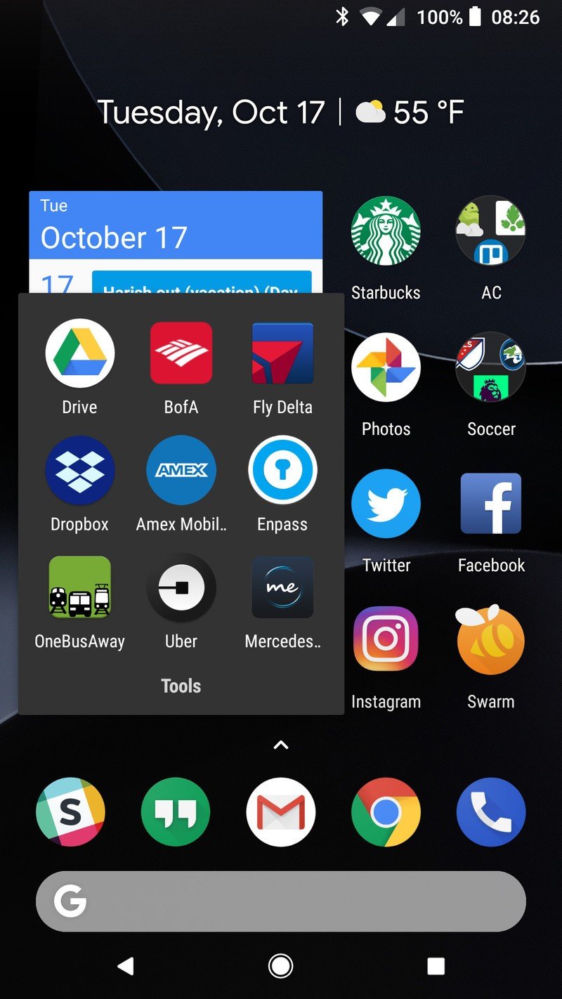
When selecting a wallpaper on the Pixel 2, choosing and applying one with mostly dark colors will darken certain elements of the UI so that they're much more fitting for the wallpaper you've selected.
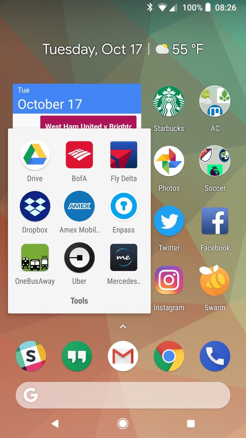
By default with Android 8.0 Oreo, app folders, the app drawer, and quick settings panel all feature stark white backgrounds. It's not a bad look by any means, but it can be a tad harsh on the eyes when it gets to be late at night.
Once you apply a dark enough wallpaper on the Pixel 2 or Pixel 2 XL, the background of app folders will change to a dark gray, the app drawer will become more transparent with a darkish hue, and the quick settings panel will go completely black – making good use of the phones' OLED display.
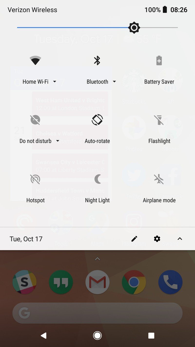
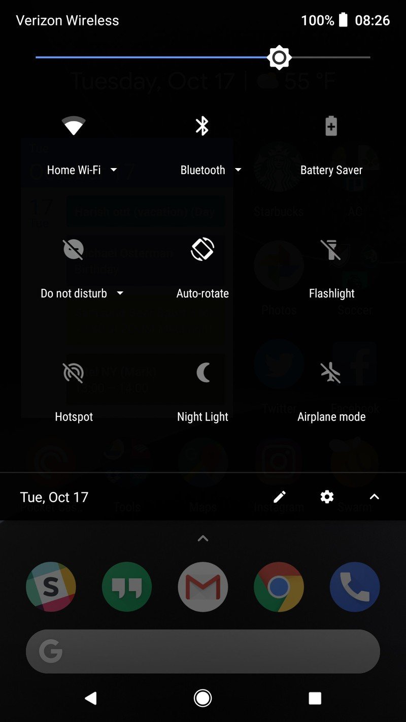
Although it's slightly annoying that this dark theme is limited on a per-wallpaper basis, it's still exciting to see this sort of theming available on Android right out of the box. We've been begging Google for something along these lines for ages now, and while this isn't a perfect implementation, it's a big step in the right direction.
Be an expert in 5 minutes
Get the latest news from Android Central, your trusted companion in the world of Android
Joe Maring was a Senior Editor for Android Central between 2017 and 2021. You can reach him on Twitter at @JoeMaring1.

