Google Photos just got a makeover that makes it easier to use on Android tablets and Chromebooks

What you need to know
- Google has updated the Photos app on Android to be more large-screen friendly.
- It now looks a lot more like the Photos web app and less like a stretched out phone app.
- With this update, the Photos app now works a lot better on Chromebooks as well.
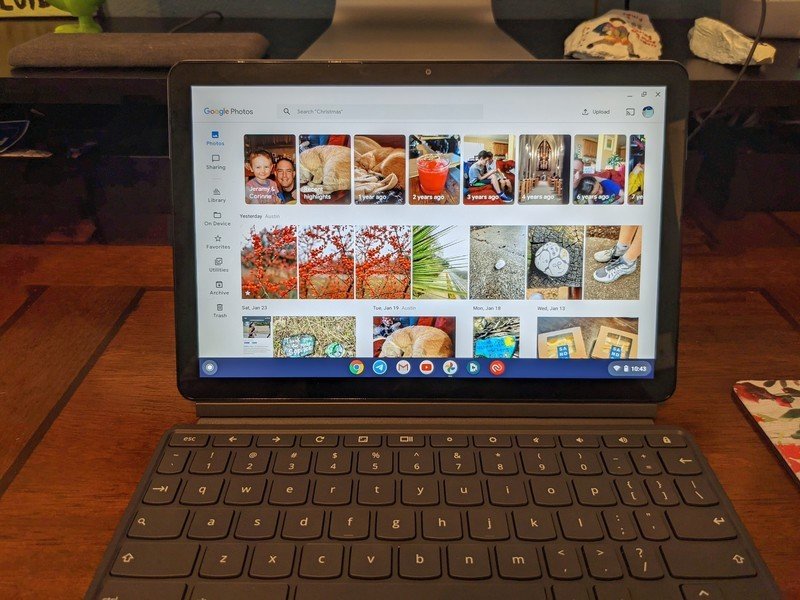
While Google makes powerful and well-designed apps for its Android platform, this only applies to phones for the most part. The majority of Google's apps on tablets and Chromebooks have been poorly designed when it comes to taking advantage of their larger screen real-estate. Google's started taking steps to fix that. Over the weekend, it's rolled out an update Photos app, reworking the interface so it makes a lot more sense on large screens.

Upon installing this update, you'll notice the new design heavily pulls from the Photos web app. There's now an omnipresent search bar for finding your pictures, just like on the web. Now gone are the bottom tab bars, replaced by a sidebar (again just like you'll find on the web). There are new options in that sidebar for quickly navigating to key points of interest, including on-device photos, your trash, your archive, and the utility page. Beyond that, the Explore and Sharing tabs remain. The main Gallery view also now looks a lot better and less like an afterthought, while Chromebooks have a prominent "Upload" button that opens the system Files app directly.
It's a change that's been long in the making. The Photos app does make a lot of sense for a tablet or a Chromebook, providing a larger canvas to view your pictures. Google taking this long to optimize it was always a black mark on the company's large screen efforts. Hopefully, more Google apps are similarly updated over the next few months. In the meantime, you can grab the Photos update from the Play Store if you haven't already.
Get the latest news from Android Central, your trusted companion in the world of Android

