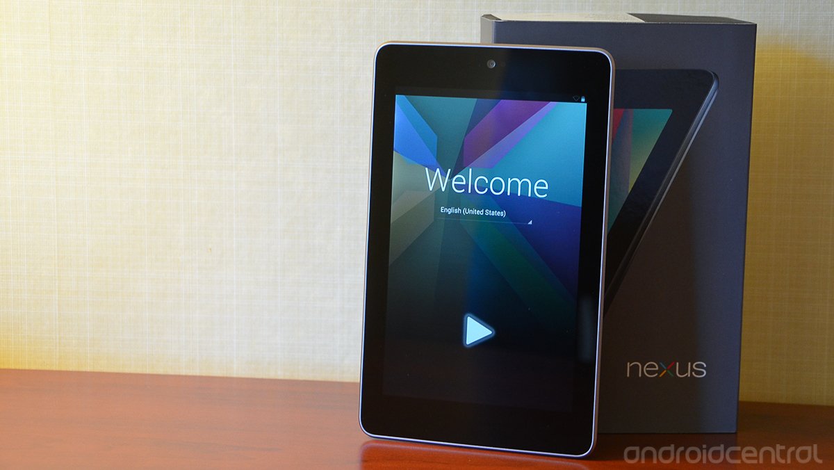
Google Nexus 7 hands-on and initial review

Meet the Google Nexus 7 -- the first Google-produced tablet, the first device with Android 4.1 Jelly Bean, the first to serve more as a direct portal to Google Play (as opposed to a tablet that just runs apps), Google's first major push into the magazine and television market, the first device to ship with Chrome as its default browser ... and that's just the start of the superlatives.
But is the Nexus 7 just another Android tablet? Can it really beat the Amazon Kindle Fire for content consumption? We'll answer those questions in the coming weeks. For now, hit the break for our initial look at Google's 7-inch tablet.
Let's just get this out of the way: Yes. The Nexus 7 is in direct competition with the Amazon Kindle Fire, and to a lesser extent the Barnes & Noble Nook Tablet. Both of those are (relatively) low-cost devices with content consumption as their main focus. They run Android apps, too, make no mistake about it. But unlike traditional Android tablets, you're not just presented with a bit display, a bunch of icons, and sent merrily on your way.
Boot the Nexus 7 for the first time and you can tell that Google's been hard at work. Ice Cream Sandwich has been refined even further, more slick and sleek than ever in its iconography. You go through the usual setup motions -- wifi, location services, your Google account -- and then find yourself at a home screen that's plenty familiar, but at the same time you can tell Google's found a new purpose with the Nexus 7.

The main homescreen is dominated by a "My Library" widget. Google's preloaded some magazines and books and music on the tablet for you, and that's what you'll see. And it's also what makes it plenty apparent that Google Play is now more important than ever to Google and to Android. You don't see a calendar widget. There's no cool analog clock. It's "Here's what you've bought, and here's where to access it."
Jelly Bean's ditched the traditional Android tablet paradigm of the System Bar and Action Bar and reverted to more of a phone interface. You've got the three on-screen buttons at the bottom, and a thin notification bar up top. And it works just fine. Jelly Bean's new notification panel fits the 7-inch display (which, by the way, has a 1280x800 resolution)
We're back and forth on whether we'll miss having a rear-facing camera. While the idea of shooting with tablets is ridiculous on spec and even more so when you see it happen, we'd still rather have a feature and not use it than need it and not have it. The front of the display has a 1.2MP front-facing camera.
Be an expert in 5 minutes
Get the latest news from Android Central, your trusted companion in the world of Android
The power button and volume rocker are on the right-hand bezel, where you'd probably expect them to be. Down below is the 3.5mm headphone jack and micro-USB port.
Other specs of note:
- Android 4.1 Jelly Bean
- NVIDIA Tegra 3 T30L quad-core processor at 1.2 GHz
- 4325 mAh battery for 8 hours of movie playback time, 10 hours of reading and web browsing, 50 hours of audio playback.
- WIfi b/g/n
- Wifi Direct
- Bluetooth
- 1GB RAM
- 8GB/16GB ROM
- Dimensions: 198.5x120x10.45mm
- Weight: 340 grams
So that's that. We're going to put the Nexus 7 through its paces in the coming weeks. But one of the crucial factors to watch for is how Google markets the tablet. Amazon has the advantage of already being a massive online retailer, with an above average (and reasonably priced) tablet. Barns & Noble has has brick-and-mortar stores, with actual human help to walk you through things with the Nook Tablet. Will Google be able to persuade tablet neophytes that the Nexus 7 and Google Play are the way to go for online content consumption? We shall see.


