Google Messages is picking up a Gmail-style navigation drawer in beta

What you need to know
- Google starts rolling out an old-school navigation drawer to the beta version of Messages.
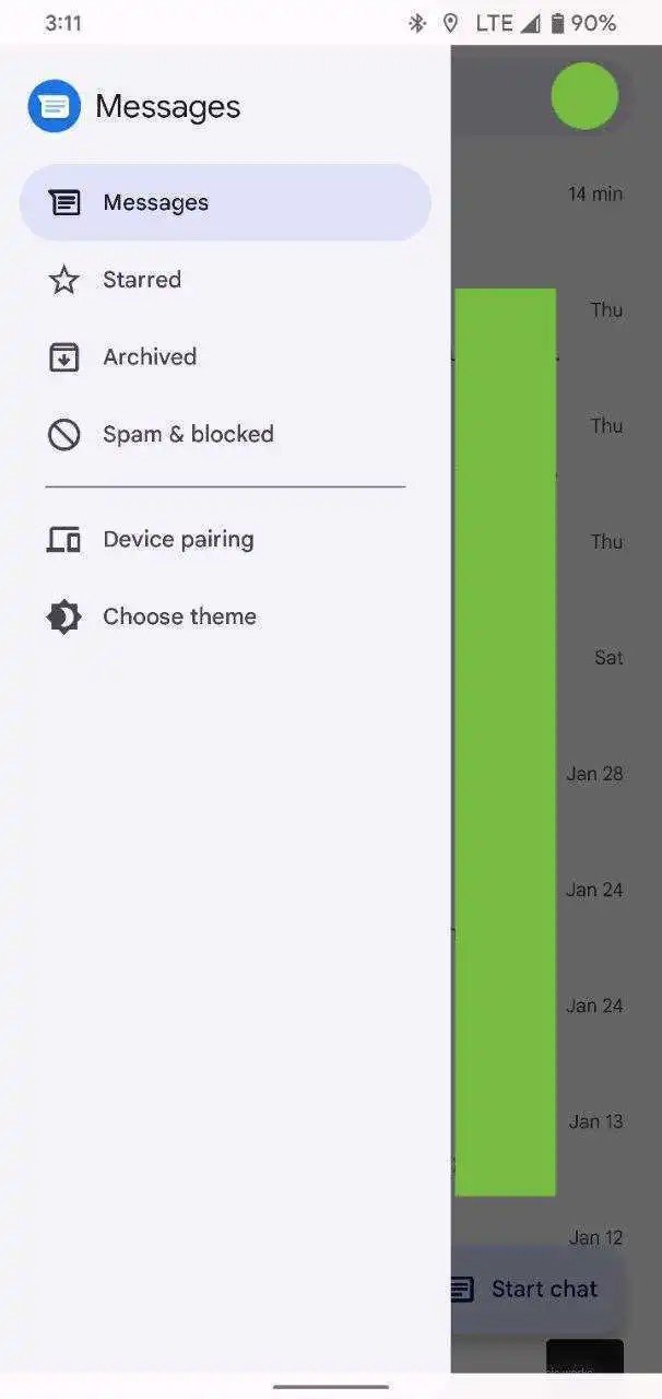
- The hamburger menu is located in the app's top left corner and contains all of the basic options such as "Messages," "Starred," "Archived," and "Spam & blocked."
- Messages is also adding support for Google Photos in an apparent shift away from MMS.
Google Messages is getting a visual makeover with a Gmail-inspired navigation drawer that improves the messaging experience on Android phones, at least for those who are part of its beta program.
The new design began appearing in the latest beta version of Messages (messages.android_20220128_02_RC00.phone.openbeta_dynamic) a few days after 9to5Google discovered the changes. The same site has now spotted the feature's beta testing, and it brings an old-school hamburger menu, as expected.
The three-dot menu that was previously located in the top right corner of the app has been removed in the new design. Instead, Messages has replaced that feature with a hamburger menu on the opposite side of the app. It contains the same essential options, such as "Messages," "Starred," "Archived," and "Spam & blocked." In a separate section at the bottom of the menu, you'll see the theme and device pairing options.


In the current version of Messages, all of these options are located within the three-dot menu, making that section a bit crowded. If you prefer Google's old way of organizing things, the switch to navigation drawer may be appealing. It's an interesting change seeing as Google recently got rid of this type of interface, most notably from the Play Store in favor of tabs.
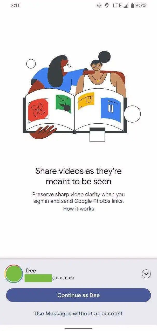
Alongside the retro navigation menu is the arrival of Google Photos integration with Messages, which first popped up in November of last year. This feature allows you to share videos in higher quality than MMS via the app.
In order to do that, you'll need to sign in to your Google account. It makes sense, therefore, for Google to replace the three-dot menu with an account switcher in the top-right corner to indicate your synced Photos account.
The latest changes are available only to a limited set of users for now, but a wider rollout shouldn't be far-off.
Be an expert in 5 minutes
Get the latest news from Android Central, your trusted companion in the world of Android

Jay Bonggolto always keeps a nose for news. He has been writing about consumer tech and apps for as long as he can remember, and he has used a variety of Android phones since falling in love with Jelly Bean. Send him a direct message via Twitter or LinkedIn.
