Google Home app gets a UI refresh and new Cast controls with version 2.15
What you need to know
- The Google Home app is getting some UI changes with the new 2.15 version of the app.
- The add devices button has been relocated, there is now an account switcher, and the Discover feed cards have a new design.
- Cast media controls have also received a massive UI refresh, but it is currently rolling out server-side and may not be available to all users yet.
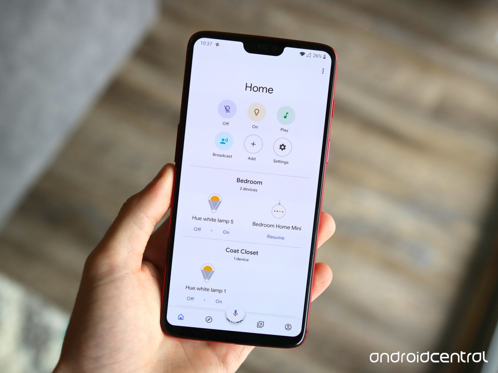
The Google Home app has a new simpler design rolling out with version 2.15. With this new UI, Google has cleaned up a lot of the clutter and streamlines the app quite a bit.
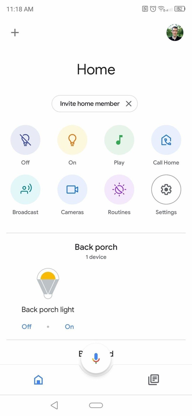
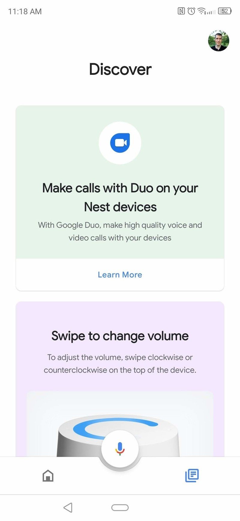
For starters, the add new device button has been relocated to the top left corner of the app, while in the right corner the three-dot menu button has been replaced with an account switcher. Similar to the account switcher in many of Google's latest app updates, it now allows you to swap accounts with a quick swipe down over your profile photo.

Source: Android Central
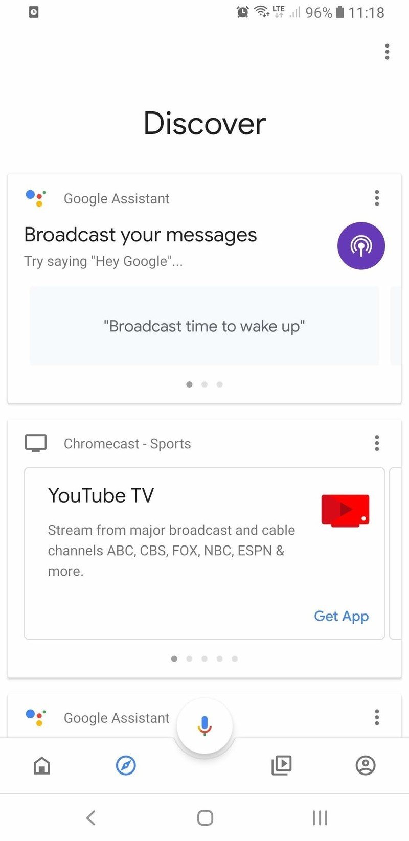
The bottom of the Home app now looks much different as Google has now cleaned up much of the clutter by consolidating the previous four-button layout down to only two buttons. Going forward, instead of seeing buttons for Home, Discover, Browse, and Account, there is now only Home and Discover.
The Discover section of the app has also received a refreshed UI, starting with the font at the top which has been changed and is now in bold. Next, the cards have been redesigned to be larger with rounded corners and feature a colorful background.
Source: Android Central
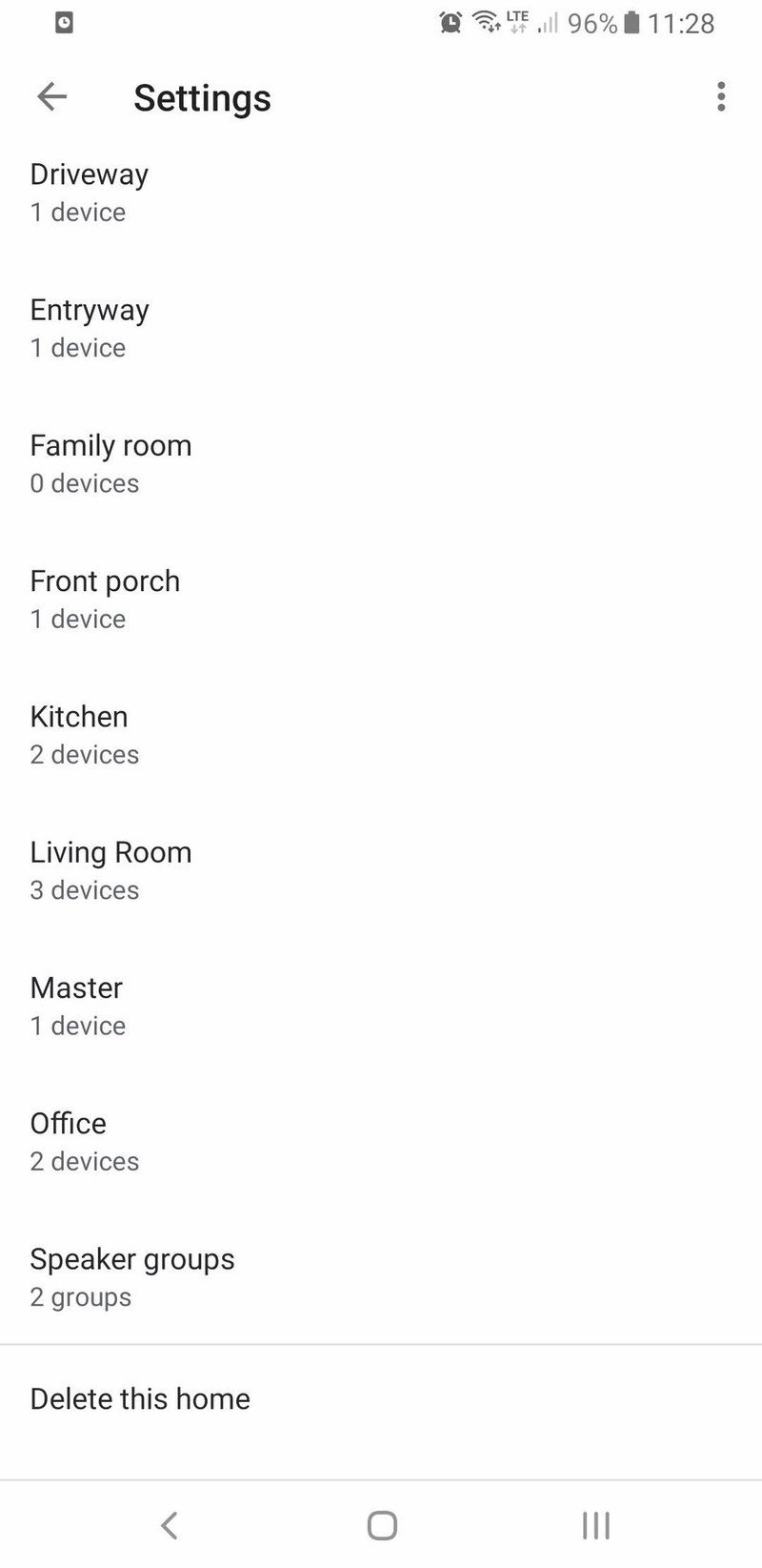
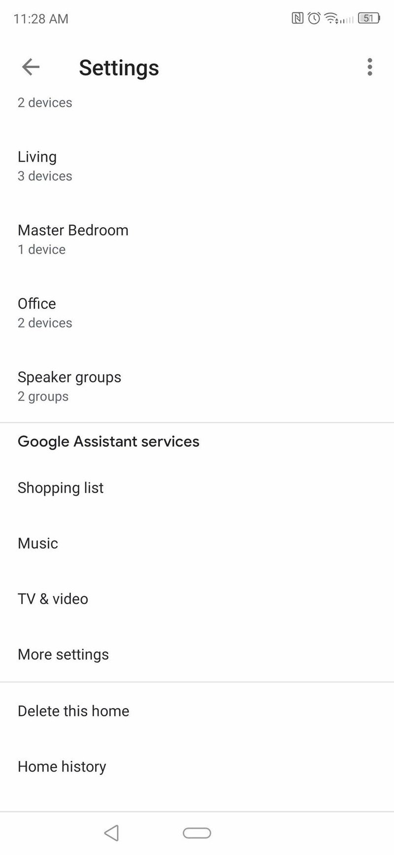
There are also some new additions to the Settings menu. If you scroll all the way to the bottom, there is now a section for Google Assistant services. From here, you'll be able to manage your Shopping list and link your preferred music and video services.
Be an expert in 5 minutes
Get the latest news from Android Central, your trusted companion in the world of Android
Source: Android Central
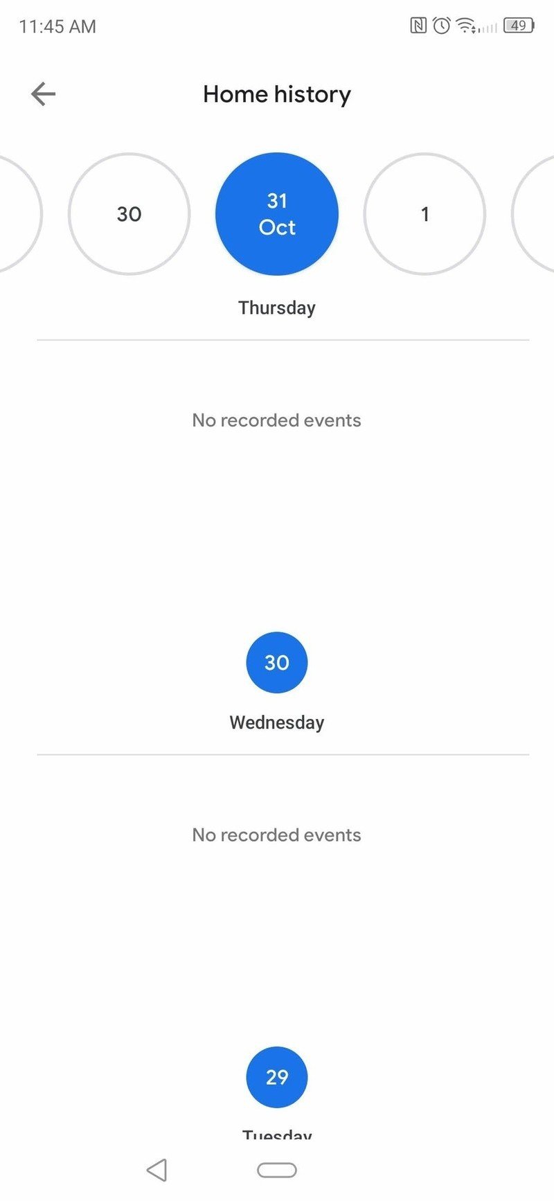
More importantly for Nest users, this is where you'll be able to view a history of events triggered by your Nest cam. If you don't own one like myself, then you'll simply see "No recorded events" when checking this section. Events should also show up in the Discover section as they happen.
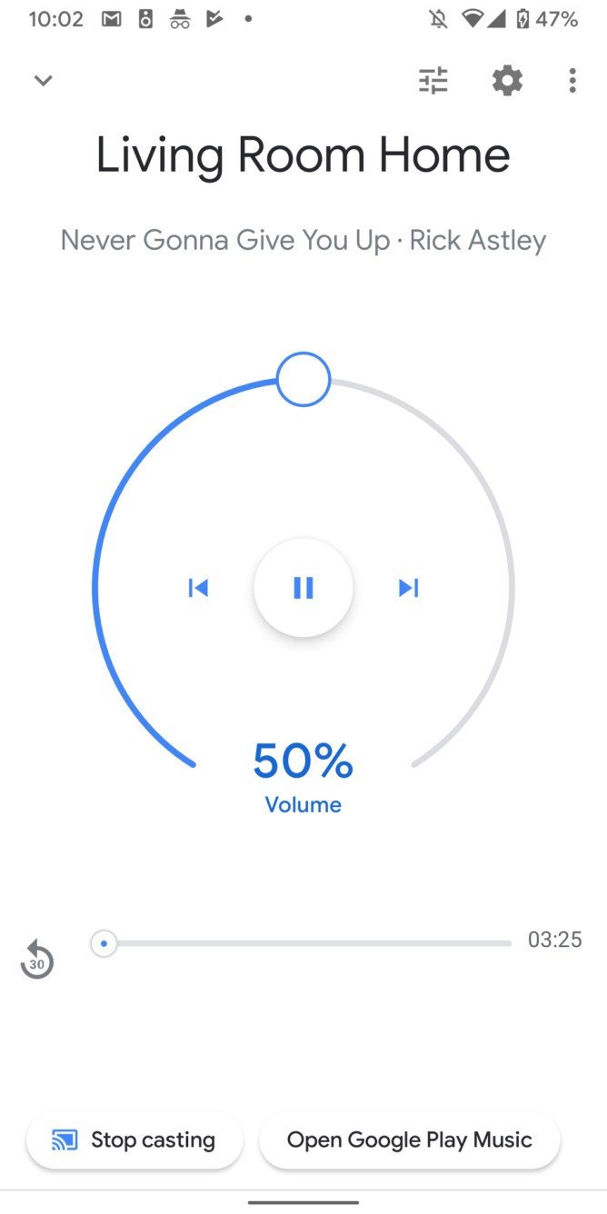
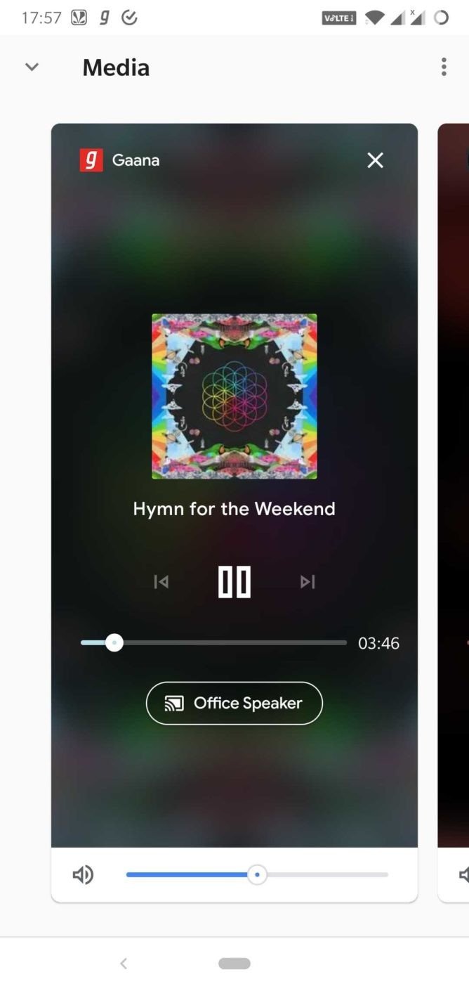
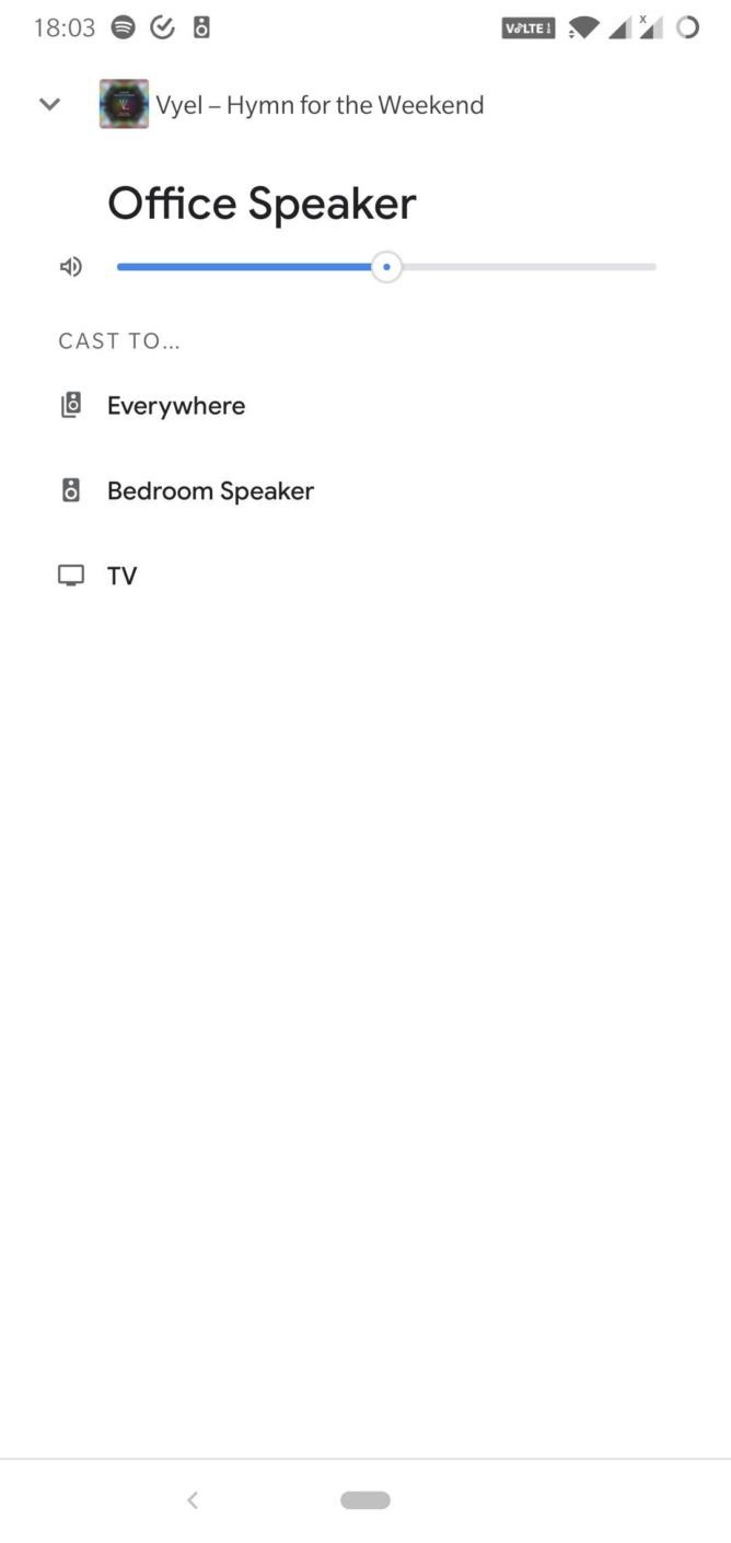
Finally, the Cast media controls have also been updated, but appear to be rolling out on the server-side, so not all users will have access to them yet. If you are one of the lucky ones with the new controls, the Play button on the main page of the Google Home app will now be renamed to Media.
Source: Android Police
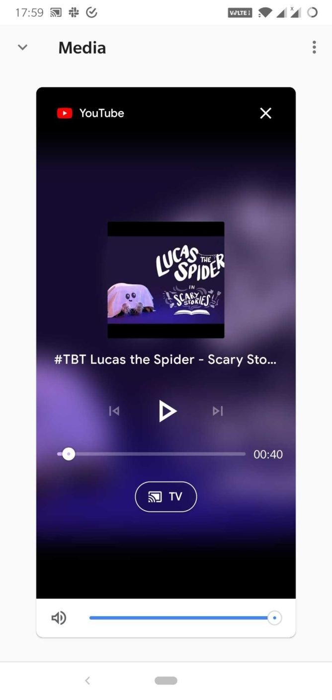
As you can see, the Cast media controls have undergone a massive overhaul here. Instead of the previous white background with controls, there is now a blurred background with album art and media controls, along with a new volume slider at the bottom.
Source: Android Police
It also features a new card layout, allowing you to swipe to the side and view media being cast on different devices on your network. This includes all of your Cast-enabled speakers, displays, and Android TVs.
Additionally, the updated UI also gives you access to transferring media to other devices — a feature Google recently introduced that previously was only accessible via a voice command.
