Hey Google, don't just change fundamental parts of my launcher without warning
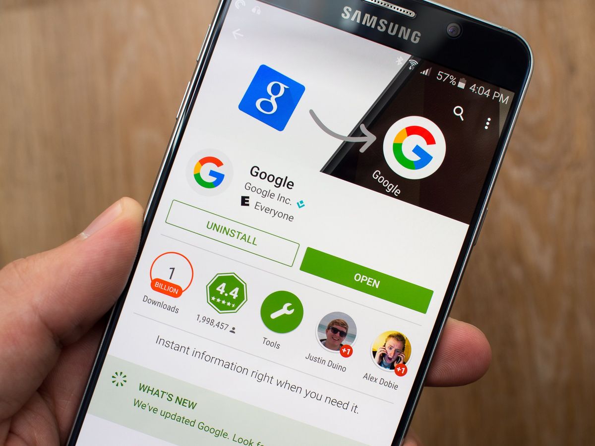
Since it became available I've been using the Google Now Launcher on pretty much every phone. Though it's of course pre-loaded on Nexuses and now Motorola phones, I even go out of my way to install it on my Galaxy Note 5 and Shield Tablet. It's a great launcher — but seriously, why can't Google just communicate when it's going to dramatically change in function and appearance through an app update?
I, like many people, often leave automatic updates from the Play Store turned on — out of convenience of keeping several devices up-to-date more than anything. And when I don't have automatic updates on, I'll just hop into the Play Store and hit the "Update all" button when there are several updates pending to get everything downloading at once.
I gave myself every opportunity to think this was my fault. It wasn't.
Today I unlock my phone and open the app drawer as I do several times a day, and all of a sudden the launcher I knew and was completely familiar with no longer worked the way it did before. The app drawer now scrolls vertically (not everyone is a fan), and has a weird frequently-used app listing and a search bar at the top. Wait, I didn't update the Google Now Launcher today, did I? I check the Play Store and nope, no update there — it hasn't been updated since August 1. What the heck happened?
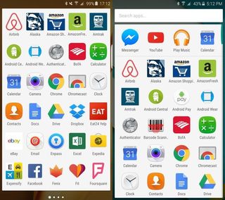
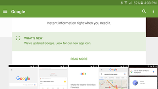
Oh, right, this is Google we're talking about so it doesn't have to make sense. A small update to the Google search app, which any rational person would think doesn't influence their home screen, changed a fundamental function and design of the app drawer of my launcher. Alright, maybe it had a big changelog in the Play Store explaining this and I just missed it ... check the app listing: "WHAT'S NEW: We've updated Google. Look for our new app icon." Well, that's been the changelog for weeks now since Google changed its logo.
So Google pushed out an update to the Google search app, to folks with automatic updates turned on, that had a major material change to the way a different app works — and in the end, there was no notification, no splash page, no changelog or anything of the sort. I, as a long-time editor at an Android news site, was genuinely confused by this whole situation. The Google Now Launcher has 10 to 50 million installs, so I'm sure I'm not the only one who was confused today.
Why the heck would Google think this is the right thing to do to the rest of the "normal" people out there? I have no idea ... because this is precisely the wrong way to handle an app update.
Why the heck would Google think this is the right way to do an update?
This specific situation is frustrating because we all interact with our launchers dozens (hundreds?) of times a day, and randomly changing things without notice is really noticeable. But it's not really acceptable in any of Google's other apps when it does the same thing. Is it really that hard to just have an up-to-date changelog in the Play Store? No, not really. Is it tough to do a quick "what's new" pop-up or splash page when you open the updated app? A little harder, but no, not really. But any of these things would go a long way to actually informing users of what's happening when things change.
Be an expert in 5 minutes
Get the latest news from Android Central, your trusted companion in the world of Android
Please, Google, don't just change my launcher without any warning or notification. I love new designs and new features, but I really hate being confused because my phone somewhat-randomly changed without my prior knowledge. This is a solvable problem.
Andrew was an Executive Editor, U.S. at Android Central between 2012 and 2020.


