Google Chat update cleans up its crowded messaging interface

Update, Dec 11 (2:28 p.m. ET): Google has officially announced the new Chat interface.
What you need to know
- The Google Chat app picks up a fresh UI for its bottom bar.
- Google Chat now hides its shortcuts behind a single button to free up some screen space.
- The latest change appears to be rolling out gradually to users.
Google has begun to roll out a new design for the bottom bar of the Google Chat app on Android, making the interface much cleaner than the previous version.
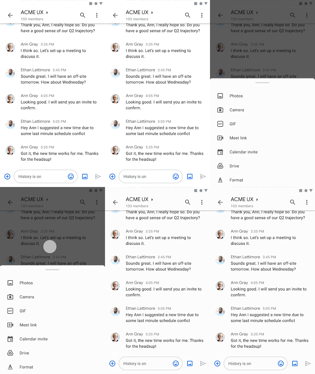
Google Chat's previously crowded bottom bar has now been tweaked with a new UI that frees up some screen real estate, as spotted by Mishaal Rahman. The app's shortcuts for Gallery, Camera, Drive, Google Meet, and Calendar are now hidden beneath the new plus button.
Looks like a new UI is rolling out for the bottom bar in Google Chat on mobile.
Left: Old
Middle & right: New pic.twitter.com/8UppM0e6QXLooks like a new UI is rolling out for the bottom bar in Google Chat on mobile.
Left: Old
Middle & right: New pic.twitter.com/8UppM0e6QX— Mishaal Rahman (@MishaalRahman) November 30, 2021November 30, 2021
Prior to this change, those shortcuts appeared in the text box, just below the area where you type your message. While those shortcuts have been consolidated into a single area, the redesigned bottom bar still includes the frequently used image button, which allows you to quickly attach photos to your chat. It is located directly next to the send button.
The most recent change reflects Google's increased focus on the successor to Hangouts, which is being phased out gradually. Google began a "forced" migration of free Hangouts users to Chat a few months ago in preparation for the shutdown of the legacy service. Since early 2020, Google has been transitioning Hangouts users to Chat, so the move was not entirely unexpected.
According to XDA Developers, the new modification is apparently available in the latest version of the Chat app (v2021.10.31.408397499). However, the update has yet to reach all modern Android phones, so the change appears to be a test for the time being.
Update, Dec 11 (2:28 p.m. ET) ― Google Chat officially rolls out its redesigned interface
Google Chat now has a redesigned interface for sending messages and media files.
Be an expert in 5 minutes
Get the latest news from Android Central, your trusted companion in the world of Android

The new update simplifies the interface, which was previously cluttered with separate buttons for emoji, media upload, GIFs, Google Drive attachment, Meet button, and other features.
Those options are now hidden behind a single plus button. When you hover your mouse over the "+" icon, you will see shortcuts to other Workspace services.
Google said "these options vary by context, and can include Drive, Docs, Sheets, Slides, Photos, and Calendar."
The latest change is available on the web and Android phones for all Workspace customers.

Jay Bonggolto always keeps a nose for news. He has been writing about consumer tech and apps for as long as he can remember, and he has used a variety of Android phones since falling in love with Jelly Bean. Send him a direct message via Twitter or LinkedIn.
