Google Calendar is soon getting a Material Design overhaul on the desktop
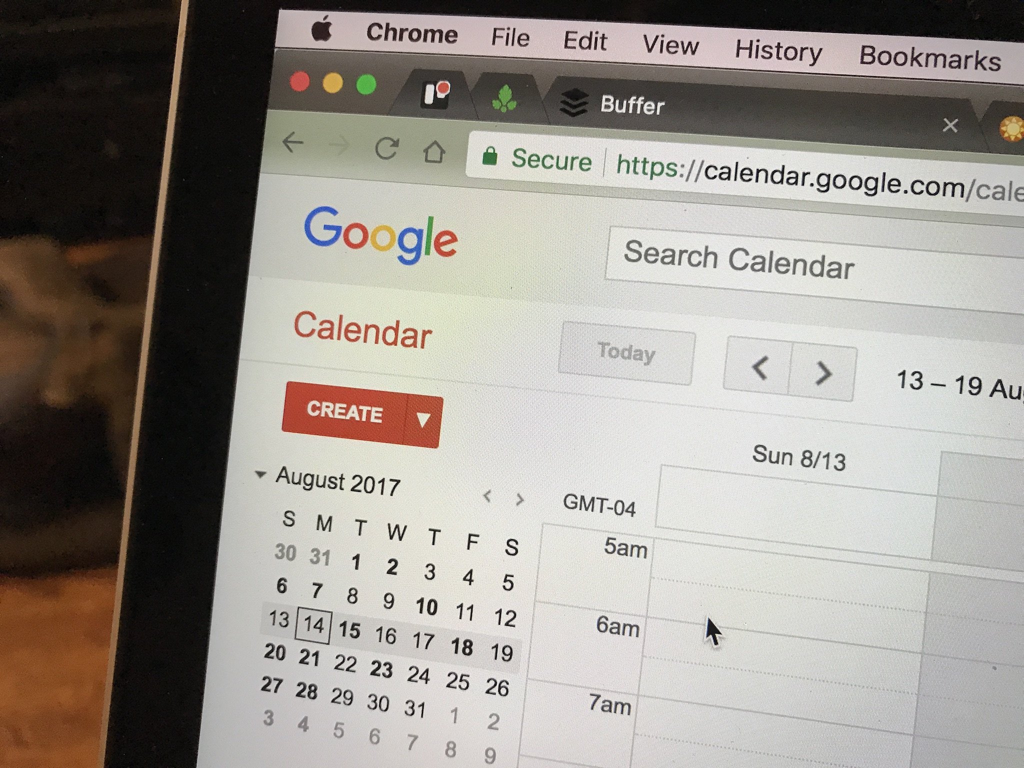
The Google Calendar app for Android first received Material Design way back in 2014, but the same cannot be said of the website. It has been over three years since Google first introduced the Material Design language, but the company has yet to roll it out to its web properties such as Gmail and Calendar.
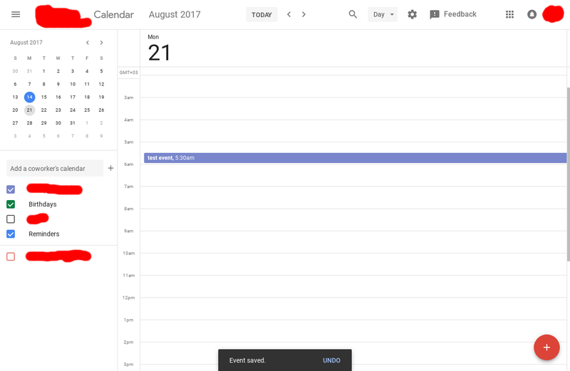
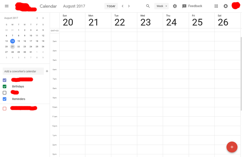
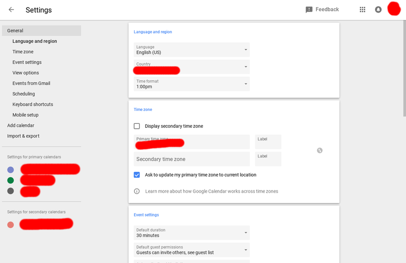
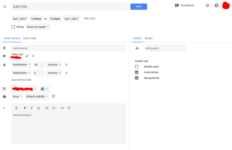
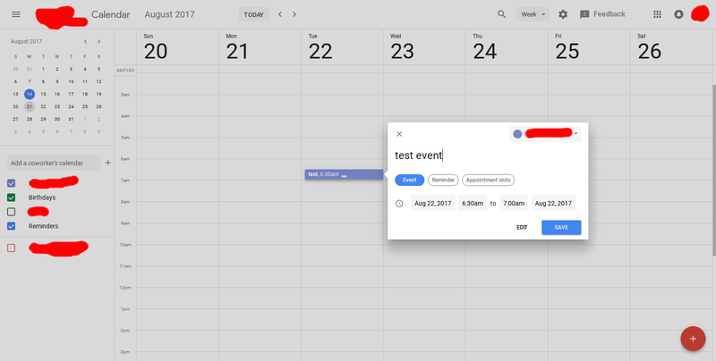
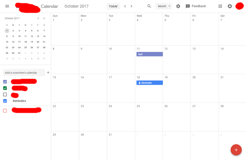
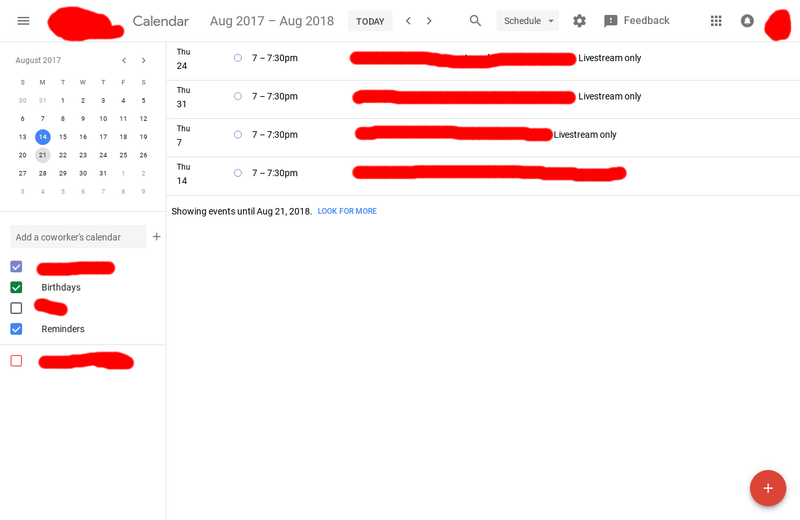
That will soon change, at least for Calendar. Reddit user xDawnut has shared images over the new UI, released as part of the Trusted Tester program. The new layout looks very similar to the Google Calendar Android application, as one may expect. There are new designs for day, week, month and list view as well as the settings menu.
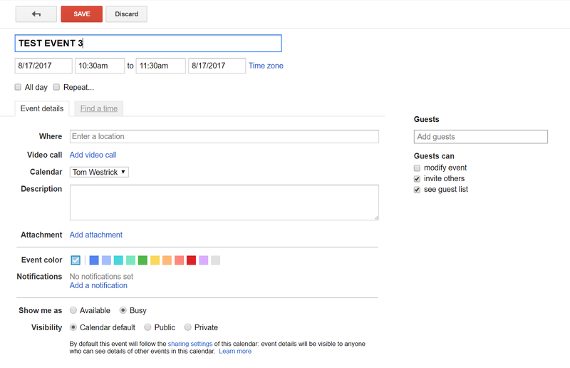
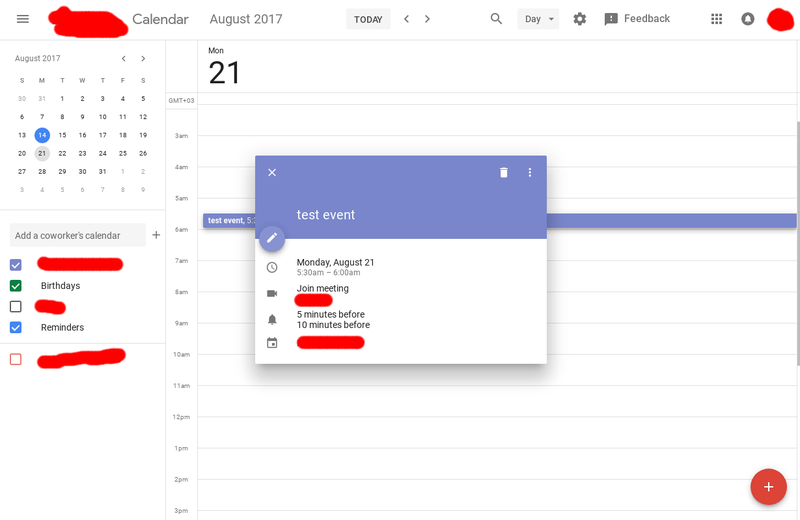
The current (left) and Material (right) New Event pages
The differences between the old and new design (as seen above) are...drastic. I'm not sure why it took Google this long to get the Calendar web site updated, but it's good that it's almost complete. Most importantly, it seems Google hasn't deprecated any functionality while rolling out this new design. Here is a gallery of the new design:

Looking forward to the design improvements to Google Calendar? Let us know down below!
Be an expert in 5 minutes
Get the latest news from Android Central, your trusted companion in the world of Android

