Google Calculator v7.5 updated with new Material Theme UI
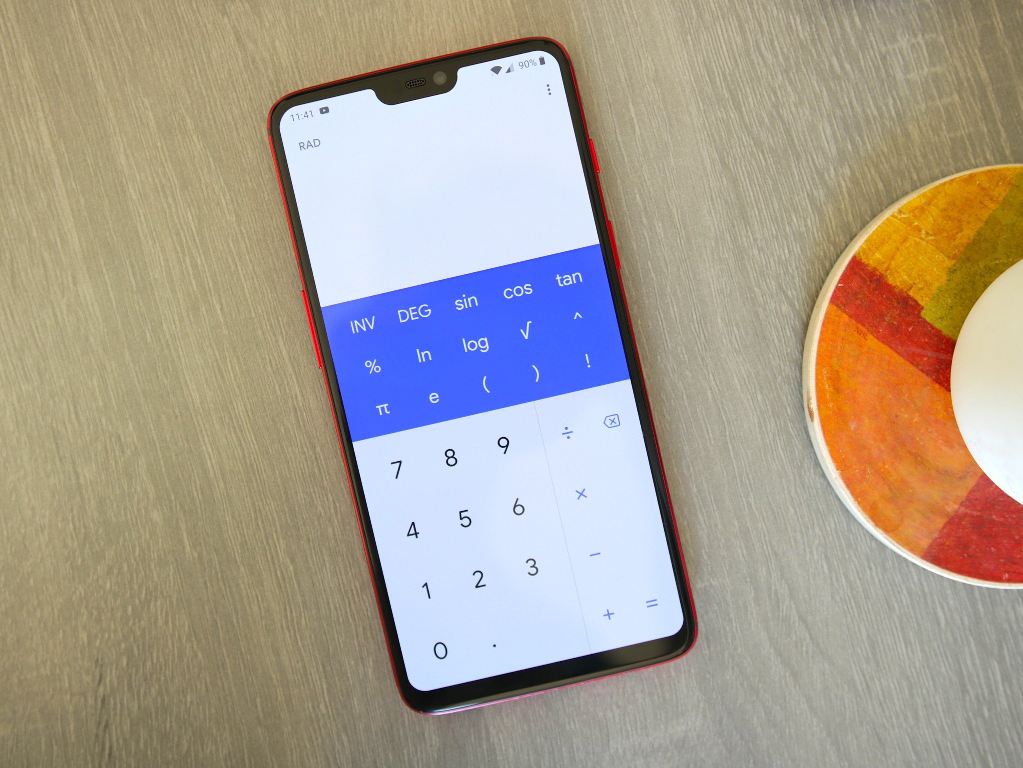
If you've been following our coverage over the last few weeks, you'll know that Google's been updating a few of its core apps to adopt its new Material Theme UI. Following in the footsteps of Android Messages, Contacts, and more, the latest app to receive this visual overhaul is Google Calculator.
Similar to those previous app updates, you won't find any functional changes in Calculator v7.5. Instead, this update is focused purely on cosmetic tweaks. So, what exactly is new?
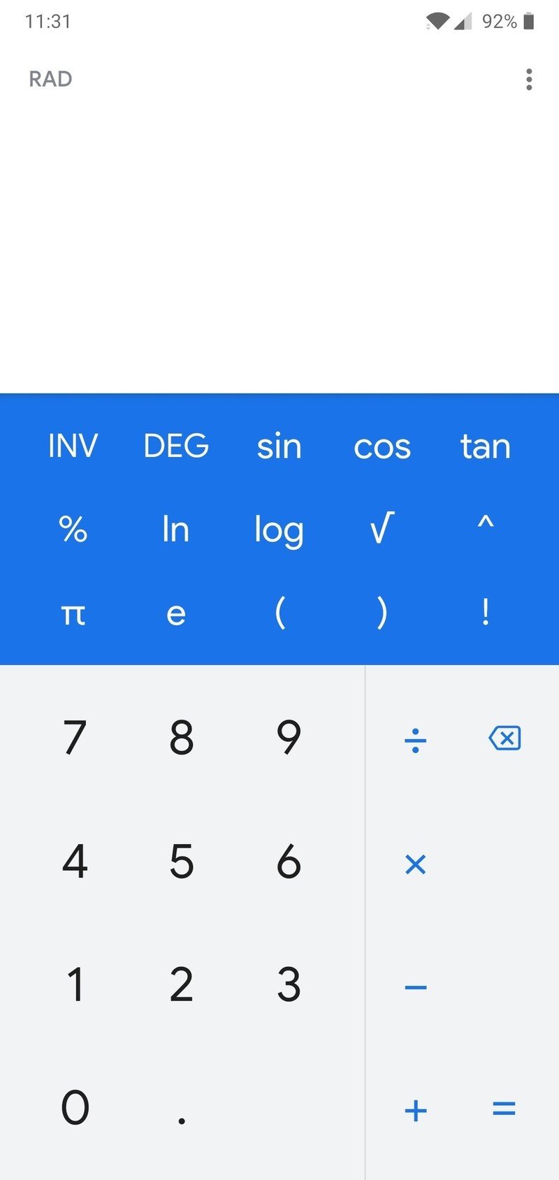
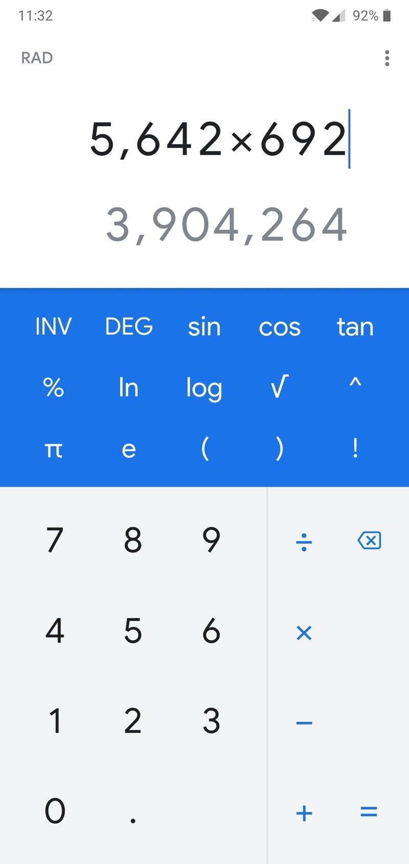
- The gray number pad is now white
- Slide-out menu is a deeper shade of blue
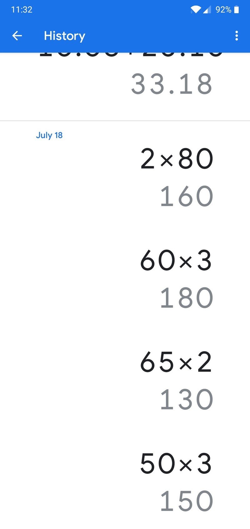
- Google Sans font has arrived
- The 0 and . buttons have switched places
In addition to the above changes, I also noticed that Google Calculator on my OnePlus 6 now shows the slide-out menu from the right permanently at the top of my screen above the number pad. I found this on both versions 7.5 and 7.4 and Andrew also has the new placement on his Galaxy Note 9.
What do you think about Google Calculator's new look?
Download: Google Calculator (free)
Be an expert in 5 minutes
Get the latest news from Android Central, your trusted companion in the world of Android
Joe Maring was a Senior Editor for Android Central between 2017 and 2021. You can reach him on Twitter at @JoeMaring1.

