Google redesigns Android brand for first time since 2014, bringing new colors and robot head

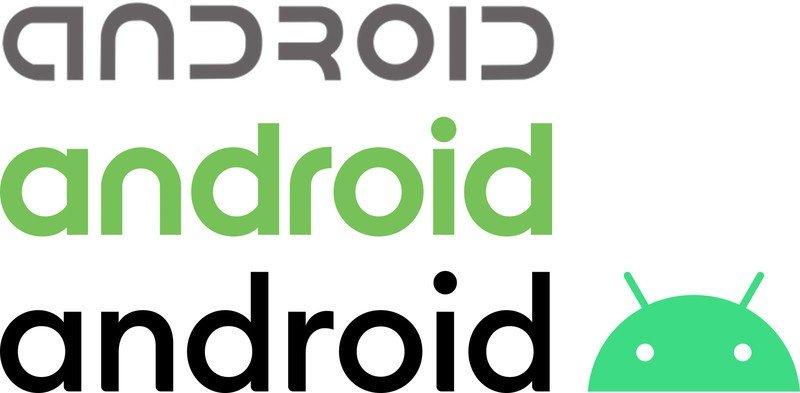
Google has just unveiled the latest version of the Android brand, marking the third official design under its tutelage and the first change since 2014. The new branding changes the look of the "Android" wordmark, incorporates a new palette of available colors, and officially kills off the full "bugdroid" robot in favor of incorporating just its head into the official logo.
At first glance, the rebrand looks subtle; and well, it is. But that doesn't mean it's lacking thought. And there's quite a bit more here than you would initially notice.

You'll no longer see the "Android" wordmark without the robot head somewhere adjacent.
Here's the short version: the "android" wordmark has thinned out, added stems and selectively rounded some corners. It's still lower-case, and substantially similar to the last redesign from 2014. More evolution than revolution, but it's definitely a change.
More importantly, Google has made a permanent addition to the wordmark: the Android name will now always be accompanied by the bugdroid robot head. You'll no longer see the wordmark without the head somewhere adjacent, be it directly to the right (as shown above), directly above (shown below) or somewhere in the viscinity if put in a larger branding context.

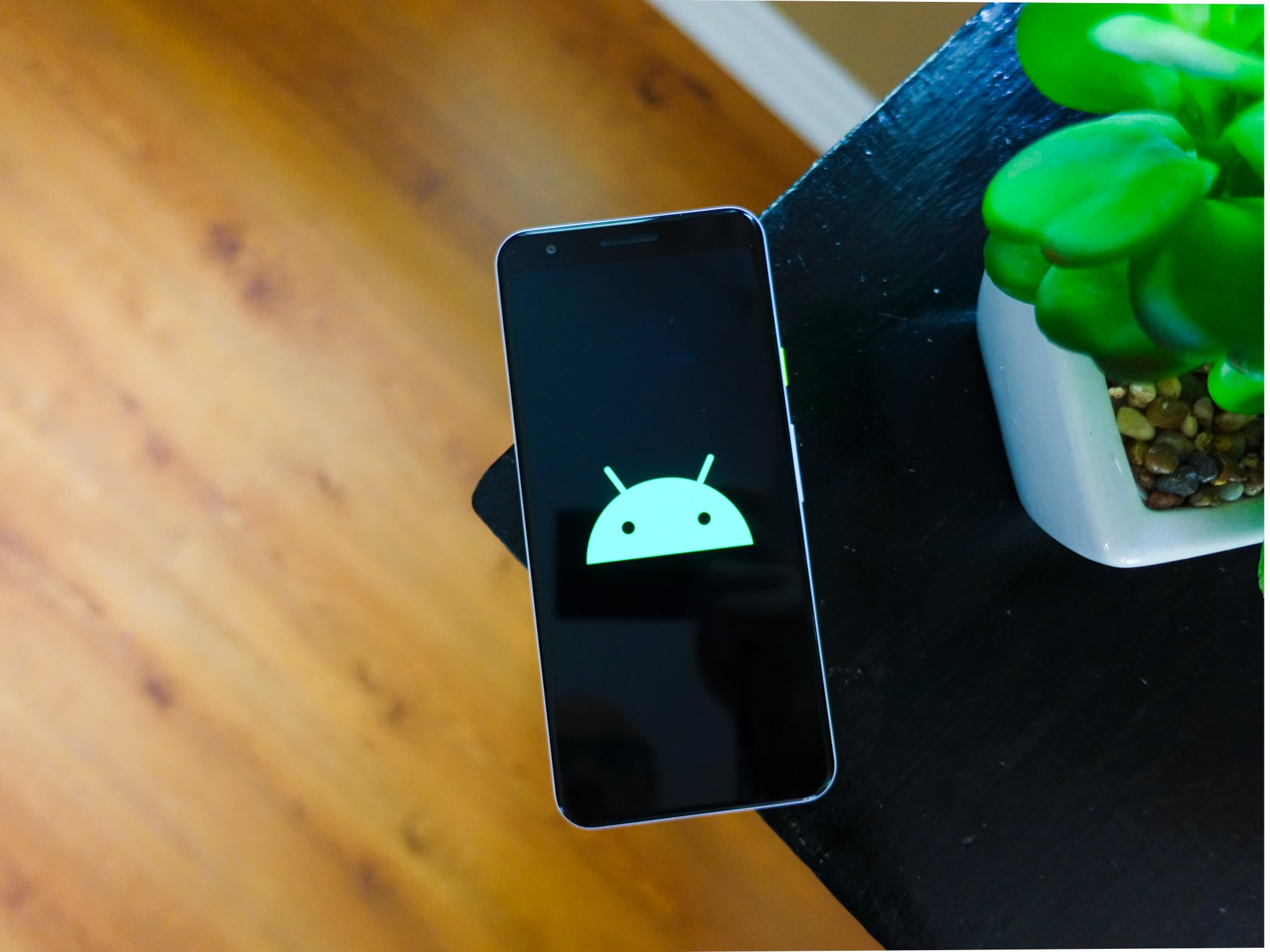
And that's significant, because the head is the only part of the robot that remains in this redesign. Yes, the robot's body is gone for good.
Now that the robot is going to show up everywhere as a permanent fixture of the Android brand, it's been reduced to just a head to fit more seamlessly in a logo context. In the process, the head received tweaks to its curve radius, as well as eye and antenna placements, which are then matched in the curves and placement of the "android" letters beside it. Together, it works well and feels like a cohesive unit.

Because the body is now gone, Google is making the Android head more expressive and anthropomorphic. Much like we saw with the last couple Android releases, you'll likely see the Android head with eyes and antennas in different positions to evoke different emotions. Google intends to be extra playful with the robot head to compensate for no longer having the whole body to move around. When I met with members of Google's design team prior to the announcement they showed several ideas they were working on to bring the robot head to even more places both digitally, in branding and marketing, and physically, such as around the Google campus.
Be an expert in 5 minutes
Get the latest news from Android Central, your trusted companion in the world of Android
For those who still wish to use the full robot, Google keeping the previous brand's assets available under the same Creative Commons license as before — so we're bound to still see interesting uses for the old version of the full robot for years to come. The distinction here is that there's no new version of the full robot with the new color scheme; it's been reduced to a head as part of the new logo.

The canonical version of the new Android logo has letters in black (or white for contrast) and robot head in green, but Google is expanding the brand's possibilities with a new color palette that can be applied to both parts. The entire palette is based around the new "Android green," which as you can see is a bit more muted with less yellow in it. Sitting alongside the new green is a secondary blue and navy, as well as tertiary orange, chartreuse and light blue.

The new color palette gives the brand flexibility to fit more appropriately in many different scenarios.
Google will provide partners with guidelines on how it would prefer to see the colors laid out in terms of their proportions and combinations, but in general companies will be free to use them in whichever ways they'd like. The set of six colors (plus black and white, of course) are designed to work together no matter the combination or layout.
The colors are obviously very complementary, while also providing plenty of contrast between any two when you put them side-by-side. The palette is earthy overall, and to my eyes draws lots of inspiration from the colors used on recent hardware products from Google. At a glance I immediately see the Pixel Slate in the navy color, and the Home Mini in the orange. The rest of the colors would fit right in with Google's current lineup of Pixel phones.
The overall Android rebrand also comes alongside Google's decision to drop the "tasty treats" naming scheme from Android versions starting with the Android 10 release.

I don't think Google was ever going to make a dramatic change to the Android brand at this point, with roughly 2.5 billion active Android devices found in every corner of the world. But these changes are significant when you consider just how huge Android is. Moving to a new color palette, and killing off the robot body in favor of incorporating its head in the logo, do have a significant impact on how the brand represents itself and is perceived.
Andrew was an Executive Editor, U.S. at Android Central between 2012 and 2020.

