The good and bad of Samsung's One UI interface for Android Pie

Samsung held its 2018 developer conference on November 7 in San Franciso, and while the highlight of the opening keynote was the company's new foldable AMOLED display, something else that was a big focus was Samsung's new Android interface called "One UI."
One UI will initially be rolled out as a beta for users later this month, and in January 2019, will officially make its way to all Galaxy S9, S9+, and Note 9 devices.
What we've seen of One UI so far looks quite promising, but it's also not without its faults. Here's both the good and bad that you can look forward to when the update lands on your phone.
The good
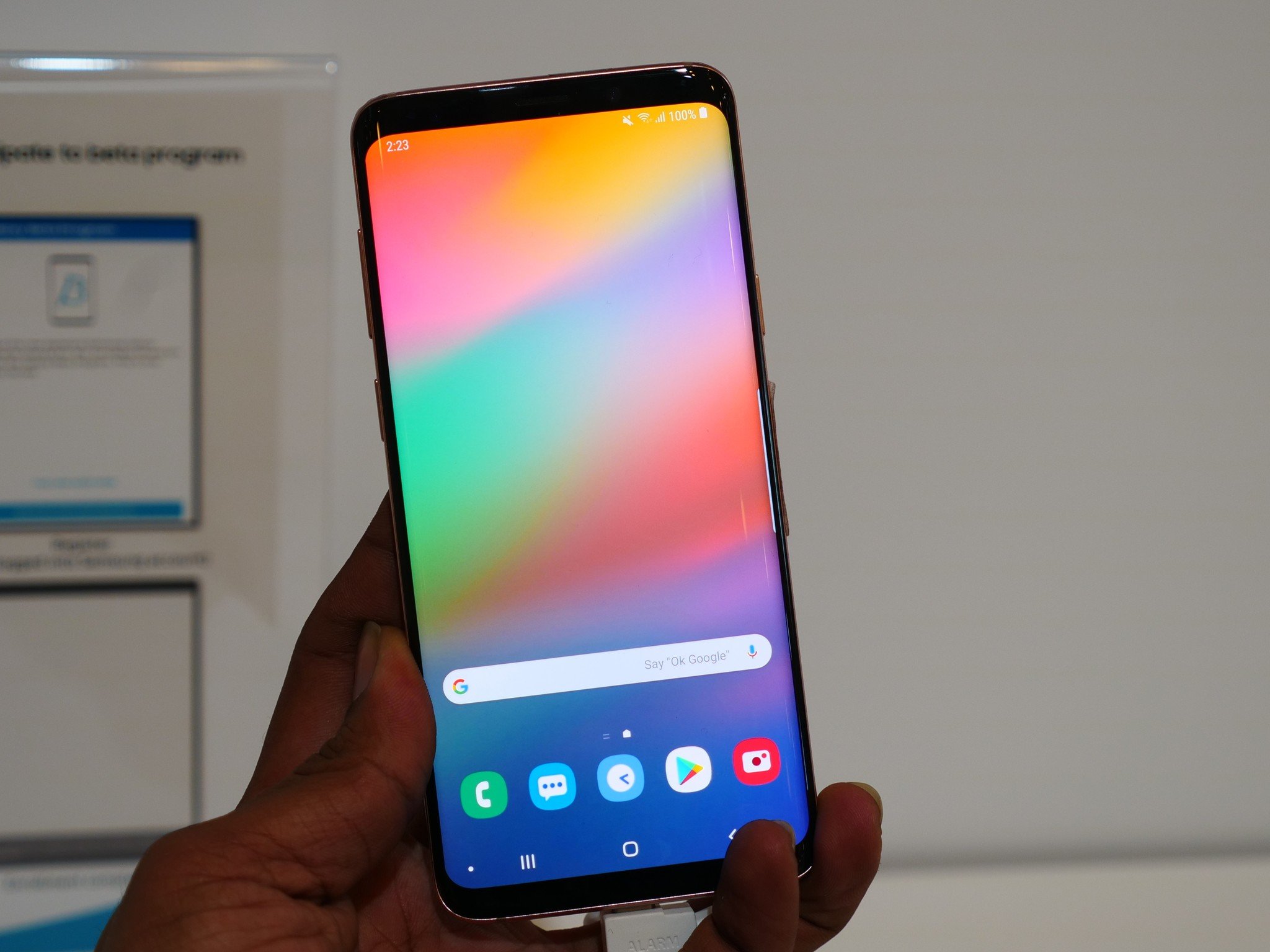
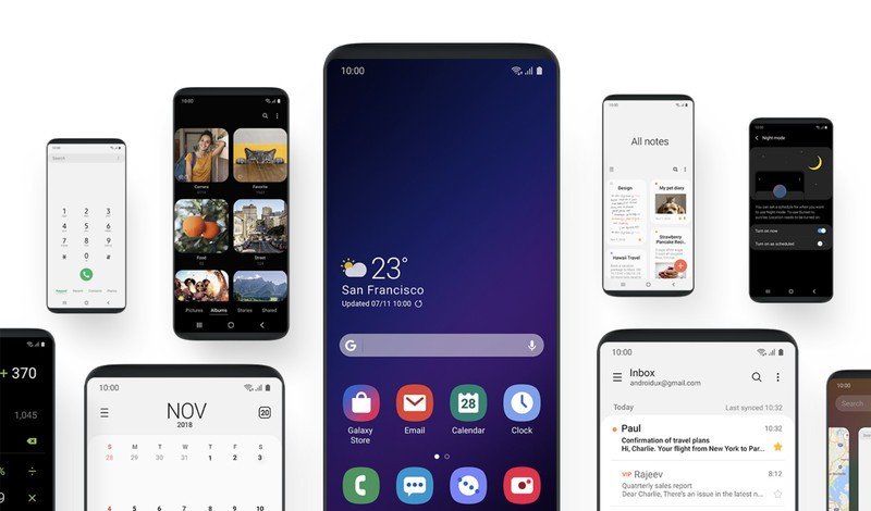
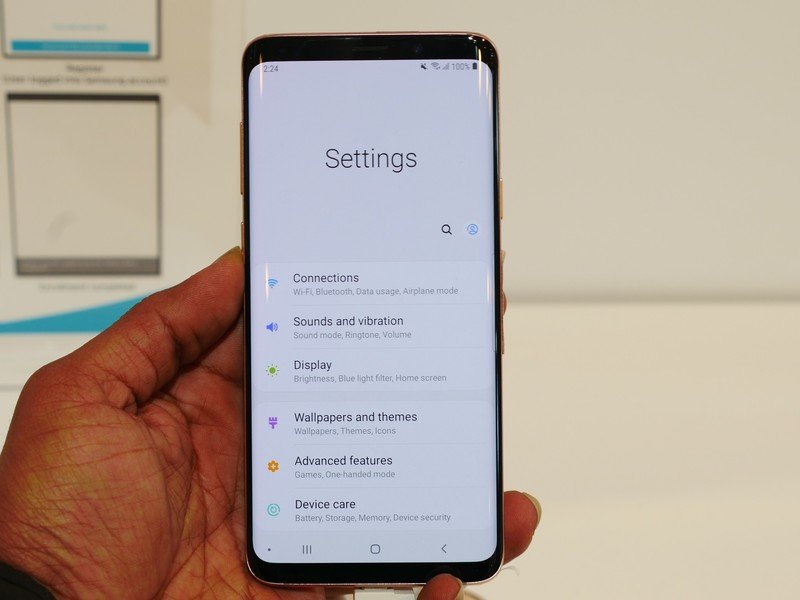
Similar to the transition from TouchWiz to Samsung Experience, One UI does a lot to help clean up the entire interface so that it's simpler and easy for people to use. For the end user, that means a less busy settings page, cleaner app icons, a new "Focus Area" on the lock screen that helps you see what's asking for your attention, and buttons that are easier to press.
That last point results in one of the biggest changes with One UI. With this update, Samsung's reworked its first-party apps and other elements so that you don't need to stretch your thumb or other fingers far across your phone's display in order to do something.
In many areas of One UI, you'll see that apps and other parts of the interface are split into two distinct sections — the Interaction Area and Viewing Area. The Interaction Area takes up the lower half of your screen and houses all of the buttons and tabs you need to touch. Above this is the Viewing Area that shows related info that doesn't require your input.

The idea here is to put everything you need within easy reach even on large phones like the Note 9 and Galaxy S9+, and if Samsung implements it right and can get other devs to hop on board, it could be a great alternative to simply resizing the entire UI to a lower portion of the screen.
Be an expert in 5 minutes
Get the latest news from Android Central, your trusted companion in the world of Android
Something else that's big with One UI is that it's designed to be easy on your eyes. No matter what time of day it is, Samsung wants One UI to be pleasing and enjoyable to look at. As such, One UI ships with something called "Night Mode" that implements a system-wide dark theme across the main UI elements and Samsung's own apps.
Speaking of themes, Samsung's making One UI more personal by also having parts of the interface change their appearance based on what color phone you have. Seeing as how Samsung's been getting more and more adventurous with colors over the last couple of years, having those bold hues go beyond the back and side of your phone could result in some huge aesthetic #goals.
Rounding out all of that, don't forget that One UI is based on Pie. That means new gesture navigation, improved notifications, new emoji, and everything else included with Android 9.
The bad
As great as One UI looks, that's not to say it'll be without its faults. Although we can't give any definitive opinions until we have more time to use it for ourselves, I can see a couple potential pain points for the interface.

While I'm personally interested to see how the Interaction Area and Viewing Area idea plays out, it's entirely possible that this will be nothing more than a huge waste of space in apps that it's implemented. In the examples we've seen so far, the notes and messaging apps push all of the actual content down to the very bottom while reserving the upper half of the screen to just say "All notes" or "Messages." It might look pretty, but that's also a lot of wasted screen real estate that could be serving a real purpose.
Not only that, but this new method of app design could make things more difficult for users instead of easier. Now on Samsung phones, you'll have some apps that follow One UI standards and others that use Google's Material Theme one. That could get confusing.
And, of course, there's the argument of it being easier to just have stock Android on Samsung phones going forward rather than Samsung continually reinventing the wheel. C'est la vie.
What do you think?
We'll soon have a better idea of how One UI works in the real world once we're able to install it on our own devices, but until then I want to know what you think. Are you excited for One UI? Do you think it's an improvement over the Samsung Experience? Do you just wish Samsung would convert to stock Android?
Whatever you think, let me know down in the comments below!
Samsung's new Android 9 Pie interface is called 'One UI', beta begins in November
Joe Maring was a Senior Editor for Android Central between 2017 and 2021. You can reach him on Twitter at @JoeMaring1.

