Google reveals a new Gmail interface that's no longer a crowded mess

What you need to know
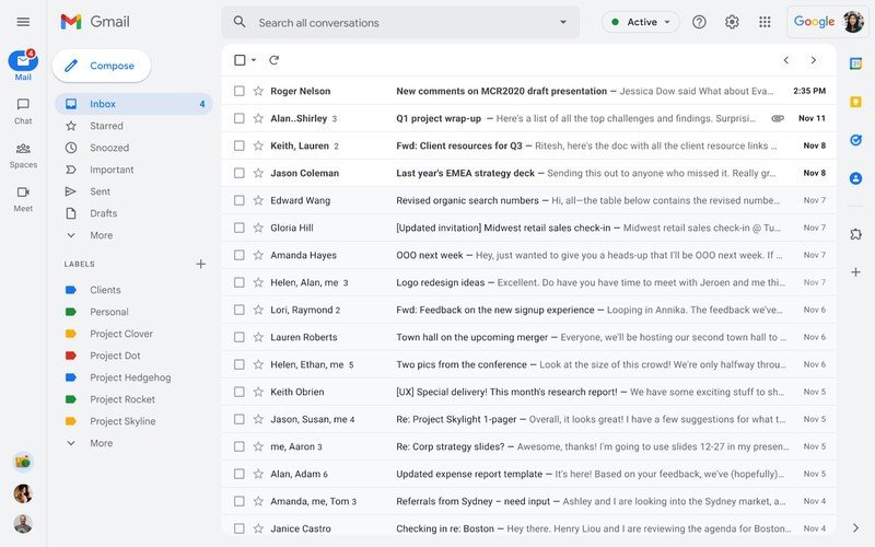
- Google is updating the desktop Gmail interface with a new, more straightforward UI.
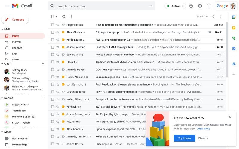
- Mail, chat, spaces, and meet will all have different sections instead of being crammed into one column.
- The rollout will begin on February 8 as an optional change but will become mandatory by Q2 2022.
Any Gmail user who frequently checks their email on a laptop or desktop computer will know just how busy the interface can be. It seems Google agrees as a new interface will become available for all users starting February 8, 2022. At that time, you should see a pop-up on the bottom corner of your inbox to switch to the new UI.
This new UI separates the mail, chat, spaces, and meet sections into easy-to-find tabs on the left side of the inbox. In the current UI, these sections are crammed in the same column, which makes it a bit difficult to see any dense information. Google previously introduced the chat, spaces, and meet sections in a Gmail update last April.


By April 2022, Google will automatically switch users to this new UI. While you'll have the option to revert to the old UI for a little while, Google says that the old UI is going away as of Q2 2022, which usually means sometime in the early Summer.
Users who like having Google Chat on the right side of their inbox will likely be disappointed, as the new UI removes that functionality. Still, by cleaning up the Gmail UI, Google looks to be making the daily task of checking emails a bit more enjoyable.
Gmail is one of the best Android apps you can download on your phone and already separates these four sections via tabs located on the bottom of your phone's display.
Be an expert in 5 minutes
Get the latest news from Android Central, your trusted companion in the world of Android

