How to give your Android phone a Microsoft makeover
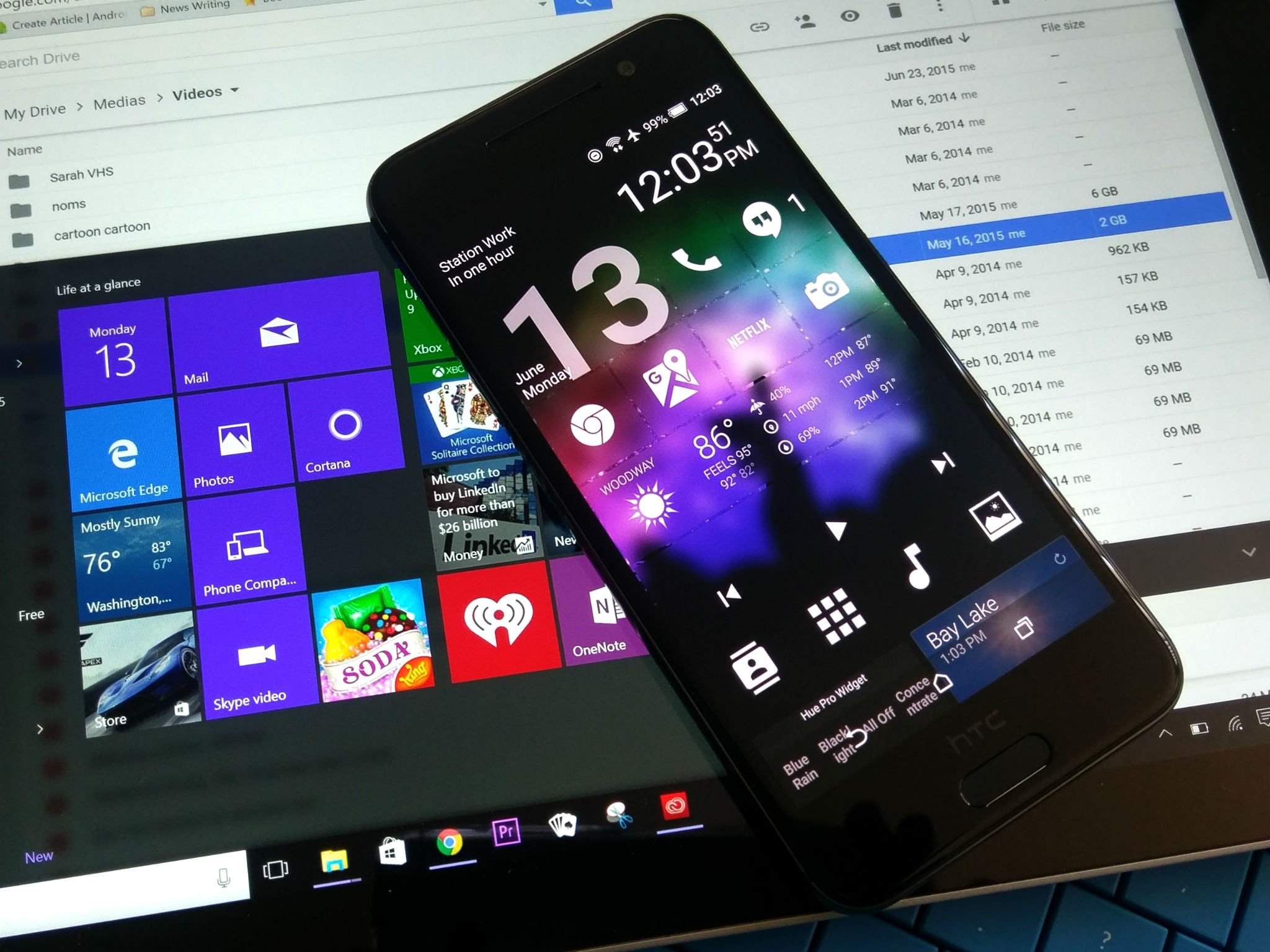
Windows Phone is in an odd place right now — an argument could be made Windows Phone's been in a weird place for a few years now — and whether you have come to Android for more apps, or more consistent experiences, or better hardware, you're here in the Android ecosystem now. But that doesn't mean you have to kiss all your Microsoft and Windows services goodbye.
Whether you're looking to recreate as much of your Windows Phone experience as you can, or you just want to see what Redmond can offer Mountain View, we've got the guide for you. Some devices offer more Microsoft services out of the box, from Cyanogen OS on the OnePlus One to Microsoft productivity suite on the Samsung Galaxy S7 — but there's plenty out there besides.
Home screen theming
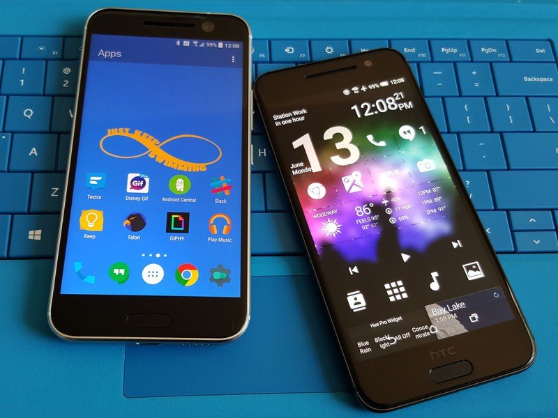
Windows Phone has a distinct UI that is somewhat reproducible in your Android device's home screen. Microsoft has opened up to Android (and iOS) in recent years, bringing dozens of apps to the Google Play Store covering the entire Microsoft ecosystem.
When it comes to bringing Microsoft magic to your Android visual experience, we have a few ways to go...
Arrow Launcher
You might expect a launcher that Microsoft brings to Android to try and mimic the launcher on Windows Phone. You'd be wrong, though, as Arrow Launcher, one of Microsoft's Garage Projects, is instead its take on a 'smart' launcher that adapts to your habits. And similar to Yahoo's Aviate and Nokia's Z Launcher, you have a home page of apps, a contacts page, and a designated page for widgets.
Arrow is a launcher that uses a lot of gestures, most notably the swipe up on the dock for an Apple-style control bar containing two rows of apps (nine apps plus the drawer shortcut), some basic setting toggles, and a brightness bar. The brightness bar doesn't play well with Adaptive Brightness, telling you to turn it off before manually adjusting the brightness, but otherwise works well.
Be an expert in 5 minutes
Get the latest news from Android Central, your trusted companion in the world of Android
As a themer, I feel obligated to tell you that Arrow doesn't do icon masks properly, which is a bummer for any unthemed icons you may have, especially on your home screen. I would recommend square icon packs like Stark or Minimal UI to bring maybe a touch of the tile motif back to Microsoft's launcher. Arrow also doesn't support individual custom icons, which is a double bummer, but the icons included in the pack will look nice. What it does have is a simple setup that is easy to familiarize yourself with and easy to lightly customize, but Arrow lacks more granular controls.
SquareHome 2
Now, as Microsoft chose not to give us a Windows 10-style launcher for Android, we must turn to third-party launchers. While there are several versions, many bearing W8 or W10 tag somewhere in their title, the tile-based launcher I'd recommend is SmartHome 2.
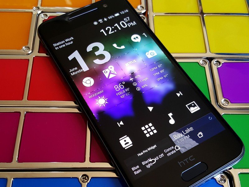
It looks a little unintuitive at first glance, it's actually pretty easy to get the hang of. You hit the plus at the bottom of the grid to add new tiles, including widgets, and you can change the theme of more than one tile by long-pressing one and selecting the double green arrows, which is not Done, but rather multi-tile editing. Once you've selected your desired tiles, you can re-theme them with the painter's palette icon. While it defaults to a frosted glass theme, you can also color your tiles from the palette provided.
If you want to add more pages, you pinch in the screen and hit the add page button appears. You also pinch in to reach the launcher's settings (the list button in the bottom right section of the screen). You can apply icon packs in SquareHome, and with the default theme and the white text, I highly recommend Whicons, a free pack with a decent selection of icons. You can also add widgets to tiles, and the best widgets you can use for these will undoubtedly be transparent widgets, preferably with white or colored text.
Wallpapers
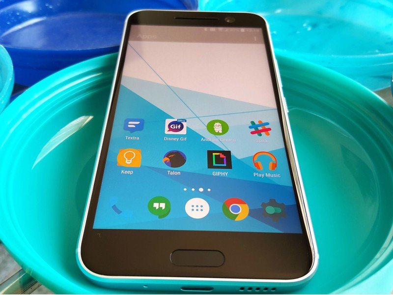
No matter the launcher you choose, you're gonna need some wallpapers to go with it. Again, I would never, ever use a stock wallpaper instead of a wallpaper that gives your phone some personality, especially when we offer you five new wallpapers every Wednesday. If you absolutely must have a Window-style wallpaper though, you're in luck, because they're easy to find and the style is well-represented. You can find some lovely examples here.
Lock screen
Microsoft has not one but two lock screen replacements on Google Play, each aimed at slightly different crowds.
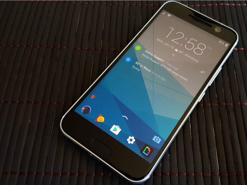
The first, Next Lock Screen, shares some features and UI with Arrow Launcher, and is aimed at productivity. This is technically not a lock screen replacement, as it defaults to the system lock screen when actually unlocking with a PIN or pattern. If you unlock with a fingerprint, you'll never notice a difference, since inputting your fingerprint will still unlock the phone. Next just functions as a layer on top of your lock screen, really.
You select five to ten of your most-used apps to appear on the bottom of the lock screen and you get the same quick toggles as on Arrow available with a swipe up. You can open these apps by tapping them on the lock screen… unless you're not using Smart Lock, in which case you tap an app, get taken to your lock screen, unlock your phone, and are then dumped into the app you chose. Next is an interesting little lock screen control center, but if you're not keeping your phone unlocked most of the time with Smart Lock and a decent timeout, or using a fingerprint, then Next just gives you one more screen to swipe through before you get to your home page.
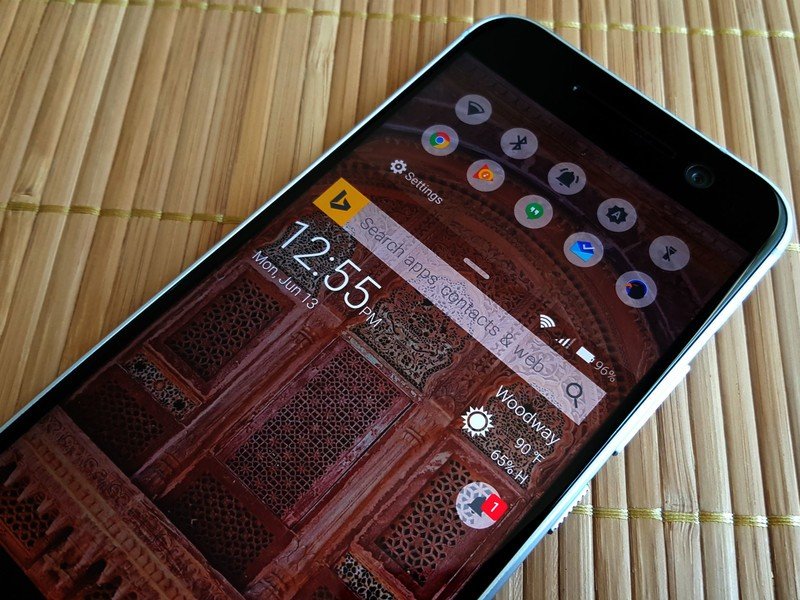
The second lock screen app by Microsoft is Picturesque Lock Screen, a Bing-powered lock screen overlay that gives you notifications, sports scores, news, and weather at your fingertips. Except the only sports are Cricket and the NFL. And the notifications don't display by default, you have to click to show them. Oh, and did I mention it's powered by Bing? Bonus points for Bing Rewards, if you're into that kinda thing, but still… Bing.
The controls for this home screen are the opposite of those in Next. You swipe down for quick toggles and quick app shortcuts and you swipe up to unlock. You swipe left to reach the news/sports results, which are powered by Bing. At the top of the lock screen is a Bing search bar, which can search through your contacts, installed apps, and your web history. Somehow I dig Picturesque a little less than Next, but if you're a Bing user, knock yourself out.
Cortana
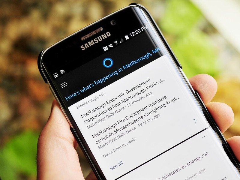
Missing that blue ring from your Windows Phone — or (much more likely) from your Windows PC? No problem! Cortana made the jump to Android last year, and for Windows 10 testers, you can even try synchronizing notifications between your Windows and your Android devices, which is something that's bound to make many users happy when it comes to the rest of us later this year.
Unfortunately, while you can get Cortana on Android, in the U.S. she won't be quite as quick as she is on Windows Phone, because her voice activated 'Hey Cortana' was removed late last year. Apparently, it was causing major issues, such as breaking users microphones and hotword activation for Google Now.
If you want Cortana more deeply-ingrained in your system and you're a more technically-savvy user, you might also consider flashing CyanogenMod on your device. (That's a big step beyond apps and themes, though.)
Microsoft Suite
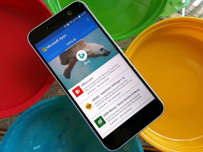
Now, I could spend days going through the rest of Microsoft's offerings on Google Play, but I don't have to. Microsoft has built an app to point you to all of their apps and directs you to their Google Play listing to download them. It's aptly called Microsoft Apps, and it lets you browse through Microsoft's apps either by category, through their most popular apps, or just scrolling through every app on offer.
Now, you may think this is a glorified list app… and it is. But scrolling through Microsoft's apps on Google Play — especially on desktop — is just like pulling teeth, and even if you just download Microsoft Apps, use it to install 2-3 apps (or 20-30), and then uninstall, it will likely be quicker and easier than jumping back and forth inside the Google Play app. Will it do much for you long-term? Maybe not, but if you've just made the jump to Android from Windows Phone — or if you just want to bring yourself closer to Microsoft's ecosystem — it's a quick simple app that'll help jump-start your Microsoft adoption. And that's all it needs to do.
So, do you rock the Windows Phone look on your Android phone? Or do you prefer Arrow Launcher and Next Lock Screen? How much Microsoft do you have/want/need on your phone? Share your Windows-based themes in the comments, along with any Windows Phone features you wish would jump to Android. I'll start: SYSTEM-WIDE DARK MODE!
Ara Wagoner was a staff writer at Android Central. She themes phones and pokes YouTube Music with a stick. When she's not writing about cases, Chromebooks, or customization, she's wandering around Walt Disney World. If you see her without headphones, RUN. You can follow her on Twitter at @arawagco.

