Getting acquainted with the new Google Photos on Android and the web
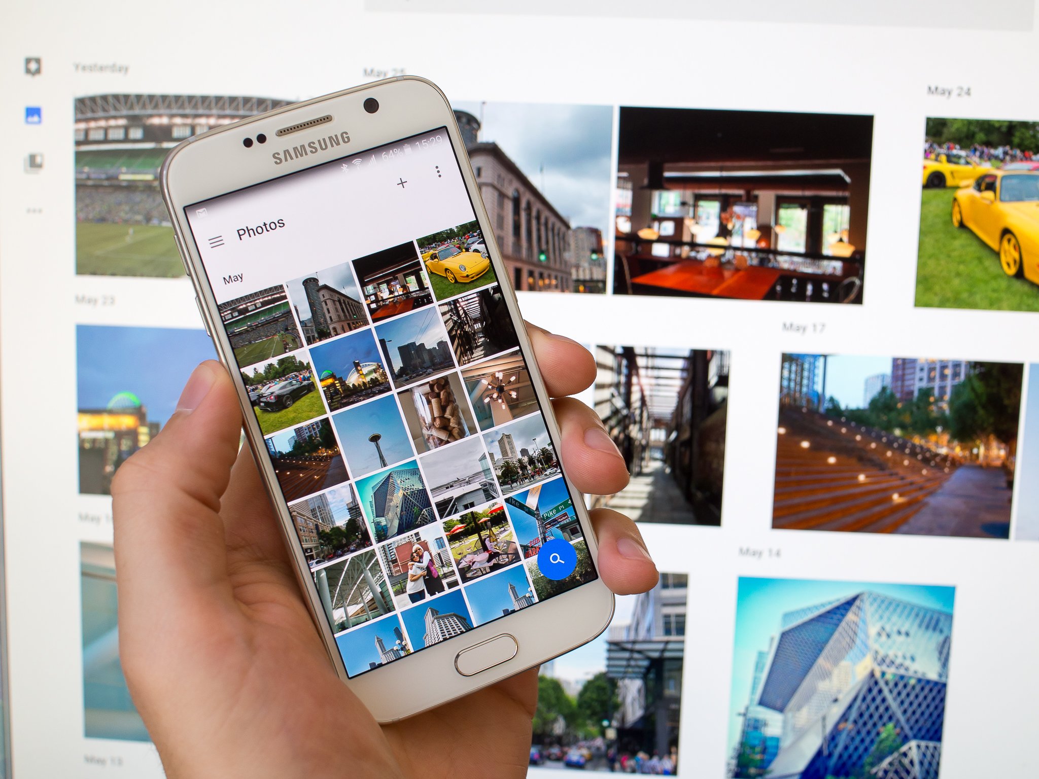
After being tied completely to Google+ (woefully) for some time, Photos has finally been broken out into its own apps for Android, iOS and the web. Google Photos, as it's now known, adopts the same icon as the old app (which was really just a stub to the Google+ back end) as well as many of the same features, but is also developing its own identity since gaining independence from Google+.
That means you technically no longer need a Google+ account to use it, and your photos now get a first-class experience with their own apps and website.
Google Photos on Android
If you pick up your phone right now and look in the app drawer, you may be saying, "oh look, I have the new Photos app!" Well, here's where a little confusion comes in — that's the old Google+ Photos app, and you're going to need to hop into the Play Store and download an update to the Google+ app that breaks it away from Google Photos. After that, you'll either receive an update to Google Photos in the Play Store, or you can simply go searching and downloading it manually. After the updates are handled, you'll be looking at a familiar icon and name, but when you open it you're getting a refreshed experience.
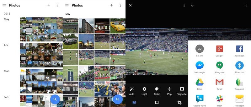
Opening the new Photos app, you get something familiar and easy to understand, but with a fresh take on the interface. Your photos are grouped into a vertically-scrolling list, sorted by day, and you get a look at every photo taken that day on any device that's signed into Photos. As you may guess the app is already populated with photos that were previously uploaded to Google +, and in the settings you can toggle the ability to view your Google Drive photos here as well.
You can pinch in on the interface to reach a "comfortable" view where you're looking at a scrolling list of images that each take up the full width of the screen, and another pinch in gets you to a single image view (the same you'd get by tapping an image). Zooming out instead gets you to a month view — again showing every photo — and another pinch out shows entire years of photos. The point on the screen at which you pinch determines where in the day/month/year you "zoom in" to, which is a clever addition.
Google is doing some trickery here to make it seem like all of these photos are local, but they actually aren't. Your device is caching recent photos in lower resolution sizes that are applicable for your screen, so you have access to practically any photo at any time (within reason) without loading up your phone's storage. Unfortunately unlike Drive or Play Music there's no way to "pin" specific pictures, albums or months in full resolution to your device, and there's actually no way to view what pictures are local and which ones aren't. In practice it's not a problem (I even turned on airplane mode and browsed, finding most pictures viewable), but the first time you're somewhere with slow network speed and a photo you thought was on your device actually won't load, you may not like that idea so much.
Be an expert in 5 minutes
Get the latest news from Android Central, your trusted companion in the world of Android
And because you're viewing all of your photos at once rather than just your device's photos, you need to keep that in mind when "deleting" things. If you delete a photo on your phone, that means you just deleted it from your tablet, your other phone and the website. If you go to delete a photo on one device that was captured on another device (and therefore saved locally on the second device), you'll see a pop-up indicating what you're about to do, but if you're deleting something that isn't saved locally anywhere, there's no warning — that photo is gone from everything. Thankfully the "trash" bin in the app keeps a history of photos for you to restore for up to 60 days, but some people are still going to learn this the hard way when the move to Google Photos.
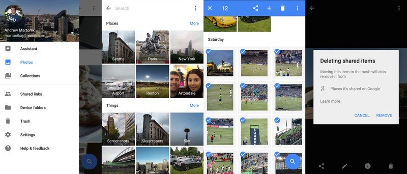
Beyond that, the rest of the main interface is simple. You have a search button that lets you query images by date, location, people and even subject matter — for example you can search for "cars" or "dogs" and see a pretty remarkable lineup of those kinds of photos. You can also use the + button at the top of the interface to manually create albums, movies, stories, animations or collages — and if you select images before choosing those options, the action will be performed with those images only.
There's also a neat somewhat-hidden feature to select photos — just long press on a photo then drag in any direction to select all photos in that range. Naturally you can choose to share any image, group of images, story or album with any app you have installed on your phone. You can also edit individual images with a set of basic editing features, but they don't directly match what was available in Google+ Photos before, nor do they match up to what you can get in third party apps.
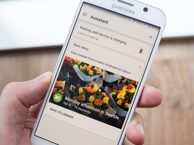
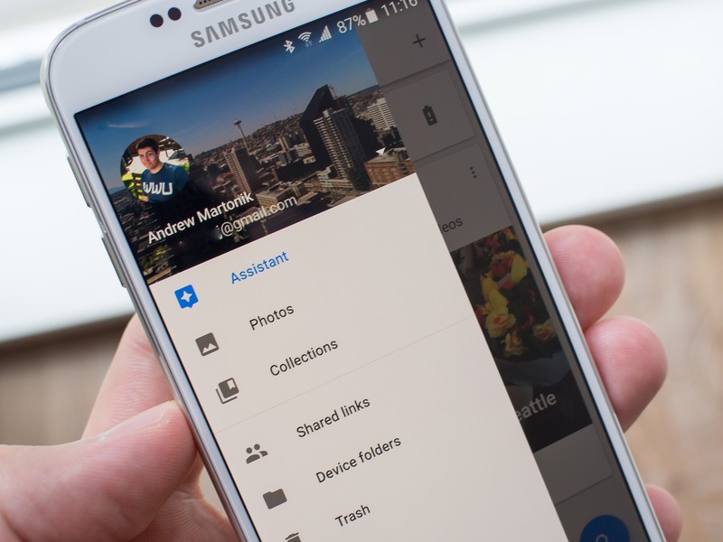
The slide-in panel from the left edge is pretty familiar, with quick availability of your "collections" (albums, movies and stories) and app settings. There's also a new "assistant" pane that shows you what's happening inside Photos, such as new stories that have been created, notifications that photos are backing up (or waiting for power to do so) and the like. It's kind of like a Google Now interface, but just for items relating to your photo library.
Google Photos on the web
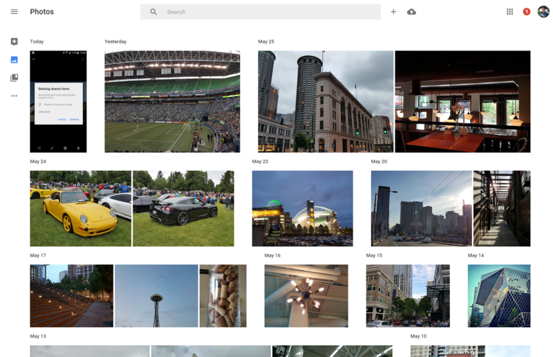
When it comes to Google services in 2015 it's a fair bet that the web experience for any given product will be tightly integrated with mobile apps in terms of design and functionality — Google Photos is a great example. Much like we've seen with the Google Play Music redesign on the web, the Google Photos website (found at photos.google.com) is very much the same experience as the Android app.
You get the same basic view on the web, but you're limited to just the day view, with no option to zoom out to a month or year view. But considering how quickly you can scroll on a computer and how many more photos can fit on the screen, it makes sense. The sidebar is here, with the same assistant and collections options, and even the settings are nearly identical to those found on Android.
You also have instant sharing buttons for Google+, Facebook and Twitter (as well as just shareable links), but unlike the Android app it always shares a public photos.google.com link where anyone can view the content you shared, rather than sharing the actual photo(s). Unfortunately that means that networks like Twitter and Facebook won't automatically pull that image to view natively on that site, but it means when someone clicks the link they can see everything — and if they're signed into Photos they can add them to their collection. You can view and delete any links you've previously shared as well, which is a neat feature and gives you control over the items you've put out there.
The web view has the added bonus of being able to quickly manually upload photos, which you can do by pressing the small upload button next to the search bar, or simply dragging photos over the page and dropping them. Google also has a slightly-redone desktop app for uploading photos on Mac and Windows, which you can install on your computer and use to automatically upload from specific folders, cameras and memory cards.
The big picture of Photos
Google has made some big changes to Google Photos as a product as well, including the ability to upload unlimited images up to 16MP (four times what Google+ Photos offered) and videos up to 1080p in size for free. You'll be presented with the question of whether you want to upload at "high quality" (free) or "original images" when opening up either the Photos app or website for the first time, and the choice isn't as easy as it first seems.
The Google Photos support docs indicate that if you choose the free version any photos that are under 16MP in size will be uploaded at full quality and anything above that will be toned down a bit, but it also uses phrases like "essentially look the same" and "larger than typical printing sizes," which indicates that they're still messing with things a bit to cut down on storage costs. If you're worried about what Google is doing to optimize your photos when they're uploaded, just choose the original file size option, and get ready to pay for additional Drive space — it's incredibly cheap nowadays.
Perhaps one of the biggest (and also not highlighted) changes of the move to Photos is the removal of Google+ integration with the service
Perhaps one of the biggest (and also not highlighted) changes of the move to Photos is the removal of Google+ integration with the service. Of course it's very easy for you to share images from Photos to Google+ directly, but you also no longer need a Google+ account to take advantage of all these photo features or apps. You can also disable the Google+ app on your Android phone and continue to use Google Photos, including automatic backup.
So much of the new Google Photos experience still feels like it's holding on to old vestiges of Google+ Photos, though, and it's clear that Google will be working to improve some aspects of the service over time. There still needs to be a better explanation of where photos are living, how they're shared and what happens when they're deleted, and the Android app still needs a little more work with finer-tuned settings for uploads and managing on-device photos.
That being said, this is a great step toward a unified photo service that "just works" at bringing together all of your photos no matter where or how you take them. It also very gracefully steps away from being a part of Google+, which I think is hard to argue was a bad decision. And while this isn't going to be a choice for those more advanced users who want ultimate control over their photos in a regular folder structure that only they control, the vast majority of normal people who take photos on a few different devices and want to show them off will greatly benefit from trying out the new Google Photos.
Andrew was an Executive Editor, U.S. at Android Central between 2012 and 2020.

