The Galaxy Z Fold 3 has amazing hardware, but its software feels unfinished
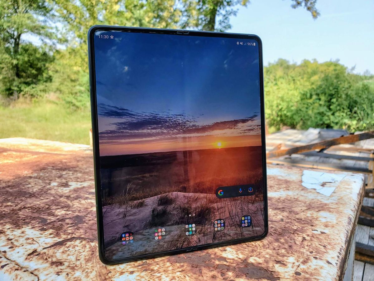
Foldable phones are still relatively new in the grand scheme of smartphones. But that doesn't mean that some of these products aren't impressive. For example, while the Samsung Galaxy Z Fold 3 isn't a significant improvement over the second generation Galaxy Z Fold 2, the fine-tuning that Samsung has done with the device is very much welcomed. However, the bulk of that tweaking Samsung did with the Z Fold 3 was mainly on the hardware side of things. The software and UI are very much the same as the prior version — and that's unfortunate because it's still kind of a mess.
Yes, Samsung did add a couple of new features and expand on a few others as well. But, when fellow freelancer Andrew Myrick put together his first 12 things to do with your new Samsung Galaxy Z Fold 3, it further solidified the complicated feelings I had when using my own Z Fold 3. Put simply — if you want to get the most of your expensive folding phone, you are going to have to do quite a bit of tinkering — and that shouldn't be the case.
Don't get me wrong; the Z Fold 3 is a fantastic device in many ways. In fact, there were a couple of reasons that I decided to trade in my Fold 2 for the new version. The first reason was because I had cracked the outer display after a tumble onto the concrete. The other reason was the improved camera experience on the Z Fold 3. I hoped that many of my disappointments from the software of the Z Fold 2 were fixed on the Z Fold 3. Unfortunately, I still feel a bit let down.
The Z Fold 3 is very much a power user's phone. Does that mean you have to be in that camp to enjoy the device — no, it does not. But, if you don't fall into that category, there are many features that you may not know are available or you may feel intimidated when trying to access them. Many of the Z Fold 3's customization and even battery features are missing when you first fire up the phone for the first time, and unless you are in the know — you may never know about Good Lock.
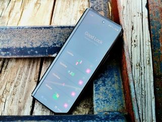
I'll give a quick description of what Samsung's Good Lock is without diving completely into it. This app houses multiple modules that you also have to download individually if you want them, allowing you to have more control over things like your lock screen, notifications, theming, etc.
Samsung has been one of the better OEMs at offering theming options for its devices for years now. Much of the theming options that used to be housed in the Galaxy Store have moved into the Good Lock module Theme Park — albeit with many options and controls over what you can accomplish. I don't feel that moving more complex customization options like themes into a separate app is necessarily bad. Still, a module that can further optimize the apps and battery of the phone to give better battery life shouldn't be hidden.
If Samsung knows of ways to improve your phone's battery life, why not apply those fixes rather than hide them within a module within an app?
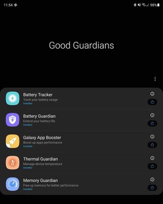
Samsung's Good Guardian app is designed to try and give your phone better battery life. Five separate modules need to be downloaded, each with its own function, giving more insight and attempting to help your battery last longer. I applaud Samsung for offering this, but if the company knows that these are things that can improve the phone's battery, why are there so many hoops that the user has to go through to find them?
Be an expert in 5 minutes
Get the latest news from Android Central, your trusted companion in the world of Android
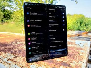
Perhaps these apps and modules to adjust the Z Fold 3 are a way to clean up the settings menu. If that's the case, there's still a long way to go. Because Samsung's settings menu has never been lacking options, although for a short while, it had gotten a little better. The number of options within the settings is up to 22 initial buttons after opening up the settings menu. Some of those choices are themes, battery, lock screen, and others that have even more sub-menus if you download their modules for Good Lock.
Of course, opening up each button gives a deluge of options with that choice, and some of those have layers too. Don't get me wrong; I'm all for choice. But the organization of the settings menu is a disaster. It appears that even Samsung knows this, because once you tap on one of the initial 22 options, after all of the choices for that option is a menu at the bottom that says Looking for something else? with settings that aren't in that menu, but are the ones you may actually be looking for.
It would make more sense to have a set menu with basic and advanced settings each having their own areas. This would make the most commonly used options quick and easy to find, with the more in-depth, power user choices in their own area. This would also allow for many of the sequestered choices into Good Lock to have a home on the phone from the start, without needing to download a separate app or modules.
Organizing and getting the Galaxy Z Fold 3 set up just the way you like is a more much-involved undertaking than a typical smartphone — and it sucks.
Something else that isn't talked about enough with these foldable phones is organization. I know some people may not care too much about how their phone is set up; all they need to know is where the phone app, their SMS app, and maybe email is — and the rest is a crapshoot. On the other hand, some set every phone up the same way. That includes home screens, widgets, and folders — I fall into this latter category.
On a phone with two completely different screens with different aspect ratios, that presents new challenges. This is another area in which Samsung needs to do better. Out of the box, the outer display and the main inner display are treated as two independent phones. So you have to set up and organize each screen separately. For some, a different organization for each display is preferred because of how they may use each screen. But for others, those differences in layout can be confusing and disorienting.
I use muscle memory as to find where each app is located within its proper folder, and when that changes, it is very frustrating. Yes, I can and do take the time to create the same folders and organization process on each display. This is something that Samsung can resolve. Unfortunately, the only realy organizational option Samsung offers is to mirror the outer display to the main display. In theory, this is good — in practice, not so much.
When cover screen mirroring is enabled it does exactly as the setting name suggests — it mirrors everything that is set up on the outer display to the inner display. It essentially creates a link for the way you organize that outer display, from the folder and the apps within them to the widgets, to the main display. This link stays active, meaning if you add a widget or folder to the cover display it will be reflected to the inner display. But, not only is the setup mirrored to the main display but a virtual separation of the large display is created to match the outer display's screen ratio.


As an example, you can't expand a widget to cover more screen real estate on the inner display because it no longer recognizes the screen size as being a single large screen. It is now virtually split into two displays, with the ratio now being observed by the UI to be the same as the outer display. It would be nice to mirror the two displays, then once the folders and more time-consuming organization were complete, disable the link. But turning off the mirror function restores the layout used prior to the setting being enabled.
The keyboard situation on the Galaxy Z Fold 3 is less a software issue for Samsung as it is a case of other apps needing to get their act together.
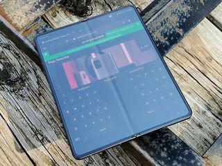
While on the subject of the unfortunate circumstances of the way Samsung's Galaxy Z Fold 3 handles the inner and outer displays, let's talk about the keyboard situation. Though there are far worse keyboard apps out there than Samsung's, there are far better keyboard apps for Android. The problem is that none of them can acknowledge that a phone has transitioned from a standard phone layout to a tablet size like Samsung's keyboard app does.
My keyboard of choice is Google's Gboard because it does such a fantastic job of voice-to-text transcription and it's better at recognizing swipe gestures than other options. But there isn't an option for a split-key layout for the keyboard when on a large format display. Instead, when the phone is unfolded, you just get a bigger keyboard. While it is less comfortable than what the Samsung keyboard offers, I'll suffer with it because the pros outweigh the cons.
Though Samsung has done better a better job resizing apps to work better on the larger format of the inner-display, many still don't look quite right. Again, this problem falls on both Samsung and app developers to solve. But, Samsung knows that it can't wait around for every developer to retool its app to work for the few foldable phones on the market if it wants to push this form-factor to the mainstream.
Will these software hiccups, frustrations, and other odd quirks drive me away from the Z Fold 3 — no, absolutely not. Because in the end, I love having a dual form-factor device in my pocket. The improved camera experience, the addition of water resistance, and the significantly better screen protector on the main display make the Z Fold 3 a near-perfect phone for me. Once Samsung, or another manufacturer — cough Google Pixel Fold — can make a more durable folding display, add dust resistance, and nail the software experience — then it'll be perfect.

