Galaxy S7 edge: A closer look at the new Edge Screen features

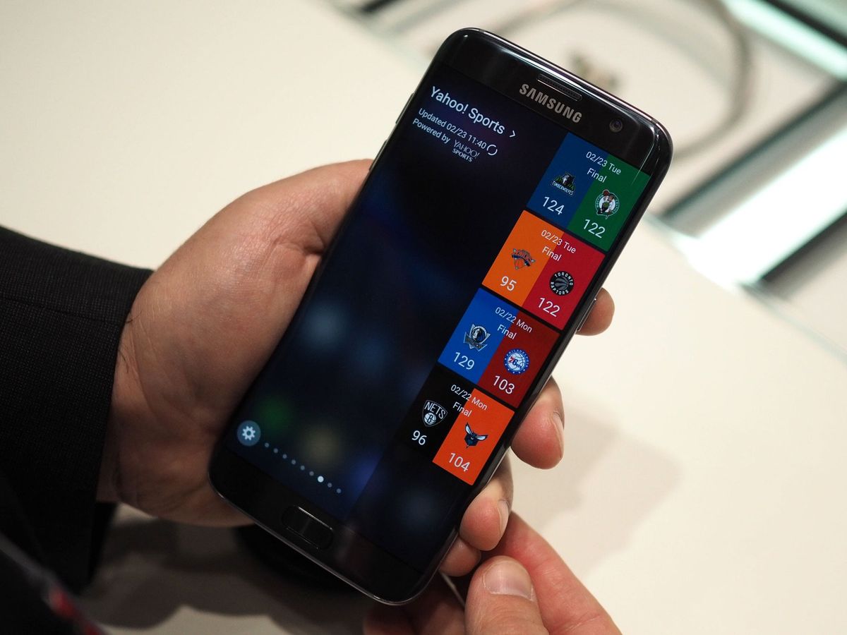
Let's be honest: The Galaxy S6 edge's curved sides were largely a design feature. They were mainly there to look cool, not to fulfill any functional requirement. That's about to change as Samsung launches the Galaxy S7 edge, however, with a larger, more customizable, more useful Edge Screen.
We already knew Samsung was overhauling its "edge" functionality in the Marshmallow updates for the Galaxy S6 edge series, but the Galaxy S7 edge gives us our first look at a device designed around these new features. Nor is it the first time Samsung has attempted this — the Galaxy Note Edge had a more fleshed-out Edge Screen, though it wasn't a particularly polished experience.
The Edge Screen of 2016 is larger, with a more customizable drawer, and an enormous array of new panels to play with. Whereas before it was mostly a glorified shortcut bar — either to specific apps or individual people — many of the new panels are about glanceable information and feeds.
Except for the on-screen ruler, part of the tools panel, which is about measuring things up to 10.5cm long.


What's more, it's now possible to download extra edge panels through Galaxy Apps, with initial offerings from Samsung including data usage readouts and news via CNN. Sure, none of this changes the fact that you don't really need a curved screen to implement features like this. Nevertheless, it's turning into more of a functional differentiator for the GS7 than in previous models.
Check out our video walkthrough for a rundown of what's new for the Edge Screen on the GS7.
Be an expert in 5 minutes
Get the latest news from Android Central, your trusted companion in the world of Android

Alex was with Android Central for over a decade, producing written and video content for the site, and served as global Executive Editor from 2016 to 2022.


