Aviate Launcher review: Smart, but not better
Updated May 2017: Review updated to reflect the stability of the launcher and how it's aged over the last two years.
Aviate Launcher has garnered hype since it first debuted on Android, and after being acquired by Yahoo has actually seen steady improvement through updates. It's been awhile since we last examined it, and now it's time to take a fresh look and see how it works today.
Aviate aims to analyze how you use your phone to better surface information and apps that are relevant based on a variety of factors, taking the burden of customization away from you. But does it work? We're going to find out.
The basics of Aviate
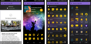
Aviate falls into the category of "predictive" launchers, as it aims to change and adapt with your usage, location, and the information you provide it. There's less focus on your personal customization — you can choose a wallpaper and icon packs, but that's about it — and more on just letting Aviate do its thing.
There's a set design of four main home screens, and you're stuck with them. Your main home screen — as in the one you get when you hit the home button — is left of center, and has a standard five-across quick launch bar at the bottom that you can put any apps you want in it, with additional rows available if you want more than five apps. You also have a search bar at the top of the screen.
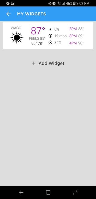
The entire rest of the screen is blank, letting you add standard Android widgets from your installed apps, but only at full width — you can't have side-by-side vertical widgets or a variety of small widgets. A simple swipe up on the screen gives you quick access to calls or messages, as well as frequently-used contacts, eliminating the need for dialer or contacts app icons.


To the left of the main screen, you get a very Google Now-like experience in the "Smart Screen" — a vertically-scrolling list of cards with various information that Aviate thinks is relevant at the time. You'll see directions to work in the morning, directions home when you're out of the house, events and places near you, news, weather and upcoming events on your calendar. The entire list adjusts throughout the day based on the time and where you are, and you can specifically call up "Today," "Places" and "Entertainment" sections if you want more to look at.
Be an expert in 5 minutes
Get the latest news from Android Central, your trusted companion in the world of Android
You can't dismiss timely cards like you do on Google Now, though — you have to either leave them there and let them be updated, or remove them until you call them back again from the settings.
It's like 70% of Google Now ... but with Yahoo.
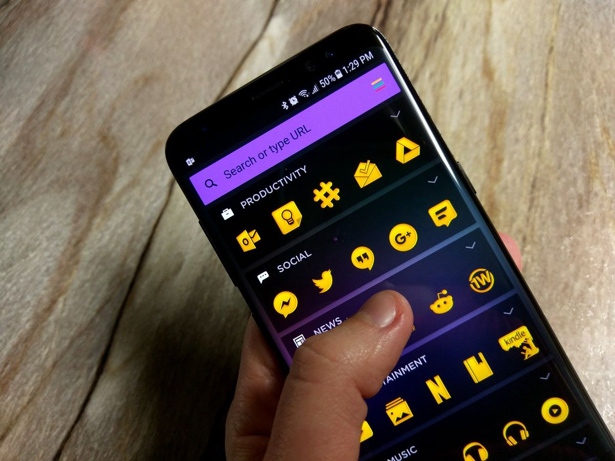
Right of the main screen is where your apps live. Rather than having standard icons and folders, your apps are organized into "collections" based on their function. You'll tell Aviate during setup what apps and categories you use most on your phone, and it'll set up at least five collections for you. Off the bat I had Transit, Utilities, Productivity, Social, and Entertainment — encompassing pretty much everything I do on the phone. Collections are basically just folders, with five apps listed above the fold for quick launching, with the rest of the apps in the collection available with an additional tap. You can choose the positioning of the collections manually, but they'll also automatically move based on how often you use each one.
Another swipe over and you get every app installed on your phone, sorted alphabetically and easily findable thanks to big letters showing you where you're at and a nice scroll bar on the side. The persistent search bar at the top of every page works for searching installed apps as well, if you prefer that method.
What it's like to use

Predictive features, especially ones that move elements around on your launcher, can seem intrusive and annoying, but in Aviate they're subtle and for the most part useful. Having my apps categorized automatically (but still tweakable manually when needed) is great, and really shows you the difference between how you think your phone should be set up to be most efficient and how it actually should be laid out based on usage.
Predictive Collections and apps are nice to have, but the Smart Screen isn't so great.
The so-called Smart Screen isn't quite as useful, though. It offers pretty basic and mundane information that I can really get anywhere, particularly from Google Now, no matter what launcher I use. Some of the predictive things like having a music selector when I plug in headphones is neat — though useless if you use Bluetooth — as is the predictive adjustment of information based on location, but it's not quite good enough in itself to make me want to use Aviate.
Perhaps the biggest thing hurting Aviate is that it's tied to Yahoo, which owns and operates the app. The search bar at the top of the launcher sends you to Yahoo Search rather than Google, and lots of the predictions and information in the Smart Screen is just pushing you out to the web rather than pulling it in and displaying it nicely inside the launcher or sending you to an installed app.
And my life just isn't tied into Yahoo — it's in Google. Although Aviate can read my calendar app to see my upcoming events, it isn't scanning my email for information on travel and appointments, intelligently learning about what sports teams I like, offering public transit information, or any of Google Now's data-driven predictive features.
Taking the questionable draw of Smart Screen out of the equation, Aviate actually works quite nicely as a standard launcher. Focusing on a handful of frequent apps and one or two widgets on the main home screen will make sense for a lot of people, and having the rest of your apps categorized by type and sorted by use will be the best way to keep the phone clean and usable. As someone who usually keeps their launcher super simple I can see why Aviate has so many downloads in Google Play.
The bottom line
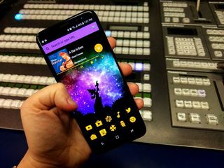
For a lot of people who have stuck with the stock launcher on their Android phone, Aviate may actually be one of the front-runners for a potential launcher replacement. It offers some useful features, a clean and attractive interface, and overall good performance in everything that it does. Aviate clearly has its loyal users and will continue to gain them, but it's absolutely not for everyone. And while I like the idea of the predictive app collections and simple main home screen, I just don't see enough value in those items to also deal with less-than-stellar predictive information in the Smart Screen.
Andrew was an Executive Editor, U.S. at Android Central between 2012 and 2020.

