Foursquare adds features, refreshes interface in latest update

Everyone's favorite social check in service Foursquare has just pushed out a notable update in the Play Store, bringing a refreshed UI, some new features and a lot of polish. The previous UI wasn't bad or ugly by any stretch, but the Foursquare team has managed to add a bit more functionality and design to this latest update. The main homescreen is now a bit cleaner, with a universal "explore" search bar at the top and options to check in, see your last location and add a photo at the bottom of the screen. A now Android-standard swipe to the right reveals a settings screen to access your profile, lists, settings and friends -- although curiously there's still a very iOS-like menu slide button in the upper left corner.
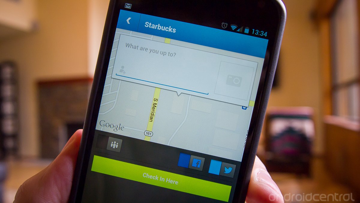
The Check In screen has received a facelift as well, with some cleaner lines and little more visual flare. The text box asking "What are you up to?" is now more prominently laid over a map of the check in location with an option to add a picture still prominently set to the right of it. There's still a bit more cleaning up and unification of the UI to go, but things are looking better with each update.
Be an expert in 5 minutes
Get the latest news from Android Central, your trusted companion in the world of Android
Andrew was an Executive Editor, U.S. at Android Central between 2012 and 2020.

