Camera cutouts: The next horrible smartphone trend?

Some smartphone trends are born of necessity, like the trend towards larger onboard storage. Some smartphone trends are born out of a desire to curb costs and space, like the trend of removing the headphone jack. Some trends are useful, such as the wide adoption of fingerprint scanners. Some trends are nuisances, such as the removal of the headphone jack. We're seeing the beginnings of a new trend, and it's going to take a chunk out of our screens, if not our sanity.

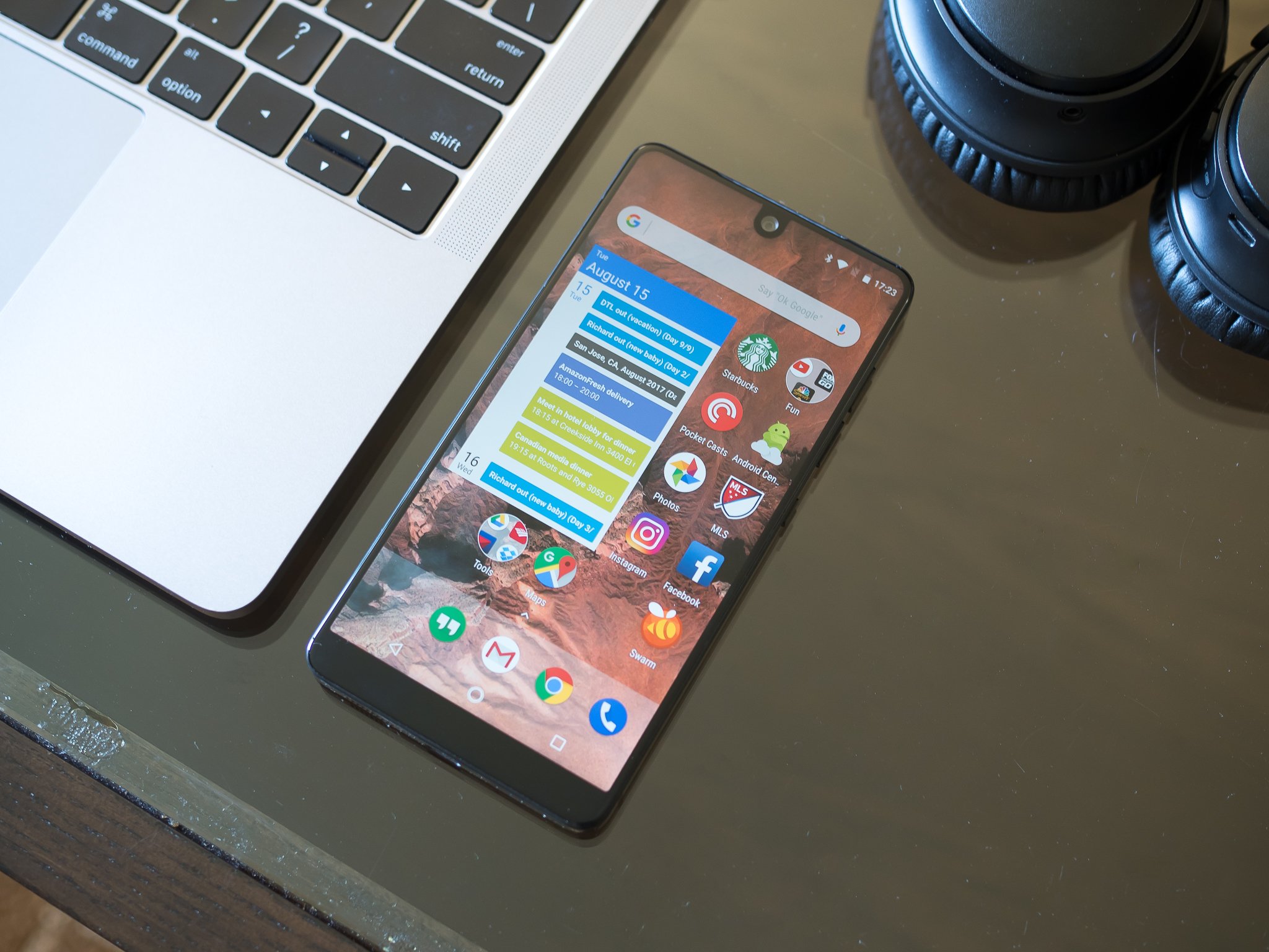
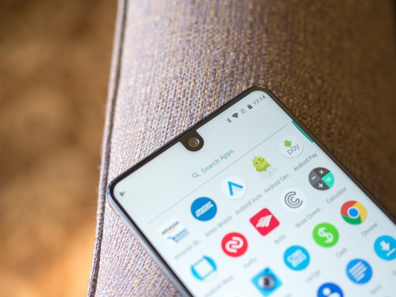
Phones have trended larger and larger for the last several years, and then this year Samsung decided to go extra tall while keeping the Samsung Galaxy S8 reasonably narrow to hold and use. Bezels shrank almost ridiculously small on that phone, but other manufacturers saw that they could go further. Essential announced the Essential Phone, which stood out from the pack in a few ways, but most noticeably for the black divot in the middle of the screen's top edge, where the camera intruded upon the status bar. It's there, and while most of the time it's easy enough to ignore, there are some instances where that's just not possible, such as when watching videos or using the Essential Phone in landscape. It was an oddity, a daring experiment in just how far manufacturers could shrink bezels and give users usable touchscreen on the front of their phones.
Then Apple said hold my micro-brewed IPA.

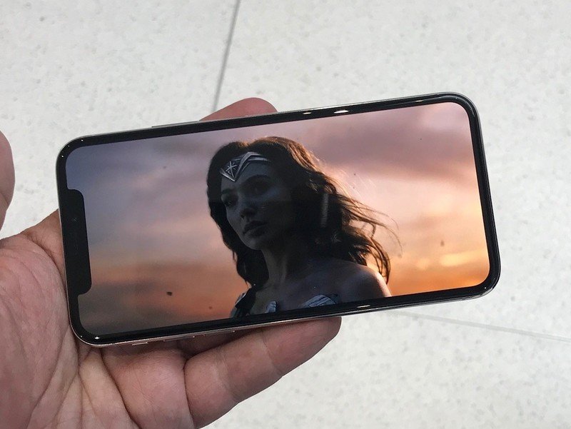
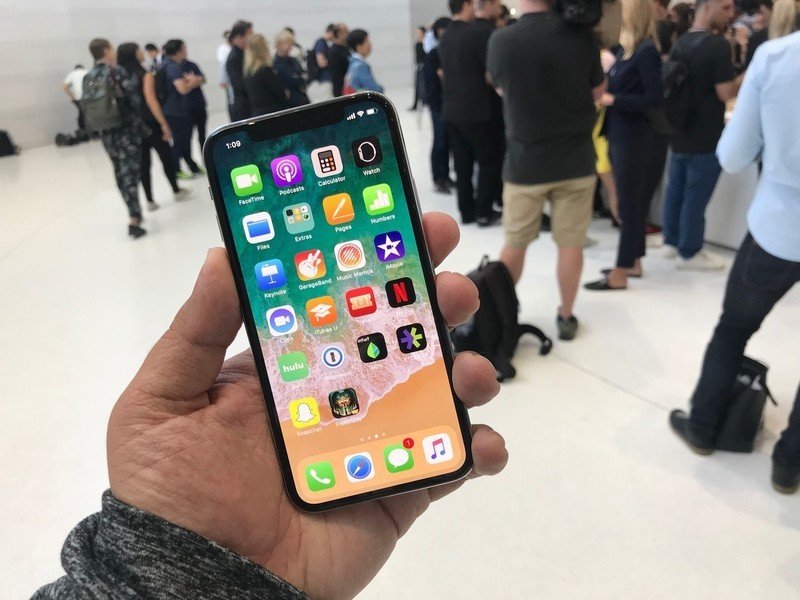
The iPhone X is here, and while there's a lot going on here, the design feature your eye instantly gravitates to isn't that new vertical camera setup, nor the shiny glass back or the loving sculpted stainless steel frame. It's to that depression in the top of the screen, where the selfie camera and all of the sensors that make Face ID more than a glitchy fad dip down into the touchscreen, giving the iPhone screen stubby, sawed-off devil's horns.
iPhone X's screen is edge to edge all the way around the front face of the phone, minus that rectangle of sensors and cameras. While I'm looking forward to seeing how accessory makers handle having so little purchase for their front case lips, the real test here is going to be how users respond to having so little to grip around the edges of this edge-to-screen, and how users respond to that awkward bar at the top of the screen.

Apple could've hidden this deformity and taken advantage of their first OLED display to have those horns blend back into the display by dying the status bar black, but they decided to lean into their choice. For that, I do have to respect them. My eyes, however, just keep twitching as they gravitate up to that black abyss in an otherwise bright, beautiful screen. I don't know if I'll ever adapt, and I'm sure I'm not alone.
I am sure of one thing, though, once Apple does it, it's bound to be imitated by other manufacturers, so get ready to see more divots, devil horns, or whatever they decide to call them.
Be an expert in 5 minutes
Get the latest news from Android Central, your trusted companion in the world of Android
They certainly look evil to me.
Ara Wagoner was a staff writer at Android Central. She themes phones and pokes YouTube Music with a stick. When she's not writing about cases, Chromebooks, or customization, she's wandering around Walt Disney World. If you see her without headphones, RUN. You can follow her on Twitter at @arawagco.

