Top 5 features Chrome OS is missing

Chrome OS already handles the basics of a desktop and laptop operating system down. So much so, that unless you need a specific application that's only on macOS or Windows, you can happily use a Chromebook as your only device. It'll be fast, it'll be secure and it will only get better over time.
But that's not to say Chrome OS still doesn't have room to grow. It's making Linux applications easier to use later this year, Android applications are getting more capabilities, and Progressive Web Applications are going to become more commonplace. But there are a few creature comforts Chrome OS could handle better.
- Customizable scroll speed for external mice
- Proper audio ducking
- Better window snapping
- System wide dark theme
- Persistent media controls for web apps
Customizable scroll speed for external mice
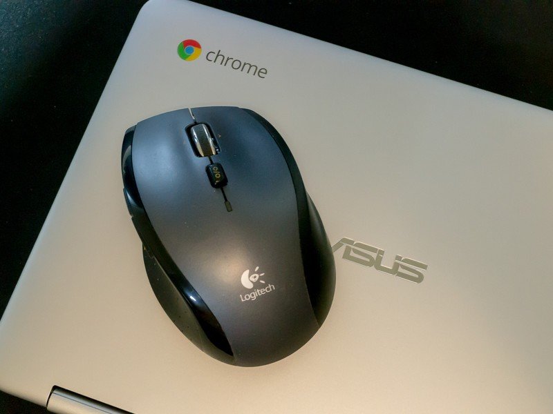
Chrome OS supports any USB or Bluetooth mouse or trackpad, but using the mouses's scroll wheel may feel… off… compared to Windows or macOS. The scroll speed on some of my mice feels just a bit too fast compared to how I've grown accustomed to over the last 20 years of using a computer, and there's no option in the settings to change this. It sounds trivial, but it's enough to keep me from using some of my mice with my Chromebook when I'm out and about.
Proper audio muting
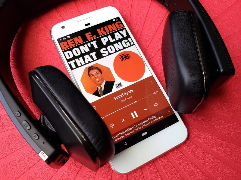
This is something Windows and macOS do, too, but that's no excuse for Google. If you have audio coming from the web browser — say a YouTube video — then you open an Android application to listen to your favorite podcast. You press play on the podcast, and you panic because the sound from the YouTube video is still playing. If you switch between two Android apps, the audio from one will correctly pause, but the same is not true of the web browser. I doubt Google or any operating system builder could reach into a site to pause whatever media is playing back, but muting the browser when another application is playing media would suffice.
Better window snapping
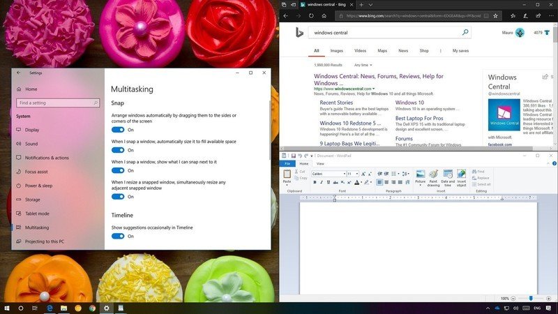
You can snap application windows to the left or right of the display in Chrome OS, but Windows does this slightly better. When you snap an application in Windows, it shows a list of all the other application windows available to be placed on the opposite side of the screen, so you can get your split screen on that much faster. Windows also lets you quickly snap an application by pressing the Windows Key + Left or Right on your keyboard. It'd be great to see Chrome OS include either of these features.
System wide dark theme
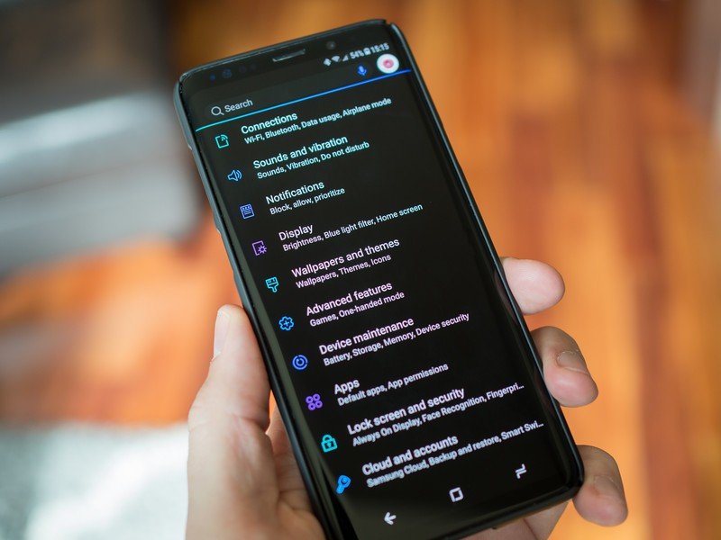
You can get a dark theme for your browser, for Gmail and other websites, but it's piecemeal. Again, I'm not sure there's much Google could do as an OS builder to make a third party site display in a dark theme, but it'd be great to see one toggle to change the browser, Settings, and any compatible Android applications from the default light theme to darker tones.
Persistent media controls for web apps
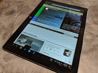
Android applications already offer media controls in the notification area, but it'd be great for websites to be able to do the same. I don't expect every website to be able to do this, but sites that use service workers as part of their Progressive Web App should be able to. It'd go a long way to making PWA's feel more like "native" apps, and it'd be more convenient for the user to have all of their media controls in one place.
Be an expert in 5 minutes
Get the latest news from Android Central, your trusted companion in the world of Android
What say you?
What features would you like to see in Chrome OS? Let us know down below!

