Five things you need to know about Lollipop on the Samsung Galaxy S5
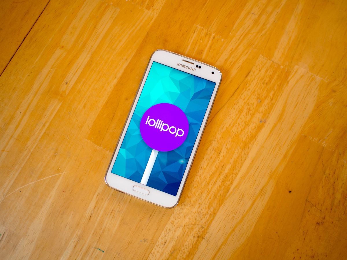
TouchWiz is far from dead. In fact, it's Material Design that feels like the stranger.
Samsung surprised everyone recently by rolling out the update to Android 5.0 through some of the notoriously difficult update channels, leaving many Galaxy S5 owners with a whole lot of new buttons to press and a couple of curious interface choices. While every upgrade to Android 5.0 is going to cause something of a learning period, the way Samsung meshes together Google's new user interface decisions with their existing user interface is likely to leave a few folks somewhat lost. Here's quick roundup of the good, the strange, and the slightly broken things about Lollipop on the Samsung Galaxy S5.
Read more: Five things about Lollipop on the Samsung Galaxy S5
Lollipop notifications work well, but the lock screen and system tray do not

Anyone who has used Android 5.0 so far knows that the update notifications system is one of the new stars of the show. The animations are slick, you can expand a great deal of notifications to interact without leaving the app you are currently in, and to be able to do all of this from the lockscreen is a genuine pleasure. Samsung made sure to get the pretty part of the notifications right, but everything else about this system is competing with TouchWiz. For example, on the lockscreen you can't just double tap on a notification to unlock the phone and launch the app. You have to unlock the lock screen notifications with a downward swipe, and only then are you able to expand notifications and jump to apps.
The notification tray once you've unlocked the phone is equally confusing to any who have seen Lollipop already. The notifications can be swiped and expanded as you would expect, but the top of the notification tray and the two-finger swipe to access to extended notification tray is classic TouchWiz. The darker blues and simple circles for activating features aren't going anywhere, and if you were hoping this part of the phone would start to look more like stock Android you're unlikely to be particularly happy.
Ultimately, if you're happy with the Galaxy S5 right now the lack of change may be a good thing. The only real functionality issue is when notifications tell you to tap in order to get an answer when the lockscreen on the Galaxy S5 has added an extra step without telling anyone.
Material Design is awkwardly sprinkled throughout TouchWiz

There are a lot of places on the Galaxy S5 that look exactly the same as it did before updating to Android 5.0. Most of Samsung's apps, for example, look and function identically to the previous version of Android. Samsung's launcher still functions the same way, thought the status bar is now transparent. Where things really start to get interesting are the seemingly random Material Design elements that pop up all over the place.
The card that pops up from the bottom of the screen to confirm which app you want to use to open something, the floating action button in the bottom right of the contacts section of the dialer, and the sort of hybrid Material look of the Settings panels now are the biggest places you'll notice this split UI. It's a lot of little things, and for the most part what you get is an experience that feels like Samsung only used the parts that were easy to add and left everything else on the cutting room floor.
Be an expert in 5 minutes
Get the latest news from Android Central, your trusted companion in the world of Android
There's plenty you can do to get more of that Material goodness in your life if you so desire, especially through replacement launchers, but if this is a sign of what we can expect from Samsung moving forward it'll be hard for a lot of folks to get excited about Material Design.
Individual Chrome Windows are enabled by default

Love it or hate it, Google's decision to let individual Chrome windows exist in the multitasking tray as separate items instead of tabs on a single window is a big part of Android 5.0. The design decision is one that users constantly discuss as though it is either the best feature ever or something to be turned off immediately after you boot the phone up.
Like the Nexus 6 and the Moto X, this Lollipop feature is enabled by default on the Galaxy S5 but is just as easy to disable as it is everywhere else. You can hop into Chrome and flip the switch to turn this feature off by heading to Settings in Chrome and flipping the toggle labeled "Merge tabs and apps", or you can give it a try and see how you like this new way of doing things. Especially with the new Lollipop multitasking window, you may find that the colorful windows created by Chrome make this your new favorite feature.
Mute and Priority mesh well together in the audio settings
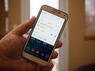
Folks who have just started to get a hang of Android 5.0 have noticed there's a button missing from the volume settings on some phones. For reasons passing understanding, Google has decided most people don't actually want to mute their phones. Instead, there's a Priority mode and a None mode for volume controls, and the lack of something in between bothers a lot of people. Samsung's new volume controls are a hybrid of what was available before and what Google thinks is best, and their implementation is one of the better changes that have been made.
If you want to mute on a Lollipop Galaxy S5, you can either hold down the volume button until the mute setting pops up, or you can tap the gear and select it out of a list. The expanded volume controls offered by tapping the gear gives users access to Priority notification controls, as well as the ability to set a timer on Mute. It really is the best of both worlds, and the granularity found in Priority notifications gives users the ability to thoroughly customize their setup.
Just a touch faster, but battery life is about the same

Android 5.0 brought with it a bunch of performance enhancing and battery extending software. The existence of 60fps animations and better battery life on any Android device is exciting, but it's honestly a little tough to see on the Galaxy S5. The biggest places you'll see improvements in performance is the camera app and the notification tray, which both feel smooth and launch faster than the previous version of the software. This is coming from an over the air install, so while your mileage may vary slightly based on usage you should have some subtle improvements.
As for battery life, after a week of use there was no obvious difference between the previous version of Android and Lollipop. We know that the big battery boosting bits of Project Volta require developers to do their part in the apps they release, so it's likely this will get better over time, but expecting any huge shift in battery life isn't likely to happen on this phone.
What do you think of the Lollipop update?
We've had some great feedback from a lot of people so far, and while there's some discussion on whether or not the Galaxy S5 is any faster with this update, the lack of any obvious outstanding bugs has been a huge relief for many. Samsung's deployment of Android 5.0 seems to be going smoothly, which is great news not only for the Galaxy S5 owners who have yet to see the update, but also owners of Samsung's other devices.
Don't forget to head to our Galaxy S5 forums for more info on this update!
