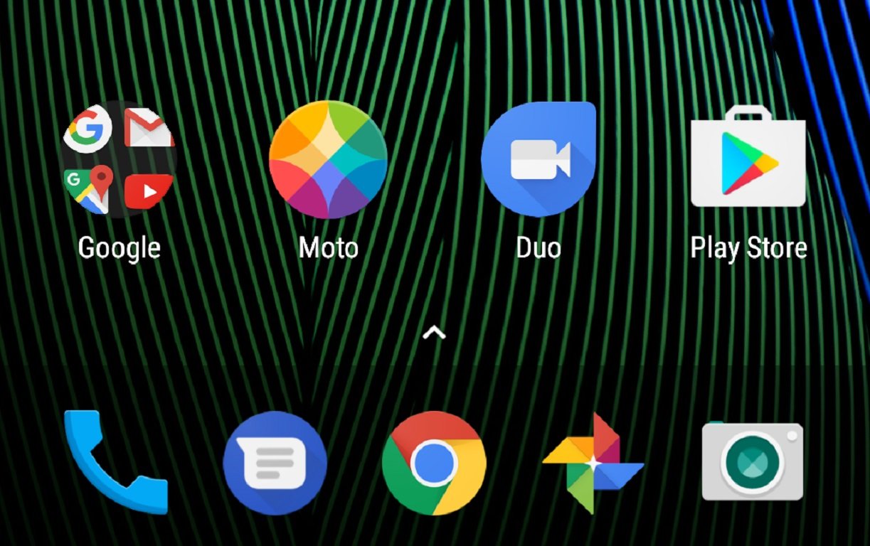
The Moto G5 Plus home screen shows just how weird Google's chat strategy is right now

Check out the home screen for a new Moto G5 Plus and you'll find the usual Google Apps folder full of bloatware useful Google-made apps, and on the other side of the Moto app you'll find an icon for Google Duo. We know that Google exercises quite a bit of control over how an Android phone with the Google Play Services onboard needs to look, with some special emphasis on the home screen.
It's not unusual for Google to want to show off new apps, so it's not too odd to see Duo on the home page instead of in the Google folder, but Duo is alone on the home screen. There's no Allo to be found. In fact, it's not even installed on the phone.
Google's messaging strategy for the future should be super clear by now. Allo and Duo, the chat and video messaging service unveiled at Google I/O last year, are the default apps for consumers. Hangouts Meet and Hangouts Chat, the re-branded counterparts every Android user has seen for the last couple of years, is for businesses or large groups. There's no law saying you must use one or the other if you prefer, but the dividing lines have become fairly clear and Google seems committed to building Allo and Duo up to offer something unique and useful to users.
So why is it the new budget-friendly and surprisingly capable Moto G5 Plus, complete with Android 7.0, doesn't reflect that strategy when you boot the phone for the first time?
Seriously, I don't know. You tell me.
Be an expert in 5 minutes
Get the latest news from Android Central, your trusted companion in the world of Android

