Fitness trackers keep ditching buttons for touchscreens, and it's terrible
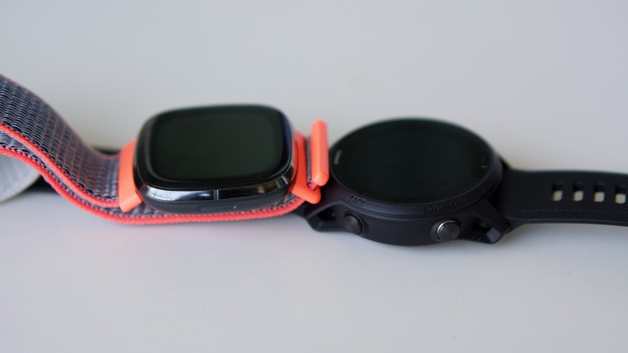
Most of the best fitness trackers and fitness smartwatches use a combination of touchscreens and buttons. The more complicated the UI or more compact the design, the more it relies on touch to navigate. And while that's perfectly fine for lifestyle watches, touch UI is an unreliable mess for fitness tech, sacrificing usability for weight and style.
Last month I decided to jumpstart my marathon training using fitness tech. Each training run, interval, or half-marathon I run, I try to switch to a new tracker or watch. I'm looking at fitness trackers as a whole to see which features enhance my performance. Or do the opposite, in the case of touch-reliant fitness tech.
Touch UI is an unreliable mess for fitness tech, sacrificing usability for weight and style.
It's not newsworthy to say that touchscreens and sweaty fingers are a match made in hell, compounded by the small surface area of a 1-inch tracker screen or 2-inch smartwatch display. Nothing is more mentally frustrating and zone-killing during a run than your freaking smartwatch refusing to acknowledge your taps and swipes on the go.
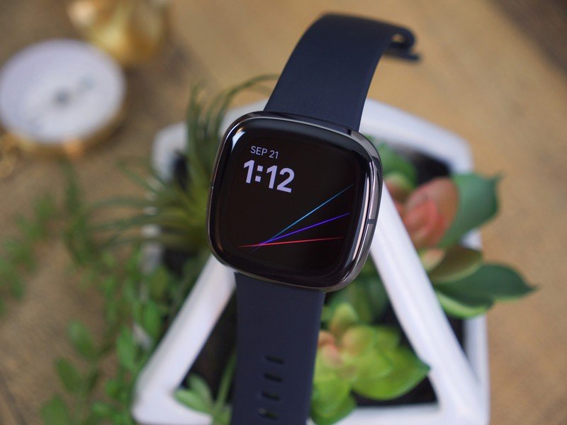
To jumpstart my test, my fitness guru coworker Jeramy Johnson lent me a Fitbit Sense and Amazfit Band 5, among others. I knew the sub-$50 Amazfit would be basic, but I was intrigued to see how the premium Sense compared to other touch-based watches. Turns out, the same as every other watch I've tested.
I live in California, where OLED "brightness" gets diluted by the near-constant sun and dim always-on screens aren't visible. If I want to view my stats as I run or pause tracking while I wait at a light, I need to activate it. But across all brands I've tested, touchscreens rarely prove that responsive. I'll tap three, four, five times before something actually happens; even then, my sweaty fingertips will swipe away, only for it to take several tries to change views.
Touchscreens and sweaty fingers are a match made in hell.
I've also found that watches' built-in accelerometers and gyroscopes can't be trusted, either. Twisting your wrist or moving it towards your face should cause the display to activate, but many brands can't seem to tell the difference between that and a typical running motion. So I use always-on and drain the battery as a compromise.
If you solely use your tracker to start and stop workouts with nothing in-between, this doesn't matter. But I like looking at more metrics during a run than a single watch display can show. And when I'm trying to hold myself accountable while running solo, I'll use advanced preprogrammed workouts that swap between different target paces manually — which I've typically only seen on premium watches with proper buttons.
Be an expert in 5 minutes
Get the latest news from Android Central, your trusted companion in the world of Android
When it comes to fitness tech, only buttons and crowns can be trusted to work quickly and consistently. But outside of the most expensive brands, most fitness tech has left them behind for good.
Style over substance
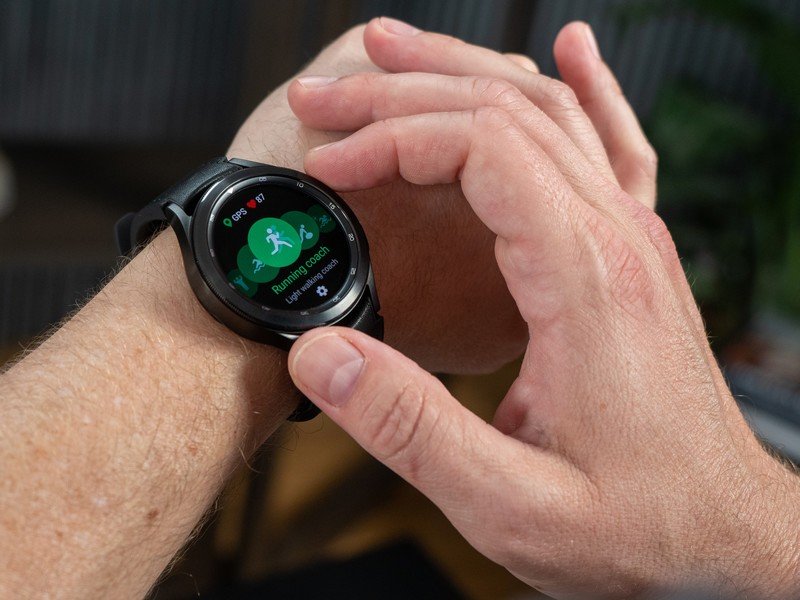
Today, knobs, crowns, and rotating bezels have become the purview of expensive lifestyle brands: your Apple Watch 7s or Galaxy Watch 4 Classics. It gives them a retro look on your wrist and offers more convenient navigation.
What's ironic is that lifestyle watches don't need buttons as much as fitness watches. Touchscreens work best in our daily lives when we're standing still or sitting; buttons provide a handy shortcut, but you can comfortably use your screen like a tiny smartphone screen in ideal conditions.
It's fitness bands that would most benefit from precise controls. But more and more, fitness brands are abandoning buttons or dials like they're out of style. And maybe they are out of style, with consumers seeing buttons as unsightly or last-gen.
Knobs, crowns, and rotating bezels have become the purview of expensive lifestyle brands.
Look at Fitbit. Old Fitbits like the Ionic, Blaze, Surge, and original Versa had two buttons, but most of its current devices only have a haptic side divot that you squeeze to turn it on or activate shortcuts. And while we love Fitbits for their sensors and software, a consistent theme across our Inspire 2, Sense, and Charge 4 testing was that this "button" often takes multiple squeezes to register properly. One finicky button does not an inspired UI make.
But hey, at least Fitbits have a semi-competent button! Most other fitness bands are fully touchscreen reliant, and our reviews typically forgive them that because they're so cheap and lightweight, have shiny AMOLEDs, and look snazzier than ever.
By trending in this direction, fitness tech creators can succeed in the $100-and under range where customers will accept some UI frustration and missing features as part of the territory. But for more expensive buys, I think these companies are ceding territory to more "hardcore" fitness companies prioritizing usability over style.
Finding the running / lifestyle balance
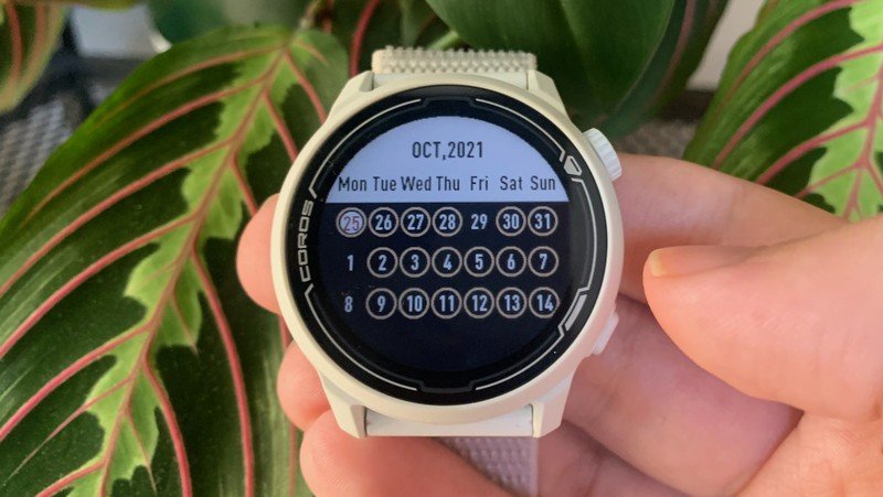
One of my favorite new running smartwatches is the Coros Pace 2, which I reviewed recently. This smartwatch has the lightweight frame of a fitness tracker, free advanced running metrics you'd usually have to pay monthly for, and two buttons (one a crown) for simple navigation. Twisting the crown unlocks the watch every time — no accidental or failed taps — after which I can access my metrics or pause a run with a quick twist and press, without any issues.
Any Garmin smartwatch will offer a similar experience, as will any other Coros or Polar running watch. But the vast majority of people want a smartwatch they can also use outside of workouts, too; for them, that means a touchscreen. And quite frankly, most of these watches cost far more than regular people are willing to spend.
There's a reason why so many of my colleagues' fitness watches are Samsung or Apple Watches, because they provide general quality and better button/touch hybrid navigation than a cheap fitness band. But they're not specialized for fitness in quite the same way, and my colleague's account of the Galaxy Watch 4 overheating during a mere 5K freaked me out.
Fingers crossed for a Fitbit metamorphosis
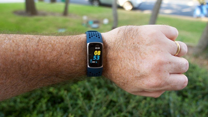
What I want is for companies to bring back proper buttons and crowns into the sub-$200 category. Even if they add a few grams of weight, these would vastly improve the fitness tracker/smartwatch navigation experience. And I hope Fitbit leads the charge.
Since Google acquired Fitbit, the company has been slow to release new smartwatches compared to past years. Whether it's due to the pandemic or its plans to incorporate Wear OS 3 into Fitbit, the company may have a major redesign in store.
Affordability and proper navigation buttons should not be antithetical to one another.
My Fitbit-loving colleagues are concerned this transition could hurt the Fitbit brand. In my case, I'm hopeful that future products like the Fitbit Sense 2 will have revamped navigation controls to control Wear OS 3 more easily. And as a happy side note, this will make navigating through its fitness tools far easier, too.
I suspect many casual fitness fans would disagree with me and happily accept unreliable touchscreen controls over a more complicated OS that depends on buttons. But I'm waiting for a fitness tracker revolution that means we don't have to accept the frustrating status quo anymore.
A 1oz watch for lightweight tracking
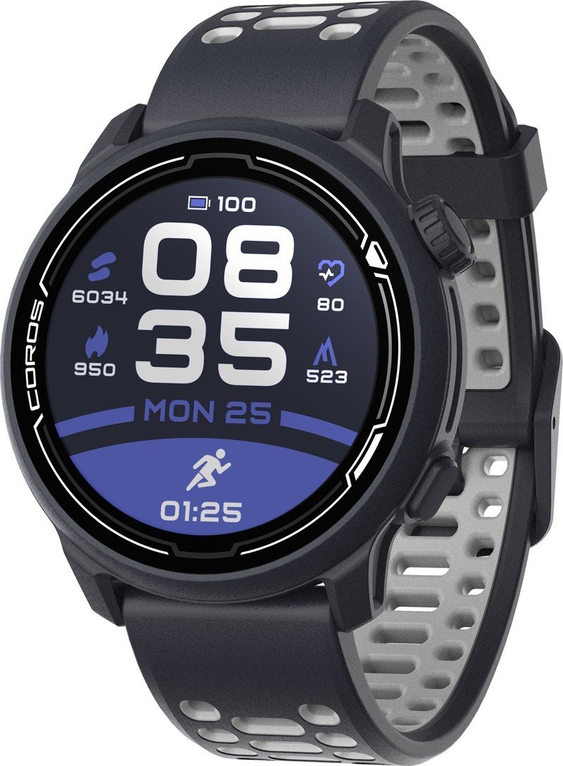
The Coros Pace 2 gives you weeks of battery life on a single charge, detailed running metrics without a monthly sub, a solid 1.2-inch LCD display, and easy button/crown navigation. It's barely heavier than a fitness tracker but is much easier to use.

Michael is Android Central's resident expert on wearables and fitness. Before joining Android Central, he freelanced for years at Techradar, Wareable, Windows Central, and Digital Trends. Channeling his love of running, he established himself as an expert on fitness watches, testing and reviewing models from Garmin, Fitbit, Samsung, Apple, COROS, Polar, Amazfit, Suunto, and more.
