Fitbit's always been about adding to its collection — unlike many other tech companies, products stick around for years on its proverbial shelves. The Zip, for instance, that clip-based instigator of the Fitbit revolution back in 2012, was only recently discontinued. Why? Because people still wanted it, so Fitbit still sold it.
What replaced it — the Inspire and Inspire HR — also replaced three other Fitbit products, and from the looks of things, this spring cleaning has done the now-public company some much-needed good.
The Inspire and Inspire HR are very similar products, with a couple of notable differences. They're also two of the best and most useful Fitbits ever released, especially for the price. So should you buy one and, if so, which one? Let's dig in.
The Good
- Tiny form factor that's comfortable to wear 24/7
- Heart rate and sleep tracking
- Attractive design with easy-to-change bands
- Fully waterproof and swimproof
- Excellent 5-day battery life
The Bad
- Vertical screen is tiny and narrow
- Notifications are real-time only, no archive
- No additional app support beyond what's on tracker
- No Fitbit Pay
The Good
- Tiny form factor that's comfortable to wear 24/7
- Attractive design with easy-to-change bands
- Fully waterproof and swimproof
- Excellent 5-day battery life
The Bad
- Lack of heart rate means losing many fitness features
- Vertical screen is tiny and narrow
- Notifications are real-time only, no archive
- No additional app support beyond what's on tracker
- No Fitbit Pay
Note: I'm going to talk mainly about the Inspire HR in this review, as I think it's the better product overall, but most of the points pertain to the Inspire, too.
Fitbit Inspire and Inspire HR Review
The last Fitbit I wore for any length of time was the Charge 3, a near-perfect blend of fitness tracking and smartwatch features. I think it's the best fitness tracker ever made and still the best Fitbit product you can buy. So I was kind of shocked to see, upon buckling the Inspire HR to my wrist, just how close this tiny wrist tracklette (yes, that's what I'm calling it) gets to its larger, more expensive counterpart from a features perspective. But for a couple of minor features, the Inspire HR is a full-fledged Fitbit, and it's become my preferred wearable.
The Inspire lineup takes the best of the Alta and Flex series and updates them for 2019.
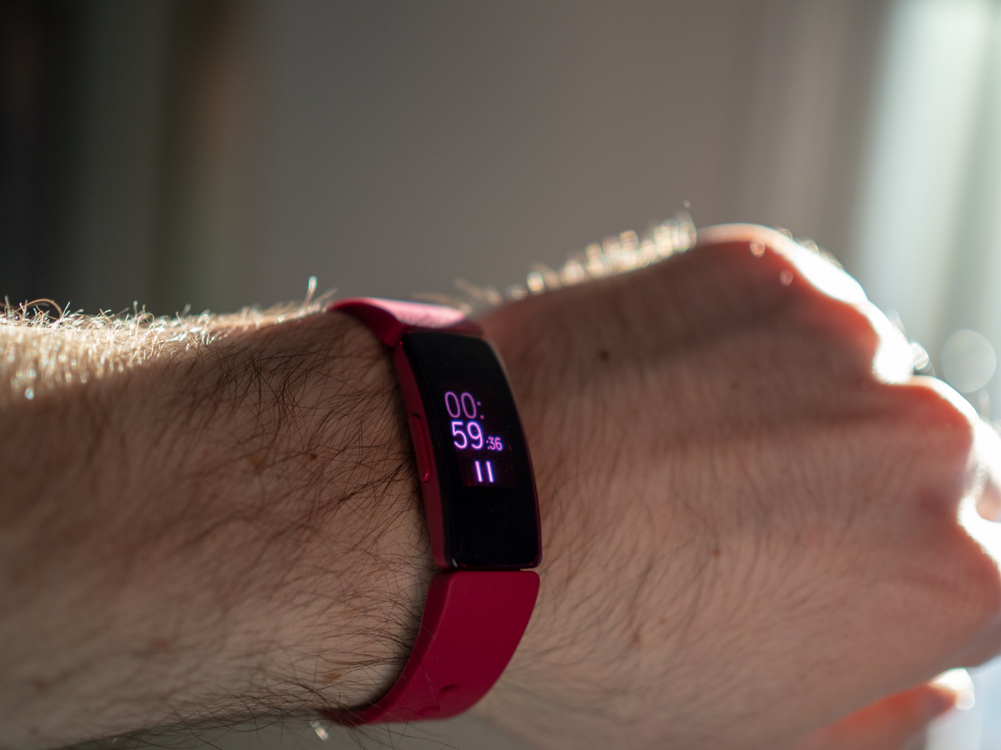
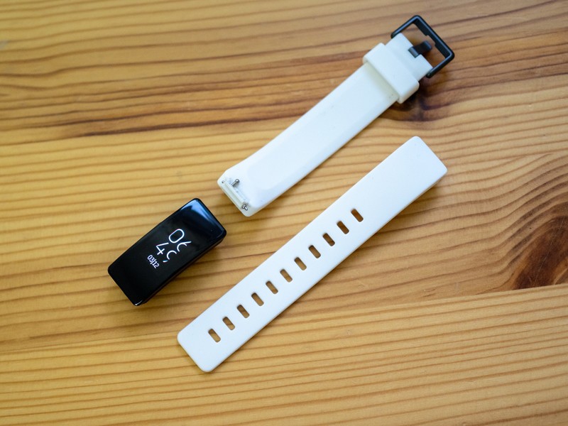
Before we get too deep into the weeds, let's talk about the differences between the $70 Inspire and $100 Inspire HR. Fundamentally, the two trackers differ in only two ways: the former lacks a heart rate monitor, and comes with a cheaper peg-and-loop band that's akin to the Apple Watch's sport band, whereas the Inspire HR has the aforementioned 24/7 heart rate sensor and a more traditional buckle, though the band is still made from a comfortable rubberized plastic.
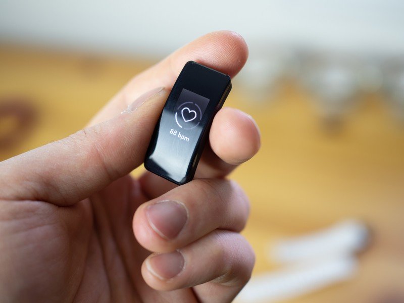
The Inspire is small, way smaller than I thought it would be. The tracker, sans band, is about 1.4 inches tall — more than the Charge 3, actually — but it's considerably narrower, at .63 inches, which makes it feel less cumbersome on the wrist. The underside of the Inspire also slopes inward as it meets the wrist, which tricks your brain into thinking it's thinner than it is. Regardless of what head games the designers are playing, this is about as close to invisible as I've felt a Fitbit to be in my many years wearing these products.
I'm also a huge fan of the black-and-white "panda" contrast of the Inspire HR the company is selling; you can get the HR in all-black, lilac, and panda, while the Inspire comes in all-black and a darker "sangria" option. Both models have both small and large band options in the box, which is generous, and there's no difference in the size or quality of the OLED touch panel.
Being much narrower than the Charge 3, Fitbit necessarily needed to make some usability sacrifices here, and while it did the best it could, focusing on a vertical-only interface, reading text on here is a challenge. That's likely why there's no place to see notifications once they've come through — you either see 'em as they come in, or you miss them.
The home screen is the watch face, which by default also shows you one additional stat — steps taken, heart rate (for the HR), today's date, etc. — and you swipe up to see additional stats in slightly more detail, pressing the single button to return to the home screen. Swiping down lets you start exercising, from a run to a swim to weight training or intervals. While the UI is simplistic, the actual statistics gleaned from your workouts are the same, at least on the HR, as Fitbit's more expensive trackers.
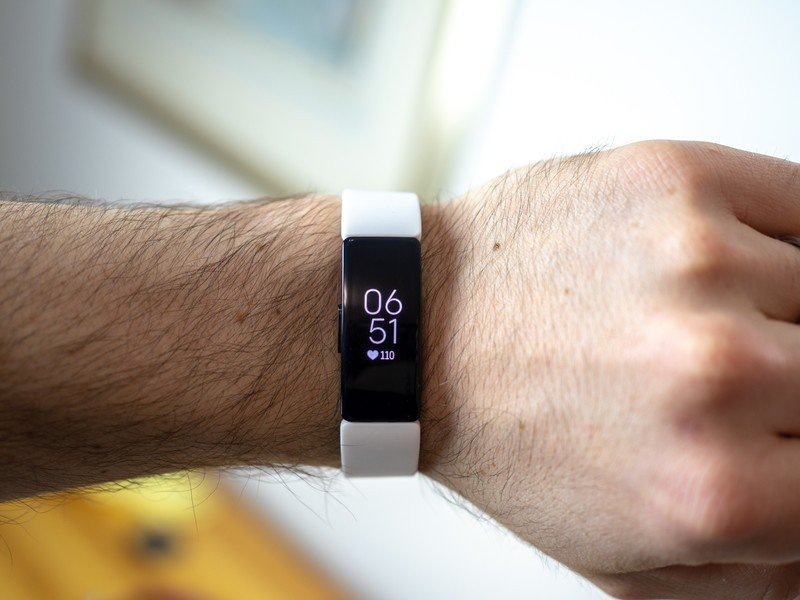
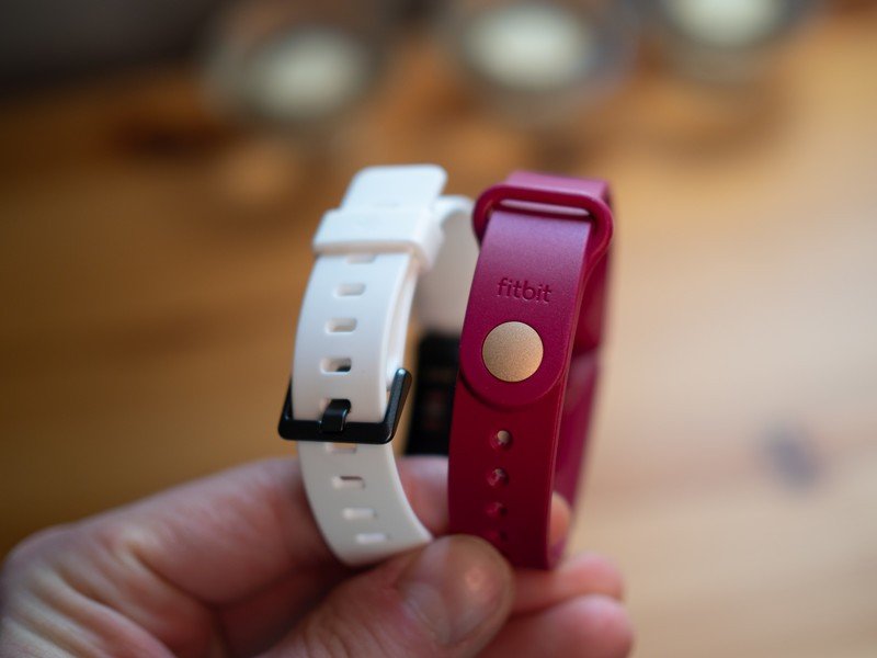
Fitbit makes the software experience that much better by incorporating subtle animations into every transition and icon. Every time I begin a run, I look forward to the little stick-figure person who begins the journey with me. There's a fluidity to the interface that's been absent on previous Fitbit trackers, and it gives the band a life — and liveliness — that is sorely needed when you're interacting with something on your wrist. That the Inspire duo replaces three distinct lines within Fitbit — the Alta and Alta HR, the Flex 2, and the Zip — speaks to the confidence the company has in the finished product.
Even the bad stuff doesn't detract from the fact that this wearable disappears on your wrist.
Of course, given the diminutive size and relatively low prices, both the Inspire and Inspire HR are hampered in some ways. The touchscreen really is quite small, and that limits the number of things you can do on the thing itself; you can't even set alarms without going into the app first. There's no GPS radio, so you'll need a phone with you if you want to accurately track the traversed area of a run or bike ride.
There's no NFC, so no Fitbit Pay. Battery life is on the shorter side of five days — I got around four and a half days in two separate charging sessions — and the information density on the tracker itself is sorely lacking. Yes, you can tell how many steps you've taken or what your current heart rate is, but anything that requires a bit of study needs to be referred to on the app. The included watch faces, if you can even call them that, are about as boring and plain as they come. And unlike the larger-screened Charge 3, neither of the Inspire products support Quick Replies on Android, a better-on-paper feature, granted, but still one that comes in handy every once in a whioe.
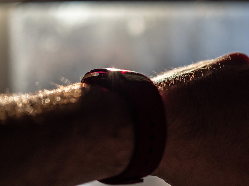
Still, none of these few downsides detract much from the sublime reality that this is easily the most comfortable Fitbit — wearable in general — that I've worn to date. I wear it to sleep, I wear it in the shower and when bathing my daughter, I wear it while working, and the only time I notice it is when I'm admiring the panda color scheme.
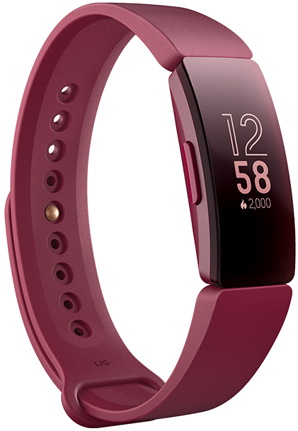
Fitbit Inspire (From $66 at Amazon)
The Inspire is in a difficult spot, because without heart rate tracking it's basically the same product Fitbit's been releasing annually for nearly 10 years now. Yes, the form factor is the same as its HR counterpart, but you lose so much in the way of functionality I really can't recommend it.
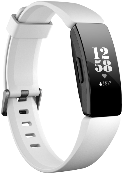
Fitbit Inspire HR (From $99 at Amazon)
The Inspire HR, on the other hand, is my new favorite fitness tracker, period. It does everything I want, including receive notifications (albeit so does the regular Inspire), taking stock of my resting and working heart rates, tracking my steps, my runs, and my (lack of) sleep. Even the magnetic charger isn't a disaster, which is a surprise given Fitbit's track record.
Both of these products are worthy successors to the products they replace, and prove that even without massive innovation, Fitbit still has an uncanny ability to build fitness products for every type of person. The Versa Lite may be a better smartwatch, and the Charge 3 a more well-rounded tracker, but the Inspire HR is the one that's staying on my wrist and, to me, that means much more at the end of five days.
Daniel Bader was a former Android Central Editor-in-Chief and Executive Editor for iMore and Windows Central.
