I have a rule about Fitbits: I don't review them — really review them, not just "review" them — until I've used the new product for at least a month. Why? Because every time I've done so in the past I've been burned by some underappreciated feature (good!) or errant bug (bad!) that only crops up with experience — and time.
The Charge 3 is the culmination of the category Fitbit all but started nearly a decade ago: the tracker. It's simple and does a few things really well, but it's limited by design. It's the reason Fitbit has sold millions of these things — people just want to count their steps and track their sleep and maybe get their notifications, but not a whole lot more.
But is the Charge 3 the perfect Christmas present or the pinnacle of a dying category of wearables?
Article continues belowFitbit Charge 3 The review
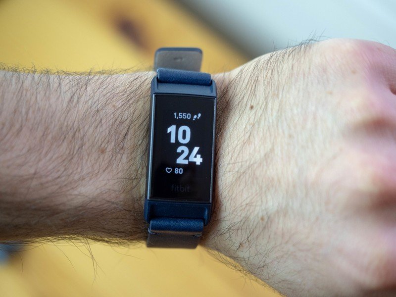
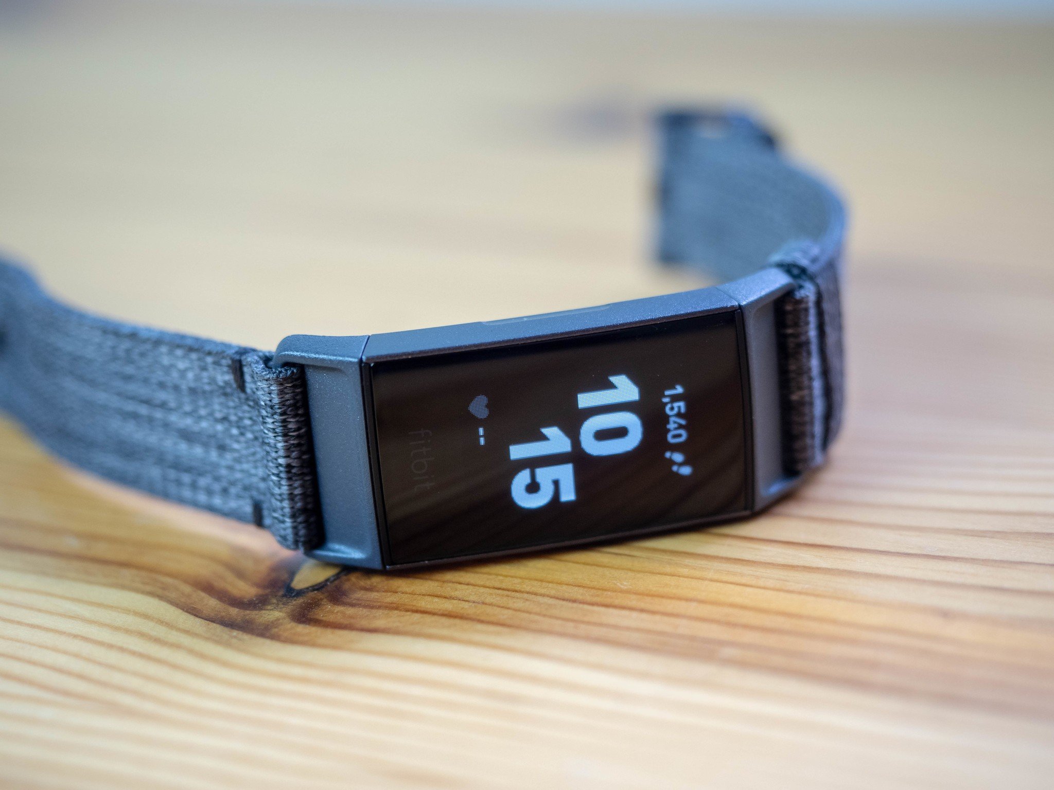
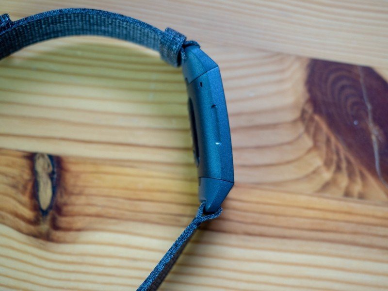
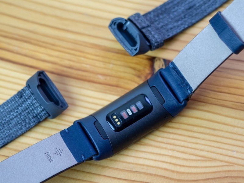
Fashioned from a textured piece of aluminum brushed in something resembling graphite (at least on the model I reviewed), the Charge 3 really is the best-looking and most comfortable of the "bigger" Fitbits — something like the Flex 2 just disappears on your wrist — with a curvature that perfectly contours the wrist. You'll find a diamond-patterned rubber sports band in the box, but I opted for the $35 Charcoal Woven Band, which snaps nicely into place using Fitbit's proprietary quick release mechanism.
The addition of a touchscreen is great, but there's so little you can do with the software it's almost wasted.
That Fitbit has built a tidy side business on accessories isn't surprising — they're merely playing Apple's game — but what is surprising is just how well-made and comfortable these bands are. Even the $50 Horween leather band is worth a look. That said, the bands are ridiculously expensive — the leather band is a third the cost of the tracker itself — and certainly hard to justify when you're presumably trying to save money by going with a fitness tracker in the first place. Thankfully, Amazon is full of decent-quality nylon, leather, and metal bands for the Charge 3.
The major difference between the Charge 3 and its predecessor, at least from a hardware perspective, is the shift from a boxy design to one of subtle curve, and from a physical button to an inductive one that makes the tracker waterproof up to 5 ATM, or 50 meters, which means that unless you're a scuba diver you can safely wear this thing 24-7-365. Well, at least when you're not charging it.
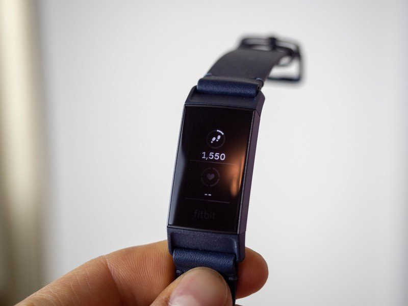
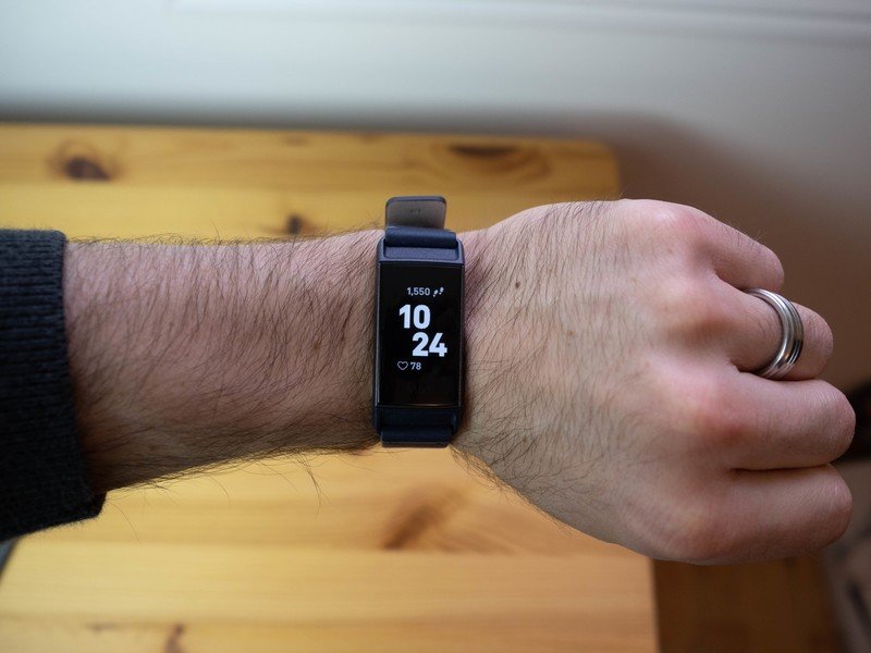
There's also a full greyscale touchscreen, which responds not just to taps just swipes. To call the UI simplistic would be an understatement, but I'm not really sure what else I need — most of the included watch faces are dense enough to provide step and heart rate data every time I lift my wrist or touch the screen, and a swipe up from the bottom reveals a summary of any metric I could possibly care about, from calories burned to minutes active to water consumed.
Get the latest news from Android Central, your trusted companion in the world of Android
Pressing the side button always brings you back to the previous screen; holding it presents a quick settings box to disable notifications or automatic screen waking. To the right of the homescreen are the Charge 3's apps, or what passes for apps by the company's tracker standards. While Fitbit doesn't claim that the Charge series is a smartwatch in the traditional sense, it does like to tout its intelligence. But when you take a look at the smattering of apps — a timer, an alarm, and a weather app to go along with the standard exercise and meditation routines — you'll quickly realize this isn't trying to be anything but a fitness tracker.
Notifications on the Charge 3 are fine, but with Quick Replies on Android they're actually pretty useful.
That said, a few weeks after the Charge 3 was released, it received an update to give it quick replies on incoming notifications when paired to an Android app. The feature was ported directly from the company's Versa and Ionic smartwatches, and it works just as well — or poorly, depending on your needs — here.
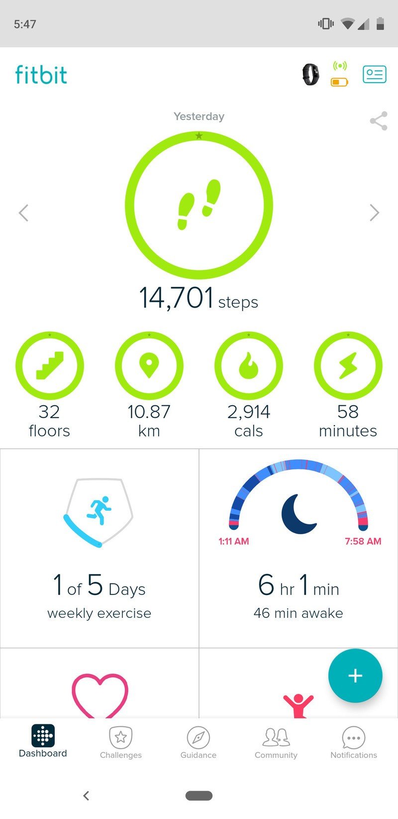
They're all configured in the excellent Fitbit app, but by default you can respond, "Yes" or "No" or "What's up?" or "Can't talk now, will respond later," along with a few other quotidian phrases. Those, along with various emojis, provide the basic fuel for a decent bi-directional interaction model, but only in the most simplistic of terms. Anything more complex than a thumbs-up emoji and you'll be taking your phone out of your pocket.
Still, I've used almost every smartwatch on the market, including Fitbit's own options, and I find myself needing to triage notifications and offer short replies more than I ever need to hail an Uber or use my screen as a remote camera shutter. As a result, I find myself enjoying the Charge 3's planned simplicity because it's only tangentially a smartphone companion. Its primary purpose is to track your health, and like all Fitbits it does this very, very well.
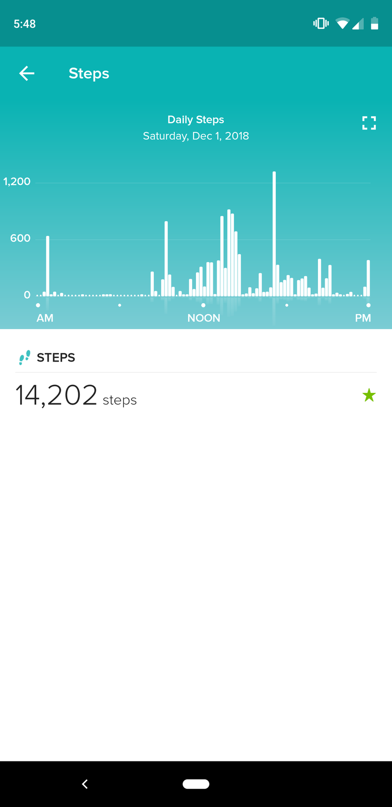
I say this acknowledging that the company hasn't always had a solid reputation for accuracy, but those issues have been largely resolved with improvements to the sensors inside its trackers along with updates to its algorithms to better detect what actually constitutes a step, or a sprint, or a swim lap. I wore the Fitbit Charge 3 along with a Motiv Ring for two weeks straight, and the step counts were within a couple hundred each day, with the Fitbit usually on the higher end. While I wouldn't recommend the Charge 3 to any serious athlete — its lack of GPS alone probably disqualifies it from that category — but to the average person hiking, running, biking, yoga-ing, or swimming a few times a week, it'll be perfect.
Much of that prowess is owed to just how lean-back the Fitbit experience has become. Not only does the Charge 3 last a week per charge — that equates to around four and a bit top-ups per month — but once it's added to your Fitbit account, the whole thing just works. It uploads data to the app in the background, automatically detects steps, sleep, and workouts, and offers meaningful insights about how you're living.
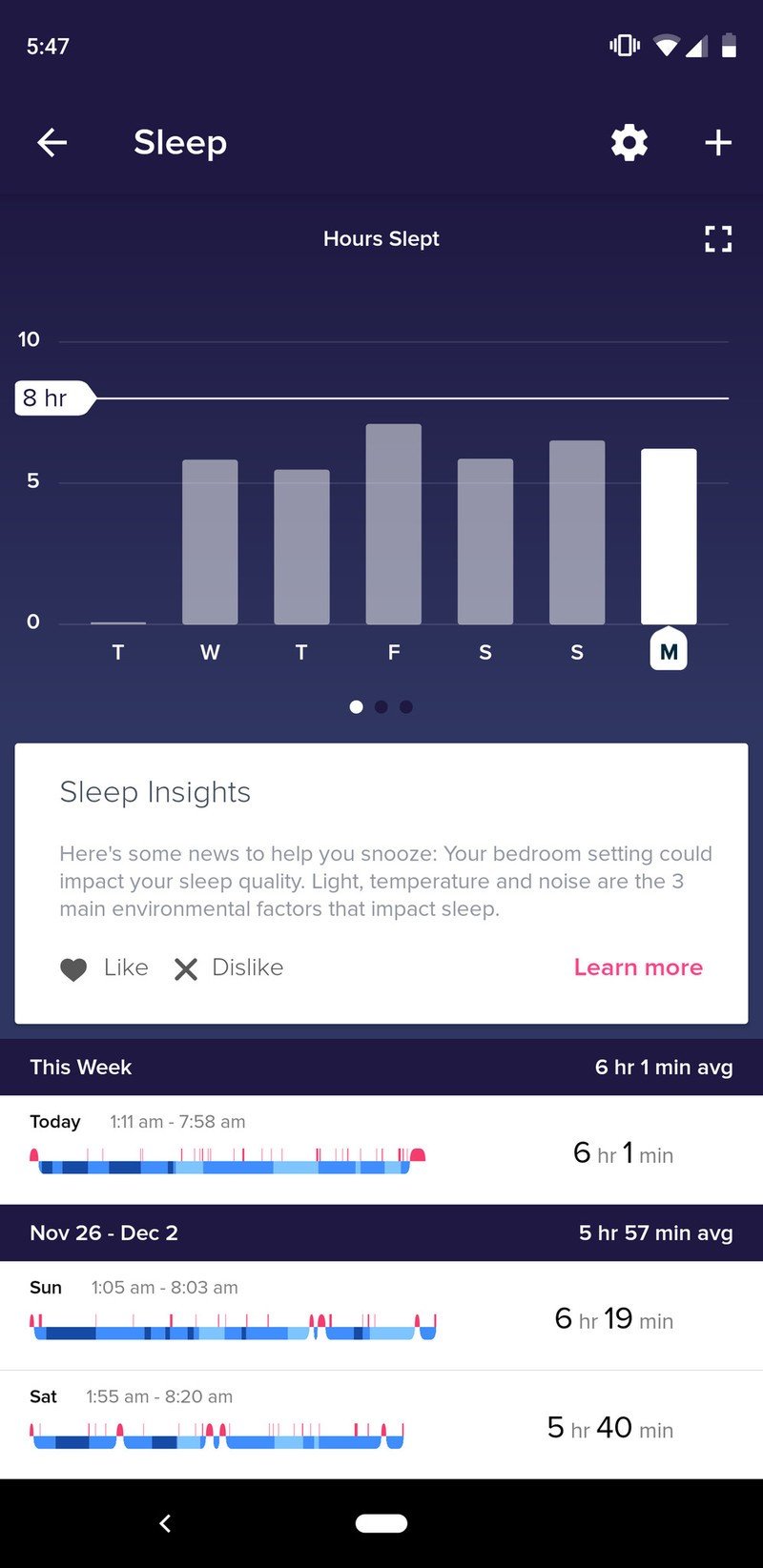
I've always been a fairly active person and felt Fitbit's metrics — all trackers' metrics, in fact — were interesting but not particularly meaningful. That changed when I realized the correlation between exercise and sleep, or lack thereof, when becoming a parent. I don't sleep nearly as much these days, so to offset the inevitable energy loss I have to be much more mindful about what I eat and how much I move. I notice that even the days I sleep relatively well — six hours compared to three or four — I can still keep my eyes open well into the evening if I spend some time on the bike, or go for a nice, long hike with my dog.
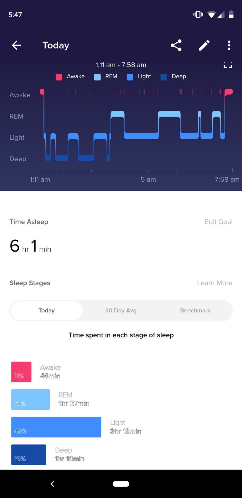
At the same time, Fitbit's sleep data, and the way it's presented, is unparalleled in the industry. Every fitness wearable tracks steps and exercise, and most now do so automatically, but few meaningfully plot sleep information into categories — what Fitbit calls Sleep Stages — like the Charge 3 and its peers.
And thanks to the ubiquity of Fitbits in the regular population, it has the most robust social features of any fitness ecosystem, rivalled only by standalone apps like Strava and MapMyRun and Apple's growing network of Apple Watch users. Indeed, with older Apple Watch models available under $200, Fitbit likely needs to appeal to Android customers more than ever. (The less we talk about improvements to Google Fit, the better.)
That brings me to some of the Charge 3's issues. While I haven't experienced any major software bugs with the Charge 3, Fitbit's community forums are littered with posts about how the Charge 3 is not only buggy but broken. The update released in early November that purported to fix a number of bugs while introducing new features like Quick Replies and Fitbit Pay has reportedly introduced a whole bunch of new concerns. While these people certainly don't represent a large percentage of Charge 3 owners in the real world, the company's seeming inability to quash bugs or ensure the seamlessness of its experience is disconcerting.
Part of the problem is likely Bluetooth itself: Fitbit has to create a device that works on iOS, Android, and Windows, and almost identically across all three platforms. Bluetooth is a notoriously finicky protocol and I have no doubt that many of the people having issues with the Charge 3 are using older Android devices with aging software.
Bluetooth issues are still present, but they're less pervasive now than they used to be.
But that's no excuse; Fitbit is the name on the box, and Samsung or LG can't and won't be held responsible for a bad experience on the wrist. I even had a minor issue getting my Charge 3 to pair to my Pixel 3 for the first time, and had to add it to another phone first to get my Pixel 3 to recognize it. Once added, it's been perfectly solid, but I can only imagine someone getting blocked from pairing the tracker to their phone entirely, without access to another device. Not a great first impression.
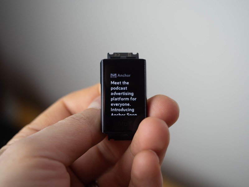
Then there's the notifications themselves. While technically the Charge 3's notifications are a bonus feature added to a standard-fare fitness tracker, they're subject to the same whims as notifications on the more expensive Versa and Ionic. Fitbit uses Android's standard notification hooks to, with permission, pull the relevant content to the wearable. You have to tell the Charge 3, through the Android app, which notifications to pull from. The issue is that they only come to the wrist when they hit the phone, and thanks to Android's intense battery-saving techniques, they often come in waves, resulting in a 10-second maelstrom of haptic earthquakes whenever my phone wakes up decides to download 15 emails. It's not exactly Fitbit's fault, per se, but it's a problem that, thanks to Wear OS's tighter integration with Android itself, handily avoids.
The Charge 3 also only offers its nascent Fitbit Pay feature with a Special Edition (read: NFC-capable) version that costs $20 more. While I appreciate the fact that this non-essential feature is omitted for price-sensitive customers, but I feel like it should be standard, if only to avoid customer confusion.
There are some other minor problems with the Charge 3 that I'm willing to forgive because of its limited ambition: the tracker comes with a weather module (I refuse to call it an app) along with an alarm, both of which need to be set up through the app before they do anything. Once they're added, they're there forever, but any maintenance needs to be done on the phone itself.
All this leads me to ask the high-level question — why get a Charge 3 when the industry, including Fitbit itself, seems to be moving towards smartwatches? The answer, at least to me, is about scope. The Charge 3 does exactly what it sets out to do — accrue copious amounts of health data, and send me notifications from my phone — and pretty darn well at that. The Versa, on the other hand, is flawed because of its ambition: its app ecosystem is barren, and it introduces far more compromise than it addresses with a more complex interaction method. Plus, its battery lasts half as long.
3.5 out of 5
I think Fitbit will likely address a lot of the flaws in its smartwatch ecosystem in 2019 with its second-gen Versa and Ionic products, but until then I'd much rather have a Charge 3 and a phone than the Versa on its own.

Daniel Bader was a former Android Central Editor-in-Chief and Executive Editor for iMore and Windows Central.
