A few quick thoughts on Google Inbox
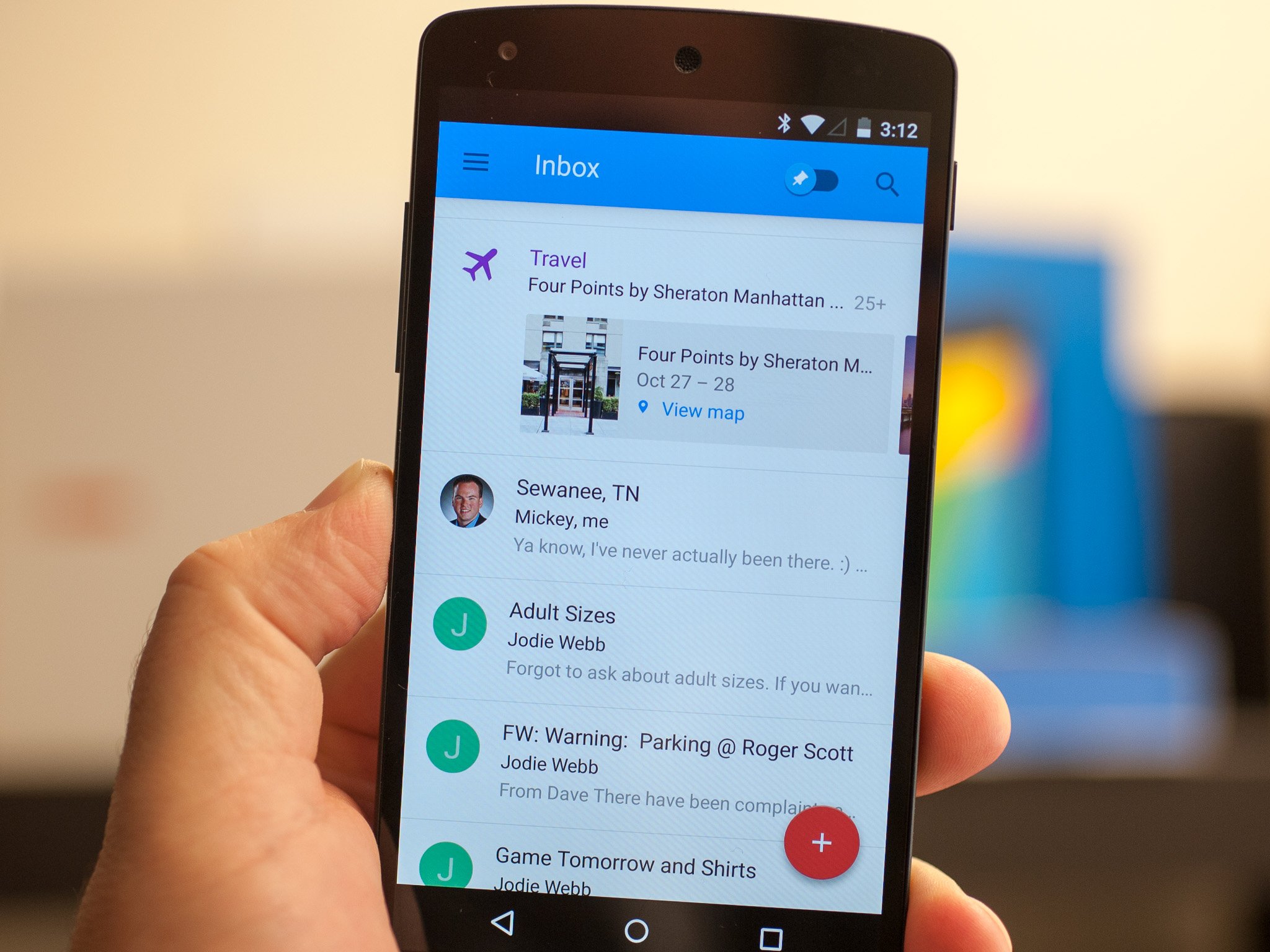
Can Google's new Inbox change the way we fail at email? Quite possibly, but it's early yet.
Google today announced Inbox, a sort of Gmail with training wheels. That is, it tries to make your email experience easier by automatically grouping emails together into categories. It's not unlike what Gmail already does with its tabbed inbox — primary, social, promotions, updates and forums sections — but Inbox makes it look good, far less clinical than Gmail proper.
Inbox is invite-only for now. (No, we don't have any to give out yet. But thank you for asking.) And while it's available on Android and iOS, it's currently only available in web form on the Chrome browser. (Which really means it's not yet available in web form, but we digress.)
This is the sort of thing that takes a little time — and email — to really get a sense of, but I've got a few random thoughts.
Inbox is friendly Gmail
Inbox looks beautiful. A good chunk of that is Material Design, no doubt. And on the web side, Polymer, Google's paradigm for bridging the mobile/desktop divide. (And very likely a reason why you can only view Inbox in Chrome at the moment. That'll be sure to change, of course.)
Don't discount design as being superficial, though. There's a reason folks prefer Flipboard over straight RSS readers. I spent a decade triaging stories in a terminal-style interface, quickly scanning dozens and hundreds of lines for what was important. I take that same approach to Gmail now, so lines and lines of messages don't faze me. That is not normal. And it's definitely not Inbox. And it's not going to solve everything for everyone. I've got serious questions about how Inbox will stand up to my work account. (Which is on Google Apps and can't be used here yet.) And I have serious questions about how we use email in the first place. (Gizmodo has a good take on that in the wake of the Inbox announcement.)
"Done" is the new "Archive"
Get the latest news from Android Central, your trusted companion in the world of Android
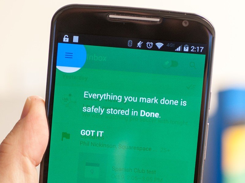
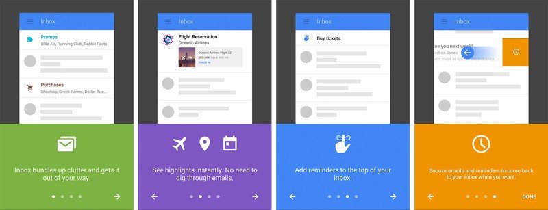
Swipe an email one way to be "Done" with an email. (That's the new Archive, and don't worry, that's where everything will be if you decide you don't like Inbox.)
Bundles are your friend, probably
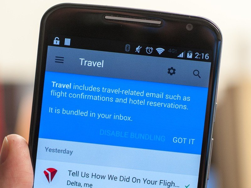
These aren't labels. Don't think of them as labels. Remember that "Inbox" is a label in Gmail. Here, though, bundles are just that. Groups of emails. Even if you're "Done" with the email, it'll still be in the bundle, unless you go so far as to "Trash" the email. But I'm definitely liking the idea more than I thought I would. "What did I order last Tuesday?" (Flips over to the Purchases bundle, scrolls down to last Tuesday.) "Oh, right. That."
I'm assuming Inbox will learn and improve the bundles as more emails come in, and as I manually move emails to them.
And you'll want to dive into the settings and make sure bundles are notifying you about new emails, if that's what you want.
Snooze is a cop-out, though
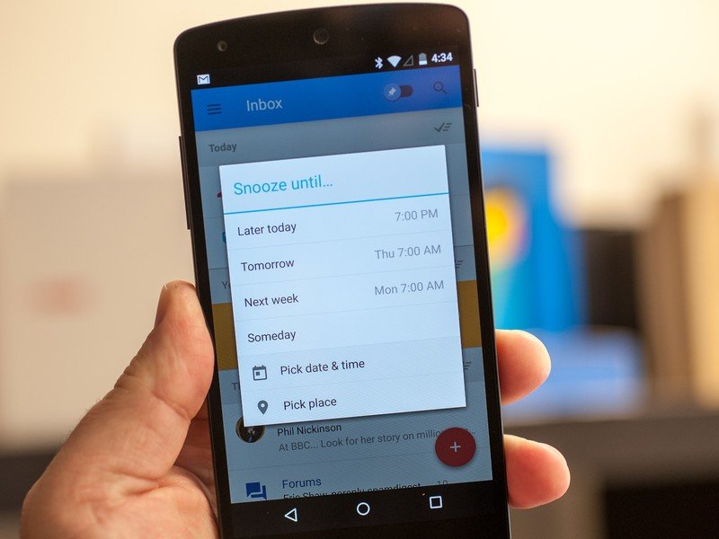
Swipe left to snooze and email and have it resurface later. That's the first step on the road to destruction for many of us, though. Either act on the email, or don't act on it.
Pinned items are awesome
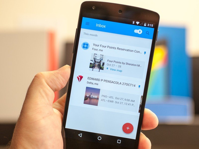
Stars just never worked for me, particularly because (either through a bug or more likely operator error) I keep accidentally starring all sorts of things. The pinned items in Inbox just seem so much more deliberate. And the top-level switch makes them easier to get to. Love this. My next flight and hotel confirmation emails are right there now. This could possibly even replace Tripit for me. (Probably not, but frequent travelers will see where I'm going with that.)
The quick-compose options are a great idea
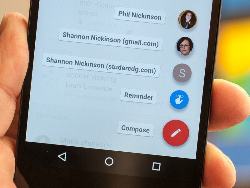
Hit the big floating action button — that's the Material Designy name for those things, by the way — and you get shortcuts for composing emails to folks — I currently see myself, two accounts for my wife, a reminder button, and a straight (and larger) compose button for emails from scratch. I'll expect those to adjust over time, right?
And this doesn't have to be perfect right away
Thank God someone is trying something. It's early days yet for this. It can and will change, and it can and will improve. I don't have to have it all figured out right this second. Neither does Google. But so far, it's a very interesting start on what may well change the email experience.

