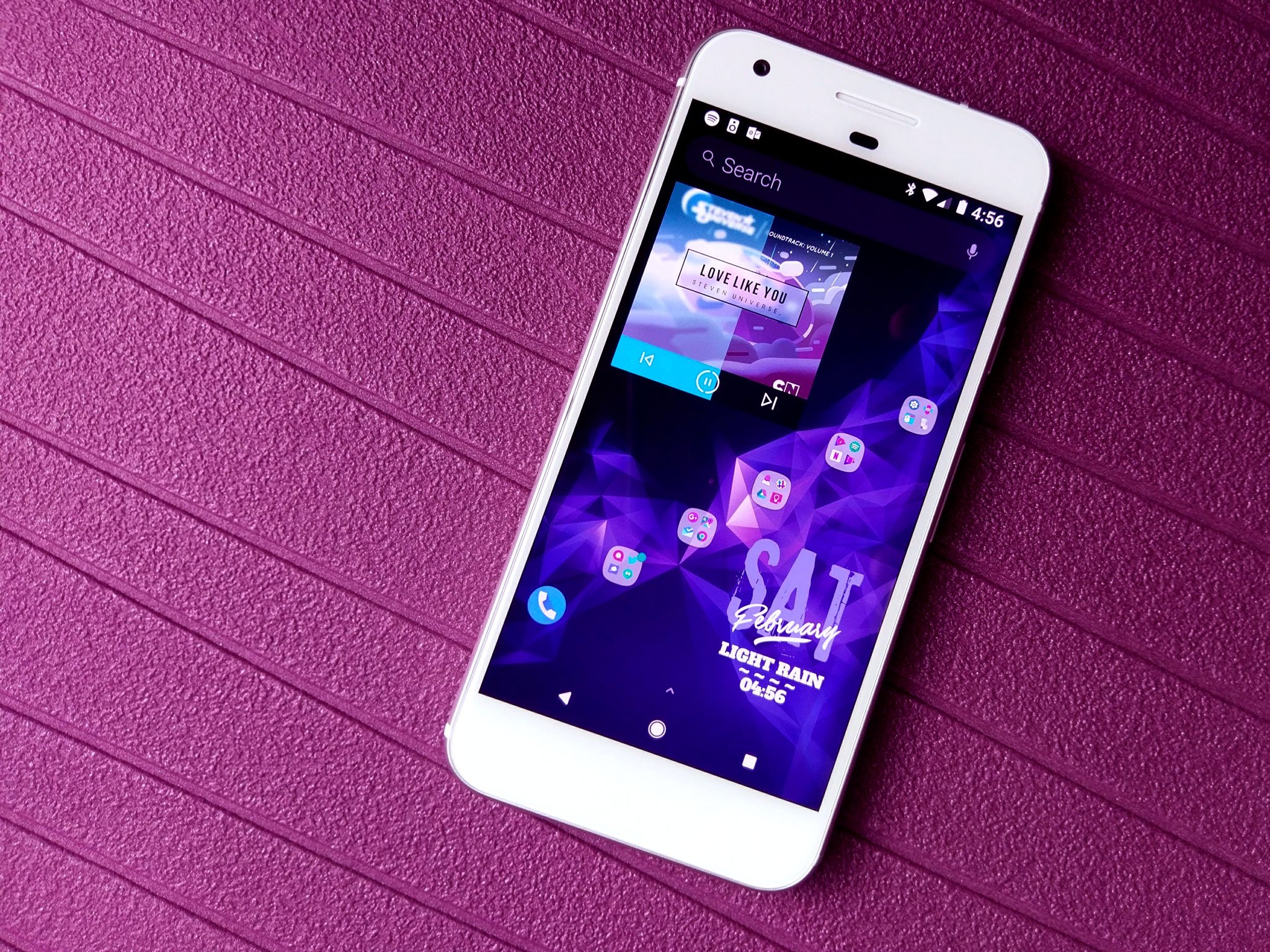
The world of Android theming is beset with big, bold, bombastic launchers that throw everything but the kitchen sink into their features, bells, and whistles, but sometimes you don't need all the pomp and pizzazz. Sometimes, you want a launcher that's light, lithe, and luxurious. If you're in the market for a launcher that's as simple as it sophisticated, Evie Launcher may earn its place as your next home screen, and as a free launcher, giving Evie Launcher a try doesn't cost you anything but a little time.
Evie Launcher's default setup is breathtakingly simple, featuring only four apps at the bottom of the desktop and one permanent search bar at the top. By default, Evie Launcher keeps the dock turned off, which definitely sets it apart from the pack, but it also leads to Evie missing the dock icons when importing a layout from another launcher during the initial setup.
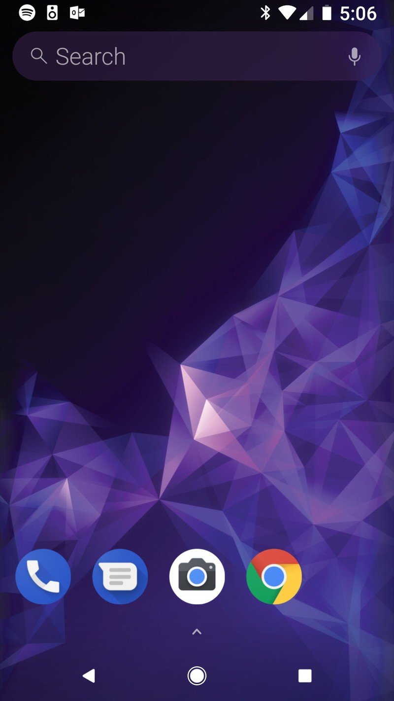
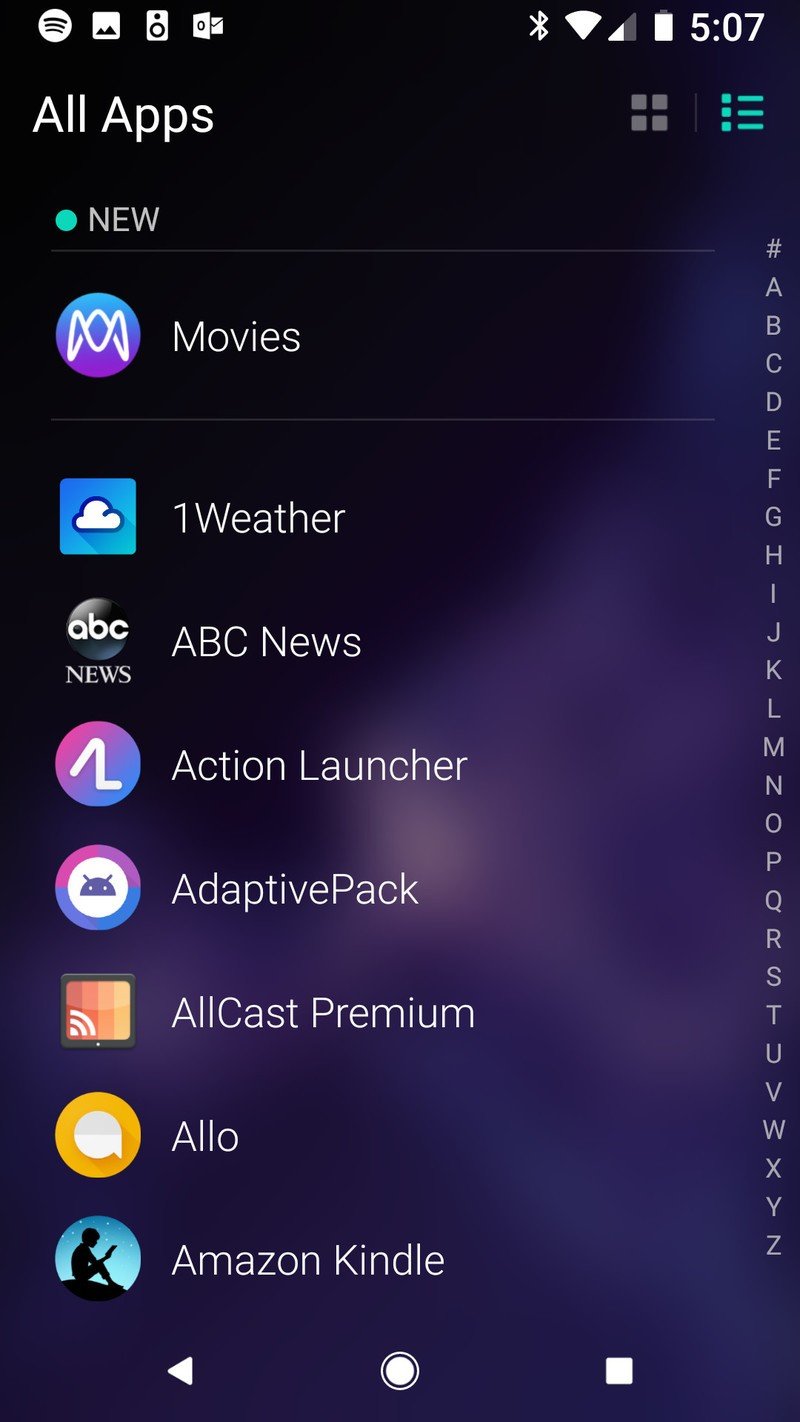
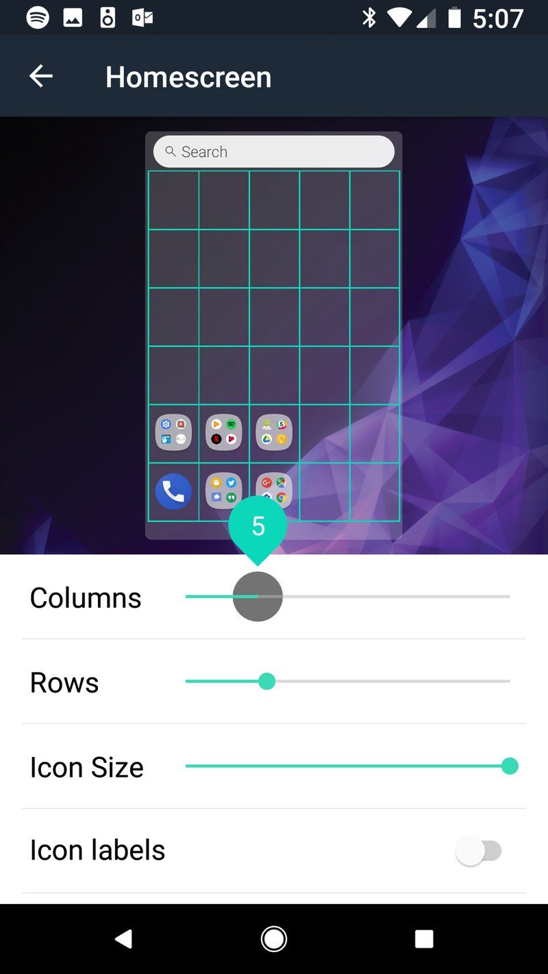
Another break with tradition is Evie's default grid size. While 4x4 has been the standard since the 4-inch phone days, Evie Launcher has a default desktop of 5x6 and is willing to take on any grid size from 3x4 to 12x12. With extra tall screens becoming the new normal, having a wide array of grid sizes is important, as you're going to want a few more rows to take advantage of that real estate.
The search bar is a permanent part of the Evie Launcher home screen, and it features one of the two gestures that are permanently turned on: swipe down to search. I wish there was a toggle to switch this gesture from opening the search bar to the notification shade — especially for those extra tall screens I mentioned before — but for now, it's a constant reminder that "hey, you can search for stuff". It's cool, Evie, but I just wanna see who texted me!
The other permanent gesture fits in with the Samsung Galaxy line and the Google Pixel: swipe up on the desktop to open the app drawer, and swipe down from the top of the app drawer to return to the desktop. The app drawer has two modes: a traditional list style or a more customizable grid layout.
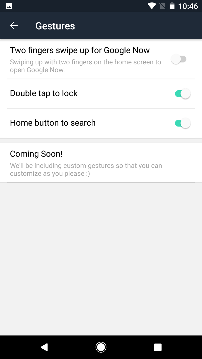
Getting back into Evie's settings, you have a bit more customization here than most light, speed-oriented launchers. Beyond setting an icon pack and adjusting your app drawer grid, you can turn back on our dock, unread badges or Android O notification dots, and even turn on a few extra gestures.
More robust gesture controls have been listed as "coming soon" for a year now, but there's still one gesture here I highly recommend turning on: double-tap to lock. There are even two methods you can choose from — just like Nova Launcher — a method that actually locks the phone and a method that just times out the screen in order to keep your phone unlocked via Smart Lock.
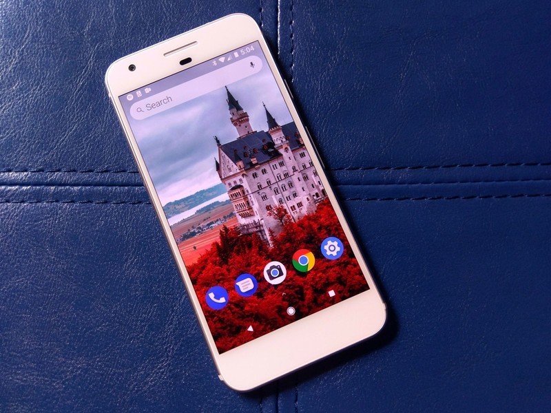
Evie Launcher is definitely showing promise, especially for users who will be left wanting when Google Now Launcher is pulled from Google Play. (That is still happening right?) While I wish it was better at importing dock elements, the launcher has made steady, stable progress in the year since we first reviewed it. Once more robust gesture controls come to Evie, it should be quite the apt competitor in a crowded launcher market, but it's no slouch right now.
Download: Evie Launcher (Free)
Updated February 2018: This review was updated to reflect almost a year of development for Evie Launcher and update some links.
Ara Wagoner was a staff writer at Android Central. She themes phones and pokes YouTube Music with a stick. When she's not writing about cases, Chromebooks, or customization, she's wandering around Walt Disney World. If you see her without headphones, RUN. You can follow her on Twitter at @arawagco.
