EverythingMe Launcher review: You just don't know me
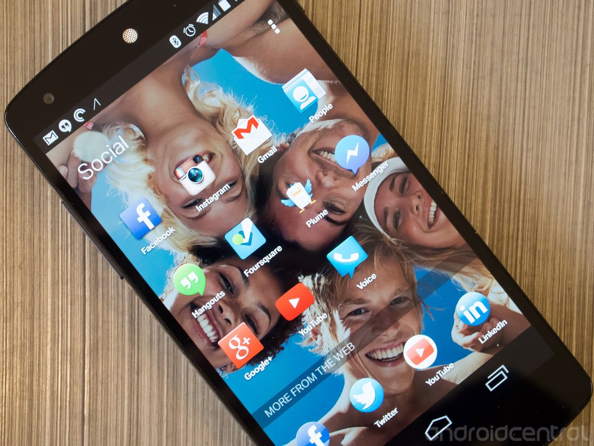
Sometimes predictions are great, but usually you just want your phone to look the same every time you unlock it.
As the current phrasing goes, when it comes to software and services, "context is king." Being able to look at your habits, usage patterns and tendencies to then make smart decisions on what you'll want next is being trumpeted as the next frontier of mobile computing. We're seeing Apple and Google get in on this game with smart calendar appointments and services like Google Now, but a new breed of contextually-aware launchers and apps have been the talk of the town in the Android world as of late.
The latest entry in this arena on everyone's tongues is EverythingMe Launcher, the product of talented developers EverythingMe (go figure) that wants to help simplify your phone experience and offer compelling new content with little user setup required. The system is pretty simple — look at the apps you have installed, when and for how long you use them and then tailor a homescreen layout to show what it thinks you want before you do.
It sounds like the mobile utopia of our dreams, but this particular time machine needs a little more tinkering before it realizes its true potential. Read with us after the break and see how EverythingMe Launcher is making an argument for being your next launcher choice.
The Prediction Bar: Where you're at, and when you're there.
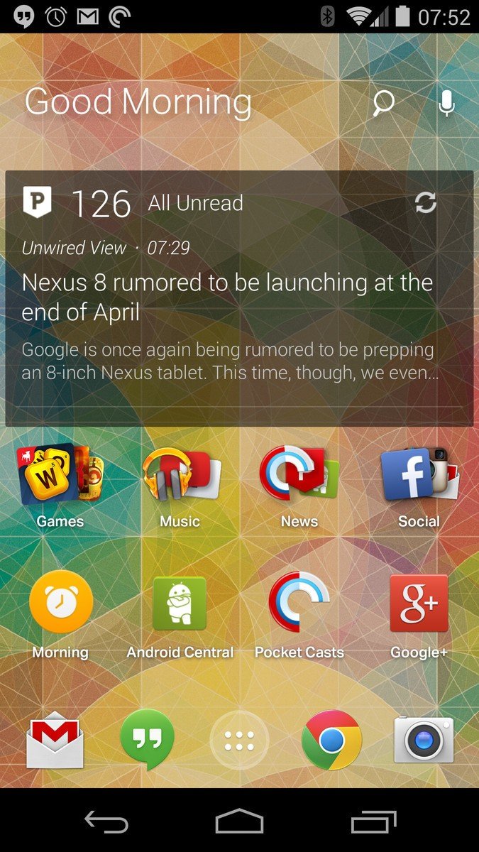
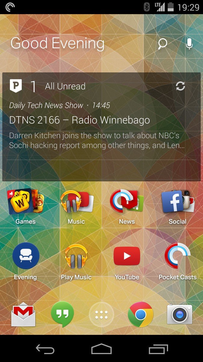
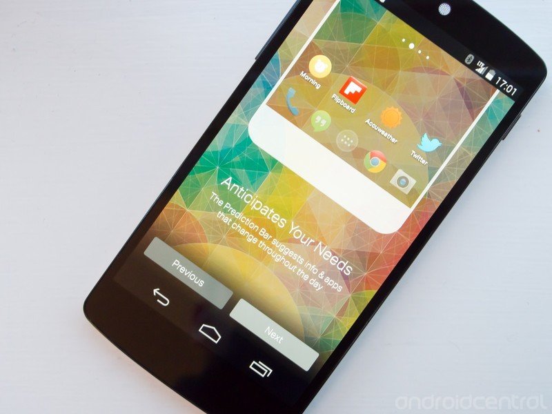
The main point of interaction for EverythingMe Launcher is the so-called "Prediction Bar." This "bar" is simply the bottom row of four app icons (above the dock) that change dynamically based on your location, the time of day and your app usage over time. The leftmost icon will be a folder of sorts, labeled by the time of day — Morning, My Day, Evening. Tapping it will open up a full-screen experience, showing a card (or cards) with relevant information, followed by a row of apps below. In the afternoon, for example, you'll see the "My Day" icon, and be taken to a page with your upcoming calendar appointments and a list of productivity apps you regularly use throughout the day, such as Chrome, Hangouts, Gmail and Google Maps.
With Smart Folders and the Prediction Bar ever-changing, you rely on your dock for the only four icons that won't change.
Back on the homescreen, the other three icons to the right will be your most-used apps during that time of day. For me, I see things like the Android Central app, Pocket Casts and Google+ in the morning, and Google Play Music, Facebook Messenger and Foursquare in the afternoon. Every once and a while you'll see another contextual app called "Around Me" that provides location-based information — à la Google Now — along with location-heavy apps and info like Foursquare, Yelp and the like.
Even after using EverythingMe Launcher for over a week, I still found the Prediction Bar to be minimally useful. With the emphasis on Smart Folders (I'll get to this more below) and this row of icons ever-changing, you rely on your four icons in the dock as being the only thing not constantly changing on your homescreen. I have more than four apps that need to be regularly accessed throughout the day, and I'd like to know exactly where they are at any given time. I shouldn't have to guess whether or not something like Facebook Messenger or my phone dialer will be in the Prediction Bar based on the time of day — this uncertainty is the exact reason why contextually-aware launchers just don't work for many.
Be an expert in 5 minutes
Get the latest news from Android Central, your trusted companion in the world of Android
Truly universal search
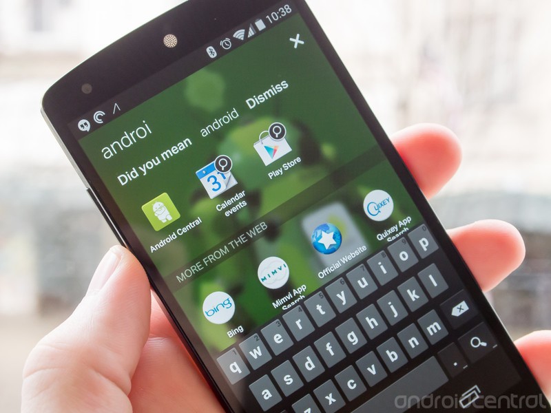
If there's one thing that EverythingMe launcher has absolutely nailed, it's the process and interface around universal search. While the functionality closely matches that of the latest Google Search integration in Android 4.4 KitKat, the display and instantaneous response you get on EverythingMe Launcher gives off a better feeling. Start typing anything — a contact name, app name, news topic, web search — and your phone will attempt to search every available bit of software, as well as the web, for information on what you're typing. As a nice touch, the background of the search screen even updates to show an image of the topic.
Typing "Andr" for example shows the Android Central app, contact listings for anyone named "Andrew" and shortcuts to bring you to search results from the Calendar and Google Play apps. Underneath any on-phone content, you'll also see a field named "More from the web" with dozens and dozens of round icons — this is where things get a little weird with EverythingMe Launcher.
Some of the web apps are useful, but they're still web apps in a world where Google Play has 900,000 better choices.
These round, app-like icons are actually just links to web pages, each of which simply loads in an in-launcher chromeless (i.e. no navigation bars or buttons) browser. Call them web apps, call them anything you want, at this point they're simply just web pages. Search for "Olympics" and you'll see an endless stream of links to web pages from sites of various reputations with coverage of the games. The top results will be things like the official Olympics website and Yahoo! News, but then you also get the Nascar website (what?), WWE (okay...) and mobile Twitter.
At the same time, I get no app results for the NBC Live Extra app, YouTube app, Google+ app, Facebook app or the actual Twitter app — all things that are installed on my phone and relevant to the Olympics. They're all just web pages that EverythingMe is presumably making some kind of affiliate deals with. These web apps don't resume nicely from the multitasking menu, don't act the same as native apps when using the back and home buttons and generally just don't offer a great experience on Android right now.
It's clear to us at this point that EverythingMe Launcher makes drastically more sense on a device that doesn't have a mature app platform and store, such as Firefox OS. Conveniently, Mozilla and EverythingMe have even inked a deal to bring this launcher technology to Firefox OS, which uses web apps as its sole way of serving content to users. If everything's a web app, EverythingMe simply offers a robust selection of apps to choose from. But when you could be using Google Play instead, these results just look bad.
This is no way a bad mark on EverythingMe Launcher as a technology or platform, and we actually think that this system has more potential for a seamless web/app experience, but it really just doesn't make sense on a modern Android device with the Google Play Store and such a stark quality divide between native and web apps.
Smart Folders
There are no regular app folders in EverythingMe Launcher, only "Smart Folders." When starting up EverythingMe Launcher for the first time, you'll be greeted with a selection of general folders such as Games, Music, Social and News, each pre-populated with the apps that presumably fit those categories. You can create new Smart Folders at any time, selecting which apps you want to be grouped and then letting the launcher pick a name and more associated apps to go with it.
Smart suggestions, but the news links and web app suggestions again go over the top.
The result is a bit of a mixed bag. Not only do you get folders filled with apps that you just don't want — leaving you to further groom and remove improperly-placed apps — but you are again given the not-so-great "more from the web" option at the bottom of each folder. As we discuss above, you'll be linked to web pages roughly-relevant to the apps in the folder. Things borderline on redundant in folders like "Social" where you have Facebook, Twitter, YouTube and LinkedIn web page links directly below a list of native installed apps that are for the exact same services.
The offerings go even further in Smart Folders like "News," where the folder is dominated by a horizontally-scrolling set of cards linking to news stories from a variety of outlets (again with a variety of reputations), with your installed news apps featuring at the bottom of the screen. In the "Games" Smart Folder, at the end of your list of installed games you'll also see one or two "Sponsored" titles that are available for download in the Play Store — it's great that they're prominently marked as such, but I still don't need game advertisements in my games folder.
Who wants this?
To my eyes, EverythingMe Launcher is best described as a tech demo rather than as a real product that has usefulness for a broad range of Android users. Falling right in line with apps like Aviate and Cover, EverythingMe Launcher tries to be the perfect solution for people who don't want to spend time configuring their phones — issue being that predictions are never perfect, and there will always be configuration of some sort.
The tangible benefits of generally great universal search and content discovery are cast in the shadow of weird web app suggestions, Smart Folders that aren't all that smart and time-of-day predictions that can never live up to their promises. What it really comes down to is the fact that you don't have to be a control freak to want your homescreens to just look the same every time you unlock your phone.
As I covered above I see a lot of potential in the technology behind EverythingMe Launcher, and with the right implementation and platform it could prove be a truly useful set of tools. But in its initial just-out-of-beta form, I'll be sticking to a traditional launcher that gives me the control — after all, nobody knows me like I do.
Andrew was an Executive Editor, U.S. at Android Central between 2012 and 2020.

