Everything you need to know about Android Oreo emoji, fonts, and icons
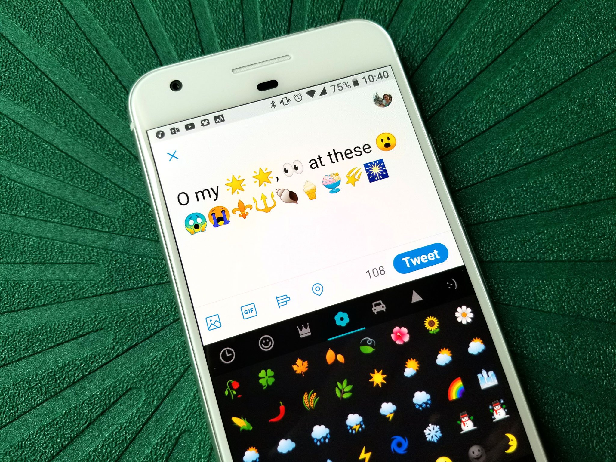
Android Oreo is coming out of Developer Previews soon, and with it comes a lot of beautiful, customization-friendly changes for Android users and developers in regards to emoji, fonts, and icons. Emoji are getting a sorely-needed upgrade in more ways than one. Fonts are getting more easy to integrate and implement for developers. App icons are getting another upgrade in yet another stab at app drawer consistency. There's a lot here to unpack, so let's unwrap these new toys!
The blobs are dead, long live the blobs
Android emoji have always been divisive, different, and kinda, well, doofish. Google's emoji have evolved and expanded just as Android has, but for the last few years, Google's emoji have stood out from the pack. First and foremost, while most face/emotion emoji are circles, Google's are yellow blobs, or lemon gumdrops. They're flat, they're simplistic, they're cute, and most people hate them. Those people can rejoice, because Google has adopted new emoji in Android Oreo: they're circular, and they're shaped and shaded to give more consistent depth, size and expression.

While I and some others have loved Google's blob emojis, millions of Android users never even saw the blobs, which brings us to another big problem. Google has never mandated the use of their unique emoji, and as a result, Samsung uses Samsung emoji and LG uses LG emoji and HTC uses a mishmash of HTC's own emoji and Google's. Since each one of these emoji libraries takes small creative liberties with the emoji's individual expressions and details, emoji's meaning can vary widely based on which library you see an emoji through. If you didn't like the emoji on your phone, tough luck, there aren't any real ways to replace them without getting into root tinkering.
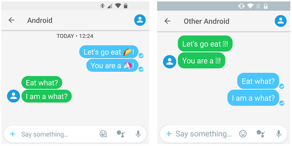
Even worse, since emoji libraries were a system file, they were only expanded and upgraded through a system update, which are slow to come for most non-Pixel phones. This meant that while the rest of the world goes nuts over a new taco emoji, or zombie emoji, all you'd see on your phone was a plain square or an empty space.
EmojiCompat and custom emoji fonts
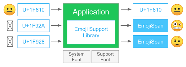
Google is looking to fix these issues in Android Oreo. First and foremost, even users who will never see Android Oreo on their current devices can see the latest emoji thanks to the EmojiCompat support library, which when added by developers to an app will allow users from KitKat on to see the latest emoji. So, even if you don't have the mind-blown emoji on your Lollipop phone, you can still see the mind-blown emoji your brother sent you after the latest Game of Thrones episode. The emoji that EmojiCompat substitute in might not match the non-Google emoji on your non-Pixel phone, but that's where a second improvement comes into play.
If developers don't want to leave the emoji displayed in their app up to the unpredictable emoji library that's included with users' phones, they now have an option to use a downloadable font with their own emoji instead. This will of course depend on developers to implement EmojiCompat and downloadable fonts in very specific ways, but there's some very fun stuff possible here.
Downloadable fonts and Fonts in XML
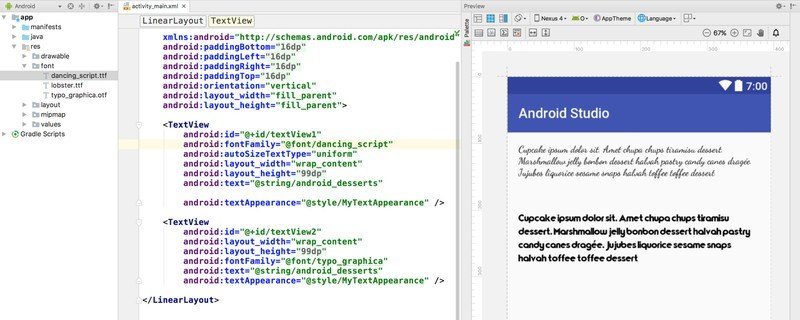
Speaking of downloadable fonts, these are going to have far-reaching implications beyond just emoji fonts. Downloadable fonts will allow developers to take font families out of their APK, making APKs smaller and more attractive to download. Instead of bundling a custom font in the APK, the app can reference and download the fonts it needs after install, meaning that a font can be downloaded once and used for multiple apps, and the app can be easily updated through the server without requiring a big app update to change it.
Be an expert in 5 minutes
Get the latest news from Android Central, your trusted companion in the world of Android
Fonts in XML is a bit more developer-oriented change, but it allows fonts to be used as a resource and called more easily by developers, meaning that changing fonts in an app, even between different sections of an app should be easier and smoother.
Adaptive Icons: ending the chaos in the app drawer
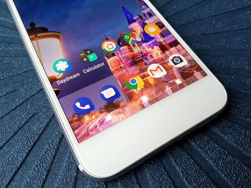
Android doesn't have the strenuous rules about icon shape, size, and shading that other platforms do, and so icons on Android devices have always been, well, a mess. There's a whole industry of icon pack makers out there who make apps to make your app drawers consistent since Android can't seem to achieve that out of the box. This year, Google is rolling on Adaptive Icons, a new two-layer icon pack standard that should make it easier for app drawers to find consistency while also offering quirky abilities like simple animations. Because all icons are submitted as two square layers and then cut into a custom shape by the device/launcher's mask, Google hopes to have this year's attempt at standardization actually take off.
Ara Wagoner was a staff writer at Android Central. She themes phones and pokes YouTube Music with a stick. When she's not writing about cases, Chromebooks, or customization, she's wandering around Walt Disney World. If you see her without headphones, RUN. You can follow her on Twitter at @arawagco.

